Bill Atkinson: Polaroids showing the Evolution of the Lisa GUI
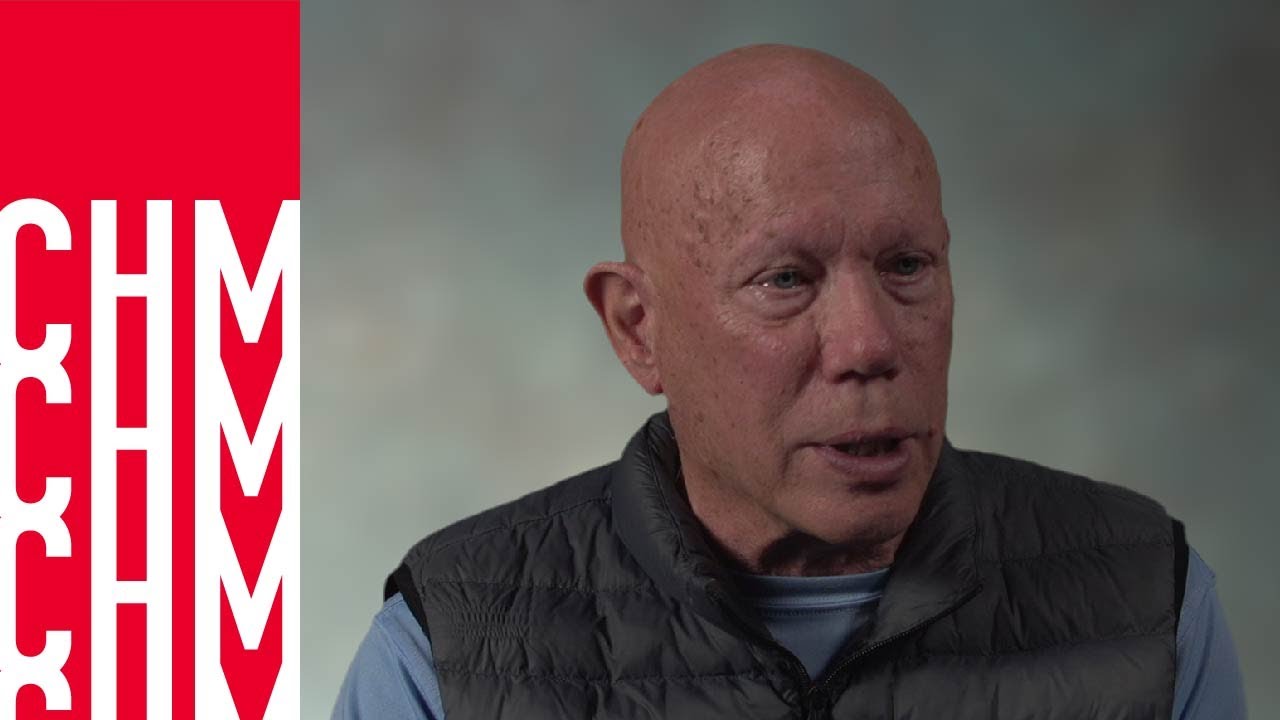
Computer History Museum
AI-assisted summary of Bill Atkinson: Polaroids showing the Evolution of the Lisa GUI — original source. Check the original for full context.
Source published:
Key ideas
- Bill Atkinson documents the creation of the Lisa graphical interface through a binder of Polaroids photographed from an Apple II prototype rig driving a custom bitmap display. (0:10)
- The single-button mouse was chosen over two- and three-button alternatives after testing showed multi-button layouts forced users to look down at their hands instead of focusing on the display. (5:25)
- The desktop icon interface and visual Trash Can were developed in secret as an after-hours skunkworks initiative by Bill Atkinson and Dan Smith to replace an unusable text-prompted file manager. (12:34)
- To produce grayscale rendering on 1-bit monochrome hardware, Atkinson modified a Western Union Desk-Fax drum scanner and developed the foundational Atkinson dithering algorithm. (17:38)
Detailed notes
## Background Published by the Computer History Museum on YouTube on January 29, 2025, this video documents a recording from December 12, 2022, featuring Apple pioneer Bill Atkinson. According to the description, Atkinson presents and explains his personal binder of Polaroid photographs taken during the development of the Apple Lisa, capturing the historical evolution of its graphical user interface.
## TL;DR Using Polaroid snapshots taken from a custom Apple II prototype rig, Bill Atkinson details how the Lisa engineering team systematically invented core modern interface conventions through rapid iteration and hands-on user testing. He explains the origins of proportional fonts, the I-beam cursor, the single-button mouse, 1-bit dithering algorithms, and the fixed top menu bar that solved per-window clipping. The walkthrough also recounts the unauthorized skunkworks project with Dan Smith and Wayne Rosing that replaced a tedious '20 Questions' file prompt with free-floating desktop icons and direct drag-and-drop manipulation. Atkinson concludes by stressing that intuitive interfaces require treating user confusion as software bugs, framing the Lisa as the direct evolutionary ancestor of the Macintosh and modern computing.
## Atmosphere & style The presentation possesses an intimate, reflective, and warmly nostalgic atmosphere as Atkinson flips through tactile, one-of-a-kind photographic artifacts from computing history. His delivery is candid and self-effacing, readily chuckling over humorous dead-ends—such as drawing swarming flies around full trash cans—while passionately critiquing modern design missteps like the ergonomics of the titanium Apple Card. Watching the video feels like an unhurried masterclass in design philosophy, grounding iconic digital paradigms in the gritty trial-and-error reality of motorcycle rides, hacked fax machines, and late-night skunkworks coding.
## Bulletin - [00:10](https://www.youtube.com/watch?v=Qg0mHFcB510&t=10s) Bill Atkinson documents the creation of the Lisa graphical interface through a binder of Polaroids photographed from an Apple II prototype rig driving a custom bitmap display. - [05:25](https://www.youtube.com/watch?v=Qg0mHFcB510&t=325s) The single-button mouse was chosen over two- and three-button alternatives after testing showed multi-button layouts forced users to look down at their hands instead of focusing on the display. - [12:34](https://www.youtube.com/watch?v=Qg0mHFcB510&t=754s) The desktop icon interface and visual Trash Can were developed in secret as an after-hours skunkworks initiative by Bill Atkinson and Dan Smith to replace an unusable text-prompted file manager. - [17:38](https://www.youtube.com/watch?v=Qg0mHFcB510&t=1058s) To produce grayscale rendering on 1-bit monochrome hardware, Atkinson modified a Western Union Desk-Fax drum scanner and developed the foundational Atkinson dithering algorithm.
## Key takeaways - [00:10](https://www.youtube.com/watch?v=Qg0mHFcB510&t=10s) Atkinson prototyped Lisa interface ideas at home using unoptimized code on an Apple II with a custom graphics card, photographing screens with Polaroid film to discuss with Larry Tesler and the team. - [00:10](https://www.youtube.com/watch?v=Qg0mHFcB510&t=10s) Hand-crafted proportional fonts on the Lisa replaced fixed-width character generators, giving different glyphs varying horizontal widths. - [01:31](https://www.youtube.com/watch?v=Qg0mHFcB510&t=91s) Early Lisa display concepts retained 1970s terminal paradigms, including dark backgrounds, 8×8 dither textures for simulated grays, and HP 300-inspired dynamic soft keys matching physical buttons. - [05:25](https://www.youtube.com/watch?v=Qg0mHFcB510&t=325s) The I-beam cursor was created to resolve ambiguity over whether inserted keystrokes would land before or after a character highlighted by an arrow cursor. - [05:25](https://www.youtube.com/watch?v=Qg0mHFcB510&t=325s) Standardizing on a single-button mouse eliminated application-specific button confusion and kept user attention firmly anchored to the monitor. - [08:58](https://www.youtube.com/watch?v=Qg0mHFcB510&t=538s) Moving menus from window borders to a fixed system-wide menubar at the top of the screen eliminated horizontal and vertical clipping and was paired with ballistic mouse acceleration. - [08:58](https://www.youtube.com/watch?v=Qg0mHFcB510&t=538s) The internal graphics harness SketchPad served as the testing ground for Atkinson's QuickDraw engine before later evolving into MacPaint. - [08:58](https://www.youtube.com/watch?v=Qg0mHFcB510&t=538s) Persistent visual highlighting in tool palettes and live outline drags solved common modal errors in early graphical authoring. - [08:58](https://www.youtube.com/watch?v=Qg0mHFcB510&t=538s) The Desktop Manager—the direct ancestor of the Mac Finder—was built by Dan Smith and Frank Ludolph under intense pre-release deadlines. - [12:34](https://www.youtube.com/watch?v=Qg0mHFcB510&t=754s) Frustrated by the tedious multi-step '20 Questions filer', Atkinson and Dan Smith received permission from engineering manager Wayne Rosing to build an unauthorized icon-driven desktop during off-hours. - [12:34](https://www.youtube.com/watch?v=Qg0mHFcB510&t=754s) Wayne Rosing supported the skunkworks desktop upon its reveal by handing out 'Rosing's Rascals' T-shirts to ratify the change while preventing other last-minute feature additions. - [12:34](https://www.youtube.com/watch?v=Qg0mHFcB510&t=754s) The visual desktop metaphor—using icons for documents, folders, trays, and tear-off stationery pads—demystified the abstract concept of digital files for everyday users. - [17:38](https://www.youtube.com/watch?v=Qg0mHFcB510&t=1058s) Atkinson developed arbitrary bitmap scaling routines and the Atkinson dithering algorithm using a modified Western Union fax drum connected to a home-built DEC LSI-11 computer. - [17:38](https://www.youtube.com/watch?v=Qg0mHFcB510&t=1058s) Atkinson dithering traveled between Apple projects, being refined by Andy Hertzfeld for ThunderScan and integrated into MacVision and HyperCard's HyperScan. - [20:00](https://www.youtube.com/watch?v=Qg0mHFcB510&t=1200s) Atkinson argues that intuitive user interfaces require continuous user testing and treating user friction as engineering bugs, citing the Apple Card's chip placement as a modern design failure. - [20:00](https://www.youtube.com/watch?v=Qg0mHFcB510&t=1200s) While commercially unsuccessful due to its high price tag, the Lisa established the direct graphical, mouse-driven lineage inherited by the Macintosh, iPhone, and modern personal computing.
## Detailed walkthrough ### [00:10](https://www.youtube.com/watch?v=Qg0mHFcB510&t=10s) The Prototype Rig, Polaroids, and Proportional Fonts
Bill Atkinson introduces a physical binder containing Polaroid photographs taken during the development of the Apple Lisa user interface. To build and test these concepts at home, Atkinson set up a cobbled-together prototype rig consisting of an Apple II outfitted with a custom graphics card that replicated the Lisa's bitmap display. He wrote throwaway, unoptimized code simply to put an interface idea on the screen. Whenever an idea was rendered, he snapped a Polaroid photo of the monitor, climbed onto his motorcycle, rode into Apple's offices, and convened with Larry Tesler and other team members to debate interface directions.
```mermaid flowchart LR accTitle: Atkinson Lisa GUI Prototyping Workflow accDescr: Cycle showing how Bill Atkinson coded interface ideas at home and reviewed them at Apple. subgraph Home ["Home Prototype"] A["Apple II with Lisa Display Card"] --> B["Unoptimized Interface Code"] B --> C["Polaroid Photo of Screen"] end subgraph Office ["Apple Office"] C --> D["Motorcycle Ride to Apple"] D --> E["Review with Larry Tesler & Team"] end ```
The earliest photographs document the very first typographic output on the machine: handbuilt proportional fonts. Atkinson highlights the stark departure this represented from the Apple II era, where every glyph occupied an identical width. Here, an "I" was noticeably narrower than a "W," establishing a typographic subtlety that modern computer users take entirely for granted.
- The home testbed relied on an Apple II host driving a custom Lisa bitmap display card. - Photographs were captured on Polaroid film and transported by motorcycle to Apple headquarters. - Screen mockups were reviewed collaboratively with Larry Tesler and the Lisa team. - Hand-drawn proportional typography marked the transition away from fixed-width character generators.
[01:31](https://www.youtube.com/watch?v=Qg0mHFcB510&t=91s) Black Backgrounds, Soft Keys, and 1-Bit Patterns
The first operational screen layout for the Lisa retained the dark presentation standard across late-1970s hardware, showing light text against a solid black background. The display allocated 720 black-and-white pixels across 25 lines of 80-character text, augmented along the bottom by ten on-screen "soft keys." These screen labels corresponded directly to an unprinted row of ten physical keys positioned along the top of the keyboard; operators were expected to read the dynamic label on the glass and hit the associated physical button below. Atkinson notes that the hardware still featured dedicated scan-line pointers, enabling smooth vertical scrolling through the middle region of the screen as long as the content stretched the entire display width.
When asked by the interviewer about the architectural origin of these soft keys—citing colleague Al Kossow's recollection that Lisa engineers hailing from Hewlett-Packard brought over concepts from the HP 300—Atkinson confirms the lineage:
> “I think Roy Mueller was Hardware Manager or Software Manager, I'm not sure which, but he had worked at HP, and we had seen these terminals that had unlabeled keys and then labels show up on the screen.”
Working under strict hardware limits of one bit per pixel (strictly binary black or white), Atkinson devised repeating 8×8 dither textures to produce simulated grayscale. These textured fills gave the engineering group their first visual mechanism for segmenting and differentiating overlapping screen regions without native color hardware.
[03:24](https://www.youtube.com/watch?v=Qg0mHFcB510&t=204s) Early Windowing, Limited Menus, and the Folder/Document Confusion
Atkinson turns to the earliest snapshots depicting multi-window layouts, stressing that these were exploratory graphical shells rather than functional operating software:
> “Remember, this is string and bailing wires prototype, this is not real code that the team is using, okay, they're still working on specifications for these Lisa 7 apps.”
These early mockups combined overlapping rectangular windows with soft-key frames and primitive popup menus. Because these early popup menus surfaced only a tiny cluster of commands tied to current mouse coordinates, they utterly lacked the breadth and depth required by complex office programs such as full-fledged word processors.
```mermaid flowchart TD accTitle: Evolution of Menu Placement accDescr: Three progressive architectural stages of Lisa menu design from bottom bars to the fixed system menubar. M1["Bottom Window Menus<br>(Limited commands, awkward selection)"] --> M2["Per-Window Top Menus<br>(Clipped by narrow or short window bounds)"] M2 --> M3["Fixed Screen-Top Menubar<br>(Guaranteed full width/height; paired with mouse scaling)"] ```
During this design cycle, the team grappled with the conceptual distinction between directories and files. Rather than understanding a folder strictly as an organizational bucket for enclosing distinct files, Atkinson’s early screens treated the folder itself as a writable document surface with embedded text. Furthermore, commands were housed in a bottom-docked menu bar displaying headings like `Edit` and action items like `Copy`. To switch operational menus, an operator had to click into the primary heading before selecting a secondary item—an awkward interaction model that proved cumbersome in daily testing.
- 8×8 binary patterns supplied the visual illusion of gray values on monochrome hardware. - Early popup menus failed to provide enough organizational room for comprehensive application suites. - Folders were initially conflated with editable text documents rather than serving solely as containers. - Bottom-edge window menus forced an unnatural two-step interaction to switch command categories.
[05:25](https://www.youtube.com/watch?v=Qg0mHFcB510&t=325s) The I-Beam Cursor and the Single-Button Mouse Decision
When users attempted to edit prose, the default arrow pointer exposed an immediate design flaw: selecting a specific glyph left the typist unsure whether newly typed characters would land immediately in front of or behind the highlighted character. To resolve this ambiguity, Atkinson engineered the distinct "I-beam" cursor to demarcate exact insertion points between characters.
Concurrently, Apple resolved the fierce industry debate surrounding pointing devices. The development group had evaluated multi-button mice possessing up to three switches, routinely running design exercises to figure out button mapping:
> “We committed at this point to a one-button mouse. We had seen mouse with up to three buttons on them and we had this sort of little contest: okay, for each application what would you label the three buttons? The first one was always select, but the other ones, every application had a different meaning for them. And when we went to one button, people stopped looking at the mouse and started looking at the screen more.”
- The I-beam cursor replaced the general-purpose pointer to disambiguate precise inter-character insertion points. - Three-button layouts induced cognitive strain because secondary and tertiary buttons lacked system-wide consistency across apps. - The shift to a standardized single button eliminated physical fumbling, keeping user attention fixed on the CRT display.
[06:26](https://www.youtube.com/watch?v=Qg0mHFcB510&t=386s) Window Manipulation: Folder Tabs, Window Menus, and the Resize Bug
Before settling on free-floating desktop icons, Atkinson prototyped desktop "folder tabs." Touching an individual tab enlarged it into a full window, while clicking it a second time collapsed it back down. The engineering group iterated through several variations of this filing-cabinet metaphor: tabs shaped with subtle curved shoulders, tabs lined along the bottom perimeter to mimic drawers, and rounded tabs where an active selection was designated by subtle bold text. Real-world testing revealed that bold outlines were far too weak for users to notice, though double-clicking tabs to toggle open/closed states persisted as a foundational behavior.
Concurrently, the team relocated menu bars from the bottom border up to the top interior border of individual windows. While an improvement, this approach exposed severe spatial bottlenecks: if a user resized a window to be narrow, horizontal titles truncated; if the window was made short, long pull-down lists spilled past the frame.
Window resizing also suffered from a jarring usability pitfall. Atkinson’s initial resize box—located in a corner—demanded an outward drag. When tentative users cautiously clicked or jabbed at the resize handle without dragging wide, the bounding box collapsed inward to a tiny rectangle:
> “One of the problems was if people just dragged it a little bit, the window would [shrink] down to that size... and they'd think they'd broken the computer, like when you take the power off a television and it goes like that, the image kind of goes down. So that didn't work so well; we debugged the user interface one error at a time.”
- Early folder tabs behaved as expandable drawers rather than static icons. - Per-window menu strips proved inadequate due to clipping within compact window boundaries. - Hair-trigger resize handles caused accidental collapses, frightening novice testers who thought the machine had lost power.
[08:58](https://www.youtube.com/watch?v=Qg0mHFcB510&t=538s) The Global Menubar, QuickDraw, Palettes, and the Desktop Manager
To permanently solve menu clipping, Atkinson elevated menus out of individual windows altogether, pinning a single universal menu bar across the very top edge of the entire display. This structural breakthrough ensured that menus always commanded maximum screen width and full vertical drop-down height. To counteract the increased physical distance required to reach the top edge, the software added dynamic mouse scaling (ballistic acceleration), allowing a swift flick of the wrist to fling the pointer across the screen. The resize control was anchored to the bottom-right corner, ensuring small drags yielded only small changes in window size.
```mermaid flowchart TD accTitle: System-Wide Lisa Screen Architecture accDescr: Top-level layout showing the fixed top menubar, application window with palettes, and desktop shelf. TopBar["Fixed Top Menu Bar (Full width, guaranteed vertical clearance)"] subgraph DesktopArea ["Desktop Workspace"] Window["Application Window<br>(Top-left close box, bottom-right resize corner)"] Palette["Tool Palette<br>(Direct tool selection with visual mode feedback)"] Tray["Desktop Tray<br>(Temporary shelf to clear workspace clutter)"] end TopBar --- DesktopArea ```
Atkinson’s QuickDraw engine simultaneously advanced, rendering rich typography (plain, bold, outline, inverse, italic, and shadowed text over patterned backdrops) alongside primitive shapes such as rounded rectangles, ovals, and graphic-filled menus. Atkinson points out an experimental harness named "SketchPad," which was an explicit homage to pioneer Ivan Sutherland's foundational interactive graphics system:
> “SketchPad was just a test bed for QuickDraw, it was never an application that shipped, and it later evolved into MacPaint. It was a tip of the hat to Ivan Sutherland; his first graphics editing program was called SketchPad, and I was a fan of his work.”
To tame overlapping workspace clutter, the team introduced a temporary parking shelf called the "tray," which allowed windows to be set aside without sacrificing desktop space.
For graphic manipulation, Atkinson introduced the first on-screen tool palette. By selecting icons for rectangles or ovals directly in the palette, the active tool remained clearly inverted so users always understood their operating state—countering traditional modal traps by making the active mode visually explicit and showing real-time shape outlines during mouse drags.
Behind the scenes, team member Bruce Daniels maintained the mouse-driven text editor that all engineers relied upon to author Lisa code, embedding scrollbars, cursor selection, cut, and paste. As the project neared its launch deadline under an aggressive policy forbidding new features, engineers Dan Smith and Frank Ludolph worked down to the wire completing the Lisa Desktop Manager—the direct architectural ancestor of the Macintosh Finder.
- A fixed system-wide menubar solved edge-clipping and was paired with mouse acceleration. - The bottom-right grow box eliminated sudden screen collapses during resizing. - "SketchPad" acted as the internal test engine for QuickDraw routines before maturing into MacPaint. - Tool palettes addressed mode errors through persistent visual highlighting and dynamic drag rendering. - Bruce Daniels' mouse-driven editor furnished the core programming environment used across the engineering team. - Dan Smith and Frank Ludolph built the Lisa Desktop Manager amidst late-stage crunch.
[12:34](https://www.youtube.com/watch?v=Qg0mHFcB510&t=754s) Replacing the "20 Questions" Filer with Desktop Icons and "Rosing's Rascals"
The turning point for the Lisa desktop interface occurred when Dan Smith approached Bill Atkinson about the unbearable friction in their existing file manager, which they nicknamed the “20 Questions filer.” To move a single file between folders across two floppy diskettes, a user was forced to navigate an exhaustive interrogation: identifying the source diskette, specifying the folder and subfolder, selecting the document, repeating the entire location hierarchy for the destination, and finally commanding the system to copy or move it. Atkinson and Smith initially mocked up a two-window navigational prototype displaying the "office" and the "desk," behaving much like an early two-level column view where clicking an item would expose its contents in the adjacent pane. Convinced they could make file management vastly more concrete, they pitched engineering manager Wayne Rosing on an unauthorized skunkworks initiative to build a system centered entirely on draggable icons. Rosing gave them permission under strict secrecy: they had to work their standard eight-hour shifts on official tasks at the office and write the experimental icon manager at home on their own time.
Operating under the radar, Atkinson and Smith produced the Lisa's first graphical diskette directory, followed by the breakthrough innovation of placing free-floating icons directly onto the desktop. Atkinson humorously pushed the visual metaphors too far at first, drawing swarming flies around the trash can whenever it was full—an addition that promptly failed the sanitation test and had to be cut. Grounding the interface in physical office objects solved a fundamental conceptual hurdle for non-technical users. Prior to the Lisa, ordinary people had no mental model for a digital file, associating the word either with an abrasive metalworking tool or a physical manila folder in a steel cabinet. The team introduced explicit visual icons for documents, folders, file drawers, diskettes, trays, and tear-off stationery pads. Underneath this intuitive visual layer, the core file-system engine and pre-flighting algorithms developed by Frank Ludolph and Dan Smith remained untouched; the icons served as the friendly front-end disguise. When they finally revealed the fully working system to the team, Rosing supported them completely, surprising them with commemorative shirts to signal his executive blessing while deterring others from derailing the schedule. As Atkinson recalled, “Wayne said, ‘Okay, don't tell anybody you're working on this. Only work on it at home, and come in here and work your eight hours here, but then go back and work extra time on it at home.’” Atkinson reflected warmly on the incident, remarking: “Wayne rosing was an amazing man to work with I I loved working with him and I still think he's an amazing person.”
The interviewer observes that if the Lisa team had not introduced icons at the eleventh hour, the Macintosh interface might have looked entirely unrecognizable. Atkinson emphasizes that the Mac, debuting just twelve months after Lisa, was conceived as an affordable “baby Lisa.” Priced at nearly $10,000, the Lisa was prohibitively expensive for individual consumers. The Mac's mission was not only to dramatically lower hardware costs, but to strip away Lisa’s corporate stiffness in favor of an approachable, playful personality that captivated consumers so intensely that they would immediately buy one and invent a practical justification later.
```mermaid flowchart TD accTitle: Evolution of Lisa File Management accDescr: Diagram contrasting the cumbersome 20 Questions filer workflow with the direct manipulation skunkworks icon interface.
subgraph OLD["The '20 Questions' Filer"] A1["Specify Source Diskette & Path"] --> A2["Select Source Document"] A2 --> A3["Specify Target Diskette & Path"] A3 --> A4["Confirm Move or Copy Command"] end
subgraph NEW["Skunkworks Desktop Metaphor"] B1["Graphical Directory & Desktop"] --> B2["Direct Object Icons (Docs, Trays, Pads)"] B2 --> B3["Drag-and-Drop Manipulation"] B3 --> B4["Visual Trash Can / Safe Deletion"] end
OLD -.->|"Redesigned by Atkinson & Smith"| NEW ```
- Dan Smith described the original multi-step file transfer process as completely unusable: “This is too complicated and so he came to me and asked could we simplify this.” - Atkinson noted how foreign computing concepts were to novice users: “Real people don't get what a file is well they do now but they didn't back then what is a file they think of a file is either something that you scrape metal with to to smooth it down or or as a file folder in a drawer but what is a what is a file on a computer they didn't know what that was.” - To prevent organizational chaos after the skunkworks reveal, Rosing distributed custom T-shirts: “Rosings Rascals and it was he was telling everybody look I sanctioned I approved of this don't everybody else go off with crazy ideas at the last minute we got to ship this thing so we were that's my favorite t-shirt from all of my Apple days is Rosings Rascals.”
---
[17:38](https://www.youtube.com/watch?v=Qg0mHFcB510&t=1058s) Bitmap Scaling, Hack-Rigged Scanners, and Atkinson Dithering
Turning through the Polaroid binder, Atkinson points out photographs documenting his breakthroughs in graphical scaling and image processing. To display graphics across varying formats, he had to pioneer arbitrary bitmap scaling routines, moving beyond simple 1:1 pixel copying to dynamically calculate pixel expansion and contraction on the fly. As Atkinson explained, “Instead of just copying pixels one for one I had to actually figure out how to to shrink or expand uh uh pixels as I was drawing them.”
The album also reveals a variety of intricate halftone images, which prompted Atkinson to share how he engineered an early scanner before commercial units existed at Apple. At home, Atkinson kept a personal wire-wrapped DEC LSI-11 minicomputer. He acquired an obsolete Western Union Desk-Fax facsimile machine—originally built to create binary copies by burning through electrosensitive silver paper with an electrical stylus—and modified its circuitry to output a variable analog signal. He then built a custom analog-to-digital converter to feed the scan lines directly into his home computer. Generating convincing grayscale imagery from strictly black-and-white displays became one of his passionate technical obsessions. He spent countless hours fine-tuning mathematical error-diffusion equations to distribute dark pixels without creating distracting moiré patterns or obvious visual clusters.
This work laid the foundation for the famous Atkinson dithering algorithm. The techniques Atkinson perfected during the Lisa era were later ported across several foundational personal computer imaging products. Third-party developers utilized his code for MacVision, an early video digitizer. Later, when Andy Hertzfeld was building the ThunderScan hardware-software bundle, Hertzfeld borrowed Atkinson’s half-toning engine, made key refinements, and traded the code back to Atkinson. Atkinson incorporated further improvements into HyperScan, the image-capture utility bundled with HyperCard.
- Atkinson modified an electrosensitive Western Union facsimile drum into an analog scanner hooked up to his home-built LSI-11 system. - The resulting algorithm, Atkinson dithering, became an industry benchmark for converting continuous-tone photographs into clear 1-bit bitmap images. - Dithering techniques traveled in an iterative loop across multiple Apple-ecosystem milestones: Lisa, MacVision, ThunderScan, and HyperCard’s HyperScan.
---
[20:00](https://www.youtube.com/watch?v=Qg0mHFcB510&t=1200s) Iterative Engineering, the Apple Card Fail, and Lisa's Living Legacy
Looking through the collection, Atkinson reflects that the binder preserves an unvarnished, incremental record of how the team stumbled their way toward the modern graphical interface. The Lisa UI did not emerge fully formed through sudden genius; it was forged through relentless, disciplined engineering iterations, repeatedly placing experimental builds in front of everyday test subjects to spot where confusion arose and diligently treating user errors as system bugs that required redesigns. Emphasizing the primacy of empirical validation, Atkinson stated: “The way you get a smooth user interface is with user testing there's no other way if you don't test on users I mean I'll show you an example of a total failure of user testing in my card.”
To prove his point about the hazards of skipping user testing, Atkinson pulls his modern titanium Apple Card from his wallet. He demonstrates that when an owner holds the card right-side up to read the typography, their thumb naturally rests directly on top of the EMV chip, blocking it right as they attempt to insert it into a terminal—an elementary ergonomic blunder avoided by every conventional credit card. Furthermore, because Apple opted for a premium titanium finish without real-world wear testing, the card acts like an abrasive blade that shreds other cards kept in the same wallet sleeve. Atkinson cautions that engineers and designers must abandon self-satisfaction: “That's my strong advice for anybody trying to make a product today is test it on real users and watch what doesn't work for them you can make it a whole lot better just by listening to their feedback but don't be so arrogant as to think that you have all the answers.”
When asked to select a single Polaroid from the binder that encapsulates the essence of the Lisa, Atkinson selects the slide showing the graphical diskette directory alongside icons scattered across the desktop surface. That visual captured a radical departure from the punitive text consoles of the 1970s, replacing typed syntax errors with visual manipulation. As Atkinson observed, “You could use a mouse to interact with it point and click instead of type and be told that you were stupid so it it made a difference Lisa made the computer accessible to more people.” While commercial success eluded the overpriced Lisa hardware, Atkinson concludes that its foundational user experience served as the indispensable genetic seed for the Macintosh, the iPhone, and the modern mobile devices carried in pockets across the globe.
- Atkinson described the creation of the GUI as iterative problem-solving: “Whatever we got in Lisa that made it work was because we were willing to be wrong and willing to iterate and willing to keep working at it until it was smooth.” - The core philosophical breakthrough of the Lisa GUI was empowering the human operator: users could “point and click instead of type and be told that you were stupid.” - Atkinson credited the Lisa as the direct evolutionary ancestor of modern ubiquitous computing: “Lisa was influential as a stepping stone it sewed seeds that other people picked the ball with and rolled and and made improvements.”
## Notable quotes > [05:25](https://www.youtube.com/watch?v=Qg0mHFcB510&t=325s) When we went to one button, people stopped looking at the mouse and started looking at the screen more. — Bill Atkinson
> [20:00](https://www.youtube.com/watch?v=Qg0mHFcB510&t=1200s) Whatever we got in Lisa that made it work was because we were willing to be wrong and willing to iterate and willing to keep working at it until it was smooth. — Bill Atkinson
## Mentioned Al Kossow, Andy Hertzfeld, Apple, Apple Card, Apple II, Apple Lisa, Atkinson dithering, Bill Atkinson, Bruce Daniels, Dan Smith, DEC LSI-11, Frank Ludolph, HP 300, HyperCard, HyperScan, Ivan Sutherland, Larry Tesler, MacPaint, MacVision, Macintosh, QuickDraw, Roy Mueller, SketchPad, ThunderScan, Wayne Rosing, Western Union Desk-Fax
## Video description [Recorded on December 12, 2022]
Bill Atkinson shows and explains his binder of Polaroid photos which he took during the development of the Lisa, documenting the evolution of its graphical user interface.
Catalog number: 102809056 Acquisition number: 2022.0174
[Source](https://www.youtube.com/watch?v=Qg0mHFcB510)