Susan Kare Shows How Strict Pixel Limits Built Early Apple Mac UI
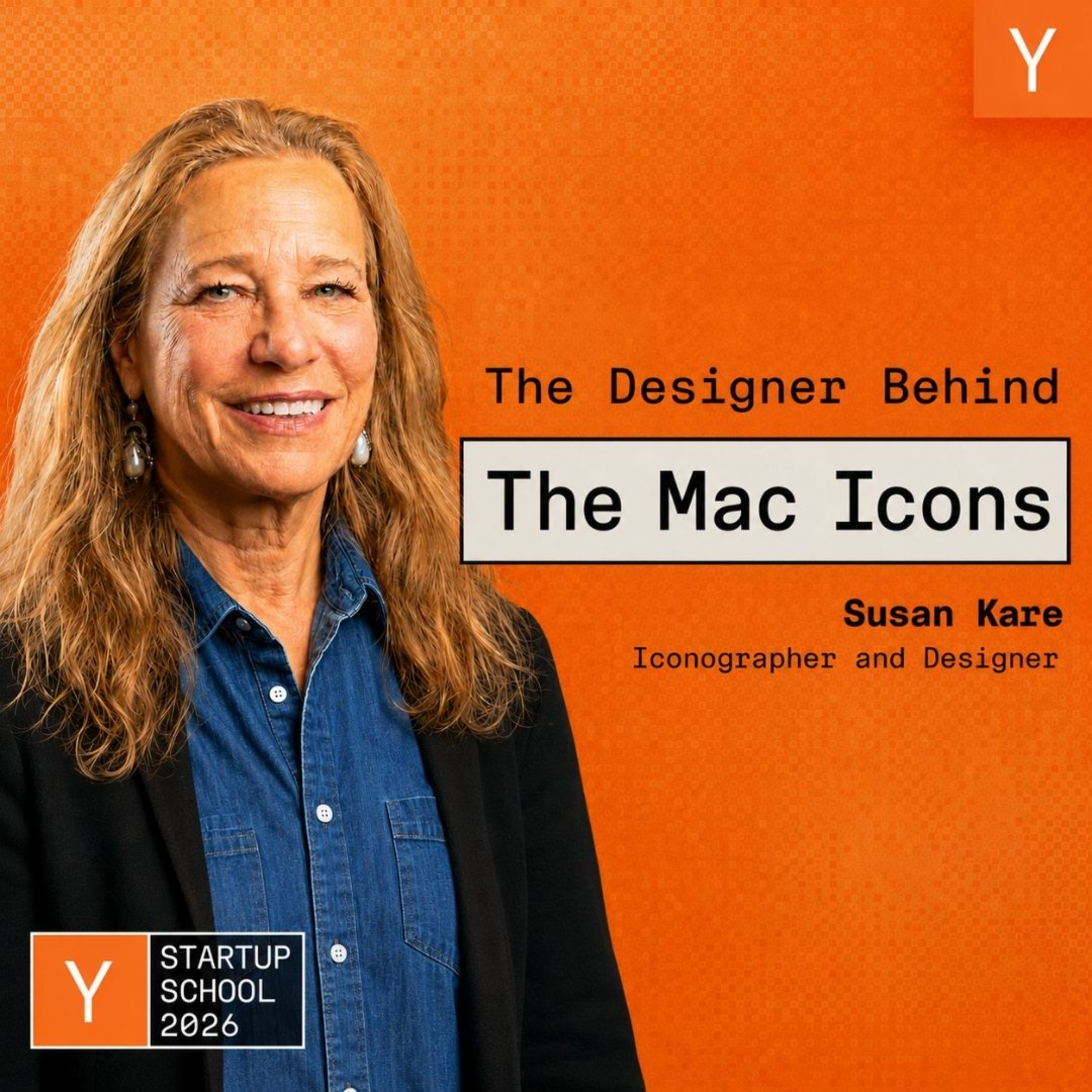
Y Combinator
Abstract conceptual metaphors endure across generations of software while literal depictions of physical hardware guarantee visual obsolescence, Kare argues.
AI-assisted summary of Susan Kare: Designing Icons & Graphics For the Original Mac — original source. Check the original for full context.
Source published:
Key ideas
- Susan Kare transitioned from fine-arts welding to Apple after high school friend Andy Hertzfeld recruited her to design bitmapped symbols and proportional fonts for the original Macintosh, drafting early ideas in a graph-paper notebook now preserved at MoMA. (0:00)
- Faced with severe hardware limitations, Kare engineered the Chicago system font with strict 45- and 90-degree angles and built core iconography within 16x16 and 32x32 monochrome grids, arguing that tight constraints actively stimulate creative solutions. (5:00)
- The iconic Command symbol was adopted after Steve Jobs objected to an 'Apple farm' of corporate logos cluttering menu shortcuts; Kare discovered the looped square in a symbol dictionary, later learning it depicts Sweden's Borgholm Castle ruins. (22:00)
- Paul Rand secured the NeXT corporate identity by refusing speculative agency contests and demanding a non-negotiable $100,000 flat fee for a single logo design, teaching Kare the value of disciplined color palettes and enduring metaphors over abstract shapes. (38:00)
Detailed notes
## Background Published by Y Combinator on their web platform on August 28, 2026, this Startup School presentation features iconographer and designer Susan Kare. According to the show description, Kare reflects on joining Apple as an art history PhD with little computing experience and going on to design foundational icons, typefaces, and visual metaphors for the original Macintosh, while sharing timeless design lessons learned from collaborators like Steve Jobs and Paul Rand.
## TL;DR Susan Kare recounts her transition from fine arts welding to defining the visual lexicon of personal computing at Apple, detailing the creation of enduring artifacts like the Chicago typeface, the Happy Mac, and the looped Swedish Command key symbol within strict 16×16 and 32×32 pixel constraints. She highlights key design tenets—embracing technical limitations, prioritizing universal conceptual metaphors over literal hardware depictions, and leveraging abstraction so users can project themselves into an interface. Kare also covers her subsequent work on Windows 3.0, General Magic, and Facebook's digital gift shop, alongside mentorship lessons from legendary graphic designer Paul Rand on typography, client negotiation, and visual discipline. Throughout the talk, she illustrates how iterative simplicity and clear ideas turn austere technical constraints into meaningful human experiences.
## Atmosphere & style Warm, self-effacing, and rich with technological lore, Kare's presentation feels like an intimate fireside chat with an accidental pioneer who still proudly identifies as a hands-on 'bit-twiddler.' Her storytelling blends dry humor—such as admitting to designing an iPod ancestor by mistake or recalling panicked reception calls about the bomb icon—with sharp, masterclass-level design critique. The mood is nostalgic yet profoundly relevant, capturing both the chaotic pirate energy of early Silicon Valley and the enduring power of disciplined visual craft.
## Bulletin - `00:00` Susan Kare transitioned from fine-arts welding to Apple after high school friend Andy Hertzfeld recruited her to design bitmapped symbols and proportional fonts for the original Macintosh, drafting early ideas in a graph-paper notebook now preserved at MoMA. - `05:00` Faced with severe hardware limitations, Kare engineered the Chicago system font with strict 45- and 90-degree angles and built core iconography within 16x16 and 32x32 monochrome grids, arguing that tight constraints actively stimulate creative solutions. - `22:00` The iconic Command symbol was adopted after Steve Jobs objected to an 'Apple farm' of corporate logos cluttering menu shortcuts; Kare discovered the looped square in a symbol dictionary, later learning it depicts Sweden's Borgholm Castle ruins. - `38:00` Paul Rand secured the NeXT corporate identity by refusing speculative agency contests and demanding a non-negotiable $100,000 flat fee for a single logo design, teaching Kare the value of disciplined color palettes and enduring metaphors over abstract shapes.
## Key takeaways - `00:00` Focusing on making designs meaningful and memorable ensures that form naturally follows strong foundational ideas. - `05:00` Severe technical constraints like monochrome 16x16 pixel grids fuel creative problem-solving rather than limiting it. - `05:00` The Chicago font established digital legibility by utilizing a 9-pixel cap height, proportional spacing, and strict 45- and 90-degree angles. - `10:00` Custom internal tools like Andy Hertzfeld's icon editor unlocked rapid iteration by replacing paper and erasers with instant screen feedback and automatic hex code generation. - `15:00` Universal abstraction allows users to project themselves into an icon, whereas excessive realistic detail narrows recognition. - `20:00` Literal depictions of contemporary hardware inevitably age poorly, making conceptual metaphors far more durable for interface design. - `22:00` Steve Jobs halted the overuse of the Apple logo in drop-down menus to protect brand equity, prompting the discovery of the Swedish feature symbol for the Command key. - `25:00` Digital pixel art is a modern continuation of centuries-old grid crafts, including mosaic tiles, cross-stitch samplers, and stone carving. - `27:00` Dithering techniques enabled Windows 3.0 to generate softer textures and functional UI depth despite an operating palette limited to 16 colors. - `30:00` Emotional resonance and cuteness drove vastly higher virtual gift purchases on Facebook than meticulously rendered high-status luxury goods. - `38:00` Speculative design contests produce inferior results compared to trusting a seasoned designer with clear constraints, as proven by Paul Rand's $100,000 NeXT logo assignment. - `40:00` Corporate identity marks work best when derived directly from the name or an immediate metaphor rather than expensive, arbitrary abstract symbols. - `45:00` Effective user interfaces nest complexity across layered depths rather than crowding every available feature onto a single visual plane. - `45:00` Presenting multiple design variations prevents executives from flatly rejecting single concepts by giving them agency to choose a preferred direction. - `50:00` Playful brand modifications like Google Doodles succeed only after a core brand identity has achieved universal recognition and trust.
## Detailed walkthrough ### `00:00` From Welding Razorbacks to the Apple Interview
Susan Kare opens her talk reflecting on her career as an iconographer and designer across numerous technology projects. Looking back at early materials from the Macintosh group, she remarks that rereading them recently felt strikingly contemporary, echoing current developments in AI. Early in her design journey, she had the privilege of working with legendary graphic designer Paul Rand (creator of the iconic UPS and IBM logos), whose advice profoundly shaped her philosophy. Summarizing Rand's impact, Susan Kare remembers: “Something he told me was always focus on making things meaningful and memorable. And I think the heart of that is have a good idea and then the form will follow.”
Before joining Apple, Kare was an art major with a Ph.D. in art history who knew virtually nothing about computers. Her day job was distinctly tactile: she was welding a life-size Razorback hog sculpture for a museum in Arkansas. While she initially believed that welding alone all day in her garage was living her dream, the isolation began to wear on her, leaving her eager to collaborate with a team.
Opportunity knocked through her high school friend Andy Hertzfeld, who was working as a system software programmer at Apple. Knowing Kare had worked on their high school yearbook and loved art, Hertzfeld explained that they needed graphical assets to display on an unreleased computer. Showing her a bare display without a case, he asked if she would come in to interview for a role creating small symbols and typographic fonts. Kare eagerly accepted, although her typographic background was modest: she had made museum exhibit labels using an early labeling machine at the Franklin Institute Science Museum in Philadelphia, and she was skilled at manually aligning and kerning Letraset rub-down type. To prepare for the interview, she visited the Palo Alto Public Library, checked out books on typography and font specimen catalogs, and carried them under her arm into the interview so she would look like she knew what she was talking about. Following Hertzfeld's advice, she bought a grid-lined notebook and drew sample bitmap designs on graph paper—including whimsical puns like a boot and pieces of paper with "ABC"—many of which directly influenced the iconography that eventually shipped.
```mermaid flowchart LR accTitle: Susan Kare's Path to Apple accDescr: Flowchart tracing Susan Kare from fine arts welding to her interview prep and hiring at Apple. subgraph PreApple["Background"] A["Art History Ph.D. / Sculptor<br/>Welding Razorback hog"] --> B["Franklin Institute Museum<br/>Exhibit labeling & Letraset"] end subgraph Transition["The Opportunity"] C["Andy Hertzfeld reaches out<br/>Needs icons/fonts for new computer"] B --> C end subgraph Interview["Preparation"] D["Checked out Palo Alto library typography books"] E["Drew bitmap sketches in graph-paper notebook"] C --> D C --> E end subgraph Outcome["Apple Entry"] F["Hired as Macintosh Artist"] D --> F E --> F end ```
`05:00` Designing Under Constraints: Chicago Font and 16x16 Bitmaps
Kare was hired on the spot; despite all her library research, nobody during the interview asked her a single technical question about font design. In a twist of fate, the humble graph-paper notebook she brought to that interview is now part of the permanent collection of the Museum of Modern Art (MoMA) in New York, prompting her advice to the audience: “Definitely hang on to your stuff.” On her very first day at Apple, she was shown the prototype interface she was hired to overhaul. The display featured crude round racks drawn on a 5.25-inch floppy illustration, but they could already be clicked and dragged with a mouse cursor, which struck her as genuine magic. One of the first prompt revisions was replacing the button label "Do It" with "OK," because "Do It" felt slightly off-color and users frequently misread it as the insult "Dolt."
The Macintosh software team was driven by an earnest, evangelistic mission to create a personal computer accessible to everyday people without requiring an instruction manual. Kare embraced the severe hardware constraints of the era, arguing that limits fuel creativity: “You can be creative, but it's good to understand what the constraints are. And then be excited about that as opposed to being upset that you don't have a thousand colors.” Working within a rigid 16-by-16 pixel black-and-white grid, she drafted tools such as a lasso to select irregular screen areas. Seeing French street artist Space Invader use these early 8-bit Macintosh motifs in Parisian mosaic art decades later brought her immense satisfaction.
Her first major typographic assignment was designing Chicago, a system font with a 9-pixel cap height. Dissatisfied with the jagged, chaotic screen text of existing displays, she engineered Chicago using strictly horizontal lines, vertical strokes, and 45-degree angles to maximize screen legibility (though she still playfully winces whenever she looks back at the lowercase "x"). Crucially, the Mac supported proportionally spaced typefaces rather than monospaced defaults where an "m" had to be compressed and an "i" stretched wide to occupy the same width. Kare designed Chicago to anchor system title bars with horizontal accent lines, establishing a clean visual hierarchy.
- **Initial Interface Revisions**: Replaced the ambiguous button command "Do It" with "OK" after observing users reading it as "Dolt." - **Display Dimensions**: Earliest interface icons and tools were built within a tight 16×16 monochrome pixel matrix. - **Chicago Typographic Structure**: Designed at a 9-pixel cap height, utilizing strict 90-degree and 45-degree angles to avoid jagged screen artifacts.
`10:00` Font Names, MacPaint, and Andy's Icon Editor
Chicago went on to have a long life; Kare jokes that when the team designed the original Mac on-screen calculator in Chicago, they were inadvertently designing the aesthetic blueprint for the first iPod. When expanding the Mac font family, Kare developed proportional serif and sans-serif alternatives to emulate Times New Roman and Helvetica, naming them New York and Geneva, along with a playful, cut-out font dubbed Ransom (inspired by kidnappers piecing together newspaper clippings to conceal their handwriting). Originally, she and Andy Hertzfeld named their fonts after stops along the Paoli Local commuter train line outside Philadelphia where they grew up, such as Paoli, Wynnewood, and Rosemont. That changed during one of Steve Jobs's routine late-afternoon walkabouts through the software area: Jobs told them that while city names were a great idea, they needed to be "world-class cities," resulting in the shift to global names like Geneva and New York.
Kare worked closely with Bill Atkinson, the creator of MacPaint—her favorite application—collaborating on its user interface, tool icons, and fill patterns. Using an early digitizing scanner Atkinson rigged up, they digitized a Japanese woodcut of a geisha owned by Steve Jobs to showcase the system's graphic rendering. When designing the Mac Control Panel, Kare prioritized animated feedback for settings adjustments (like mouse tracking and key repeat speed) and deliberately eliminated text labels so the interface could be understood universally without localizing separate versions for international markets.
To free Kare from sketching on graph paper, Andy Hertzfeld programmed a custom bitmap icon editor. The tool was rudimentary by modern standards—it lacked drawing shapes and multiple undo levels—but it displayed an enlarged editing canvas alongside a 72 DPI live preview and automatically generated the hexadecimal code representing the graphic. Kare praises the breakthrough: “You can iterate without an eraser. It's hard to overstate how great this was.” Kare could tweak pixels, key the generated hex strings into the system build, and review the live results immediately. During downtime, she invited team members into her office to sit for 32-by-32 pixel portraits—a discipline that proved that with enough iteration, even a grid of just 1,024 dots can capture individual human likeness and character.
`15:00` The Happy Mac and the Power of Simplicity
Susan Kare discusses her early portrait work—noting likenesses of figures like Pharrell Williams, Ashton Kutcher, and design leader John Maeda, none of whom sat for their portraits—before turning to one of her very first assignments at Apple: the boot icon. Because the original 128K Macintosh took a noticeable amount of time to boot up and sat grinding while loading, the team needed an image to occupy the screen and reassure users that the hardware was operating properly. Restricted to a strict 32×32 pixel canvas, Kare drew upon her memory of a smiling button she had owned around age fourteen to create the Happy Mac.
```mermaid flowchart TD accTitle: The Abstraction Spectrum accDescr: Visual chart illustrating how excessive detail limits universality while abstraction invites self-projection. subgraph Concrete["Hyper-Specific Detail"] A["Chrome Pen with Reflections"] B["Photorealistic Face"] end subgraph Universal["Universal Abstraction"] C["Simple Pencil Drawing"] D["Minimal Line Smiley Face"] end Concrete -->|"Strip away distracting detail"| Universal D -->|"Scott McCloud Principle"| E["Viewer projects themselves onto icon"] ```
Reflecting on why the icon resonated so strongly, Kare cites Scott McCloud’s seminal book *Understanding Comics*, published a decade after the Mac debuted. McCloud illustrated that when a face is rendered with extensive photographic detail, the viewer sees an alien individual; strip away that detail into a spare line drawing, and anyone can project themselves into it. Kare applied that same insight across the Macintosh interface. To represent writing, a simple pencil proves far more universal than a chrome fountain pen with realistic reflections, which anchors the concept to a single luxury instrument. She draws a parallel to standard pedestrian warning signs depicting silhouettes of two school children holding hands:
> “There’s not a technical reason that they couldn't have plaid lunchboxes and shoelaces or be singing a song, but it would probably be more distracting and just take away from that instant recognition that you’re aiming for.”
- **Happy Mac Constraints**: Designed on a 32×32 pixel grid specifically for the original 128K Macintosh boot sequence. - **Iconography Philosophy**: Select one or two salient details rather than larding the image with extraneous visual noise.
---
`18:00` The Unhappy Mac, System Errors, and the Bomb Icon
Operating under the assumption that the Macintosh system software would be extraordinarily stable, the team instructed Kare to create failure states that they believed end users would virtually never encounter. For minor issues, she designed an Unhappy Mac, sketched to look sick or hungover. For total system crashes, she leaned into cartoon irreverence, creating an old-fashioned Bugs Bunny–style spherical bomb with a burning fuse.
Because the team assured her that total system failures were essentially impossible, Kare felt free to be humorous. That calculation quickly unraveled as early machines crashed in the wild. While working in the software group’s glass-walled enclosure—known around Apple as the "fishbowl"—Kare watched a panicked call get routed in from the front receptionist:
> “The caller was worried that she was looking at a bomb and was her computer going to explode. So I felt a little guilt.”
The incident underscored for Kare that interface design carries real emotional weight for anxious users, and that iterative testing is vital to prevent metaphors from being taken literally.
---
`20:00` Application Icons, Metaphors, and Hardware Traps
When developing icons for the initial software suite, Kare established a semantic visual system based on verbs and nouns: an active, process-oriented application icon paired with a corresponding document icon. Because she designed MacPaint first, she gave the application icon a lively, action-oriented look that tied directly to its saved canvas files. Similarly, when crafting the generic alert figure, she deliberately cropped the silhouette’s head so that neither gender, age, nor hairstyle could be identified.
```mermaid flowchart LR accTitle: Application and Document Pairing Model accDescr: Diagram showing Kare's verb and noun system connecting active applications to stationary document files. subgraph Verb["Application (The Verb)"] A["MacPaint Brush Icon"] end subgraph Noun["Document (The Noun)"] B["Matching Data File Icon"] end Verb -->|"Generates and opens"| Noun ```
Kare also modernized legacy visual tropes. Rejecting the traditional sand-filled hourglass—which felt more like an antiquated egg timer—she created a contemporary wristwatch cursor to signal that the computer was busy: “It seemed like, hey, we’re in the ’80s. Let’s like update these things.” Conversely, she fell into what she terms a classic design trap with the print icon by drawing the Apple ImageWriter complete with its tractor-feed paper and sprocket holes:
> “So in general, I think it's not good in icons to show pictures of a particular product design, because like the three-and-a-half-inch floppy for save... even though there's still a few of those kicking around, but obviously it didn't age well. Better to use a metaphor.”
- **ImageWriter Icon Trap**: Drawing literal hardware (tractor-feed sprockets and platen knobs) tied the icon to ephemeral mechanical devices rather than the abstract concept of printing. - **Floppy Disk Warning**: Physical hardware representations inevitably become obsolete, whereas conceptual metaphors endure.
---
`22:00` Steve Jobs, the "Apple Farm," and the Swedish Feature Symbol
During the development of the Mac’s drop-down menus, keyboard shortcut commands were initially designated by a small Apple logo beside each shortcut letter. Late one afternoon, Steve Jobs walked into the software area and objected forcefully, insisting that scattering the corporate trademark across every line of every menu cheapened the brand:
> “Steve came in one day at the end of the day and said, you cannot do this. I think he called it an Apple farm and said, ‘Our logo is precious and we have to respect it.’ So, you know, we just can’t have a bunch of apples.”
Tasked with inventing an alternative mark for the Command (or "feature") key, Kare initially brainstormed literal concepts of commanding, but found them aggressive, while references to the Ten Commandments felt like an unhelpful pun. She went to the library to page through symbol dictionaries until she found an abstract decorative sign identified as a Swedish feature marker. Measuring an exact 16×16 pixels, the looped square resembled a four-leaf clover for good luck or a highway cloverleaf interchange indicating speed.
Years later, while landing at the airport in Gothenburg, Sweden, Kare was delighted to spot the exact symbol on national roadside signage marking historical monuments and tourist sites. A Swedish acquaintance explained that the symbol is a top-down aerial depiction of the 13th-century Borgholm Castle ruins, representing a square fortress with four circular corner watchtowers. Even after the fact, the seemingly abstract symbol turned out to have a physical origin.
---
`25:00` Art History, Grid Embroidery, and the Cairo Font
Drawing on her background in art history, Kare emphasizes that pixel art is merely a digital extension of ancient visual traditions:
> “And, you know, you study art history, you know, there’s not much new under the sun. People have been making little symbols for a long time.”
She compares screen bitmapping to historical precedents spanning thousands of years, highlighting ancient stone carvings, cross-stitch samplers, and early typographic forms executed with seven- or ten-pixel capital heights centuries before proportional digital fonts. On a personal level, she traces her comfort with grid-based constraints to childhood craft kits where she glued tiny mosaic tiles onto grids to make ashtrays for her parents.
```mermaid flowchart TD accTitle: Evolution of Grid-Based Symbol Craft accDescr: Historical progression connecting ancient mosaics and embroidery to Kare's 1984 Cairo font and modern digital emojis. A["Ancient Hieroglyphs & Inscriptions"] --> B["Mosaic Tile Crafts & Needlepoint Grids"] B --> C["1984 Macintosh Cairo Font"] C --> D["Modern Digital Emojis"] ```
These influences coalesced in the creation of the 1984 Cairo font, a pictorial dingbat typeface bundled with the Macintosh. Kare views Cairo as an early precursor to modern emojis, enabling users to combine graphics inline with text decades before smartphones:
> “It isn’t really just about a grid of pixels. It’s the metaphor and the idea and the meaning behind everything.”
---
`27:00` Iterating for Swatch and Bringing Dithered Color to Windows 3.0
To illustrate that icon design is an exploratory process rather than an exact science, Kare walks through her development sketches for an alarm icon commissioned by the watchmaker Swatch. Her initial instinct was to draw an alarm clock with vibrating ringing lines, followed by variations depicting travel alarm clocks. She quickly realized that placing a clock icon on a physical wristwatch was absurdly self-referential ("Why would you want a clock on a clock?"), leading her to branch out into abstract acoustic sound bursts, dynamic z-lines, and musical alarms. She notes that she often relies on rough programmer placeholders or client requests as launching pads for refinement.
Following her tenure at Apple, Kare was hired by Microsoft to overhaul the user interface graphics for Windows 3.0. Although limited to a basic palette of 16 system colors, having color enabled functional improvements, such as using vivid red for high-priority alerts. To prevent the interface from resembling what she described as a "garish chess board," Kare applied dithering techniques—interleaving different colored pixels in alternating patterns—to produce softer, subtly textured tones across dialog boxes, tools, and the deck of cards that would soon hook millions of users in Windows Solitaire.
`30:00` Skeuomorphic Desktops and the Facebook Gift Shop
Susan Kare reflects on her iconic early work, noting humorously that she had to delete Windows Solitaire from her own computer because she played it far too much. Moving into the decades following her tenure at Apple, she discusses working with diverse clients across fun, serious, and corporate projects. One notable assignment was designing the logo and interface elements for General Magic. The company explored an intensely literal desktop metaphor featuring virtual hallways with doors, interactive drawers you could tap to slide open and store items, and even "jars of text." Kare laughs and winces at these concepts in hindsight, observing how antiquated the skeuomorphic elements—like virtual Rolodexes and rotary-style office phones—feel today, along with realizing the system sent digital postcards without anticipating the true trajectory of email.
```mermaid flowchart TD accTitle: Facebook Virtual Gift Project Mechanics accDescr: Process showing how virtual gifts were launched daily and evaluated based on initial sales velocity. subgraph Launch["Daily Launch Cycle"] A["New gift design launches at midnight (ET)"] --> B["Measure sales volume in first 15 minutes"] end subgraph Analysis["Performance Insights"] B --> C{"High sales velocity?"} C -->|Yes| D["Identified as bestseller"] C -->|No| E["Standard release"] D --> F["Key lesson: 'Cute trumped everything'"] end ```
Kare also spent nearly four years working with Facebook on their virtual gift shop. Instead of simply sharing uploaded images, users paid real money—one dollar—to send digital drawings to friends. Every night at midnight Eastern Time, a brand-new gift went live, and Kare’s team could accurately predict whether it would become a runaway bestseller by observing transaction numbers just fifteen minutes later. Kare initially assumed high-status luxury goods—such as meticulously rendered Rolex watches or diamond earrings—would seem like a bargain for a dollar. Instead, consumer psychology surprised her:
> “What I learned was that cute trumped everything. It just teddy bears, anything heart-shaped? The Kiss Mark was the best seller of all time. And I would say if my life depended on selling products, a drawing for a dollar, I now know I would draw a penguin because we had, we had multiple limited edition, limited editions of penguins and they all sold out.”
The Facebook gift shop also featured celebrity collaborations with figures like Britney Spears. Facebook eventually sunset the entire program to avoid competing directly with third-party platform developers, but Kare views it as an extraordinary lesson in designing small emotional artifacts that carry real perceived value.
---
`35:00` Post-Apple Freelance Work: From Badges to Route Maps
Continuing her visual survey, Kare details several freelance projects across various industries. At Pinterest, she collaborated with an animator to craft subtle icon animations, intentionally keeping the motion restrained so it would never become irritating over repeated viewings. Before Mill.com unveiled its public branding, she produced a temporary "trash panda" logo, playing on the company's waste and food-recycling mission. For Amtrak’s quarterly publication, *The National*, which regularly commissions artists to reimagine its railway map, she created pixelated icons representing different destinations reachable by train.
Her design practice also extended into physical and mobile gaming: - **Magic Puzzle Company**: Kare developed early logo explorations for their jigsaw puzzles, which reveal an unexpected optical "magic trick" once completed. - **Niantic Games**: She created logo and visual studies for *Pikmin Bloom* and *Peridot*, relishing avatar design because customizable characters give players free rein to find an identity that speaks directly to them. - **Ledger Crypto Hardware Wallets**: She crafted retro-style physical badges that slot into an opening on the front of the device, allowing users to personalize their hardware. - **Offline-Focused Venture Capital**: A friend, Dave Morin, phoned her on a Friday needing branding, hats, and t-shirts ready by Monday morning for a firm whose premise was stepping away from computer screens to collaborate outdoors in the mountains through physical sports.
---
`38:00` Working with Paul Rand at NeXT
Transitioning from her portfolio to personal design philosophies, Kare shares advice gathered from mentors. She highlights the legendary graphic designer Paul Rand, who began working professionally for magazines around the age of fifteen. Rand took a famously austere view of typography, brusquely telling people that designers did not need endless new fonts—they simply needed to know how to use classic typefaces well.
```mermaid flowchart LR accTitle: Steve Jobs vs Paul Rand NeXT Logo Negotiation accDescr: Steve Jobs's proposed multi-designer contest contrasted with Paul Rand's singular ultimatum. subgraph JobsPlan["Steve Jobs's Contest Proposal"] J1["Invite 5 design firms"] --> J2["Pay $15,000 each"] J2 --> J3["Pick the winner"] end subgraph RandApproach["Paul Rand's Terms"] R1["Refuse competitive pitch"] --> R2["$100,000 flat fee"] R2 --> R3["Design exactly 1 logo option"] end JobsPlan -.->|"Rejected by Rand"| RandApproach ```
When Steve Jobs founded NeXT after being forced out of Apple, Kare urged him to hire Rand to create the corporate identity. Jobs was initially unfamiliar with Rand and suggested running a speculative design contest: hiring five different designers or agencies at $15,000 apiece, reviewing their concepts, and picking the winner. Kare opposed design competitions as an ineffective way to get great creative work. When she reached out to Rand, the veteran designer gave a legendary ultimatum:
> “I invited some people and then I invited Paul Rand and he said, 'You will pay me $100,000. I will do one logo, and you will like it.' And that is actually what happened. And we did like it. And we did pay him.”
Collaborating with Rand proved to be an invaluable masterclass. Kare observed that Rand relied on a tight, disciplined palette of trusted fonts and colors across decades of projects. She adopted this philosophy herself, deciding that if PMS 354 green was good enough for Paul Rand, it was certainly good enough for her.
---
`40:00` Lessons from Masters, Mentors, and Family
Rand held very strong views on trademark design, urging designers to manipulate the product's actual name—as he did by angling "NeXT" inside a cube—rather than inventing arbitrary abstract shapes. He pointed to the then-current AT&T "death star" globe as an example of what not to do:
> “He said, if you can spend a ton of money to make some random symbol, associated that doesn't really mean anything much... you can do whatever you want, but most people don't have unlimited money.”
Rand's corporate identities were rooted in clear, direct metaphors: IBM's pinstripes conveyed business authority, Morningstar incorporated a rising sun, and the classic UPS logo united a heraldic shield with a tied parcel. When Rand designed the UPS logo, he field-tested it on his six-year-old daughter Catherine; when she immediately exclaimed, "It's a present, Daddy!", Rand took that instant recognition as the ultimate proof of success. Kare laments that UPS later modernized the mark—likely due to corporate committee debates arguing the company handled more than simple packages—and admits she still hopes they bring the original back.
Kare concludes this portion by reflecting on advice from other figures who shaped her thinking: - **Paul Saffo**: The futurist offered insights into project timelines that resonated with Kare's tendency toward creative optimism; while one always hopes a task will take an hour, complex work inevitably requires building in margin for the unexpected. - **Dr. Morley Kare**: Susan's father was the founding director of the Monell Chemical Senses Center in Philadelphia, a research institute studying taste and smell. Susan introduced her father to Paul Rand, who designed the Monell Center's logo. Drawing on his grind raising research funds, her father offered unvarnished, realistic advice that Kare still leans on whenever she faces rejection or disappointment. - **Daniel Nord**: A Swedish-born architect who served under the Mayor of London before moving to Portugal. Frustrated by committees trapped in endless circular discussions around conference tables, Nord urged designers to make things visual immediately—showing the solution directly through drawings rather than describing it endlessly in words. - **Jean Pigozzi**: An Apple enthusiast, art collector, and heir to the Simca automobile company whom Kare met through Steve Jobs. Pigozzi provided an amusing, lighthearted perspective on their shared era, reminding her to embrace the sheer fun of having built the original Macintosh alongside Andy Hertzfeld, Bill Atkinson, Bud Tribble, Steve Jobs, and Alan Kay.
`45:00` UI Tenets, Flying the Pirate Flag, and Bad Advice from Steve Jobs
Bud Tribble, an extraordinarily accomplished computer scientist who is now in his 80s, introduced Susan Kare to a guiding user interface tenet derived from Alan Kay: avoid placing every element on the same visual or structural plane. Instead, interfaces should nest features so that ease of use feels entirely natural and achievable. Kare reflects on this concept constantly in her work. She also recalls meeting Alan Kay, who offered an encouraging observation that brought her tremendous satisfaction: “He just said, yeah, it's like, who knew? Proportionally spaced fonts can actually look pretty good.”
Kare shows a photograph of a very young Steve Jobs sitting inside her cubicle at Apple, recalling how he would urge the team back in the 1980s to appreciate the rare moment they had together. At Kare’s very first Apple offsite, Jobs presented three distinct goals. One of those goals inspired Kare and programmer Steve Capps to create a notorious piece of company lore. Capps hand-sewed a black pirate flag, and Kare painted a skull and crossbones on it, substituting a rainbow-striped Apple logo for the traditional eye patch. Because security was significantly more relaxed at the time, the two crept into Apple's Bandley 3 building in the middle of the night, climbed up onto the roof, and hoisted the flag as a defiant declaration that the Macintosh division operated as renegade pirates.
```mermaid flowchart LR accTitle: Apple Mac Pirate Flag Creation accDescr: Steve Jobs sets offsite goals, inspiring Steve Capps and Susan Kare to craft and hoist the pirate flag. A["Steve Jobs's Offsite Goals<br/>('Better to be a pirate')"] --> B["Steve Capps<br/>Sews black cloth flag"] B --> C["Susan Kare<br/>Paints skull & crossbones<br/>with striped Apple eyepatch"] C --> D["Midnight Roof Mission<br/>Climb up Bandley 3 roof<br/>to hoist the flag"] ```
During user testing and live demos, Kare noticed an important human dynamic: people felt immense relief and joy when they could figure out how to operate the Mac without feeling inadequate. Conversely, telling users an interface was easy could make them feel foolish if they struggled with it.
Kare notes that Jobs did not always give perfect guidance: “This is the only piece of really bad advice I got from Steve Jobs.” When Jobs decided against purchasing stock, Kare reasoned that if he was passing, she should not buy hers either. Jobs also tried steering her career away from pixel art and interface graphics, telling her: “Susan, you can twiddle bits and never make more than $20,000.” He insisted she would be far better off working as a creative director. Kare took his advice when she joined NeXT as creative director—an experience that let her collaborate with legendary graphic designer Paul Rand—yet she realized that at her core, she remained a bit-twiddler, inevitably returning to hands-on design.
- **Workplace Intensity:** Jay Chiat, co-founder of Apple’s advertising agency Chiat/Day, set a tone where work-life balance was virtually nonexistent; nearly every engineer in Apple's software group kept a sleeping bag tucked inside their cubicle. - **Team Size Dynamics:** Kare observed across multiple companies that around 15 people represents the threshold where consensus hiring works cleanly and everyone can still gather in a single room on the same page before operational friction sets in. - **Managing Steve Jobs:** Andy Hertzfeld gave Kare a crucial tip for design reviews with Jobs: “Don't show him one thing because he'll say he doesn't like it.” Providing multiple variations gave Jobs room to dismiss an option while still actively selecting a preferred direction.
`50:00` Google Doodles, Pinterest Insights, and Closing Thoughts
Kare highlights insights gathered from collaborators across the industry, including Pinterest co-founders Ben Silbermann and Evan Sharp, as well as her own mother's timeless guidance. She also pays tribute to Dennis Hwang, an undergrad at Stanford when he began working at Google as an artist and computer scientist. Hwang helped invent the Google Doodle, challenging standard brand orthodoxy:
> “Like don't mess around with the logo and put it in a different color and put it on a crazy background until people know it so well that you can play with it.”
Hwang demonstrated that once a brand mark achieves worldwide ubiquity, designers earn the license to transform, reinterpret, and play with it without confusing users. Kare wraps up by sharing a lighthearted slide featuring an accordion player—noting it has zero political meaning and is just a fun photo—before presenting a final reflection on dealing with artistic roadblocks and critiques. Rather than letting harsh feedback or a failed attempt prompt someone to quit, she explains that it simply signals when it is time to move on to the next concept.
She closes her talk by expressing heartfelt gratitude to Y Combinator for hosting the event, praising how seamlessly the day was organized and mentioning how envious she felt of all the founders and attendees taking part in Startup School.
## Notable quotes > `05:00` You can be creative, but it's good to understand what the constraints are. And then be excited about that as opposed to being upset that you don't have a thousand colors. — Susan Kare
> `25:00` It isn’t really just about a grid of pixels. It’s the metaphor and the idea and the meaning behind everything. — Susan Kare
> `50:00` Don't mess around with the logo and put it in a different color and put it on a crazy background until people know it so well that you can play with it. — Susan Kare
## Mentioned Susan Kare, Steve Jobs, Paul Rand, Andy Hertzfeld, Bill Atkinson, Bud Tribble, Alan Kay, Steve Capps, Scott McCloud, Dennis Hwang, Ben Silbermann, Evan Sharp, Dave Morin, Daniel Nord, Jean Pigozzi, Paul Saffo, Dr. Morley Kare, Jay Chiat, Apple, Macintosh, NeXT, Microsoft, Windows 3.0, Windows Solitaire, Facebook, Pinterest, General Magic, Google, Google Doodle, Amtrak, Magic Puzzle Company, Niantic, Ledger, MoMA, Franklin Institute Science Museum, Y Combinator, Startup School, Happy Mac, Unhappy Mac, Chicago font, Geneva font, New York font, Cairo font, Ransom font, MacPaint, ImageWriter
## Video description <p>Susan Kare joined Apple as an art history PhD who barely knew anything about computers. She went on to design many of the icons, typefaces, and symbols that helped make the original Macintosh feel understandable and human, defining a visual language for personal computing that still influences software today.At Startup School 2026, Susan shares the stories behind the Happy Mac, Command key, Chicago font, and more, along with the design lessons she learned from Steve Jobs, Paul Rand, and the original Mac team: make things meaningful and memorable, embrace constraints, iterate constantly, and use just enough detail to make an idea instantly clear.Transcript: https://www.ycrootaccess.com/p/susan-kare-on-designing-the-original</p>
[Source](https://anchor.fm/s/8c1524bc/podcast/play/124236322/https%3A%2F%2Fd3ctxlq1ktw2nl.cloudfront.net%2Fstaging%2F2026-7-14%2F429861286-44100-2-58495781e8404.mp3)