Mark Ferrari Adapts Lucasfilm 8-Bit Palette Cycling for Modern Games
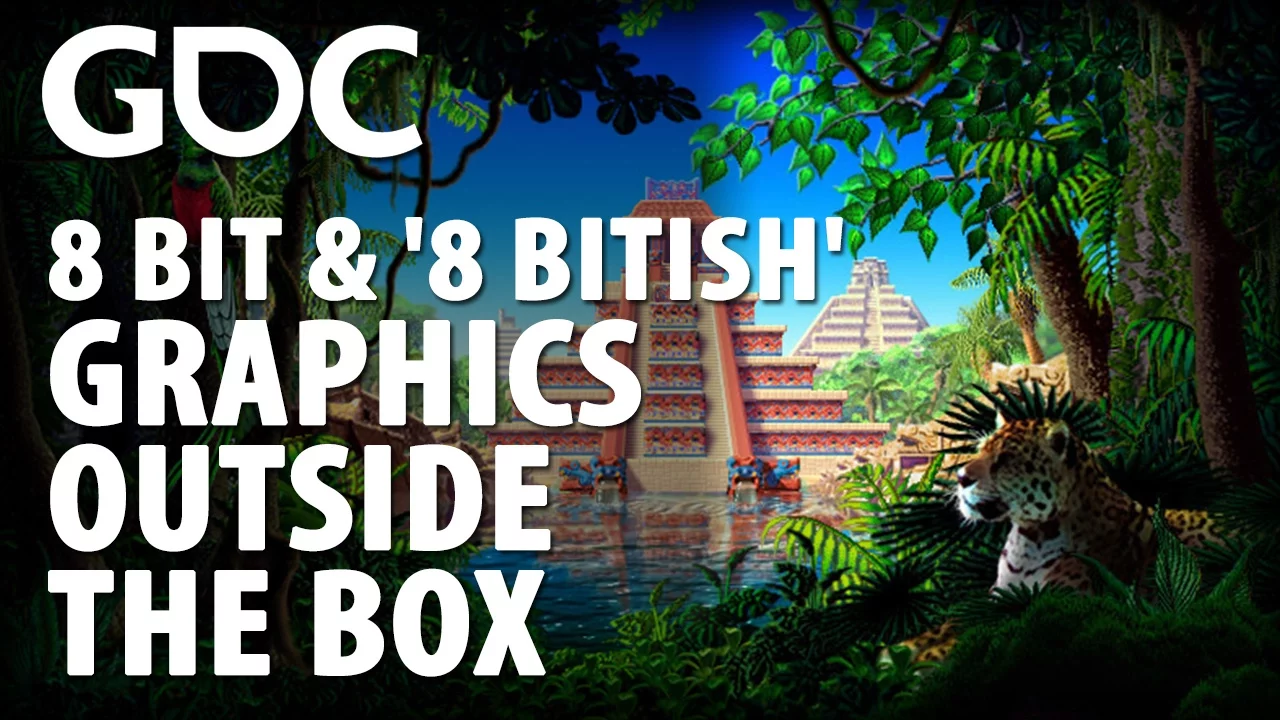
8 Bit & '8 Bitish' Graphics-Outside the Box — GDC Festival of Gaming

GDC Festival of Gaming

Lucasfilm veteran Mark Ferrari argues severe palette constraints enforce visual discipline and mastery of physical lighting that modern unlimited software tools erode through superficial automation.

AI-assisted summary of 8 Bit & '8 Bitish' Graphics-Outside the Box — original source. Check the original for full context.

Source published:

Key ideas

  • Mark Ferrari demonstrates how classic 8-bit game backgrounds used color cycling and palette shifting on single static canvases to create complex environmental animations like waterfalls, driving rain, and day-night cycles without frame-by-frame redraws. (5:47)
  • Severe historical hardware constraints, such as the fixed 16-color EGA palette and early compression limitations, forced artists to pioneer dithering techniques that let viewers mistake 16-color scenes for 256-color VGA art. (1:31)
  • For modern retro projects like Thimbleweed Park, production relies on an '8-bitish' compromise: preserving low pixel resolutions and hard-edged rendering in Photoshop while abandoning strict palette caps and manual pixel-by-pixel dithering to meet modern asset scaling demands. (15:19)
  • Apparent fluid motion speed in color-cycled animations is determined by the spatial pixel length of gradient segments rather than cycling frequency, allowing slow crests and fast cascades to be powered by a single constant cycle rate. (49:52)

Detailed notes

## Background Published by GDC Festival of Gaming on YouTube on January 10, 2017, this GDC 2016 presentation features veteran digital artist Mark Ferrari from Terrible Toybox. The talk covers techniques for creating 8-bit and '8-bitish' game graphics, focusing on his acclaimed methods for color cycling and palette shifting to produce intricate, dynamic environmental background animations without frame-by-frame rendering.

## TL;DR Mark Ferrari traces the history and craft of indexed pixel art from rigid 16-color EGA constraints at Lucasfilm Games to the modernized '8-bitish' production of Thimbleweed Park. He demonstrates how palette shifting and color cycling can simulate fluid waterfalls, weather, and full day-to-night transitions on single static canvases while drastically conserving memory. Ferrari breaks down practical workflows, showing how to leverage dither templates, contour fills, and real-world lighting principles in modern tools like Photoshop and Pro Motion. Ultimately, he argues that working within severe technical limits disciplines an artist's vision and produces a creatively manageable space that unbounded modern tools cannot replicate.

## Atmosphere & style The presentation carries a warm, conversational, and nostalgic tone, combining seasoned industry war stories with an intricate, screen-by-screen masterclass in pixel manipulation. Ferrari speaks with self-deprecating humor and generous candor, treating complex technical hurdles with playful pragmatism and genuine reverence for creative restraint. Watching it feels like pulling up a chair alongside a master craftsperson who takes immense delight in deconstructing the invisible trickery behind beloved classic game worlds.

## Bulletin - [05:47](https://www.youtube.com/watch?v=aMcJ1Jvtef0&t=347s) Mark Ferrari demonstrates how classic 8-bit game backgrounds used color cycling and palette shifting on single static canvases to create complex environmental animations like waterfalls, driving rain, and day-night cycles without frame-by-frame redraws. - [01:31](https://www.youtube.com/watch?v=aMcJ1Jvtef0&t=91s) Severe historical hardware constraints, such as the fixed 16-color EGA palette and early compression limitations, forced artists to pioneer dithering techniques that let viewers mistake 16-color scenes for 256-color VGA art. - [15:19](https://www.youtube.com/watch?v=aMcJ1Jvtef0&t=919s) For modern retro projects like Thimbleweed Park, production relies on an '8-bitish' compromise: preserving low pixel resolutions and hard-edged rendering in Photoshop while abandoning strict palette caps and manual pixel-by-pixel dithering to meet modern asset scaling demands. - [49:52](https://www.youtube.com/watch?v=aMcJ1Jvtef0&t=2992s) Apparent fluid motion speed in color-cycled animations is determined by the spatial pixel length of gradient segments rather than cycling frequency, allowing slow crests and fast cascades to be powered by a single constant cycle rate.

## Key takeaways - [00:00](https://www.youtube.com/watch?v=aMcJ1Jvtef0&t=0s) Early Lucasfilm Games artists operated under rigid 16-color EGA hardware palettes that were spaced at uniform mathematical intervals rather than harmonized for artistic utility. - [01:31](https://www.youtube.com/watch?v=aMcJ1Jvtef0&t=91s) Ron Gilbert's breakthrough compression technique allowed dithered patterns to compress efficiently, unlocking perceptual color mixing that visually blended intermediate shades on CRT displays. - [03:30](https://www.youtube.com/watch?v=aMcJ1Jvtef0&t=210s) Severe creative constraints often produce higher artistic mastery and focus than infinite modern digital toolsets, which can encourage superficial dabbling. - [05:47](https://www.youtube.com/watch?v=aMcJ1Jvtef0&t=347s) Color cycling enables complex, multi-layered atmospheric effects—such as falling snow and flowing water—on a single 8-bit canvas without requiring multi-layer compositing or runtime redraws. - [09:56](https://www.youtube.com/watch?v=aMcJ1Jvtef0&t=596s) By shifting the active 256-color palette across a single static background, artists could simulate 24-hour day/night transitions, weather changes, or completely different geographic scenes. - [12:35](https://www.youtube.com/watch?v=aMcJ1Jvtef0&t=755s) For an X-Men Storm plug-and-play TV game with strict ROM limits, nine distinct environmental scenes across three times of day were compressed into a single shared pixel canvas purely through palette swapping. - [15:19](https://www.youtube.com/watch?v=aMcJ1Jvtef0&t=919s) Modern audiences desire the nostalgic feeling of retro games rather than authentic historical limitations, necessitating an '8-bitish' aesthetic compromise with modern quality-of-life pacing. - [24:52](https://www.youtube.com/watch?v=aMcJ1Jvtef0&t=1492s) Manual pixel-by-pixel dithering was replaced in Thimbleweed Park with concentric banded shading and selection-offset anti-aliasing to rapidly scale room production across hundreds of assets. - [26:43](https://www.youtube.com/watch?v=aMcJ1Jvtef0&t=1603s) Gary Winnick's Lucasfilm hiring principle held that it is far easier to teach traditional artists how to operate computer software than to teach computer technicians how to become artists. - [29:32](https://www.youtube.com/watch?v=aMcJ1Jvtef0&t=1772s) Digital painting tools cannot substitute for foundational art principles, such as understanding how outdoor shadows receive blue ambient illumination from the sky rather than direct sunlight. - [33:02](https://www.youtube.com/watch?v=aMcJ1Jvtef0&t=1982s) Painting the environmental sky first establishes the master ambient light, which dictates the local colors, turning edges, and bounce-light tones across foreground architecture. - [49:52](https://www.youtube.com/watch?v=aMcJ1Jvtef0&t=2992s) The perceived velocity of animated liquid in color cycling is controlled by the physical length of spatial gradient segments, while cycling palette indices at a constant rate. - [54:56](https://www.youtube.com/watch?v=aMcJ1Jvtef0&t=3296s) Hard flashing across cycling color seams is eliminated by interpolating the boundary colors and staggering cycle speeds across unsynchronized ramps for chaotic elements like foam and fire. - [01:10:27](https://www.youtube.com/watch?v=aMcJ1Jvtef0&t=4227s) Dynamic lighting ramps on volumetric curved surfaces require minimal colors: one to three highlight tones, one darkest turning-edge tone, and one to three shadow or bounce-light tones. - [01:17:04](https://www.youtube.com/watch?v=aMcJ1Jvtef0&t=4624s) Although modern hardware makes low-spec rendering and color cycling practically obsolete, practicing within strict indexed constraints remains an invaluable creative discipline. - [01:23:27](https://www.youtube.com/watch?v=aMcJ1Jvtef0&t=5007s) Configuring modern software like Photoshop for authentic retro rendering requires working at true native canvas dimensions, using the Pencil tool, disabling anti-aliasing, and locking interpolation to Nearest Neighbor.

## Detailed walkthrough ### [00:00](https://www.youtube.com/watch?v=aMcJ1Jvtef0&t=0s) Lucasfilm Games and the Tyranny of the 16-Color Palette

Mark Ferrari introduces himself with dry self-deprecation, anticipating that an audience gathered to hear about "8-bit and '8-bitish' art" might reasonably wonder who he is. He traces his digital art roots back to Lucasfilm Games, joking that he began working there before anyone in the audience was born. In those early days, artists were confined to a rigid, unyielding palette of exactly sixteen EGA colors. This was not a custom palette chosen for an individual title; the entire computer gaming industry was forced to use those exact same sixteen hues across every game produced.

```mermaid flowchart LR accTitle: Evolution of Early Lucasfilm Graphics accDescr: Progression from rigid 16-color solid EGA art to dithered EGA scenes. subgraph EarlyEGA["Early EGA Era"] A["16 Fixed Colors<br/>(Programmer-spaced RGB)"] --> B["Solid Fills Only<br/>(No compression for dither)"] B --> C["Flat Scenes<br/>(Zak McKracken)"] end subgraph DitherEGA["Dithering Revolution"] D["Dither Compression<br/>(Devised by Ron Gilbert)"] --> E["Simulated Gradients<br/>(6-7 blues vs. 4)"] E --> F["Atmospheric Depth<br/>(The Secret of Monkey Island)"] end EarlyEGA --> DitherEGA ```

Ferrari explains the origin of those infamous sixteen colors with characteristic humor, noting that they were created by well-intentioned programmers who simply adjusted the RGB values at uniform, mathematical intervals. The engineers marveled at the symmetrical balance of their numbers and declared the job done, while artists were left to clean up the visual mess and cry over the results. Compounding the challenge at Lucasfilm was a harsh technical constraint: they initially could not dither between colors because their compression algorithms could not handle dithered pixel patterns, forcing artists to render early game screens with solid, unblended fields of color.

- The sixteen standard EGA colors were universal across the entire PC gaming industry at the time. - RGB channels were spaced evenly by programmers to achieve mathematical symmetry rather than artistic nuance. - Dithering was initially prohibited because early run-length compression schemes bloated drastically when trying to compress alternating pixel noise.

---

[01:31](https://www.youtube.com/watch?v=aMcJ1Jvtef0&t=91s) Conquering Dither: From *Zak McKracken* to *The Secret of Monkey Island*

Following the completion of *Zak McKracken and the Alien Mindbenders*, Ferrari sought to break out of flat, posterized visual boundaries. He put up mockups demonstrating that by interweaving the limited sixteen colors through dithering, the screens could gain dramatically more depth and tonal variety. Inspired by these tests, Ron Gilbert—whom Ferrari points out as sitting right in the audience—figured out how to compress dithered graphics. This breakthrough opened up intermediate hues that previously seemed impossible, such as six or seven distinct variations of blue instead of the four base shades provided by the hardware palette.

The impact was immediate. Games produced with this technique won graphics awards, with contemporary observers mistaking EGA titles for 256-color VGA games because nobody had ever seen sixteen-color graphics exhibit such visual richness. The studio pushed this mastery even further in *The Secret of Monkey Island*. By refining dither patterns, the art team moved far beyond flat, cartoonish backdrops to render genuine sunsets, atmospheric perspective, focal depth of field, and beach sand that actually possessed granular texture rather than resembling a giant, forgotten spot of flat yellow paint.

As Mark Ferrari reflects on that creative breakthrough: > “If somebody gives you two gum wrappers and three sticks and tells you to make the Pieta with this, you will take two gum wrappers and three sticks as far as they can possibly go in in your effort to accomplish your mission.”

- Ron Gilbert developed the compression technique that enabled Lucasfilm Games to store dithered backgrounds without exceeding memory limits. - The dither technique created perceptual color blending, allowing artists to expand their limited palette into subtle gradients. - Critics and players frequently mistook late-era Lucasfilm EGA art for early 256-color VGA graphics due to the sophistication of the rendering.

---

[03:30](https://www.youtube.com/watch?v=aMcJ1Jvtef0&t=210s) The Paradox of Choice and the Discipline of 256 Colors

Transitioning through a slideshow of his subsequent work—including background art for the final Game Boy Advance *Spyro the Dragon* title—Ferrari explores why he maintained an enduring fascination with 256-color, 8-bit limited-palette art long after hardware and production mandates required it. While clarifying that he has no nostalgic desire to ever draw 16-color EGA art again, he insists that his most inventive work emerged when forced to wrestle with those sixteen miserable tones. Severe technical limitations serve as a crucible for ingenuity, demanding that the artist exhaust every conceivable trick to solve a visual problem.

Ferrari contrasts this historical frugality with the modern software landscape. When artists are provided with limitless tools and an infinite 32-bit color space, the temptation is to dabble shallowly across dozens of evolving features rather than mastering the expressive potential of a single constraint. He laments that the contemporary games industry moves so fast that tools become obsolete before anyone can explore their outer limits. Back in the early PC era, Ferrari spent ten consecutive years working inside a single piece of software—Electronic Arts' Deluxe Paint II—pushing the application to perform visual stunts that even its original developers never envisioned.

Reflecting on the difference between abundance and constraint, Ferrari observes: > “If somebody gives you all the artistic resources of the universe and says make the Pieta with this, you will dabble in all of those resources until the time is up and you have made nothing at all.”

- Ferrari spent an entire decade relying primarily on Deluxe Paint II by Electronic Arts as his main graphics workstation. - Modern art pipelines often suffer from rapid tool churn, where artists only achieve superficial proficiency before a package is replaced. - Ferrari argues that a limited, indexed palette is an active tool that can be directly manipulated, whereas a 32-bit true-color space behaves like an ineffable cloud that removes the craft of direct index control.

---

[05:47](https://www.youtube.com/watch?v=aMcJ1Jvtef0&t=347s) Color Cycling: Complex Environmental FX on a Single Canvas

To demonstrate the full potential of indexed palettes in Deluxe Paint II, Ferrari presents interactive scenes animated exclusively via color cycling, running in an HTML5 emulator built by engineer Joe Huckabee. These dynamic scenes depict cascading waterfalls, driving rainstorms, and fluttering snowflakes drifting across scenic landscapes. Crucially, none of these sequences contain traditional frame-by-frame animation, multi-layer compositing, or secondary sprite sheets. The entire illusion of fluid motion, depth, and transparency is achieved by rotating color values through specific ranges of the indexed palette across a single 8-bit background image.

```mermaid flowchart TD accTitle: Color Cycling and Palette Shifting Architecture accDescr: How indexed palettes manipulate static pixels to create animation and environmental shifts. subgraph StaticCanvas["Single 8-Bit Pixel Canvas"] PX["Static Pixel Indices<br/>(No redraws, no frame layers)"] end subgraph PaletteMagic["Palette Manipulation Engine"] CC["Color Cycling Range<br/>(Rotating indices continuously)"] PS["Palette Swapping<br/>(Redefining RGB lookup values)"] end subgraph VisualOutput["Screen Illusions"] FX["Dynamic Environmental Motion<br/>(Falling snow, rain, flowing water)"] TOD["Global Atmospheric Transitions<br/>(24-hour day/night cycles, weather)"] end PX --> CC PX --> PS CC --> FX PS --> TOD ```

In the falling snow example, viewers perceive semi-transparent flakes descending over trees and rocks, despite the hardware having no native alpha-channel transparency whatsoever. By carefully planning where the cycling colors sit within the palette and how the pixel indices correspond to the stationary scenery, Ferrari tricks the viewer's eye into seeing transparent flakes passing across opaque geometry. The scenes were originally created for software titles that have long been defunct, only gaining widespread modern viral exposure after Huckabee developed a web-based engine to emulate Ferrari’s legacy LBM files directly in modern browsers.

- All environmental animation is driven exclusively by cycling color registers; no pixels are redrawn and no additional frame data exists. - Falling snow and flowing water simulate translucent layers on a strictly single-layer canvas through indexed pixel mapping. - The demonstration runs via an HTML5 color-cycling engine engineered by Joe Huckabee to display Ferrari’s vintage 1990s files.

---

[07:00](https://www.youtube.com/watch?v=aMcJ1Jvtef0&t=420s) Software Preservation, Retro Aesthetics, and Modern Tools

Ferrari addresses the fragile state of 8-bit digital art creation tools in modern computing. Deluxe Paint II is barely operable today, frequently crashing or hitching even inside DOSBox emulators. While Ferrari expresses deep gratitude to Jan Tismer (Cosmigo) for developing and maintaining Pro Motion—the sole prominent software package keeping indexed 8-bit painting alive—he notes that Pro Motion still lacks several critical palette and brush features that made DPaint unique. To fill this gap, Joe Huckabee has been working on a modern, dedicated tool capable of handling these high-level color-cycling techniques at higher modern display resolutions.

Contemplating why audiences continue to pack halls for 8-bit graphics lectures despite the lack of modern commercial incentives, Ferrari concludes that people are captivated by the raw aesthetic and the nostalgia of an era prior to photorealistic, cinematic 3D games. For creators, an 8-bit environment offers an intimate sandbox where an artist can mentally comprehend every single pixel and palette index. On the right side of his demonstration screen, the active palette cycles dynamically, exposing the exact registers that generate the motion while static elements remain untouched.

Emphasizing the creative intimacy of the format, Ferrari notes: > “The great thing about a limited palette is that you can use it, you can manipulate it, it isn't just there a giant ineffable cloud like the 32-bit universe that provides whatever is called for.”

- Deluxe Paint II has become largely impractical for daily professional production due to emulator instability and legacy input quirks. - Cosmigo’s Pro Motion stands as the primary modern production tool for indexed pixel art, though it does not replicate all of DPaint II’s palette-manipulation idiosyncrasies. - Joe Huckabee is developing a contemporary tool tailored specifically for high-resolution indexed color cycling and palette shifting.

---

[09:56](https://www.youtube.com/watch?v=aMcJ1Jvtef0&t=596s) Dynamic Atmospheres and Plug-and-Play Compression

Building on the principles of color cycling, Ferrari pushed indexed technology further by developing full-scene palette shifting. Rather than cycling a handful of water or snow registers, he designed static paintings whose entire 256-color palette could be swapped out wholesale. By meticulously assigning pixel indices to surface highlights, ambient light, and shadows, a single static illustration could transition through every hour of the day—dawn, high noon, dusk, and midnight—as well as severe weather states like thunderstorms and heavy fog, entirely without drawing a second frame of artwork.

These techniques were originally implemented for a desktop product designed to mirror the user's real-world environment. The application remained on screen 24 hours a day, reading the computer's system clock so that looking at the monitor mirrored the current light conditions outside the player's window. Ferrari then explains how extreme hardware limitations resurfaced later in his career when working on standalone plug-and-play TV games, where the entire game hardware was embedded directly inside a toy controller.

While developing an X-Men game focused on the character Storm, the production team hit brutal ROM storage bottlenecks. The design called for flying sequences with perspective scanline parallax backgrounds whipping beneath the character, requiring vast expanses of scrolling terrain with virtually no memory available to store raw bitmap data. Palette shifting and clever index reuse once again served as the ultimate compression mechanism to pack diverse visual content into minimal storage.

- Palette shifting transforms an entire environment's lighting, weather, and time of day using a single unchanging background image. - A 1990s desktop software title utilized Ferrari's art to display real-time 24-hour day/night cycles synchronized to the user's local clock. - An X-Men TV plug-and-play game featuring Storm faced severe ROM storage limits, requiring scanline parallax backgrounds to be compressed through extreme palette manipulation.

[12:35](https://www.youtube.com/watch?v=aMcJ1Jvtef0&t=755s) Palette Shifting: Nine Scenes in One Canvas

Demonstrating the radical storage savings made possible by indexed color, Mark Ferrari shows a single background image being completely transformed across environments and times of day purely by swapping the active palette. Starting with an image of a mountain valley with hills, trees, and clouds, he loads successive palettes to push the landscape from midday to sunset and then into full night. Next, he swaps in a palette that zeroes out the contrast on the lower foliage and re-interprets the shapes, shifting the viewpoint high up into the stratosphere looking down upon a sea of clouds. That cloud environment is then shown at sunset and night as well.

```mermaid flowchart TD accTitle: Single Background Image Palette Shifting Flow accDescr: Diagram illustrating how a single graphic asset produces nine distinct scenes across three environments and three times of day solely via palette swaps.

subgraph ASSET["Base Graphic Asset"] IMG["Single 8-Bit Screen"] end

subgraph ENV["Three Distinct Environments"] V["Valley with Trees & Hills"] C["Stratosphere Clouds View"] S["Futuristic Cloud City"] end

subgraph TOD["Times of Day (Per Scene)"] D["Daytime"] SS["Sunset"] N["Night"] end

IMG --> V IMG --> C IMG --> S

V --> D & SS & N C --> D & SS & N S --> D & SS & N ```

Finally, he loads another palette entirely: the exact same raw pixel layout suddenly renders as a futuristic city skyline bathed in light. He shows the city during the day, in the evening, and at night, yielding a total of nine distinct scenes (three environments across three lighting states) compressed into one single piece of background art. Ferrari reflects on why this medium remains so potent and memorable:

> “I think that that is probably part of the reason why 8-bit and 8-bitish art is still so relevant today is because it was a mentally and creatively manageable space to work in which I'm not sure a lot of our other much more cinematographic and three-dimensional things are quite the same and because it wasn't going to evolve so quickly that as soon as you began to figure out what was going on everything had changed and you had to start over.”

- The valley landscape uses the exact same pixel indices for tree canopies as the cloud layers use for puffy cloud tops. - Swapping palettes enabled vast artistic variation without consuming scarce floppy-disk or memory budgets. - Ferrari notes that indexed color allowed artists to maintain direct control over every single color index and position on the screen.

---

[15:19](https://www.youtube.com/watch?v=aMcJ1Jvtef0&t=919s) Thimbleweed Park and the "Renaissance Faire" Compromise

Ferrari explains that his current work stems from collaborating with Lucasfilm Games veterans Ron Gilbert, Gary Winnick, and David Fox on their crowdfunded adventure game *Thimbleweed Park*. After a wildly successful Kickstarter campaign that raised hundreds of thousands of dollars in 30 days, the team set out to create a game that felt like a long-lost late-1980s Lucasfilm title. However, Ferrari points out a critical aesthetic dilemma: while players possess deep nostalgia for that era, they do not actually want a literal 1:1 recreation of authentic 1987 EGA graphics.

> “If people sat down to an EGA game right now with solid colors like they would really have gotten in 1987 it might have been like going to a Renaissance fair and finding yourself in the actual Renaissance with sewage flowing in the streets and people with hideous deformities and everybody smelling like people really smelled in the Renaissance; they might prefer the Renaissance Faire.”

To resolve this, the team elected to deliver an "8-bitish" experience—a game that looks and feels the way players *remember* classics feeling, while subtly applying modern polish. The designers refined the interface, pacing, and puzzle design to eliminate retro frustration, while Ferrari authored the art in Adobe Photoshop using a 256-color VGA-style aesthetic rather than strictly enforcing strict palette limitations.

- The *Thimbleweed Park* Kickstarter demonstrated an immense audience appetite for classic point-and-click pixel art. - The art is painted in Photoshop to resemble 256-color VGA art rather than true, limited EGA, often using far more than 256 total colors across a scene. - Before beginning technical demonstrations, Ferrari takes an informal vote from the audience; the crowd overwhelmingly chooses to hear about his modern "8-bitish" production workflow for *Thimbleweed Park* over raw legacy color-cycling tools.

---

[20:12](https://www.youtube.com/watch?v=aMcJ1Jvtef0&t=1212s) Blocking Out Rooms and Building Layered Lighting

Ferrari walks through his modern scene construction process in Photoshop. He begins with a rough brush sketch on a canvas at target pixel resolution to block out architecture and staging. If an asset has to squeeze into an extremely tight footprint, he tests it at hard pixel level immediately, joking about Gilbert's demanding design requests:

> “Ron will sometimes give me 10 whole pixels of space and tell me that he wants the thing to have mechanical arms and a keyboard and a place for the keys to show and paper coming out of it and 15 lines of poetry in Aramaic, and I have to figure out how to do that in 10 pixels.”

Once proportions are locked, flat local colors are blocked into the room. To create dramatic illumination, Ferrari constructs geometric template shapes indicating pools of light cast across the walls and floors. He makes hard selections around these circular or elliptical masks with the Magic Wand tool, then uses Photoshop's Color Balance adjustment tool to step-tint the pixels, adding yellow, blue, red, or green. By starting at the center circle and iteratively expanding the selection outwards across concentric rings, he constructs soft, natural gradients of light while preserving crisp pixel boundaries.

- **Mandatory Photoshop configuration**: Every tool and transform must be locked to **Nearest Neighbor** interpolation (General Preferences, Free Transform, and Image Size). - **Anti-aliasing disabled**: Anti-aliasing must be toggled off for the Magic Wand, Pencil tool, and Paint Bucket fills to prevent blurry intermediate pixels. - The Pencil tool is Ferrari's primary instrument for executing 8-bitish assets in Photoshop.

---

[22:56](https://www.youtube.com/watch?v=aMcJ1Jvtef0&t=1376s) Rapid Anti-Aliasing Techniques and the Role of Dither

Smoothing harsh diagonal edges by placing pixels one by one is traditionally grueling work. Ferrari demonstrates a fast selection trick he uses in Photoshop to anti-alias stair-stepped lines without tedious individual pixel clicks:

```mermaid flowchart TD accTitle: Batch Edge Anti-Aliasing Workflow accDescr: Step-by-step process used by Mark Ferrari in Photoshop to anti-alias a jagged line using selections and color balance.

SEL["Select Jagged Pixel Line with Magic Wand"] --> NUDGE["Nudge Selection Over by 1 Pixel"] NUDGE --> SUBTRACT["Hold Alt and Deselect Overlapping Core Pixels"] SUBTRACT --> HIDE["Hide Selection Outline (Ctrl/Cmd + H)"] HIDE --> ADJ["Adjust Edge Value / Hue with Color Balance"] ADJ --> REP["Repeat by Nudging Another Pixel Out for Softer Rolloff"] ```

He selects the hard pixel boundary using the Magic Wand, nudges the selection marquee over by a single pixel, holds the `Alt` key to subtract the original core line, and then hides the selection marquee so he can see the edge clearly. Using Color Balance, he quickly adjusts the intermediate tone of the entire exposed border at once. Repeating this process one step further allows him to build an anti-aliased gradient across long runs of pixels in seconds. While he demonstrates this on a mouse at the podium, he notes that he normally works on a 21-inch Wacom Cintiq display at home. Finally, he transitions toward discussing dither, recalling his early industry reputation:

> “In the old days I was sort of the dither guy; I was the one that convinced everybody that dither was a better way.”

[024:52] From Painstaking Dither to Banded Shading

Reflecting on the evolution of his workflow from EGA to VGA, Mark Ferrari points out that much of the wall dithering seen in earlier scenes was stamped down by hand, one pixel at a time, using the pencil tool in intricate patterns. While visually striking, this manual approach proved unsustainable given the sheer volume of assets required for the project. Offering a caveat that all displayed artwork represents in-progress material—much of it not yet fully colored and all subject to change—Ferrari explains that the team transitioned away from pixel-level dithering in favor of concentric bands of color to shade walls and rooms, such as Delores's room.

This change was driven purely by production reality: banding provided a clean aesthetic that could realistically be finished across dozens, potentially hundreds, of backgrounds. Ferrari jokes about the endless flow of ideas coming from Ron Gilbert:

> “Every time I think I'm caught up he comes up with another great idea it's like one of those anxiety dreams where every time you reach the front door of the Haunted Mansion and are about to run outside it opens onto a new hallway full of twice as many ghosts.”

He clarifies that he loves the collaboration, but practical compromises were required. The game also abandoned strict palette limits; Ferrari does not restrict himself to 256 colors, nor even strictly to 1,500 colors. The philosophy is to ensure the art looks and feels authentically retro without inviting players to literally count the palette entries.

```mermaid flowchart TD accTitle: Shading Technique Evolution accDescr: Comparison of manual pixel dithering versus banded color shading for backgrounds. subgraph Traditional ["Manual Dithering (EGA/Early VGA)"] A["Pencil Tool Pixel-by-Pixel"] --> B["Intricate Dither Patterns"] B --> C["Extremely Slow / Bottleneck"] end subgraph Modern ["Banded Color (Thimbleweed Park)"] D["Concentric Bands of Color"] --> E["Clean Retro Aesthetic"] E --> F["Scalable to 100+ Backgrounds"] end ```

[026:43] Q&A: Tool Evolution and the Lucasfilm Philosophy

Opening the floor for a ten-to-fifteen-minute audience Q&A before returning to pure 8-bit techniques, Ferrari recaps his core workflow tips: always use nearest-neighbor scaling, turn off anti-aliasing, and leverage selection tools to drop in flat color blocks before dialing them in using color balance or hue, value, and saturation sliders rather than picking colors manually from a static swatch.

An audience member asks whether Ferrari’s personal taste in 8-bit-style art changed as modern digital tools emerged, or whether his aesthetic remained constant while the medium evolved. Ferrari explains that for the past ten to fifteen years, his professional work has primarily consisted of 32-bit high-resolution concept art, game art, and publishing illustration. He recalls his beginnings when Gary Winnick originally recruited him for Lucasfilm: Ferrari warned him that he was a died-in-the-wool technophobe who had never touched a computer. Winnick’s reply shaped the studio's hiring approach:

> “Gary's response was we find it's easier to hire artists and teach them to use computers than it is to find computer technicians and teach them to be artists.”

Ferrari remarks that the rigid limitations of the original EGA palette were living proof of that philosophy. While Ferrari loves contemporary software because it removes arbitrary constraints and allows him to take images anywhere he wants, he reflects that he never had quite as much creative joy as he did when forced to invent unexpected tricks to outsmart primitive limitations.

[029:32] The Desert Shadow Anecdote: Understanding Real-World Light

A questioner praises Ferrari's color harmony and asks whether aspiring artists should develop their color sense through pixel art or through traditional fine art media like oils. Ferrari firmly argues that digital tools cannot compensate for a lack of fundamental artistic comprehension. He recalls mentoring young artists in Seattle, including a DigiPen graduate working in a 3D environment on a sunlit desert scene. The artist wanted crisp, cool shadows against bright structures, but his scene rendered shadows as muddy, ink-like black blobs.

When Ferrari asked the artist where the light inside those shadows was supposed to be coming from, the junior artist pointed straight at his 3D interface:

> “And he said the secondary light source I said no I me he pointed at the interface there's the secondary light source right there on that little Globe no no I mean those aren't black so there's light in them from somewhere they're Shadows so it's not the same thing that's lighting up all the sunlit parts where does the light in a shadow come from and he pointed to the color wheel and I realized oh my God he he doesn't understand I'm asking questions about the world he thinks I'm asking questions about his tool”

Once Ferrari prompted him to visualize the physical world—a star casting warm yellow light, while the surrounding atmosphere scatters blue ambient skylight into the occluded areas—the artist immediately knew how to tint the shadows. Ferrari stresses that digital tools must initially be approached as virtual traditional media rather than technical rendering systems; without real-world observation and foundational art knowledge, no tool will solve aesthetic problems automatically.

- Digital software does not generate artistic intelligence; traditional observation remains foundational. - Shadows in outdoor daytime environments are illuminated by scattered skylight (cool ambient blues) rather than direct sun (warm yellow light). - Relying solely on software widgets like color wheels or secondary light nodes without understanding physics results in flat, lifeless rendering.

[033:02] Establishing Atmospheric Light: Sky-First Workflow

Ferrari demonstrates the practical application of ambient lighting by opening an art asset for "B Street." Struggling briefly with his desktop layout—joking that he rearranged everything that morning to tidy up for the talk and was now paying the price—he opens the layered file and toggles off the background sky.

Without the blue backdrop, the street's architecture appears completely disjointed. Ferrari points out that without the sky's color established first, an artist cannot make informed decisions about the local colors, highlights, or reflected ambient tones on the foreground buildings:

> “If it weren't for this blue sky behind this building I would have no idea what color to make anything so the first thing I do is turn off you know is turn off everything except for the background and do that and then I draw the buildings into the background because the sky and the light in the background tells me everything I need to know about what color everything else is going to be”

He emphasizes that establishing environmental lighting sets the baseline values and hues for every object in the frame, serving as the foundation for overall visual coherence and contrast across the scene.

[36:41](https://www.youtube.com/watch?v=aMcJ1Jvtef0&t=2201s) Art Theory, Contrast, and the Digital Canvas

Mark Ferrari stresses that classical art principles remain foundational for pixel art. Beyond value contrast—the obvious separation between light and dark—artists must actively balance saturation contrast (juxtaposing vivid, saturated hues against muted, desaturated tones) and color temperature contrast (balancing warms and cools). Even when painting an environment dominated by a single spectrum, such as an underwater setting filled with blues, greens, and purples, he notes there must still be small touches of warm tones like red, orange, or yellow. Without that interplay, the image flattens into a boring monochrome. Ferrari remarks: “Pretty much anything you could say about standard art theory would probably apply to digital art, and you have to know that stuff because the tool doesn't know it for you.”

[37:27](https://www.youtube.com/watch?v=aMcJ1Jvtef0&t=2247s) Painting Dynamic Time-of-Day Palette Shifts

An audience member asks how Ferrari actually paints and iterates on scenes where the 8-bit palette shifts across the day. Ferrari explains that he starts with a single time of day, typically morning, setting the sun to the left since left feels inherently East and right feels inherently West. To pull off changing lighting across the day under severe palette constraints, he must be extremely conservative with color counts. Non-sky structures are restricted to only three to seven colors total. The sky receives a generous budget of 16 to 32 colors to form long, subtle gradients that conceal dithering. Furthermore, fully half of the 256-color palette must be reserved strictly for dynamic color cycling ramps (water, wind, fire), which cannot appear anywhere static without causing trees or buildings to flash uncontrollably.

```mermaid flowchart TD accTitle: 8-Bit Palette Allocation for Time-of-Day Transitions accDescr: Visual breakdown of how a 256-color palette is budgeted between static geometry, smooth skies, and cycling animations.

subgraph Allocations ["256-Color Palette Allocation"] direction TB CycleRamp["Dynamic Ramps (~128 Colors)<br/>Strictly reserved for color cycling"] SkyRamp["Sky Gradients (16–32 Colors)<br/>Long, smooth dithering steps"] StaticGeo["Static Geometry (3–7 Colors per asset)<br/>Shared across shifts"] end

subgraph ShiftLogic ["Color Layering Strategy"] direction TB Morning["Morning State:<br/>5 hidden sub-colors share identical RGB"] Evening["Day to Evening Progression:<br/>RGB values diverge to trace moving shadows"] end

StaticGeo --> Morning Morning --> Evening ```

The trick to shifting light down a surface, like a rock pinnacle, lies in hidden color duplication. A single highlight facet in morning light might appear to use only three colors, but each of those three is actually painted using a dithered gradient composed of five distinct palette indexes. In the morning palette, all five indexes share the exact same RGB value, so the entire strip reads as a single flat taupe. As the scene moves across midday to evening, those underlying color indexes are individually altered—some darkening, some shifting hue, and some brightening—causing shadows to stretch and sunlight to visibly creep down the rock. Ferrari begins by creating a flat, blocked-out map of the composition to chart where sunlight will strike and crawl before committing to the sub-color gradient fills.

- Objects outside the sky are restricted to 3 to 7 colors to keep index multiplication manageable. - Sky gradients utilize 16 to 32 colors so that neighboring steps in the dither blend seamlessly. - Approximately 50% of the entire 8-bit palette is reserved for color cycling animation ramps. - Light progression is baked into the art by mapping out multiple palette indices that start at identical color values and diverge over the time cycle.

[41:01](https://www.youtube.com/watch?v=aMcJ1Jvtef0&t=2461s) Dithering Patterns, CRT Monitors, and Dither Templates

Asked about his methodology for manual pixel-by-pixel dithering, Ferrari recalls his EGA days and describes the geometric expansion of dither patterns. When stepping away from a standard repeating checkerboard to make transitions more diffuse, he systematically offsets pixels, adding a pixel vertically and horizontally to open up spaces into a soft, branching pattern. He quips that in the original era, artists relied on hardware flaws to smooth the work: “Back in the days we did this, CRT monitors were so blurry that we actually counted on the blur to sort of fill those colors in and blend them for us.” Modern crisp LCD displays reveal every dot, making technique far more critical.

To accelerate the grueling process in modern "8-bitish" work, Ferrari makes heavy use of reusable dither templates. Because Photoshop lacks native dithered gradient fills, he creates grayscale dither patterns—such as banded linear ramps or circular lighting shapes—in separate files. He brings these patterns into his painting as dedicated template layers, selects individual density steps using the magic wand, and toggles back to the target artwork layer to adjust color balance or HSV. This allows large surfaces to receive uniform, hand-crafted dither gradients within minutes.

[43:57](https://www.youtube.com/watch?v=aMcJ1Jvtef0&t=2637s) Hardware Constraints: EGA vs. CGA Color Capabilities

A questioner asks whether the 16-color EGA (Enhanced Graphics Adapter) format enforced localized cell color limits similar to the Commodore 64, where an 8x8 pixel block could only pick from two or four colors. Ferrari clarifies the architectural differences across PC graphic standards. While CGA had strict hardware restrictions that limited small chunks to four fixed colors, EGA lifted per-block limitations completely. Under EGA, artists had the freedom to place any of the 16 available palette colors into any individual pixel anywhere on the screen, “whether we liked it or not.”

[44:53](https://www.youtube.com/watch?v=aMcJ1Jvtef0&t=2693s) Tool Recommendations and Advice for Aspiring Pixel Artists

A fan who grew up admiring Ferrari’s work asks what software and mindset a beginner should adopt when entering pixel art. Ferrari highlights Cosmigo’s Pro Motion as the leading dedicated software package available. He also recommends keeping an eye on developer Joe Huckabee (Twitter: @jhuckabee), who is building a much more flexible next-generation tool anticipated for the coming year.

Ferrari reflects on the creative liberation available to contemporary pixel artists. Historical creators were shackled to merciless release schedules, strict commercial requirements, and tiny floppy disk byte budgets. Today, pixel art is an artistic choice rather than an engineering compromise, giving artists total aesthetic control: “The beautiful thing about doing 8-bit art today is that nobody really needs you to do this in some commercial template to a certain schedule and within certain limitations, which means you're doing this for yourself, so take it as far as you can take it.”

[46:21](https://www.youtube.com/watch?v=aMcJ1Jvtef0&t=2781s) Dithering Templates and Workflow Bridges

Reflecting on the early era of PC game development, Mark Ferrari contrasts the past with modern pixel art production. In the EGA days, he would excitedly produce elaborate art, only to have Ron Gilbert rush into the room to explain the technical impossibilities that prevented those ideas from being used in the engine. Today, artists enjoy the luxury of choosing 8-bit aesthetic constraints out of love rather than hardware necessity:

> “So really enjoy the freedom of doing 8-bit art in an age that doesn't need 8-bit art, just wants it. That's, you know, like marriage: it's better to want your partner than to need her—my wife is in this audience too, sorry Shannon, I'll get this right someday—it's better to want your partner than to need them. Well, it's better to want to do EGA art than it was to need to do EGA art, I mean 8-bit art back when we did it.”

Ferrari puts on reading glasses over his regular spectacles—joking that the audience will eventually reach that age too—and returns to Photoshop to demonstrate an efficient dithering technique. Hand-placing individual pixels with a pencil tool is tedious and unnecessary. Instead, he maintains a pre-rendered dither template layer. By placing a solid color layer above it, selecting a specific dither density on the template with the Magic Wand tool, and hiding the selection outline so his view remains unobstructed, he uses color balance and Hue/Saturation/Lightness sliders to adjust the selected pixels directly. By progressing up the template layer by layer with a Wacom stylus, smooth dithered gradations are generated rapidly without single-pixel placement.

```mermaid flowchart TD accTitle: Dither Template Workflow accDescr: Process for creating custom dithered shading between ProMotion and Photoshop.

subgraph S1["Asset Generation in ProMotion"] A["Generate indexed contour/gradient fill"] --> B["Export as BMP file"] end

subgraph S2["Photoshop Processing"] B --> C["Import as template layer"] C --> D["Magic Wand selection by dither band"] D --> E["Hide selection outline"] E --> F["Adjust Hue/Saturation/Balance sliders"] end ```

Dedicated indexed-color tools like ProMotion and DPaint excel at contour gradient fills that automatically conform to arbitrary, complex shapes—a capability Photoshop lacks. Ferrari circumvents Photoshop's limitation by exporting shapes into ProMotion, generating the conformant gradient or dither pattern, saving that file as a BMP, and re-importing it into Photoshop to serve as an instant dithering stencil.

---

[49:52](https://www.youtube.com/watch?v=aMcJ1Jvtef0&t=2992s) Deconstructing Animated Waterfalls: Speed, Gradients, and Seams

Ferrari transitions to demonstrating color cycling animation by pulling up Joe Huckabee's website, where his classic canvas-based animations are hosted. To show the underlying mechanics, he opens raw production working files in ProMotion to break down how to build an animated waterfall from scratch.

A common misconception is that animating movement requires altering the cycling speed of the palette. In reality, perceived water velocity is controlled entirely by physical gradient segment lengths, while the palette cycles at a constant frequency. A short vertical segment spanning only three pixels forces the color transition across that distance in the exact same timeframe as a lower segment spanning ten pixels. Consequently, water cresting the top lip appears to glide slowly, whereas the elongated vertical segments down the face appear to cascade rapidly.

```mermaid flowchart LR accTitle: Gradient Length and Perceived Speed accDescr: Relationship between spatial gradient length and apparent fluid velocity under a constant cycle rate.

subgraph Constant["Palette Cycle Engine"] Clock["Fixed Cycle Speed (Uniform Clock)"] end

subgraph Geometry["Spatial Distribution"] Short["Short Vertical Segments (3 px)"] Long["Long Vertical Segments (10 px)"] end

subgraph VisualOutput["Perceived Velocity"] Slow["Slow, cresting movement at lip"] Fast["Rapid, rushing cascade down face"] end

Clock --> Short Clock --> Long Short --> Slow Long --> Fast ```

When stacking multiple gradient segments, raw transitions create a harsh visual pop when cycling from the final index back to the initial index. To remedy this, Ferrari adds small buffer zones (marked as yellow margins in his templates) across each seam:

- The top half of the margin is filled with the final color index of the preceding upper gradient. - The bottom half is filled with the first color index of the subsequent lower gradient. - This interpolated step eliminates hard "knife edge" flashing across the boundary. - Simulated transparency (a moiré effect) is achieved by cross-hatching two offset iterations of the cycling pattern across an alternating 50% checkerboard dither, tricking the eye into seeing transparent layered flow.

---

[54:56](https://www.youtube.com/watch?v=aMcJ1Jvtef0&t=3296s) Value Shading, Dynamic Edges, and Chaotic Foam

To turn the flat cycling sheet into a natural, volumetrically shaded cascade, Ferrari clones the master cycle pattern across multiple palettes. Each palette variation maintains the exact same number of colors, cycle velocity, and direction, but shifts in overall value and hue (pale highlights versus deep shadowed tones). Using stencil masks, he fills specific zones of the waterfall with the corresponding light, midtone, or shadow variations of that identical animation sequence, preserving motion continuity across smooth lighting changes.

To soften the boundary where the water meets surrounding rock cliffs, Ferrari applies an edge stencil using a temporary standalone color. He remaps the stencil using an extreme dark palette variation configured with cliff rock colors and waterfall colors in equal proportions:

> “Once you stencil that with the rock colors and the fall colors in equal amounts into these green spaces here, the result is that when the gradient shows the fall colors it'll look like that part of it is joined to the falls, and when it shows the rock colors it'll look like that part of it is joined to the rocks, and it'll make the edges of the fall seem to waver between the rocks and the fall.”

For the base of the waterfall, where the water churns violently into foam, using a single synchronized contour gradient causes the entire pool to pulse and flash in unison (`dark light dark light`). Ferrari breaks this artificial unison using a "clown color stencil":

- A set of temporary, garish "clown colors" (matching the exact number of entries in the cycle range) fills scattered cells. - The cells are remapped to the water gradient to define the base animation. - A second cluster of adjacent cells is filled using the same clown-color stencil, but remapped with an offset—starting two palette positions further along the cycle. - Offsetting the cycle indices across adjoining foam cells disrupts the visual synchronization, yielding chaotic, churning surface turbulence.

[58:50](https://www.youtube.com/watch?v=aMcJ1Jvtef0&t=3530s) Creating Mist and Assembling the Waterfall

Continuing his breakdown of how to eliminate harsh flashing across repeated tiles, Mark Ferrari explains how staggering the starting palette index solves the problem. By taking a cycling gradient and shifting the starting position from cell to cell—making one cell start on color number one while an adjacent cell starts on color number three—the cells cycle out of phase. When these remapped cells are tiled, the overall surface avoids pulsing simultaneously, replacing a blinding strobe with an evenly dispersed, natural rhythm.

Ferrari then demonstrates how he built the mist and the final composition of the waterfall. He started by creating a base layout blocked out in flat placeholder tones—what he terms a “clown color template.” He created two distinct cycling gradients: one intended for the falling water and another distorted gradient fill tailored for the rock surfaces, noting that distorted gradient fills are straightforward to generate in classic 8-bit art programs. Once the clown colors were replaced by these cycling gradients, the entire piece came together. Because the composition was constructed along strict character boundaries, Ferrari was able to select the finished section, duplicate it, flip it, and build out the full waterfall landscape.

```mermaid flowchart LR accTitle: Waterfall construction pipeline accDescr: Pipeline showing template generation, gradient fills, and character-aligned replication. subgraph Setup["1. Base Setup"] A["Clown Color Template"] end subgraph Gradients["2. Gradient Fills"] B["Waterfall Cycling Gradient"] C["Rock Cycling Gradient"] A --> B A --> C end subgraph Assembly["3. Tiling & Composition"] D["Character-Boundary Grid"] E["Flipped & Replicated Final Scene"] B --> D C --> D D --> E end ```

Ferrari acknowledges the minor clumsiness of operating older programs during a live demonstration, laughing that it has been a long time since he relied on these specific workflows. Looking at the clock, he notes that while the scheduled hour has ended, the room remains open until 2:00 PM. He invites attendees to stay if they wish:

> “I will stay for up to another half an hour talking as long feel free to leave anytime you want um I will not take it personally.”

[01:01:21](https://www.youtube.com/watch?v=aMcJ1Jvtef0&t=3681s) The Illusion of Falling Snow in Deluxe Paint

Launching DOSBox to run Deluxe Paint (DPaint), Ferrari shows the mechanics behind his falling snow effect. At its foundation, the snow layer is a single diagonal pattern built across an approximately seven-color cycling gradient. Within that gradient, every single slot except one is tuned to identical background values, while that lone remaining slot holds the bright snow color.

To make the snow fall across a complex, multicolored background without using true transparency layers, Ferrari categorized the background art into distinct color families—such as dark browns, dark greens, grays, and whites. He set up multiple cycling gradients of identical length and speed, with the snow color occupying the exact same position in each cycle. The non-snow slots in each gradient were color-matched to the corresponding background tones:

- Dark brown gradients covered shadows, dark tree bark, and deep crevices. - Dark gray and muted green gradients covered foliage and mid-tones. - Using a stencil restricted strictly to the target color ranges, Ferrari stamped the identical cycling pattern five or six times across the entire image using a strict alignment grid.

When the palette cycles, the white dot travels down the diagonal tracks while the remaining colors blend invisibly into the static background art. Ferrari points out that if someone inspects the scene closely, the stripes and trails are physically drawn into the canvas rather than floating on an overlay. Because the background art is heavily filigreed and detailed, the eye merges the matching colors, creating the illusion of translucent white flakes drifting freely across the scenery. Ferrari points out that the exact same masking and stenciling methodology was used to create his rain animations and ocean waves.

[01:05:15](https://www.youtube.com/watch?v=aMcJ1Jvtef0&t=3915s) Wavering Edges, Fire, and Cloud Textures

Ferrari moves on to explain his "wavering edge" technique, which brings static elements like underwater flora, marine life, and pond reflections to life without full-frame animation. By ringing an object with a 1-to-2-pixel border filled with a linear cycling gradient that transitions halfway between the object's color and the background water's color, the silhouette appears to ripple and sway. He points out that this exact trick drives the reflection of mountains and trees in water, as well as organic flames.

Opening Joe Huckaby’s browser-based canvas demonstration of his artwork, Ferrari analyzes the fire effects and interior lighting:

> “If I had made the the light the yellow the light orange and the dark red gradients all the same length and the same size then these Flames would have gone flash flash flash at you but because of the fact that the yellows and the oranges and the reds are all moving at different speeds from each other there isn't anything synced up to flash here so it's just a fluid movement that keeps going.”

```mermaid flowchart TD accTitle: Flame and Light Animation Pipeline accDescr: Structure of asynchronous fire cycling and moire lighting textures. subgraph FireAnimation["Asynchronous Flame Cycling"] F1["Yellow Gradient: Speed A"] F2["Orange Gradient: Speed B"] F3["Red Gradient: Speed C"] end subgraph Lighting["Moiré Light Texture"] M1["Checkerboard Pixel 1: Diagonal Up-Right"] M2["Checkerboard Pixel 2: Diagonal Up-Left"] M3["5 Value-Mapped Gradients (Light to Dark)"] M1 & M2 --> M3 end ```

To create the flickering firelight cast against the stone cavern walls, Ferrari built a moiré pattern within a checkerboard dither: - Every alternating pixel contained diagonal bars moving upward and to the right. - The remaining pixels contained diagonal bars moving upward and to the left. - That interference pattern was remapped across five color gradients spanning light highlight tones to deep ambient shadows. - By stenciling different depths of the rock and stamping the aligned pattern, dynamic, shimmering light washes across the background.

Ferrari shows the same principle at work in his "Mountain Storm" scene, where an apparently transparent sheet of roiling cloud mist is actually a single full-screen color-cycling texture mapped to light and dark values over underlying cloud shapes. When an audience member asks how long these scenes took to produce in the prime era of DPaint, Ferrari estimates:

> “Depending on the complexity of the scene it probably took somewhere between two days and a week and a half for one image.”

Simple running water took about a day and a half, whereas intricate scenes like falling snow required a week and a half of meticulous work. He notes that these effects can still be authored today in modern software like Pro Motion, though he runs into immediate humorous trouble when Pro Motion's menus cluster awkwardly in the center of the projector display.

[01:10:27](https://www.youtube.com/watch?v=aMcJ1Jvtef0&t=4227s) Palette Budgets, Tile Constraints, and Lighting Ramps

Mark Ferrari pulls up artwork created in Pro Motion for a Spyro game, returning to the waterfall scene whose construction he demonstrated earlier. He struggles briefly with moving the window on screen before explaining the severe technical limitations under which these assets were produced. Unlike the freeform 256-color landscapes shown in Joseph Huckaby’s HTML5 canvas demo, this handheld title operated as a tile/character set game. Not only did Ferrari have to fit within a strict palette budget, but every scene had to be constructed entirely out of roughly two hundred repeatable 8×8-pixel character tiles. Because of this tile reuse constraint, he could not paint freely across the screen.

```mermaid flowchart TD accTitle: Ferrari Three-Tone Lighting Ramp accDescr: Light travels from source to surface, generating highlight, turning edge, and bounce shadow tones.

subgraph LightSource["Light Behavior"] Direct["Direct Light Source"] --> Surface["Bright Side: Direct Hit"] Direct --> Miss["Light Misses Object"] Miss --> Bounce["Bounces off Environment"] Bounce --> Backside["Shadow Side: Ambient / Bounce Light"] end

subgraph ColorRamp["Palette Assignment"] Surface --> HL["1–3 Highlight Colors"] Backside --> SH["1–3 Shadow / Bounce Colors"] Edge["Unlit Transition Zone"] --> TE["1 Turning Edge Color (Darkest)"] end ```

Looking at his palette organization, Ferrari points out that he tries to reserve half of the 256-color palette for cycling effects. In the scene on display, only the top four and a half or five rows represent static artwork; everything from that boundary downward is reserved for animated color cycling. Returning to the thunderstorm scenes, he points out that the entire static art for nine distinct backgrounds occupied only a tiny fraction of the palette. The remaining slots were deliberately kept open for environmental animation, such as Hurricane-force winds and blowing rain tied to Storm's superpowers. Ferrari notes with a laugh that he wished he had shared this principle before people started filtering out of the room:

> “So yeah, you learn really quickly to make minimal use of colors and I should have said this when everybody was still here but, what you really want is you want one to three highlight colors and you want one to three Shadow side colors what I call Bounce light colors and you want one what I call turning Edge color.”

Ferrari elaborates on this core lighting theory: when a directional light hits an object, the side facing the source becomes the highlight. Light that misses the object reflects off the surrounding environment and illuminates the rear, forming the bounce light on the shadow side. Right between the two lies the "turning edge"—a narrow band struck neither by direct illumination nor by bounce light, making it the darkest tone on the object. At minimum, low-resolution pixel art requires three colors: one highlight, one turning edge, and one shadow/bounce tone. At most, an artist needs three highlights, one turning edge, and three shadow tones arranged linearly into turning-color ramps.

[01:14:15](https://www.youtube.com/watch?v=aMcJ1Jvtef0&t=4455s) Pre-Rendered Ridge Fills in Deluxe Paint

After a quick aside waving goodbye to his wife—joking to the audience, “That was my wife. I don't blow kisses to all of you, I'm just warning you now, so you won't be disappointed”—Ferrari switches into DOSBox to open Electronic Arts' classic Deluxe Paint (DPaint). Looking at an old landscape where only the water animates, he inspects the tree trunks, pointing out how the highlights sit on one side, faint bounce light on the other, and deep values run down the center. Because DPaint was built for low legacy display resolutions that once filled an entire CRT monitor, the canvas appears locked at a fixed, unscalable size in the emulator window.

He demonstrates how arranging color ramps according to the turning-edge rule speeds up production through gradient fills:

- Setting up an ordered color ramp: Highlight $\rightarrow$ Turning Edge (darkest) $\rightarrow$ Bounce / Shadow. - Drawing a tree trunk contour. - Executing a "ridge gradient fill" inside the contour. - The software automatically shades the form with volume and depth along the directional vector, eliminating the need to manually place pixels or shade chiaroscuro by hand.

Ferrari admits his live test caught parts of two adjacent gradients, making the fill look slightly misaligned, but reiterates that arranging palettes around physical lighting transitions turns DPaint's fill tools into instant surface shaders.

[01:17:04](https://www.youtube.com/watch?v=aMcJ1Jvtef0&t=4624s) Creative Expression vs. Practical Obsolescence

Ferrari closes DOSBox with Ctrl+Alt+Delete and opens the floor for questions. The first attendee takes the microphone not to ask a question, but to offer high praise, stating that watching Ferrari work felt like observing a master in his prime and expressing deep gratitude for the presentation. Ferrari receives the applause warmly and reflects on the dramatic shift in video game hardware since the late 1980s and 1990s:

> “When we did these originally they mattered for really practical logistical reasons: storage, processing time, refresh rates on screens made doing full screen animations of environmental stuff like this impossible. This was the only way you could do this kind of animation. Now of course we live in a world where the resources are virtually infinite and getting more infinite all the time, so there is no compelling reason practically to be doing any of these things anymore... but as an artistic, as a creative expressive act, I think that it really does put you in a space that nothing else does.”

He commends modern digital artists who explore low-spec palette cycling, emphasizing that the disciplined visual thinking learned within strict boundaries elevates the work an artist does even when they return to modern software suites.

[01:18:40](https://www.youtube.com/watch?v=aMcJ1Jvtef0&t=4720s) Lighting Precision and Automating Dither Templates

A second attendee steps up with an observation and a practical technical question. He remarks that Ferrari's crisp, evocative lighting resembles photorealistic fine art or surrealist paintings like René Magritte, achieving a clarity rarely matched in modern 3D rendering. The attendee then asks about the dither templates used for blending: given how painstaking and tedious manual dithering can be, could someone write software tools to automate the generation and mapping of these dither patterns across hue shifts?

Ferrari confirms that automation is entirely viable:

- A programmer friend once built a custom tool for him that automated painting color-cycled falling snow directly across a scene. - The tool tracked the canvas pixel directly beneath the cursor, identified which color ramp in the palette was closest in value to that pixel, and instantly stamped the mathematically correct cycling dither pattern over it. - Ferrari painted the falling snow dynamically in real time while the computer handled all tedious pixel-matching underneath.

Ferrari emphasizes that manual dithering is undeniably tedious and demands immense patience if done by hand. He mentions that Joseph Huckaby is developing a modern pixel art tool designed to automate these precise shading tasks, support higher resolutions, and integrate native layer management beyond what older tools like Pro Motion provide. A member of the European demoscene then steps up to the microphone, noting their history pixeling within the severe hardware restrictions of the Commodore 64 and Commodore Amiga.

[01:21:38](https://www.youtube.com/watch?v=aMcJ1Jvtef0&t=4898s) Pixel Art Tools and Joe Huckabee's Upcoming Software

An audience member steps up to mention software options for pixel art and color cycling. Having previously used Pro Motion for Game Boy Advance pixel work, they recommend the freeware tool GrafX2 as a solid, cost-free alternative for anyone interested in the technique, before adding that they eagerly anticipate the new tool currently in development. Mark Ferrari agrees and directs the room to keep an eye on developer Joe Huckabee, noting that he is personally eager to get his hands on the software the moment it becomes accessible.

```mermaid flowchart TD accTitle: Joe Huckabee Tool Feedback Process accDescr: Flow diagram showing how user suggestions reach Joe Huckabee as he takes his hiatus to build the pixel art tool. subgraph Input ["Community Input"] A["Audience Feature Requests<br/>(Plugins, extensions, workflow)"] B["Direct Contact<br/>(Twitter / Cyber Frontier)"] end subgraph Dev ["Development Transition"] C["Hiatus from Day Job<br/>(Starting in a couple months)"] D["Independent Development<br/>by Joe Huckabee"] end subgraph Output ["Target Software"] E["Next-Gen Indexed Color &<br/>Palette Animation Tool"] end

A --> B B --> D C --> D D --> E ```

Another attendee asks whether Huckabee's upcoming tool will support plugins and extensions so artists can customize their workflows. Ferrari explains that the primary reason the software does not exist yet is simply Huckabee's demanding day job. However, Huckabee is scheduled to take a hiatus in just a couple of months to concentrate on independent development. Ferrari describes Huckabee as exceptionally approachable and brilliant, emphasizing that now is the prime window to pitch ideas directly to him:

> “And if you are looking for specific features I encourage you to tweet him or uh you know find him in the uh sure out there in the Cyber Frontier someplace and tell him what it is you're looking for cuz now is exactly the time when he could use that information.”

- Software mentioned by the attendee includes Pro Motion (popular for handhelds like the GBA) and GrafX2 (a free, open-source 256-color bitmap paint program). - Joe Huckabee is an independent developer who has collaborated extensively with Ferrari on canvas-based color cycling engines. - Ferrari emphasizes that Huckabee is remarkably receptive to outside feature suggestions, whether regarding plugin architecture or UI improvements, while the software is in its formative stages.

[01:23:27](https://www.youtube.com/watch?v=aMcJ1Jvtef0&t=5007s) Photoshop Configuration for Retro Canvas Resolutions

A questioner asks Ferrari about his exact canvas setup and workflow inside Adobe Photoshop when crafting modern retro game scenes. Ferrari explains that on his current project (*Thimbleweed Park*), the goal is to replicate the authentic feel of classic graphic adventure games across varying display constraints. Their canvas heights range from 128 pixels up to 428 pixels high, while the width varies dynamically based on how broad a scrolling scene needs to be. He notes that these dimensions closely mirror the historical standards of classic PC gaming, sitting between the coarse 320×200 resolution typical of the 1980s EGA/VGA era and the 640×480 index-color standard that marked the twilight of 8-bit art in the 1990s.

When asked how to configure Photoshop templates to achieve pristine retro results without modern rendering artifacts, Ferrari outlines a strict rule set. The original sketch must be created directly at native target dimensions—such as 128 pixels high by roughly 480 pixels wide—rather than being drawn large and downsampled. Every single stroke must be executed using the Pencil tool rather than the Brush tool. Furthermore, anti-aliasing must be ruthlessly disabled across the board, and the application's interpolation settings must be permanently locked to Nearest Neighbor so pixels never blend, blur, or create unintended intermediate colors.

| Setting / Parameter | Ferrari's Configuration | Purpose / Effect | |:--- |:--- |:--- | | **Canvas Height** | 128 to 428 pixels | Targets retro standards between 320×200 (1980s) and 640×480 (1990s) | | **Canvas Width** | Dependent on screen/scroll width (e.g., ~480+ px) | Accommodates side-to-side scene scrolling at 1:1 pixel scale | | **Drawing Tool** | Pencil Tool only (never Brush Tool) | Prevents soft edges and ensures clean, discrete pixel placement | | **Anti-aliasing** | Turned off globally | Stops automatic edge smoothing and extra palette generation | | **Interpolation** | Nearest Neighbor globally | Preserves hard square pixels during scaling and transforms |

[01:24:54](https://www.youtube.com/watch?v=aMcJ1Jvtef0&t=5094s) Session Wrap-up and Hallway Alcove Q&A

Noticing a signal from the room monitors indicating five minutes remaining, Ferrari quickly wraps up the formal lecture. He expresses gratitude to the GDC staff for being generous in letting him exceed his scheduled time limit. Understanding that attendees still have technical questions about palette animation and retro rendering techniques, he invites anyone with remaining questions to join him down the hall in the alcove area—explicitly directing them away from the alcove directly outside the door to avoid blocking traffic—to chat face-to-face. He closes the presentation by warmly thanking the packed audience for their focus:

> “Otherwise thank you so much for all of this time and attention I appreciate it very much.”

## Notable quotes > [36:41](https://www.youtube.com/watch?v=aMcJ1Jvtef0&t=2201s) Pretty much anything you could say about standard art theory would probably apply to digital art, and you have to know that stuff because the tool doesn't know it for you. — Mark Ferrari

> [03:30](https://www.youtube.com/watch?v=aMcJ1Jvtef0&t=210s) If somebody gives you all the artistic resources of the universe and says make the Pieta with this, you will dabble in all of those resources until the time is up and you have made nothing at all. — Mark Ferrari

> [07:00](https://www.youtube.com/watch?v=aMcJ1Jvtef0&t=420s) The great thing about a limited palette is that you can use it, you can manipulate it, it isn't just there a giant ineffable cloud like the 32-bit universe that provides whatever is called for. — Mark Ferrari

## Mentioned Mark Ferrari, Ron Gilbert, Gary Winnick, David Fox, Joe Huckabee, Jan Tismer, Lucasfilm Games, Electronic Arts, Cosmigo, Adobe Photoshop, Deluxe Paint II, Pro Motion, GrafX2, DOSBox, The Secret of Monkey Island, Zak McKracken and the Alien Mindbenders, Thimbleweed Park, Spyro the Dragon, X-Men, Storm, Commodore 64, Commodore Amiga, Enhanced Graphics Adapter, Color Graphics Adapter, GDC

## Video description In this GDC 2016 talk, Terrible Toybox's Mark Ferrari discusses and demonstrate some of his techniques for drawing 8 bit game graphics, including his celebrated methods for use of color cycling and pallet shifting to create complex and realistic background animation effects without frame-animation

GDC talks cover a range of developmental topics including game design, programming, audio, visual arts, business management, production, online games, and much more. We post a fresh GDC video every weekday. Subscribe to the channel to stay on top of regular updates, and check out GDC Vault for thousands of more in-depth talks from our archives.

Follow us on Twitter https://twitter.com/Official_GDC

Check out our Facebook page for GDC exclusives https://www.facebook.com/GameDevelopersConference

Visit our site: http://ubm.io/2ctNvqZ

[Source](https://www.youtube.com/watch?v=aMcJ1Jvtef0)

中文简报

Mark Ferrari 将卢卡斯影业 8 位调色板循环技术应用于现代游戏 卢卡斯影业资深美术师 Mark Ferrari 认为,严苛的调色板限制能培养视觉严谨性以及对物理光影的掌控力,而现代无限制的软件工具却因浮于表面的自动化削弱了这些能力。 Mark Ferrari 回顾了索引像素艺术的历史与工艺,从卢卡斯影业游戏时期严苛的 16 色 EGA 限制,一路讲到《笨头帮公馆》(Thimbleweed Park)现代化的“类 8 位”制作流程。他展示了如何通过调色板平移和颜色循环技术,在单一静态画布上模拟流动的瀑布、天气变化以及完整的昼夜交替,同时大幅节省内存。Ferrari 详细解析了实用工作流,展示了如何在 Photoshop 和 Pro Motion 等现代工具中运用抖动模板、轮廓填充以及现实光影原理。他最终指出,在严苛的技术限制下工作能够锤炼艺术家的视野,并营造出一种现代无边界工具无法复现的、在创作上可控的空间。 Mark Ferrari 展示了经典 8 位游戏背景如何利用单一静态画布上的颜色循环和调色板平移技术,无需逐帧重绘即可制作出瀑布、暴雨和昼夜交替等复杂的环境动画。 (5:47) 历史上严苛的硬件限制(例如固定的 16 色 EGA 调色板和早期的压缩限制),迫使美术师开创了抖动技术,使观众将 16 色场景误认为是 256 色的 VGA 艺术作品。 (1:31) 对于像《笨头帮公馆》这样的现代复古项目,制作依赖于一种“类 8 位”的折中方案:在 Photoshop 中保留低像素分辨率和硬边渲染,同时放弃严格的调色板数量上限以及手动逐像素抖动,以满足现代美术资源的制作规模需求。 (15:19) 颜色循环动画中看似流动的运动速度,取决于渐变分段的空间像素长度而非循环频率,这使得缓慢的浪峰与湍急的瀑布能够由单一恒定的循环速率共同驱动。 (49:52)

Reading summary

Veteran digital artist Mark Ferrari argues that severe hardware constraints—such as rigid 16-color palettes and restricted byte budgets—acted as vital catalysts for visual ingenuity in early game art. He asserts that mastering foundational art theory and indexed palette manipulation allows artists to achieve rich environmental dynamics and atmospheric depth that modern software abundance often discourages. Technical Constraints as Catalysts for Innovation (1:31) Ferrari traces his digital origins to Lucasfilm Games, where artists were initially bound to a rigid, unyielding 16-color EGA palette spaced mathematically by engineers. To overcome flat, posterized visuals, Ferrari introduced manual dithering, prompting Ron Gilbert to engineer compression routines that allowed dithered backgrounds to fit within strict memory limits. In games like The Secret of Monkey Island, this technique simulated intermediate hues—producing six to seven distinct blues instead of the hardware's four—leading contemporary observers to mistake 16-color EGA screens for 256-color VGA art. Ferrari spent a decade working primarily in Electronic Arts' Deluxe Paint II, maintaining that severe technical limitations forced him to discover visual solutions that software engineers never intended. In contrast to modern 32-bit production pipelines where limitless tools often prompt shallow experimentation across evolving features, working within severe technical boundaries demanded deep mastery and turned deprivation into an engine for artistic invention. Palette Manipulation for Dynamic Motion and Compression (5:47) Rather than relying on frame-by-frame animation, multi-layer compositing, or secondary sprite sheets, Ferrari generated complex environmental movement using indexed palette cycling on static 8-bit canvases. By rotating color values through designated palette registers, environmental phenomena such as cascading waterfalls, driving rain, falling snow, and flickering fire animated across a single background image. Apparent water velocity was controlled not by cycle frequency, but by varying spatial gradient lengths across a constant cycle clock, while falling snow was achieved by embedding cycling patterns directly into matching background color families without native alpha channels. Beyond localized motion, full-canvas palette shifting operated as a radical compression technique. By systematically remapping RGB lookup values across identical pixel indices, a single static illustration could transition through 24-hour day-and-night cycles and changing weather conditions. In one production demonstration, Ferrari compressed nine distinct scenes—three unique environments across three times of day—into a single background canvas purely through palette swaps. Primacy of Foundational Art and Lighting Theory Ferrari stresses that digital tools cannot compensate for an artist's lack of foundational observational skills. Recalling a junior 3D artist who mistook digital interface swatches for real-world illumination, Ferrari points out that believable digital rendering requires understanding physical phenomena, such as how direct sunlight leaves cool, scattered skylight bouncing into shadowed areas. In his workflow, Ferrari always paints background skies first, as establishing ambient environmental light dictates the baseline values, hues, and contrast of every foreground asset. To build structured forms within indexed limits, Ferrari applies traditional rules of value, saturation, and color temperature contrast. For directional surface lighting, he organizes palettes into three-tone ramps: direct highlights, a darkest turning edge running along the unlit transition boundary, and ambient bounce light in the shadows. Arranging palettes around this physical lighting behavior allowed automated directional ridge fills in Deluxe Paint II to shade volumetric surfaces instantly without manual pixel rendering. The 8-Bitish Aesthetic and Modern Workflows (15:19) While collaborating on Thimbleweed Park with Ron Gilbert and Gary Winnick, Ferrari adopted an '8-bitish' compromise rather than an authentic recreation of 1987 EGA limitations. Recognizing that modern players desire the nostalgic memory of classic graphic adventures rather than genuine historical flaws, the team authored assets at low native resolutions (128 to 428 pixels high) in Adobe Photoshop, discarding rigid color limits and painstaking manual dithering in favor of clean banded shading that could be sustained across hundreds of backgrounds. To prevent modern graphics software from blurring retro pixel assets, Ferrari locks Photoshop interpolation strictly to Nearest Neighbor, disables anti-aliasing across all selection and fill tools, and draws exclusively with the Pencil tool. Because classic software like Deluxe Paint II is unstable in modern emulators and modern alternatives like Cosmigo's Pro Motion lack key legacy features, Ferrari utilizes reusable dither templates and selection offsets to accelerate shading, while anticipating dedicated next-generation indexed art tools developed by engineer Joe Huckabee. While modern computing power has eliminated the technical necessity for palette cycling and dither compression, Ferrari concludes that working within deliberate indexed constraints remains an unmatched discipline for creative expression. The enduring power of low-spec art lies in the intimate comprehension of every pixel and palette register, cultivating foundational artistic instincts that elevate an artist's work across any medium.

精炼阅读摘要

资深游戏美术师 Mark Ferrari 指出,早期严苛的硬件约束迫使创作者深挖技术潜力,而现代像素艺术则转变为一种主动选择的美学媒介;通过索引调色板循环与抖动技术,艺术家能在极小的数据预算内实现复杂的动态光影和环境特效。 技术桎梏下的视觉突破与抖动革命 (0:00) 在 Lucasfilm Games 早期,全行业被迫共用由程序员按数学间隔设定的 16 色 EGA 固定调色板,起初因压缩算法限制无法进行抖动混色,画面呈现生硬的色块平铺(如《Zak McKracken》)。随后,程序员 Ron Gilbert 研发出能够处理抖动图像的压缩技术,美术团队得以通过交错像素模拟出更多中间色阶,例如将原本仅有的 4 种基础蓝色扩展为 6 至 7 种过渡蓝。这种技术在《The Secret of Monkey Island》中进一步成熟,成功呈现出真实的日落、大气透视、景深以及具颗粒感的沙滩,甚至一度被当时的观察家误认为是 256 色的 VGA 游戏。 Ferrari 认为,现代软件环境提供了近乎无限的 32 位色彩空间,但创作者往往容易在繁杂的工具功能中浅尝辄止;相反,他在早期单凭 Electronic Arts 的 Deluxe Paint II 连续工作了十年,挖掘出软件原本未设想的视觉表现力。极度受限的技术边界在历史上充当了激发创造力的熔炉,促使艺术家耗尽所有技巧去解决视觉传达问题。 调色板循环与全场景光影压缩 (5:47) Ferrari 利用 Deluxe Paint II 的索引调色板机制,开发出仅依靠调色板循环(Color Cycling)实现的动态环境特效。在这类技术演示中,静态画布上的像素索引保持不变,没有传统逐帧动画、多层合成或精灵图,仅通过轮换特定索引范围内的颜色,就能在单一 8 位底图上表现瀑布奔流、暴风雨和飘雪。在飘雪示例中,虽然硬件完全不支持 Alpha 通道透明度,但通过将循环渐变与背景中的不同色系进行数值匹配与模板印压,人眼会被欺骗并感知出半透明雪花穿过复杂背景的错觉。 进一步的技术延伸则是全场景调色板置换(Palette Shifting)。Ferrari 将画面像素索引细致分配给高光、环境光与阴影,仅通过整体替换 256 色调色板中的 RGB 查找值,就能让同一幅静态背景在黎明、正午、黄昏、午夜以及雷暴或浓雾间无缝切换。在一次演示中,Ferrari 展示了同一张基础像素图通过调色板替换,演变为山谷、平流层云海以及未来云端都市三种截然不同的环境,且每种环境均覆盖三种时间段,从而以单一画幅的内存开销压缩了整整九个场景,这种手段曾在内存极度匮乏的即插即用电视游戏机开发中解决了巨大的 ROM 瓶颈。 伪8位折中方案与现代像素绘制流程 (15:19) 在众筹冒险游戏《Thimbleweed Park》的开发中,制作组面临怀旧与体验的平衡困境。Ferrari 形象地将严格复刻 1987 年的原始 EGA 纯色画面比作去真正的中世纪文艺复兴时期忍受街道污秽,而玩家实际上期待的是经过美化修饰的“文艺复兴游园会”。因此,团队采纳了“伪8位”(8-bitish)路线:在保留玩家记忆中经典感觉的同时,摒弃严格的调色板数量上限(不仅超越 256 色,甚至突破 1500 色),并改用 Adobe Photoshop 进行创作。 为确保在现代工具中呈现原汁原味的复古像素感,Ferrari 制定了严格的 Photoshop 配置标准:画布尺寸直接设定为目标分辨率(如高度在 128 至 428 像素之间),通用首选项、自由变换和图像大小插值必须锁定为“邻近”(Nearest Neighbor);魔棒、铅笔和油漆桶工具必须全面关闭抗锯齿,并且绘制时只使用铅笔工具。在铺设室内光影时,他先用大色块设定建筑,再利用几何蒙版配合“色彩平衡”工具由内向外逐圈微调色相与明度,从而在保持纯粹硬边缘像素的同时快速构建出柔和的光线渐变。 动效几何学、物理光照与自动化构建 (49:52) 在剖析动态瀑布的实现时,Ferrari 纠正了一个常见误区:水流的快慢并非取决于调色板轮换的频率,而取决于画布上渐变几何段的物理长度。在调色板恒定速度循环下,仅跨越 3 像素的短线段呈现缓慢滑行动势,而跨越 10 像素的长线段则呈现飞速下泻的视觉感知。为了消除循环接缝处的生硬跳变与大面积同步闪烁,他利用“小丑色模板”(Clown Color Template)错开相邻单元格的起始索引,并结合明暗色调的渐变变体与边缘模板,使水体边缘呈现自然的波形摆动。 在艺术理论方面,Ferrari 强调数字工具无法替代对物理现实的观察。在指导年轻艺术家绘制沙漠阴影时,他发现新手往往将阴影画成漆黑死色,误将三维软件界面上的辅助光源滑块当成物理世界本身;艺术家必须理解天光漫反射与冷暖对比,阴影才有真实生机。对于大面积繁重的人工抖动,Ferrari 指出在现代屏幕上 CRT 显示器的天然模糊已不复存在,手绘极为耗时,因此他通常制作灰度抖动模板图层进行批处理调色,并证实此类像素匹配操作完全可以通过专用脚本或 Joe Huckabee 正在研发的下一代索引色工具实现自动化。 Ferrari 总结道,早期调色板与像素技术是受制于存储空间、处理能力和刷新率的工程妥协,而如今在硬件资源近乎无限的时代,这些限制已转变为一种纯粹的自主创意表达。尽管诸如 Deluxe Paint II 等老旧软件在现代系统中面临维护与运行困境,但严苛约束下培养出的视觉思维,依然是数字艺术家不可替代的核心素养。

Detailed notes — zh

## Background 该视频由 YouTube 频道 GDC Festival of Gaming 于 2017 年 1 月 10 日发布,记录了资深游戏美术师 Mark Ferrari 在 GDC 2016 上的演讲。视频简介指出,Ferrari 在演讲中详细讲解并演示了绘制 8 位游戏图形的绝技,特别是其备受赞誉的调色板循环(Color Cycling)与调色板置换(Palette Shifting)技术,展示如何在无需逐帧动画的前提下制作出逼真复杂的全屏动态背景特效。 ## TL;DR Mark Ferrari 回顾了从卢卡斯影业游戏(Lucasfilm Games)16 色 EGA 时代到《神秘岛公园》(Thimbleweed Park)现代“类 8 位”开发的美术演变历程,阐述了“极限限制激发最高创造力”的艺术哲学。他深入拆解了调色板循环与置换的核心机制,展示了如何仅凭单张静态底图和索引色轮转,零帧动画实现瀑布奔流、暴风雨、降雪以及 24 小时昼夜无缝流转。此外,他还公开了利用抖动模板(Dither Templates)、同心色带渐变以及在现代 Photoshop 中通过最近邻插值(Nearest Neighbor)与色彩平衡高效绘制像素画的完整实战流程。 ## Atmosphere & style 整场讲座沉浸在一种大师级工匠回溯黄金年代的温厚、幽默与通透感中,台下坐着 Ron Gilbert 等业界老友,互动亲切自然。Ferrari 说话风趣自嘲,从调侃程序员均分 RGB 数值的“灾难”到佩戴叠戴老花镜操作 DOSBox 模拟器,现场笑声与惊叹声此起彼伏。当他演示静态像素在调色板轮转下瞬间化作奔腾流水与漫天风雪时,空气中弥漫着技术奇观带来的纯粹震撼,让人真切感受到在被商业约束戴上镣铐的年代里,艺术家是如何将极简的工具推向令人屏息的极限。 ## Bulletin - [05:48](https://www.youtube.com/watch?v=aMcJ1Jvtef0&t=348s) 传奇像素艺术家 Mark Ferrari 解构了 8 位时代调色板循环(Color Cycling)的核心技术:仅凭单层静态图像与索引色轮转,无需额外帧序列或 Alpha 通道即可呈现降雪、流水和火焰等高度逼真的动态效果。 - [12:35](https://www.youtube.com/watch?v=aMcJ1Jvtef0&t=755s) Ferrari 提出“调色板置换(Palette Shifting)”机制,通过在同一张底图上载入不同索引色,单张像素画即可衍生出 3 种地貌和各自的 3 种昼夜光景,实现多达 9 种完全成立的场景状态。 - [15:19](https://www.youtube.com/watch?v=aMcJ1Jvtef0&t=919s) 《神秘岛公园》(Thimbleweed Park)确立了“文艺复兴集市”式复古哲学:保留 256 色时代的像素颗粒与复古质感,但利用现代 Photoshop 流程解绑硬性颜色数量上限,专注于视觉氛围而非死守技术参数。 - [19:48](https://www.youtube.com/watch?v=aMcJ1Jvtef0&t=1188s) 在 Photoshop 中构建纯正类 8 位美术的关键配置在于:强制全局插值采用“最近邻”(Nearest Neighbor)、全面禁用抗锯齿并仅使用铅笔工具,配合选区与色彩平衡滑块高效打光调色。 ## Key takeaways - [01:18](https://www.youtube.com/watch?v=aMcJ1Jvtef0&t=78s) 早期 EGA 16 色调色板是程序员机械划分 RGB 数值的产物,直到 Ron Gilbert 攻克抖动压缩技术,才让原本贫瘠的调色板在《猴岛小英雄》中呈现出细腻的夕阳、空气透视与沙滩质感。 - [03:30](https://www.youtube.com/watch?v=aMcJ1Jvtef0&t=210s) 极致的物理限制反而能激发最深度的创造力;长期深耕单一工具(如 Deluxe Paint II 长达十年)使艺术家能够发掘出超越软件开发者预想的技术边界。 - [49:52](https://www.youtube.com/watch?v=aMcJ1Jvtef0&t=2992s) 调色板循环动画的核心在于速度由渐变的空间跨度决定而非转动速率:较短的像素跨度呈现缓流,较长的跨度产生飞流直下的极速视觉感。 - [51:45](https://www.youtube.com/watch?v=aMcJ1Jvtef0&t=3105s) 调色板循环中的消除断层技巧:在两段循环交界处留出过渡边缘并注入垂直渐变,连接首尾索引,避免循环时产生刺眼的闪烁硬刃线。 - [53:32](https://www.youtube.com/watch?v=aMcJ1Jvtef0&t=3212s) 无 Alpha 通道下的半透明模拟依赖棋盘格交错抖动(Checkerboard Dither),将两套微调相位的循环纹理织入奇偶像素中,利用人眼视觉暂留呈现波光粼粼的莫尔波纹效果。 - [57:33](https://www.youtube.com/watch?v=aMcJ1Jvtef0&t=3453s) 利用“小丑色模板”(Clown Color Stencil)人为错开各组渐变的起始索引偏移量,可以彻底打碎群体单元的同频闪烁,营造混乱翻滚的逼真水沫与沸腾动态。 - [01:01:21](https://www.youtube.com/watch?v=aMcJ1Jvtef0&t=3681s) 降雪伪透明效果通过将循环条带中绝大多数索引色调谐为背景底色、仅保留 1 个白色雪花点实现,结合密集精细的背景线刻掩盖循环痕迹。 - [01:05:08](https://www.youtube.com/watch?v=aMcJ1Jvtef0&t=3908s) “摆动边缘”(Wavering Edge)法则:在静止物体边缘勾画 1 至 2 像素细边并填充半前景半背景色的循环渐变,即可以零帧开销实现水草招展与游鱼摆尾。 - [01:06:55](https://www.youtube.com/watch?v=aMcJ1Jvtef0&t=4015s) 避免火焰和漫反射动画机械重复的关键在于多通道去同步化:将黄、橙、红等渐变设为互不整除的长度与差异化循环速度,彻底消除大面积同频脉冲。 - [29:33](https://www.youtube.com/watch?v=aMcJ1Jvtef0&t=1773s) 户外场景绘画铁律是天空先行:背光阴影的本质是天空散射光(Skylight)的冷色填充,必须先确立天空与地平线远景的色温,才能正确指导前景建筑的冷暖对比。 - [36:41](https://www.youtube.com/watch?v=aMcJ1Jvtef0&t=2201s) 传统艺术理论在数字环境中依旧绝对适用:高水准画面必须同时兼备明暗对比(Value)、饱和度对比(Saturation)以及冷暖色温对比(Color Contrast)。 - [01:12:53](https://www.youtube.com/watch?v=aMcJ1Jvtef0&t=4373s) “转折边缘”(Turning Edge)受光理论主张物体的立体形态最简仅需 3 色、最多不超 7 色定义,其中亮部与反光阴影交界处的转折边缘往往是物体最暗的部分。 - [44:53](https://www.youtube.com/watch?v=aMcJ1Jvtef0&t=2693s) 现代复古像素创作不再背负存储与显存的硬性商业枷锁,这一技术从必须妥协的工程解法升华为一种纯粹自发的艺术表达形式。 ## Detailed walkthrough ### [00:00](https://www.youtube.com/watch?v=aMcJ1Jvtef0&t=0s) Lucasfilm Games 起步与 16 色 EGA 时代的“设计灾难” Mark Ferrari 以轻松幽默的基调开启了这场演讲。他坦言自己并不会理所当然地认为在座的听众都知道他是谁,台下的观众大概率只是对所谓的“8位(8-bit)以及类 8 位(8-bit-ish)艺术”心怀好奇,顺便在心里嘀咕“Mark Ferrari 到底是谁啊”。为了打破这种距离感,他首先展示了一组自己早年的作品幻灯片。 Ferrari 回忆起自己加入 Lucasfilm Games(卢卡斯影业游戏部)的往事,打趣道那是在台下所有观众出生之前的事情。当时整个行业受制于极度严苛的技术条件,所有画面只能依赖一套固定的 16 色 EGA 调色板。这种限制并非某一款游戏所特有,而是彼时整个游戏行业制作任何游戏都必须共用的 16 种具体颜色。谈及这套色彩的由来,Ferrari 带着标志性的调侃吐槽道,它们不过是出于好心的程序员直接把 RGB 数值机械地划分为均等区间而生成的产物:“那些好心的程序员只是把 RGB 数值拉到均等间隔,然后说‘看啊,多么对称,多么平衡,我们大功告成了’,而剩下的哭泣与善后工作全留给了我们这些人。”在刚进公司的那段时期,图像连抖动(Dithering)都无法使用,因为当时的压缩算法根本无法处理抖动点阵,美术师只能凭借原始纯色块竭尽所能地作画。 - 当年整个行业的所有游戏被迫共享一套完全相同的标准 16 色 EGA 调色板。 - 早期游戏存储极度受限,因抖动噪点无法被有效压缩,画面只能采用未抖动的平涂色块。 --- ### [01:18](https://www.youtube.com/watch?v=aMcJ1Jvtef0&t=78s) 抖动算法(Dither)与《猴岛小英雄》的画面革命 转机出现在《Zak McKracken and the Alien Mindbenders》制作完成之后。Ferrari 当时在屏幕上展示了一些测试画面,并向团队力陈抖动技术的潜力,指出只要引入抖动算法,画质就能获得飞跃。幸运的是,坐在本次演讲现场台下的 Ron Gilbert 攻克了抖动压缩的技术难关。这项突破使得原本只能显示 4 种蓝色的调色板,在视觉上能够呈现出 6 到 7 种过渡蓝色。尽管这些作品依然基于低分辨率的 EGA 模式,但惊艳的视觉表现斩获了多项图形大奖,甚至让不少业内人士误以为这是 VGA 规格的游戏。 紧接着,团队迎来了名作《猴岛小英雄》(The Secret of Monkey Island)。在这一时期,美术团队对抖动技术的运用已臻化境。画面彻底摆脱了早期《Zak McKracken》那种平铺直叙的扁平感,在原本贫瘠的 16 色环境下创造出了令人震撼的晚霞夕阳、空气透视(大气透视感)以及景深虚化效果。Ferrari 骄傲地表示,他们甚至能够细腻地刻画沙滩的质感,让沙子看起来就是真实的沙粒,而不再像“某人忘记填色的一大块黄色斑块”。这种攻克极限的技术探索,极大地激发了当时美术师的创作野心。 ```mermaid flowchart TD accTitle: EGA Graphics Dithering Breakthrough accDescr: Diagram showing how dither compression enabled richer visuals on 16-color EGA systems. subgraph Limitations ["早期 EGA 限制"] A["固定 16 色调色板<br/>(RGB 均等切分)"] B["无抖动压缩能力<br/>(仅平涂纯色色块)"] end subgraph Breakthrough ["算法与技术攻关"] C["Mark Ferrari<br/>概念与画面验证"] D["Ron Gilbert<br/>实现抖动点阵压缩"] end subgraph Results ["视觉与艺术跨越"] E["表现力提升<br/>(4 种蓝色扩充至 6-7 种)"] F["《猴岛小英雄》光影革命<br/>(夕阳/空气透视/景深/沙滩质感)"] end A --> B B --> C C --> D D --> E E --> F ``` --- ### [03:30](https://www.youtube.com/watch?v=aMcJ1Jvtef0&t=210s) 限制下的创造力:“两张口香糖包装纸与三根树枝” 随着硬件发展,Ferrari 转向了 256 色(8 位)美术创作,并展示了包括 Game Boy Advance(GBA)平台上最后一款《小龙斯派罗》(Spyro the Dragon)作品在内的大量 8 位像素画。尽管现代游戏行业早已没有必须使用 8 位或限制调色板的技术包袱,但他依然对 8 位艺术保有浓厚的执念。对此,Ferrari 提出了关于艺术创作与限制关系的经典论断:正是极致的束缚催生了最高水平的创造力。 为了阐明这一观点,他打了一个生动的比方:“如果有人给你两张口香糖包装纸和三根树枝,让你用这个做出一座《圣母怜子像》,你会在努力完成使命的过程中,把这两张包装纸和三根树枝的潜力压榨到极致。”相反,如果给予一个人全宇宙的所有艺术资源去创作同一题材,创作者往往只会在无限的选择中浅尝辄止,直到时间耗尽也一无所获。Ferrari 认为这正是当今数字艺术面临的普遍困境:工具与资源迭代过快,从业者只能忙于跟风学习当前的“时髦资源”,浅尝辄止便被下一波浪潮取代。相比之下,他当年使用 Electronic Arts 推出的 Deluxe Paint II 长达十年之久,这种长期深耕让他能够挖掘出连软件开发者都未曾设想过的惊人技巧。 - Ferrari 在完全没有工具迭代压力的情况下,专注于使用 Deluxe Paint II 进行了长达 10 年的深度技法探索。 - 现代工具的快速淘汰剥夺了创作者深挖技术边界的沉淀时间,导致大量浮于表面的平庸探索。 --- ### [05:48](https://www.youtube.com/watch?v=aMcJ1Jvtef0&t=348s) 调色板循环(Color Cycling):无需帧动画的动态世界 Ferrari 随后演示了他利用 Deluxe Paint 制作的标志性色彩循环动画。屏幕上展示的落雪、雨水、瀑布等自然流动景象,全部依托纯粹的“调色板循环(Color Cycling)”实现。在这些场景中,没有任何传统动画中的额外图层,没有哪怕一张冗余的帧动画,也没有任何真正的 Alpha 透明度通道,整幅画面就是一层静态的 8 位图像,却生动地呈现出雪花穿过背景的透明感。 这些早期经典作品曾随着老旧软件平台的淘汰而蒙尘多年,直到开发者 Joe Huckabee 编写了一个基于 HTML5 的调色板循环模拟器,才让这些精巧的技术在现代浏览器中重获新生并广受赞誉。Ferrari 坦言,如今在现代系统上运行 8 位工具极为艰难,Deluxe Paint II 就算在 DOSBox 模拟器中也运行得十分勉强。当前市面上唯一真正活跃的 8 位艺术工具是由 Cosmigo 开发的 Pro Motion。尽管他由衷感谢 Cosmigo 为延续 8 位工具所做的努力,但也直言 Pro Motion 缺少许多当年 Deluxe Paint 所具备的关键功能。不过,他向观众透露了一个好消息:Joe Huckabee 正在开发一款全新的现代化工具,预计次年推出,该工具将不仅完整重现这些传统的调色板循环功能,还能直接支持创作者梦寐以求的高分辨率输出。 - 演示中的复杂动态效果(降雪、暴雨、流水)全由单层 8 位图像驱动,依靠轮转索引色彩生成,完全不占用额外的帧序列存储。 - 行业内专属于纯 8 位的绘画工具近乎绝迹,市面主要依靠 Cosmigo 开发的 Pro Motion,但部分 Deluxe Paint 的经典特性仍无法替代。 --- ### [07:54](https://www.youtube.com/watch?v=aMcJ1Jvtef0&t=474s) 8 位艺术的当代魅力与调色板置换(Palette Shifting) Ferrari 探讨了为什么在既无技术强制要求、又缺乏创作工具的今天,8 位艺术依然能吸引如此庞大的拥趸。他分析认为,一部分老玩家是因为怀念 3D 第一人称射击游戏泛滥之前的那种独特质感,而更多年轻一代则纯粹是被这种他们未曾亲身经历过的独特美学所震撼。在他看来,8 位艺术的核心魅力在于其“小到足以激发真正创造力”的封闭环境。在 32 位或真彩色时代,颜色像是一片浩瀚无垠的云雾,想要什么唾手可得;而在限定调色板的体系下,美术师必须精打细算地操控调色板上的每一个索引位置,画面右侧可见跳动的调色板状态,清晰地标示出哪些色块在参与循环,哪些属于静态。 在掌握了局部色彩循环后,Ferrari 进一步研究出“调色板置换(Palette Shifting)”技术。通过预先精巧地规划调色板位置,他可以在不改变任何像素点、不增加任何动画帧的前提下,仅凭整体切换调色板的 RGB 数值,就能将同一张静态背景无缝转变为黎明、正午、黄昏、深夜以及暴风雨等任意光照与天气条件。这项技术曾被应用在一款壁纸式软件中,其画面能做到 24 小时全天候运转,屏幕里展现的天气与光影完全与玩家窗外的现实世界实时同步。 --- ### [11:44](https://www.youtube.com/watch?v=aMcJ1Jvtef0&t=704s) 极端内存限制下的插画技巧:电视直插手柄游戏 在演讲最后,Ferrari 分享了一个大约发生在七到十年前、在极端技术受限下构思调色板置换技巧的案例。当时他们正在为一款“即插即用(Plug-and-Play)”的电视游戏手柄开发 X 战警(X-Men)主题游戏。这种设备的芯片直接集成在手柄内部,受限于微型芯片极其微小的存储空间和算力,传统意义上早已不成为问题的存储与处理性能再次变成了棘手的拦路虎。 游戏的主角是能够操纵天气并飞行的暴风女(Storm)。为了营造她在空中高速飞翔作战的沉浸感,游戏需要大量能够进行“扫描线视差滚动(Scanline Parallax)”的透视背景,让地表场景以极快的速度在角色身下掠过。面对这种对背景素材量需求巨大、而硬件存储空间几乎被压榨到极限的双重困境,Ferrari 再次利用调色板置换的技巧,在极度苛刻的硬件容量限制下,成功塞入了远超设备常规承载能力的复杂美术场景。 - 游戏设备形态为芯片内置于手柄的电视直插型玩具,硬件规格重回极端受限的年代。 - 核心玩法需要暴风女在空中飞行战斗,地表透视背景必须支持扫描线视差位移,对背景图的种类与容量提出了极高要求。 ### [12:35](https://www.youtube.com/watch?v=aMcJ1Jvtef0&t=755s) 单张图底的九种变貌:调色板切换的极致极限 Mark Ferrari 展示了一张山谷场景。在这款由他绘制背景的飞行游戏中,暴风女(Storm)正掠过画面上方。由于当年存储空间极其匮乏,他们必须在单张背景图的基础上压榨出尽可能多的场景变化:首先是不同时间的变换,仅通过载入不同的调色板,画面就顺畅地切换到了日落与黑夜,原本白天的部分云层甚至在夜间调色板中自然隐去。 紧接着,他展示了更激进的做法:在完全不改动任何底图像素的前提下,再次载入新调色板。原本的山丘和整片树林瞬间“消失”,画面一跃变成了平流层俯瞰云海的景象;对这同一片“云海”,他再度依序载入日落与夜晚的调色板。观察敏锐的观众依然能认出云层里原先树木的轮廓,但这还不是终点。Ferrari 随后调出了一套全新调色板,将整幅画面彻底变幻为一座科幻感十足的“云中之城”(Cloud City),并同样演示了这座城市的黄昏与夜景。 ```mermaid flowchart TD accTitle: 单张像素图底通过调色板切换实现多场景与时间演变 accDescr: 展示同一份像素底图如何搭配不同调色板,衍生出3种完全不同的地貌环境及各自的3种昼夜时间段。 subgraph Base["同一张像素底图(Pixel Art Base)"] P["基础像素分布 (Trees / Hills / Clouds / Structures)"] end subgraph Valley["环境 1:山谷场景 (Valley)"] V1["白天 (Day)"] V2["日落 (Sunset)"] V3["夜晚 (Night)"] end subgraph Stratosphere["环境 2:平流层云海 (Stratosphere)"] S1["白天 (Day)"] S2["日落 (Sunset)"] S3["夜晚 (Night)"] end subgraph City["环境 3:云中之城 (Cloud City)"] C1["白天 (Day)"] C2["傍晚 (Evening)"] C3["夜晚 (Night)"] end P --> Valley P --> Stratosphere P --> City ``` 仅仅依靠一份像素图底与几套索引色调色板的交替,就变幻出了三种截然不同的地理环境以及各自的三种昼夜光景,相当于在单张画面中塞进了九种完全成立的场景状态。Ferrari 指出,他并非指望现代开发者照搬调色板位移或颜色循环技术,而是想证明:在受限的环境中,由于色彩能够被逐一精确掌控,创作者反而能获得极大的掌控力。“8-bit 与类 8-bit 美术在今天依然具有生命力,原因就在于它是一个在心理与创意层面都完全可控的创作空间(mentally and creatively manageable space)。”这种环境不会像如今高度拟真的三维或电影化技术那样日新月异,导致艺术家刚弄明白底层逻辑,技术便已全面迭代,一切不得不推倒重来。 - 单张美术资源借助调色板切换,实现了山谷、平流层云海、云中之城三个完整场景。 - 每一个独立场景均配套日景、日落/黄昏、夜景三种完整光照氛围。 - 索引色的局部控制力使得低内存时代的游戏美术能够以极高密度呈现环境丰富度。 --- ### [15:19](https://www.youtube.com/watch?v=aMcJ1Jvtef0&t=919s) 《神秘岛公园》与“文艺复兴集市”哲学 Ferrari 谈到他站上 GDC 讲台的核心契机:他受邀与 Ron Gilbert、Gary Winnick 以及 David Fox 这几位卢卡斯影业游戏(Lucasfilm Games)时代的传奇元老合作,为众筹大作《神秘岛公园》(Thimbleweed Park)绘制背景美术。大约一年前,团队意识到玩家群体对复古冒险游戏仍有强烈渴求,于是发起了 Kickstarter 众筹,承诺打造一款纯正体验的游戏——宛如玩家在 20 世纪 80 年代末买了一盒卢卡斯冒险游戏,却一直没拆封,直到今天才偶然拆开外包装启动它一样。这场众筹在 30 天内筹集了数十万美元,大获成功。 然而,团队在构思具体视觉表现时迎来了观念转折:玩家固然对年少时的经典作品怀有极深情怀,但如果真的完完全全照搬 1987 年的标准(比如 Ferrari 在讲座开篇展示的纯色 EGA 调色板),现代人大概率难以下咽。Ferrari 借此打了一个极具讽刺色彩的生动比喻:这就像人们去逛“文艺复兴市集”(Renaissance Fair),图的是那种浪漫情调和节日气氛;但如果真把他们扔回真实的文艺复兴时代,面对满街横流的未经处理的污秽下水道、身患可怖畸形的居民以及扑鼻而来的恶臭体味,没有人会喜欢。 > “所以我们决定尝试去做的是:提供一款玩起来和看起来都完全符合人们记忆中样貌的游戏,但 Ron、Gary 和 David Fox 已经拥有了数十年的经验,能够吸取以往制作这些游戏的教训。” 因此,团队决定在《神秘岛公园》中提供一个“文艺复兴市集版”的经典体验:在保留标志性像素颗粒、视觉氛围以及约 256 色复古感的同时,彻底优化交互界面与谜题逻辑,剔除当年令人恼怒的设计缺陷。更重要的是,这套画面并非真正的严格 8-bit——它是 Ferrari 在现代 Photoshop 中绘制的“类 8-bit”(8-bitish)美术,图像中往往包含数倍于 256 色的实际颜色,但整体依然传达出 VGA 黄金时代的艺术神韵。 --- ### [19:48](https://www.youtube.com/watch?v=aMcJ1Jvtef0&t=1188s) Photoshop 中的类 8-bit 流程:纯像素环境与选区打光法 在现场举手表决中,Ferrari 确认了观众对于探索他在现代 Photoshop 中如何制作“类 8-bit”美术的浓厚兴趣,随后切入具体工作流展示。他先用笔刷快速勾画房间构图轮廓,交代空间感。当遇到尺寸极其严苛的关键道具时,他必须直接在底层切入硬像素精细绘制。他现场调侃了 Ron Gilbert 苛刻的策划需求:“Ron 有时只会给我整整 10 个像素的空间,然后告诉我他希望这个机械装置带有机械臂、键盘、一个能显示按键的地方、吐出来的纸带,外加 15 行用亚拉姆语写的诗歌;而我必须想办法在 10 个像素里把它们都做出来。”因此在正式动工前,他必须先用像素验证可行性。 ```mermaid flowchart LR accTitle: Photoshop 类 8-bit 背景分层制作流程 accDescr: 展示从笔刷草图、像素占位验证,到设置最近邻插值,再到选区配合色彩平衡实现光照梯度的全过程。 subgraph Step1["起稿阶段"] A["画笔快速构图草稿"] --> B["关键道具硬像素占位验证"] end subgraph Step2["软件强制配置"] C["首选项/变换/缩放: Nearest Neighbor"] --> D["全面禁用 Anti-aliasing (抗锯齿)"] end subgraph Step3["光照与渲染"] E["同心圆光斑模板"] --> F["魔棒工具建立硬边缘选区"] G["色彩平衡逐层追加冷暖光度"] end Step1 --> Step2 Step2 --> Step3 F --> G ``` 随后,Ferrari 详述了在 Photoshop 中还原纯正像素质感的核心软件设置。为了避免软件自动平滑边缘,必须关闭所有抗锯齿机制: - 在首选项(General Preferences)、自由变换(Free Transform)、图像大小(Image Size)等所有支持插值算法的选项中,一律强制设为“最近邻”(Nearest Neighbor)。 - 任何工具均不得开启抗锯齿(Anti-aliasing),包括选区工具、油漆桶填充、画笔均须关闭,铅笔工具(Pencil Tool)几乎成为主力绘制工具。 在给房间打光时,Ferrari 开发出了一套模板与选区协同的工作流: 1. 先根据光源位置绘制出由多个同心圆组成的光池(Pool of Light)模版。 2. 使用魔棒工具拾取选区,由内向外分层选取。 3. 借助色彩平衡(Color Balance)向墙面逐层追加黄色(暖光)或蓝绿色(冷光)。 4. 先给中心圆增加色彩倾向,随后扩大选取至第二圈再次追加色彩,通过选区的层叠递进,在保持硬像素边缘的前提下渲染出连续自然的光照渐变梯度。 --- ### [22:56](https://www.youtube.com/watch?v=aMcJ1Jvtef0&t=1376s) 高效锯齿修整技巧与抖动之争的演进 在处理像素画斜线的阶梯状边缘(Jaggies)时,Ferrari 现场演示了一种无需单像素手工点涂的高效抗锯齿(Anti-aliasing)技巧。他首先选中山脊或硬轮廓边缘的像素线条,将其选区水平位移 1 个像素,按住 `Alt` 键减去与原线段重合的部分,从而只保留需要填补过渡色的那一层像素缝隙;接着,他临时隐藏选区蚂蚁线以保持视野清晰,直接调用色彩平衡或明度滑块调整这排像素的色相;随后再把选区向外挪动 1 个像素,重复施加更弱的过渡色。这种成排批量修饰锯齿的手法,相比传统在数位板上逐个像素逐点替换,效率有着质的飞跃。 他边演示边向观众解释,现场用普通鼠标操作显得有些笨手笨脚,而他在工作室里主要使用的是一块 21 英寸的 Wacom Cintiq 液晶数位屏,操作起来流畅得多。尽管这套技巧大幅缩减了边缘处理的工作量,但在实际场景搭建中,仍有极大部分细节必须依靠一粒一粒硬像素手工调整。 在展示电台场景等资产时,Ferrari 聊到了美术风格上的历史权衡与演变。在早期 8-bit 和 16-bit 时代,他曾是坚定的“抖动(Dither)推崇者”,在行业内力推网点抖动(Dithering)技术以在极度受限的色彩空间下模拟出复杂的平滑中间过渡。然而,当他在《神秘岛公园》的现代化类 8-bit 流程中回看抖动技术时,团队又必须重新做出一系列视觉取舍——在不需要硬性迁就 256 色显存上限的今天,如何在原汁原味的复古复刻与现代人舒适的观感之间找到最佳平衡点,成了这套全新工作流的核心挑战。 ### [24:52](https://www.youtube.com/watch?v=aMcJ1Jvtef0&t=1492s) 从单像素抖动到同心色带:工作量现实与风格妥协 Mark Ferrari 谈到了他在《雷鸣一堡》(Thimbleweed Park)早期开发中的着色尝试。他最初习惯了 EGA 时代的限制,并顺理成章地将那种细密的手工抖动(dithering)手法延续到了 VGA 风格的创作中。他指着墙面上的抖动图案向观众解释,几乎所有的噪点都是他用画笔铅笔工具一个像素一个像素手工点上去的,排布成奇特的交错图案。然而,这种极度耗时的方式在实际生产中很快被证明是不可行的——游戏中不仅有大家目前看到的场景,还有大量正在制作中、甚至尚未完全上色的背景图,所有展示的内容都仍处于迭代修改中。 面对庞大的背景数量,团队决定放弃全手工抖动,转而采用色带(bands of color)过渡。在切回角色 Dolores 的房间场景时,Ferrari 说明他现在是通过画出一圈圈同心色带来处理阴影与明暗。这种方法不仅视觉效果出色,而且切实可行,能应付成十上百张背景图的高强度产出。谈到项目体量,Ferrari 幽默地调侃起主创 Ron Gilbert 仿佛永远停不下来的新灵感:每次他以为自己终于快画完了,Ron 就会冒出另一个新点子,这种经历就像是一场经典的焦虑噩梦——当你历尽千辛万苦终于摸到鬼屋的正门、眼看就要逃出生天时,大门猛地敞开,展现在眼前的却是一条塞满了两倍幽灵的崭新长廊。Ferrari 笑着补充道,尽管如此,他依然非常享受这个过程。 此外,Ferrari 明确了团队对于色彩限制的现代态度:他们不再严守 256 色的硬性限制,甚至需要的话用上 1500 种颜色也完全不在意。核心目标是保证画面的质感与氛围“看起来并感觉上像 8-bit”,玩家没必要也不应该真的去逐个统计画面里究竟包含了多少种颜色。 ```mermaid flowchart TD accTitle: 场景着色方案演变 accDescr: 展示从耗时的高精度抖动过渡到高效同心色带的决策流程 subgraph EarlyStage["早期制作方案"] A["延续 EGA 习惯:单像素铅笔手工抖动"] --> B["耗时极长,无法匹配庞大场景需求"] end subgraph Adjustment["生产策略调整"] B --> C["转向同心色带 (Banded Color) 阴影"] C --> D["大幅压缩单张背景工时"] C --> E["解除严苛的 256 色调色板限制"] end subgraph FinalLook["最终呈现标准"] D --> F["保留经典复古质感,追求整体氛围而非技术参数"] E --> F end ``` - 在早期概念草图中,墙面噪点几乎全部由 Ferrari 使用单像素铅笔工具手工点绘。 - Dolores 房间的阴影最终改用同心色带阶梯渐变替代复杂抖动。 - 团队彻底抛弃了纯粹的 256 色软硬件限制,优先确保艺术视效符合 8-bit 时代精髓。 --- ### [26:43](https://www.youtube.com/watch?v=aMcJ1Jvtef0&t=1603s) 问答开场:数字工作流的调色习惯与艺术观念的演变 在进入纯正 8-bit 技术演示之前,Ferrari 安排了约 10 到 15 分钟的现场 Q&A 环节,邀请对 8-bit 风格感兴趣的观众走到走廊两侧的麦克风前交流。在等待提问时,他顺带总结了现代绘制复古像素画的几条核心经验:务必使用“最近邻插值”(Nearest Neighbor)、坚决关闭抗锯齿(Anti-aliasing),并且重度依赖选区工具。他提到,在现代软件中,先用任意颜色快速填充选区,再通过“色彩平衡”或“色相/饱和度/明度”滑块来动态调整,比起去调色板里死板地挑色或手工配色,效率要高得多。 第一位提问者走上台前,好奇 Ferrari 随着现代工具和新技术的演进,其对 8-bit 风格艺术的个人品味是否发生了改变,还是说品味一直恒定、仅工具改变了。Ferrari 回应称,在过去的 10 到 15 年里,他的主力工作其实完全集中在 32 位高分辨率的画作上,广泛涵盖各类概念美术、游戏美术以及出版插画。他回忆起当年初入游戏行业时的趣事:当 Gary Winnick 第一次与他接洽并邀请他加入 Lucasfilm 时,Ferrari 曾坦承:“I would love to work for Lucasfilm, but I am a dyed-in-the-wool technophobe who's never touched a computer, and I'm not sure I'm the guy for you.”(我很想为 Lucasfilm 工作,但我是一个彻头彻尾的技术恐惧症患者,从来没摸过电脑,我不确定我是否是你们要找的人。)而 Gary 当时给出的经典回答则是:“We find it's easier to hire artists and teach them to use computers than it is to find computer technicians and teach them to be artists.”(我们发现,招募艺术家并教他们用电脑,要比找电脑技术员再教他们成为艺术家容易得多。)Ferrari 打趣道,当年的 EGA 调色板就足以证明这句话有多正确。 Ferrari 坦白自己从不是纯粹的硬核极客或狂热玩家,他自始至终首先是一名画家。尽管现代高分辨率工具摆脱了种种硬件桎梏,让他能够随意把画作推向任何想去的地方,但他内心深处依然觉得,探索有限色彩的极限才是他最具创意的巅峰体验:“I have never had as much fun creatively as I did figuring out how to take this tool further and do things with it that made the pictures better, even things that nobody ever actually saw coming.”(在我的创作生涯中,从来没有任何事情能比得上探索如何把这种限制性工具推向极致、做出让画面更好甚至让所有人始料未及的效果那样充满乐趣。) - 现代调色工作流:先填充色块,再配合 HSL 或色彩平衡滑块调节,取代在面板中手工挑色。 - Ferrari 过去十余年主要从事 32 位高精度艺术与概念设计,自称本质上是传统艺术家而非技术狂。 - Gary Winnick 的招募理念奠定了 Ferrari 的数字艺术生涯:教艺术家掌握工具远比教技术员懂艺术更高效。 --- ### [29:33](https://www.youtube.com/watch?v=aMcJ1Jvtef0&t=1773s) 现实世界与工具参数:从光影逻辑到天空先行工作流 第二位提问者对 Ferrari 作品中出类拔萃的色彩和谐感表达了由衷赞赏,并请教初学者应当直接从像素画切入,还是先通过油画等传统媒介去磨炼色彩感觉。Ferrari 认为这是一个极具深度的好问题。他指出,数字艺术时代最普遍的误区之一,就是管理者、雇主甚至艺术家自己都误以为现代软件能够替创作者完成一部分艺术工作,但事实绝非如此。 为了阐明这一点,Ferrari 分享了他在西雅图一家大型外包公司指导年轻美术师时的真实经历。当时一位刚从 DigiPen 毕业、如今已成长为公司顶梁柱的 20 岁出头年轻人,正在一个 3D 软件中制作沙漠强光场景。由于明暗反差处理不当,阴影部分看起来就像是一团团脏兮兮的墨渍,完全没有沙漠阴影该有的冷色通透感。年轻画师向他求助,Ferrari 便问他:“你认为那些阴影里的光是从哪儿来的?”那名画师困惑地指着界面说:“辅助光源(secondary light source)啊,就在那个小球体上。”Ferrari 进一步追问,阴影并不是纯黑的,光到底来自哪里?画师却直接伸手指向了软件里的色轮界面。Ferrari 这才震惊地意识到,这位年轻画师根本没有在思考现实世界的物理规律,他的大脑完全被局限在软件工具的控制面板里了。直到 Ferrari 引导他去想象一颗真实的行星:恒星(太阳)投射下暖黄色的直射光,而整个大气层散射出蓝色的天光(Skylight),正是这种环境天光填充了背光面的阴影。一旦画师脱离工具界面、开始按照真实世界的光学现象思考,所有采色和明暗问题便迎刃而解。Ferrari 总结道:“You still need art skills to do art in any digital environment. If you don't know what you're trying to do and understand how it's done outside of that digital environment, it's very unlikely you're going to make the tool do that part for you.”(在任何数字环境中进行艺术创作,你始终需要真正的艺术功底。如果你根本不知道自己想表达什么,也不明白脱离了数字环境这套规律该如何运作,工具就绝不可能替你完成创作。) 随后,Ferrari 打开《雷鸣一堡》的 B 街(B Street)场景 PSD 图层文件进行现场演示。在手忙脚乱地寻找文件时,他还不忘自嘲早上为了演讲特意清理桌面导致现在反而找不到源文件。调整好画幅后,他关掉了背景的天空图层,展示孤立的建筑物轮廓。失去天空衬托的建筑配色显得怪异突兀,Ferrari 解释道,如果没有背后的蓝天,他根本不可能凭空知道前景建筑该用什么样的冷暖色调来呼应。因此,在画所有户外场景时,他的铁律是必须先完成天空和远景地貌,因为天空的散射光照奠定了整个环境的基准色调,直接决定了其后所有建筑与道具的明暗倾向。 ```mermaid flowchart LR accTitle: 场景光影与绘画顺序 accDescr: 展示天空环境光决定前景建筑色彩的绘画流程 subgraph WorldPhysics["现实光学逻辑"] Sun["太阳直射光 (暖黄光)"] Sky["天空散射光 (冷蓝光)"] end subgraph PaintingProcess["Ferrari 的绘制流程"] Step1["1. 绘制天空与远景背景"] --> Step2["2. 确立环境全局光影基调"] Step2 --> Step3["3. 依据天光冷暖绘制前景建筑"] end Sky -.->|"填充背光阴影"| Step2 Sun -.->|"决定受光高光"| Step2 ``` - Ferrari 批评了现代数字创作中过度依赖工具界面的现象,强调艺术理解必须源自对物理世界光影规律的观察。 - 户外阴影的本质是天空散射光(Skylight)的填充,而非工具色轮上的随机吸色。 - 场景创作铁律:优先绘制天空与地平线远景,确立全局光色逻辑后,再在背景氛围中细化前景建筑。 ### [36:41](https://www.youtube.com/watch?v=aMcJ1Jvtef0&t=2201s) 艺术理论在数字绘画中的运用:对比度的三大维度 Mark Ferrari 深入阐述了色彩与光影对比在绘画中的核心作用。他强调,对比绝不仅仅是“明与暗”的明度对比(Value Contrast),还包括“饱和与不饱和”的饱和度对比(Saturation Contrast),以及“冷色与暖色”的色温对比(Color Contrast)。在任何一幅成功的画作中,这三者都必须同时具备:即使是在描绘一个几乎完全由蓝、绿、紫主导的水下场景时,画面里也必须在某个角落带有一点点红色、橙色或黄色;因为一幅完全没有暖色或完全没有冷色的作品,视觉上会显得单调乏味,甚至沦为索然无味的“单色画”。 Ferrari 指出,传统艺术理论的一切规律完全适用于数字艺术,数字艺术家必须吃透这些理论基础,因为“工具不会替你思考这些理论”: > “Pretty much anything you could say about standard art Theory would probably apply to digital art and you have to know that stuff because the tool doesn't know it for you.” - **明暗对比(Value Contrast)**:构筑画面的基础光影与空间深度。 - **饱和度对比(Saturation Contrast)**:通过鲜艳色与灰浊色的相互衬托,引导视线焦点。 - **冷暖对比(Color / Temperature Contrast)**:即使在极端色调环境(如纯冷水下世界)中,也必须埋入微量反向色温,避免画面死板。 --- ### [37:27](https://www.youtube.com/watch?v=aMcJ1Jvtef0&t=2247s) 8位调色板昼夜流转与极度严苛的颜色预算 一位现场听众提问:在利用8位调色板变换来实现“昼夜交替(Time of Day)”动态光照时,具体的绘画与迭代流程是怎样的? Ferrari 详细拆解了他的工作法。他通常以清晨为起点开始绘制:习惯上他把画面的左侧默认设定为东方(日出方),右侧默认为西方,让最初的光线全部从左侧照射进来。为了实现平滑的昼夜光线位移(例如阳光打在岩石尖峰的顶端,随后在一天中逐渐向下爬行),色彩预算必须受到严苛控制。除天空之外,画面中几乎任何物体或结构,其基础可见颜色通常只控制在 3 到 7 种之间。 ```mermaid flowchart TD accTitle: 昼夜流转调色板分配与梯度结构 accDescr: 展示8位调色板在昼夜系统中的严苛划分及单色背后的多色渐变映射 subgraph PaletteSplit["256色调色板空间分配"] A["调色板上限 256 色"] --> B["约 128 色:色彩循环动画区<br/>(流水、火光等,不可被静态物体共用)"] A --> C["约 128 色:静态场景与昼夜变换区"] C --> D["天空渐变区:16-32 色<br/>(长渐变以隐藏抖动噪点)"] C --> E["地表及结构物:极简预算<br/>(每个结构仅用 3-7 种基础色)"] end subgraph ColorMapping["单条高光带的微观颜色映射"] E --> F["早晨看似单一的高光灰褐色(Taupe)"] F --> G["底层预埋 5 种不同抖动索引色"] G --> H["随着日照推移<br/>各索引色独立改变明度与色相"] H --> I["光线平滑向下蔓延/衰退"] end ``` 这种极端克制的原因完全源于调色板容量的硬性限制: 1. **单色背后的复合梯度**:如果在清晨的一根岩石尖峰高光面上看似只用了 3 种颜色,但这 3 种颜色中的每一种,背后都必须由 5 种不同的索引色抖动(Dither)组成渐变。在清晨时刻,这 5 种颜色在调色板中被调成几乎一模一样的灰褐色;但随着太阳移动,这 5 种颜色会各自独立地变暗、变亮或变换色相。如果基础颜色超过 3 到 7 种,乘以每个颜色背后的 4 到 5 级迭代颜色,单单一个小石尖就会瞬间吃光整个调色板。 2. **天空的长渐变消耗**:天空需要占用 16 到 32 种颜色。这是为了隐藏抖动痕迹——要想让网格抖动不被人眼察觉,唯一的办法就是拉长渐变带,让相邻两阶颜色的色差极其微小。 3. **保留色彩循环区**:Ferrari 会将 256 色调色板中的整整一半(约 128 色)保留给流动水体、瀑布等色彩循环渐变区。这些颜色区间绝不能被场景里的树木或建筑复用,否则背景物体会在动画播放时产生诡异的疯狂闪烁。 在实际操作中,Ferrari 会先画一张纯色色块构成的极简概念地图(Block-out map),提前规划好阳光攀爬与衰退的物理路径。随后在同一个工作文件里,从早晨一步步推演到黄昏,每推进到一个新的时间段,就在原本看似单色的色块中填入预埋好的多色渐变,赋予它们未来随时间改变亮度和色相的能力。 --- ### [41:01](https://www.youtube.com/watch?v=aMcJ1Jvtef0&t=2461s) 抖动技法:从CRT硬件模糊到现代灰度模板 观众询问 Ferrari 在纯手工逐像素抖动(Dithering)时的心智模型与方法论。Ferrari 坦言口头解释很抽象,但核心规则是有规律可循的: - **发散式棋盘抖动法则**:若没有现成的重复笔刷图案,通常从标准的 1x1 棋盘格(Checkerboard)开始起步。若想让颜色渐变更加发散和过渡柔和,就按照每隔一个像素的规则递进,横向与纵向交替追加空白像素,形成一种平滑分支的扩散图案。 - **历史硬件的天然优势**:在 EGA 时代,笨重的 CRT 阴极射线管显示器自带物理模糊效果,艺术家当年其实是“指望这种屏幕模糊来自动帮我们柔化并混合色彩”。如今高清液晶屏像素极其锐利,画面看起来会显得颗粒感极重,失去了当年的硬件平滑红利。 - **灰度抖动模板(Dither Templates)**:针对现代“伪8位(8-bit-ish)”创作,Ferrari 披露了一项极为高效的独门秘技。由于 Photoshop 等现代绘图软件根本没有内置“像素抖动渐变填充”功能,他会预先手工绘制好常用形态的纯灰度抖动层(如水平条带抖动、同心圆形抖动、特殊光斑形状抖动)并单独保存为模板文件。当主画作需要大面积抖动时,他直接将灰度模板拖入作为参考图层,用魔棒工具在模板上精准吸选某一阶的灰度选区,接着切回主图层直接调整色彩平衡(Color Balance)或 HSV 滑块来给对应选区上色,极速完成复杂平滑的局部抖动填充。 --- ### [43:57](https://www.youtube.com/watch?v=aMcJ1Jvtef0&t=2637s) EGA 与 CGA 的硬件色彩约束差异 面对关于早期显卡硬件架构的提问(即 EGA 的 16 色是否像 Commodore 64 那样在每个 8x8 像素图块内受到 2 色或 4 色的严格限制),Ferrari 给出了清晰的历史技术辨析: 在 Commodore 64 或 IBM 早期的 CGA 环境下,屏幕在局部块区确实存在严格的色彩上限(如 CGA 限制在每个小区块仅能显示指定调色板内的 4 种颜色)。但当技术迈进到 EGA(Enhanced Graphics Adapter)时代后,画面彻底摆脱了局部块区的束缚。Ferrari 风趣地回顾道: > “When we went to EGA we could put all 16 of those colors all beautiful 16 of those colors anywhere we wanted to in that picture whether we liked it or not.” 在 EGA 环境中,全屏 16 种预设标准色可以毫无限制地泼洒在屏幕的任意单个像素上,这给予了像素画家构筑极度复杂网格抖动的自由。 --- ### [44:53](https://www.youtube.com/watch?v=aMcJ1Jvtef0&t=2693s) 新人入局像素艺术的工具推荐与时代自由 一名年轻观众提到自己的父亲从小就向自己展示 Ferrari 令人着迷的像素画,并询问如今想认真投身像素艺术创作,有哪些推荐的软件和给新人的建议。 Ferrari 推荐的专业软件是由 Cosmigo 开发的 Pro Motion(长期作为像素艺术行业标杆的专用工具)。同时,他向大家推荐了技术开发者 Joe Huckabee(推特账号 `@jhuckaby`),透露 Joe 正在研发一款未来更加灵活强大的下一代像素绘图工具。 在给艺术家的心态建议上,Ferrari 对比了两个时代的行业环境:在 1980 至 1990 年代,像素艺术家是被商业铁律紧紧绑架的——项目必须在极度苛刻的时间节点前交付,必须压缩在几百 KB 甚至更小的存储介质内,所有作画手段都是在妥协与戴镣铐跳舞;而如今,投身 8 位风格艺术创作的人不再背负这种硬性商业约束,不需要迎合刻板的商业流程与存储指标,完全是出于个人的热爱在创作: > “The beautiful thing about doing 8-bit art today is that nobody really needs you to do this in some commercial template to a certain schedule and within certain limitations which means you're doing this for yourself so take it as far as you can take it you know do what you love.” ### [46:21](https://www.youtube.com/watch?v=aMcJ1Jvtef0&t=2781s) 在无需8位美术的时代做8位美术:约束的解放与抖动模板技术 Mark Ferrari 回顾了早期游戏开发的艰难境遇。在当年,艺术家们往往无法随心所欲地创作:“在那些日子里,我们无法做自己热爱的事;我尝试了各种各样自己喜欢的设计,而 Ron(Gilbert)总会冲进来,从技术层面告诉我为什么绝对不能那么做。”如今的环境则截然不同。他风趣地类比道:“就像婚姻一样,渴望伴侣比依赖伴侣更好……在当今这个完全不需要8位美术、只是出于纯粹喜爱的时代做8位美术,要好好享受这种自由;想做 EGA 风格,远比当年被逼着必须做 EGA 风格幸福得多。”由于妻子 Shannon 也在台下,他在调侃时连忙补上一句道歉,引来全场笑声。在步入技术细节前,Ferrari 戴上了叠戴的老花镜,打趣大家迟早也会变老。 ```mermaid flowchart LR accTitle: 抖动模板制作流程 accDescr: 展示在 Pro Motion 中生成渐变网格并导入 Photoshop 快速调色的流程 subgraph S1["素材生成"] A["Pro Motion / DPaint"] -->|"轮廓渐变填充"| B["导出为 BMP 文件"] end subgraph S2["PS 批量调色"] B --> C["作为底层抖动模板导入 PS"] C --> D["魔棒工具拾取特定灰度阶"] D --> E["隐藏选区 + 滑块调整色彩/色相/明度"] end ``` Ferrari 随后演示了在 Photoshop 中利用抖动模板(dither template)加速绘制的技巧。传统像素画如果逐点手绘抖动极其耗时,而他的方法是将纯色图层置于预先做好的黑白抖动模板之上。操作时,只需切换到模板层,用魔棒工具点击选中某一特定灰阶层级,隐藏蚂蚁线选区后返回上层,直接滑动色彩、色相或饱和度滑块,就能一次性为整套点阵赋予目标颜色。这一流程配合 Wacom 压感笔极度高效,完全无需用铅笔工具去手点单个像素。这些基础渐变模板可以直接在 Pro Motion 或 Deluxe Paint 等专为索引色(indexed color)设计的软件中自动生成,保存为 BMP 导入 Photoshop。他特别指出,Pro Motion 具备强大的“轮廓渐变填充”(Contour Gradient Fill)功能,能够沿着任意异形空间的几何轮廓自动生成结构化渐变,而 Photoshop 原生完全做不到这一点,只能手动绘制或在两款软件间来回导出导入。 - 8位技术对比:过去受限于芯片显存与硬件规格,美术处处受制于技术;如今纯像素风格完全是一种自发的审美选择。 - 软件工具特性:Deluxe Paint 与 Pro Motion 原生支持匹配复杂不规则选区的“轮廓渐变填充”,是制作高阶抖动网格的核心工具。 --- ### [49:52](https://www.youtube.com/watch?v=aMcJ1Jvtef0&t=2992s) 调色板循环动画:瀑布水流速度控制与接缝消除 演讲进入核心主题——调色板循环(Color Cycling)。Ferrari 关闭 Photoshop,切换到 Joe Huckabee 的色彩循环演示网页,随后在 Pro Motion 中调出瀑布动画的拆解图,详细阐述如何纯靠色彩索引变换制造复杂的流体动态。他解释道,调色板循环中所有循环颜色的转动速率在全局上是恒定的,要想表现瀑布从顶端缓慢漫过岩石、下落时急剧加速的物理过程,关键在于控制渐变的“空间长度”,而非调节循环速度。 > “控制运动速度的方法是依靠渐变的长度,而不是渐变的速度。” —— Mark Ferrari 在水流刚翻越岩石顶部时,对应区段的垂直空间极短(仅跨越 2 到 3 个像素);而在垂直下落区域,相同的循环周期需要跨越 5 到 10 个像素。由于整组颜色必须在同一物理时间内跑完各自区间,较长的渐变段在视觉上就会显得飞速下坠,而较短的段落则显得缓慢平缓。 ```mermaid flowchart TD accTitle: 瀑布循环动画接缝平滑处理 accDescr: 展示不同速度段渐变交界处的黄色过渡边缘设置 subgraph Waterfall["瀑布物理段落划分"] W1["顶端短渐变区:视觉速度慢(3像素)"] W2["中部过渡渐变区:视觉速度中等"] W3["下段长渐变区:视觉速度快(10像素)"] end W1 -->|"交界处放置过渡边缘"| J1["黄色过渡边缘(垂直渐变)"] J1 --> W2 W2 -->|"交界处放置过渡边缘"| J2["黄色过渡边缘(垂直渐变)"] J2 --> W3 ``` 分段渐变带来的致命问题是循环断层(seam)。在普通循环渐变中,内部颜色之间可以通过抖动平滑过渡,但渐变的最后一个色号与第一个色号首尾相接处,会形成一条硬边缘。如果不做处理,画面在循环时会出现极其刺眼的闪烁刀刃线。Ferrari 的解决方案是在两组渐变之间留出细微的黄色过渡边缘(margins),并在边缘内注入垂直渐变:将过渡区的上半部填充上一段渐变的末尾色,下半部填充下一段渐变的首位色,以此消除色彩硬切,保证循环无限流畅。 - 物理流速控制:通过渐变占用的垂直像素跨度(空间长度)换算视觉流速,顶部短(慢)、垂壁长(快)。 - 消除闪烁断裂线:必须在两段渐变连接处建立微型过渡色带,手动平滑首尾索引的断层。 --- ### [53:32](https://www.youtube.com/watch?v=aMcJ1Jvtef0&t=3212s) 棋盘半透明模拟、光影重映射与边缘消隐 8位图形原生没有 Alpha 透明通道,为了让水流呈现出层叠通透的“莫尔波纹”(Moiré effect),Ferrari 采用了棋盘交错抖动(checkerboard dither)。他将同一套循环纹理复制两份,空间上略微错开,然后分别灌入棋盘格黑白相间的像素点中。这样,奇数像素显示一套相位,偶数像素显示另一套微调相位的纹理,两者交织叠加,在无透明度支持的硬件上完美模拟出水流在空气中波光粼粼的半透明动态质感。 为了给瀑布制作明暗立体感(顶部明亮、背阴面深暗),Ferrari 没有单独重绘,而是使用“模板重映射”(Remapping)。他将结构、长度、运动速度和方向完全一致的循环动画,复制出若干组仅在色相与明度上偏移的调色板(从亮蓝到深暗蓝)。通过蒙版模板(Stencils),他将较亮的渐变灌入受光区,中度渐变灌入过渡区,极深渐变灌入阴影区,使得整条瀑布在维持统一动态骨架的同时,拥有了真实的光影体量感。 瀑布与背景岩石的衔接同样巧妙。如果直接贴在岩石缝隙中,瀑布边缘会显得异常僵硬死板。Ferrari 在瀑布与岩石交界的边缘区域设定了专门的蒙版色(如画面其他地方未使用的绿色),然后灌入一组特殊的深色循环渐变。这套渐变调色板在配置时,岩石暗色与瀑布水流色各占约一半。当调色板循环运转时,该区域的像素会在岩石质感与水花质感之间来回摆动交替,使瀑布外缘产生拍打岩石、随风摇曳的动态毛边效果。Ferrari 补充说明,这处瀑布当年是为一款基于字符集(character set)的游戏设计的,所有图块其实都是标准化网格单元,可以像印章一样拼接成不同造型的瀑布。 ```mermaid flowchart TD accTitle: 瀑布复合视觉效果构建 accDescr: 展现从透明模拟、光影映射到边缘动态融合的技术层级 A["棋盘格交错填色"] -->|"相位错位叠加"| B["生成半透明莫尔流动质感"] C["同构调色板色相/明度偏移"] -->|"模板蒙版分层涂色"| D["赋予瀑布全局光影明暗体量"] E["岩石边缘过渡区填色"] -->|"调色板混合50%岩石色与50%水色"| F["产生水流拍打岩壁的动态残边"] B --> G["最终自然流体表现"] D --> G F --> G ``` - 棋盘半透明原理:利用人眼视觉暂留与相邻像素混色,以 50% 网格交错承载两套相位不同的同质动态,凭空制造透明感。 - 边缘动态模糊(Anti-aliasing in motion):将环境岩石色与流动流体色按对半比例编入同一段循环索引中,利用时间轴上的颜色跳变替代空间抗锯齿。 --- ### [57:33](https://www.youtube.com/watch?v=aMcJ1Jvtef0&t=3453s) 底部翻滚水沫的构建与“小丑色”相位偏移技术 瀑布底端翻滚的沸腾水沫(boiling foam)是另一项复杂的动态结构。其基础制作方式是使用轮廓渐变,将循环渐变注入一组类似气泡团块的几何结构中。然而,如果单纯给所有气泡单元灌入同一条渐变,会导致所有泡泡在同一时刻整体变暗、整体变亮,呈现出机械且难看的整体明暗闪烁(dark-light pulsing)。 为了消除这种同步感、制造出混乱自然的翻腾水花,Ferrari 运用了他称之为“小丑色模板”(Clown color stencil)的错相重映射技法。所谓小丑色,就是采用一组色彩对比极度刺眼、在正常画面中绝不可能出现的纯色标号(如红、绿、黄、紫等),颜色数量严格等于循环调色板中的颜色阶数。 ```mermaid flowchart LR accTitle: 小丑色相位重映射流程 accDescr: 说明如何使用纯色标号为各个水泡单元打散循环起始点 subgraph Step1["打标阶段"] A["制作小丑色模板:纯红、纯绿、纯蓝等高对比纯色"] B["将不同气泡单元涂上不同的小丑色"] end subgraph Step2["相位解耦"] C["单元 A:对应调色板索引 0-N(原始起点)"] D["单元 B:将小丑色对应到索引偏移 2 阶的调色板"] end Step1 --> Step2 Step2 --> E["各气泡在不同相位起伏,打破同步闪烁"] ``` 具体实施时,他先用小丑色将各个相邻的水泡单元标记开来。随后在进行调色板重映射时,单元 A 从循环调色板的起始颜色开始映射;而对于相邻的单元 B,则有意将其起始点在调色板序列中向上平移两个色阶。通过人为打散各个水泡在时间轴上的循环相位,每个微小单元的明暗涨落彼此错开,原本单调死板的全局闪烁瞬间转化成了层叠翻滚、错落有致的逼真水花飞溅效果。 - 同步闪烁缺陷:相同循环渐变直接套用在群组图案上会导致全图同频忽明忽暗。 - 小丑色蒙版核心作用:借助高对比度的占位色块,在软件中快速重新分配色彩索引的起始偏移量(Phase Offset),实现零帧动画开销下的非线性群体紊流动态。 ### [58:50](https://www.youtube.com/watch?v=aMcJ1Jvtef0&t=3530s) 瀑布水雾模板与重映射消除闪烁 在处理循环渐变(cycling gradient)时,为了避免整个画面出现机械化的明暗闪烁,Mark Ferrari 详细拆解了单元格(cell)颜色重映射的逻辑。如果让整个色块同步循环,视觉上就会变成刺眼的反复闪耀;但若将相邻单元格的起始色号错开——比如一个单元格从一号色开始循环,相邻单元格则从三号色启动——重新映射之后,各个单元格便会在不同时间点分别变亮与变暗。“在最终效果中,你不会看到整片区域像闪光灯一样明暗交替,而是各个单元格在不同步的时间点变亮变暗,整体色块就不会单纯对着你闪烁了。” 对于水雾(mist)效果,制作思路与瀑布完全相同。Ferrari 先绘制了一套高对比度的小丑色(clown color)模板,用作后续填入循环渐变的占位标记。随后,他制作了两组渐变:一组覆盖瀑布水体,另一组覆盖岩石表面。这些渐变是通过 8 位绘图工具中非常容易实现的“扭曲渐变填充”(gradient fill distorted)生成的。将小丑色区域替换为渐变后,由于所有绘制都是基于字符网格边界(character boundaries)完成的,他可以直接选中图块,借助网格对齐将其抓取、水平翻转,从而快速拼贴组装出属于自己的瀑布景观。 Ferrari 坦言自己已经很久没有使用这些老旧工具了,现场操作菜单与网格时略有生疏。此时常规演讲时间已至中午 12:30,但由于该演讲厅在下午 2:00 之前没有其他议程,他宣布愿意多留半小时进行加时讲解与答疑,并向需要赶场的听众致谢,同时幽默地表示大家随时可以离场,他绝不会介意。 ### [01:01:21](https://www.youtube.com/watch?v=aMcJ1Jvtef0&t=3681s) DOSBox 里的 DPaint 演示:降雪效果的伪透明错觉 Ferrari 随后在 DOSBox 模拟器中启动了经典的 Deluxe Paint(DPaint),打趣说这会比看他笨拙地操作现代工具更加精彩。他利用 DPaint 深度解构了降雪场景的底层结构:观众所看到的飞雪,实际上是一套大约由 7 种颜色组成的循环渐变图案。在这 7 种颜色中,绝大多数色位都被调谐为环境背景色,仅仅保留了一个调色板色位作为白色的雪花点。 为了让降雪“穿过”不同景物,Ferrari 会在静态画面中归纳出若干颜色家族(color families),例如深褐、深绿、灰阶和高光白色。接着,他为每个颜色家族创建一组长度相同、循环速度相同、雪花色位完全一致的循环渐变。唯一的区别在于:对于深褐色区域,渐变中的其他颜色全被调成深褐色;对于绿色区域,渐变中的其他颜色全被调成灰暗色调。 ```mermaid flowchart TD accTitle: 降雪伪透明循环渐变原理 accDescr: 展示如何通过模板、网格对齐和背景同色化制造雪花漂浮在背景上的错觉。 subgraph Template["1. 基础雪花循环条带"] A["7 色循环渐变条带<br>(6 格背景调谐色 + 1 格白色雪花点)"] end subgraph ColorFamilies["2. 按背景色系克隆条带"] B1["深褐系条带<br>(其余 6 格调为深褐色)"] B2["灰绿系条带<br>(其余 6 格调为暗灰色)"] B3["浅色系条带<br>(其余 6 格调为浅灰色)"] end subgraph StencilStamp["3. 模板遮罩与网格对齐图章"] C["借助网格锁定与蒙版 (Stencil)<br>将条带精确对齐覆盖到对应背景色块"] end subgraph Result["4. 最终视觉错觉"] D["视觉呈现:透明白色雪花在空中飘落<br>底层事实:嵌入背景细密纹理中的实心像素动画"] end A --> B1 A --> B2 A --> B3 B1 --> C B2 --> C B3 --> C C --> D ``` 在合成时,Ferrari 打开模板蒙版(stencil)并开启网格对齐功能,把选定颜色家族对应的条带图案对齐盖印(stamp)到画面的特定色块上,整张图重复覆盖五六次。“如果仔细看,你实际上能在整个画面中看到那些循环的条带轨迹;但由于渐变中除雪花外的所有颜色都与紧挨着的静态背景色极其接近,只要背景刻画得足够繁密精细,那些轨迹就不会被察觉,肉眼看去就像无数白色小点透明地划过空间,而事实上它们是完全嵌入在底图之中的。” - 降雪渐变通常由约 7 种颜色循环构成,其中仅有 1 个色位被赋予纯白雪花色。 - 伪透明效果完全依赖精密的背景色彩调谐(tuning)和精细复杂的纹理线刻(filigree)来掩盖循环色带的走线边缘。 - 雨水、雪花乃至海水的流动,底层都是同一套条带蒙版印模逻辑的延伸。 ### [01:05:08](https://www.youtube.com/watch?v=aMcJ1Jvtef0&t=3908s) 摆动边缘技巧:水流倒影、游鱼摆尾与火焰动画 在解释水下珊瑚、游鱼以及池塘倒影时,Ferrari 介绍了一种名为“摆动边缘”(wavering edge)的独门技巧。在原本完全静止的像素轮廓周围,只需勾画出仅 1 到 2 像素宽的细边,并将这段细边填充为线性循环渐变(linear cycling gradient fill)。这个渐变的色彩一半取自前景物体的固有色,另一半取自背后的水体环境色。随着调色板循环滚动,前景边缘与背景之间会不断交融进退,从而让静止的水草产生招展波动的柔和感,鱼儿看似在自主摆尾,水中的山峦与树木倒影也随之荡漾生姿。 这一手法在处理火光与烈焰时同样极具威力。在展示壁炉火焰的演示画面时(Ferrari 特别感谢了 Joe Huckaby 编写的 HTML5 调色板循环演示器,使这些老资产得以在现代系统上重见天日),他指出了避免火焰显得虚假的关键:“如果我把浅黄、浅橙与深红的循环渐变做成完全一样的长度和速度,这些火焰就会整片整片地闪烁;但因为黄、橙、红各个渐变通道的长度与移动速率彼此错开,没有任何通道处于同步步调,火焰便呈现为永不停歇的流体运动。” 至于炉火映射在后方粗糙石壁上的漫反射晃动,则是利用棋盘格抖动(checkerboard dither)与莫尔条纹(Moiré pattern)做出来的:在棋盘格的奇数像素中放入向右上角移动的对角线条带,在偶数像素中放入向左上角移动的对角线条带;将生成的交叉动态纹理重新映射给 5 种不同明度的色彩通道(从最内圈的高亮色到最外圈的极暗色),最后使用模板蒙版将它们对齐烙印在石头各个凹凸部位,就能呈现出岩石表面光影流动的强烈质感。 - “摆动边缘”法则:在静态边缘绘制 1 至 2 像素轮廓,填入“50% 前景物色彩 + 50% 背景色彩”的循环渐变,即可以极低成本实现摇曳、摆动与波光粼粼的动态感。 - 火焰与水流的多通道去同步化:黄、橙、红各组渐变必须采用互不整除的长度与差异化循环速度,从物理上消除大面积同频闪烁。 - 暴风雨高山(Mountain Storm)云层:虽然看起来像有一层流动的半透明云影掠过山顶,但实际上它是一整块实心循环纹理,只是根据底层云朵的明暗雕塑结构,被分别映射到了深浅不同的对应色阶上。 ### [01:09:04](https://www.youtube.com/watch?v=aMcJ1Jvtef0&t=4144s) 制作工期答疑与 Pro Motion 软件故障插曲 进入现场观众问答环节,有听众提问在当年 DPaint 能够全屏运作的全盛时期,完成这样一张复杂的 8 位循环动画背景需要耗费多少工时。Ferrari 给出了具体的时间跨度:“这取决于场景的复杂程度,一张图通常需要耗费两天到一个半星期之间的时间。” Ferrari 进一步解释说,工期完全由委托方提出的美术需求决定:如果游戏只需要简单的流动水面,通常一天半就能搞定;但如果画面中需要大范围飘落细密的风雪,涉及大量的颜色家族分组、多通道条带印模和手工边缘对齐,往往需要投入整整一个半星期极其繁琐细致的操作。 Ferrari 强调,这类技法在现代并非无法复现,利用专门的像素软件 Pro Motion 依然可以完美绘制出这类循环动画。他随即尝试在现场笔记本上启动 Pro Motion 进行实操演示,然而软件界面的菜单和弹窗却异常地卡死在屏幕中央动弹不得。Ferrari 摆弄着光标连声抱怨,推测可能是笔记本连接现场投影仪的分辨率适配问题导致了显示错乱。尽管遇到了现代软硬件协同的小故障,他还是稳住节奏,开始引导观众继续观察下一张瀑布范例的像素构图。 - 简单水体背景制作周期:约 1.5 天。 - 复杂降雪与暴风雨多通道循环背景制作周期:长达 1.5 周。 - 现代替代工作流:Ferrari 证实 Cosmigo 的 Pro Motion 具备完整支持此类调色板循环渐变制作的功能体系。 ### [01:10:27](https://www.youtube.com/watch?v=aMcJ1Jvtef0&t=4227s) 极端硬件限制下的色彩管理与图块约束 Mark Ferrari 继续展示他早期在 Pro Motion 软件中为一款《小龙斯派罗》(Spyro)游戏制作的场景,其中包括他之前演示过绘制过程的瀑布动画。他一边在电脑上调整窗口,一边向观众解释,这些场景的视觉效果之所以比他在 Joe Huckabee 演示网页中展示的风光场景要粗糙一些,是因为这款游戏采用的是基于图块字符集(character set)的架构。这意味着他不仅要受限于 256 色调色板,而且整个游戏场景还必须完全由 200 多个可重复复用的 8×8 像素字符图块拼凑而成。在这种硬性指标下,艺术家根本无法在 256 色的画布上天马行空地自由绘制,一切构图都必须严格服从像素图块与调色板的双重算力紧箍咒。 为了支撑起动态天气与环境交互,调色板的分配必须极其克制。Ferrari 展示了他在调色板中预留空间的方式:他通常会刻意空出半个调色板。在演示的画面中,除了最顶部的 4 到 5 行包含整个画面的静态色彩外,从第 5 行往下所有的色彩索引全部被分配给了动态颜色循环(Color Cycling)。回看之前展示的暴风雨场景,整张画面的静态色彩实际上仅占用了极小的调色板区块,剩余空间之所以被彻底保留,是因为游戏中角色(例如暴风女 Storm)释放特殊技能召唤飓风时,系统必须在画面上叠加呼啸的风力等各种可见特效,而所有这些动态覆盖效果都必须瓜分剩余的调色板。因此,全部 9 个场景实际上仅靠那一小撮共享调色板便构建完成。 ```mermaid flowchart TD accTitle: 256色调色板的资源配比架构 accDescr: 展示256色索引调色板中静态背景色与动态颜色循环区的划分机制。 subgraph Palette["256 色索引调色板"] Static["顶层 4-5 行索引<br/>静态背景与物体基础色<br/>(高复用率、极小化占用)"] Dynamic["底层绝大部分调色板索引<br/>颜色循环动画专用<br/>(瀑布流水、呼啸狂风、环境特效)"] end Static --> Frame["8x8 像素图块组合成的静态场景"] Dynamic --> CycleFX["动态调色板轮换产生的实时环境特效"] ``` - 游戏引擎限制:不仅受限于 256 色,更受制于仅有 200 多个可重复使用的 8×8 像素图块(Tile/Character)。 - 调色板分区:画面静态元素仅占用顶部约 5 行颜色索引,剩下的大半空间全部分配给颜色循环机制。 - 特效兼容:预留大量调色板是为了容纳全屏动态技能特效(如呼啸的风场与飓风动画)。 ### [01:12:53](https://www.youtube.com/watch?v=aMcJ1Jvtef0&t=4373s) “转折边缘”受光理论与预渲染脊线渐变 Ferrari 深入分享了他在严苛色彩限制下总结出的光影绘制法则。对于任何受光物体,他建议在极简条件下仅使用三种颜色,或者在最复杂情况下使用不超过七种颜色来定义形态: 1. **高光色(Highlight Colors)**:直射光源照射到的明亮侧,极简时只需 1 种,最多 3 种递进色彩。 2. **反光/阴影色(Shadow/Bounce Light Colors)**:光线掠过物体打在背景上反射回来的反面环境光,极简时只需 1 种,最多 3 种递进色彩。 3. **转折边缘色(Turning Edge Color)**:位于亮部与反光阴影交界处的微小区域,此处既受不到直射光,也接不到反弹光,实际上往往是物体上“最暗的部分”。Ferrari 强调这只需 1 种颜色。 在向提前离场的观众开玩笑(中途有观众离席,他打趣说“那是我妻子,我可不会给你们所有人飞吻,别抱期待”)之后,Ferrari 切换到 DOSBox 中重新打开 Deluxe Paint(DPaint)进行实机演示。他指着画面上的一排大树表示,虽然因为 DPaint 时代的分辨率限制无法在现代大屏上放大窗口,但可以看出树木中间有一条明显的暗带,而两侧则有较浅的光线。这就是由高光、转折边缘和反光阴影组成的完整色彩梯度(Ramp)。 他在调色板中将色彩严格按照“高光 -> 转折边缘 -> 阴影反光”的连续顺序排列。这样一来,当他绘制一个树干轮廓并使用脊线渐变填充(Ridge Gradient Fill)时,树干就会立刻自动呈现出富有立体感的光影结构。Ferrari 解释道:“这样我就不需要手动逐像素去渲染从高光到阴影的过度,系统会自动帮你完成明暗渲染”,从而省去了用单色像素笔刷逐点描画明暗对照法(Chiaroscuro)的繁琐苦工。 > “在这些分辨率下,最少你需要一种高光色、一种转折边缘色和一种阴影侧色;而最多,你可能只需要三种高光色、三种阴影侧色,以及依然只有一种转折边缘色,我把它们编排成转折色彩渐变。” —— Mark Ferrari ### [01:17:04](https://www.youtube.com/watch?v=aMcJ1Jvtef0&t=4624s) 约束的艺术价值与自动化笔刷的讨论 现场进入问答环节后,第一位观众起立向 Ferrari 表达了极高的赞誉,认为能亲眼目睹这种技法是一种荣幸,并称赞他是“所处时代的大师(master of his time)”。Ferrari 真诚地感谢了大家,但他随即清醒地指出,当年之所以开发这套技术,完全是受制于存储空间、CPU 处理能力和显示器刷新率等极其现实的工程指标;在当年的硬件条件下,全屏环境动画若不用调色板轮换根本无法运行。如今计算资源近乎无限,这种技术在工程上早已没有必然存在的理由,这也是相关软件工具几乎绝迹的根源。但 Ferrari 强调:“但作为一种艺术性的、创造性的表达行为,我认为它确实能把你带入一个无可替代的境地”,通过极限约束锻炼出来的观察与思维方式,即便换到现代 3D 与数码绘画工具中,也依然有着巨大的反哺价值。 随后另一位观众提出观察:Ferrari 的作品有一种甚至连现代 3D 渲染都难以企及的通透、锐利的光感,令人联想到超现实主义画家马格里特(René Magritte)或超写实绘画;紧接着这位观众提问:既然抖动模板(Dither Template)和色相/色彩偏移技术如此惊艳,那是否可以通过编写代码来实现抖动模板生成的完全自动化? Ferrari 给予了完全肯定的答复,并回忆起一位曾为他写过专属工具的朋友。该工具可以在画面上直接以颜色循环方式“刷出”落雪动画: - 笔刷工具能够实时识别鼠标光标下方像素的色彩索引; - 软件自动计算并比对调色板中哪一组渐变与底层像素最为接近; - 随着笔刷划过,程序自动在屏幕上覆盖并拼合对应的抖动过渡网格; - 艺术家不再需要手工逐点去对齐网格,而是能像普通画画一样用笔刷直接把下落的飞雪“绘制”在现有场景之上。 Ferrari 坦言,这套手工流程确实极端乏味(tedious)且极度消耗耐心,完全值得用程序将其自动化。他特别提到,Joe Huckabee 正在开发的全新像素画工具,就很可能会把这些繁琐的流程自动化,同时支持超高分辨率以及类似 Pro Motion 的像素画分层(Layers)功能。最后,一位自 demo scene 起家、曾在 Commodore 64、Amiga 及 Atari ST 上创作像素画的老玩家也举手发言,对 Ferrari 所分享的低调色板与低分辨率绝技表达了深切共鸣。 > “在这些技术最初诞生的时候,它们之所以重要完全是出于极其现实的后勤考量:存储、运算时间、屏幕刷新率,使得这种全屏环境动画完全不可能用常规方法实现……现在我们生活在一个计算资源近乎无限的世界,从实用角度来说,已经没有非做这些事情不可的必然理由了;但作为一种艺术创作与表达行为,我认为它确实能带你进入一个任何其他事物都无法企及的领域。” —— Mark Ferrari ### [01:21:38](https://www.youtube.com/watch?v=aMcJ1Jvtef0&t=4898s) 像素绘图工具推荐与 Joe Huckabee 的新工具展望 在现场问答环节中,一位听众首先分享了自己的工作流体验:他之前使用 Pro Motion 软件为 Game Boy Advance(GBA)绘制像素美术与颜色循环动画,并热情地向在场同行推荐了一款名为 GrafX2 的开源免费绘图软件,称其效果非常出色,同时表达了对 Joe Huckabee 正在开发的新像素工具的极高期待。Mark Ferrari 随之附和,建议大家密切关注 Joe Huckabee 的动态,因为新工具正是由他亲手打造,且 Ferrari 自己也一直在热切期盼该工具正式开放。 随后,另一位与会者跟进提问,想知道 Joe Huckabee 的新工具是否会支持插件和扩展功能。Mark Ferrari 解释称,该工具之所以至今未能面世,主要是因为 Joe 的全职工作占据了大量时间;不过 Joe 即将在几个月内暂时放下日常工作休假,届时他将以独立开发者的身份全力投入。Ferrari 强调 Joe 是一个极易沟通且开放的人:“Joe 是一位独立开发者,也是个非常好接触的人,我非常确定,任何人如果对这款工具有任何功能上的期许、希望加入或改进什么特性,Joe 都会无比欢迎大家的反馈。” Ferrari 鼓励有特定功能需求的开发者直接在 Twitter(现 X)或其他网络平台上联络 Joe,因为眼下正是提出需求、影响工具设计方向的最佳时机。 - **推荐工具**:听众推荐了开源像素画绘制软件 GrafX2 作为除 Pro Motion 之外的低门槛选择。 - **开发者动态**:Joe Huckabee 计划在全职工作间歇期集中精力推进新一代颜色循环与像素工具的开发。 - **功能征集**:Ferrari 呼吁现场及线上开发者主动向 Joe Huckabee 反馈对插件、扩展及核心工作流的功能构想。 --- ### [01:23:27](https://www.youtube.com/watch?v=aMcJ1Jvtef0&t=5007s) Photoshop 画布分辨率设置与纯像素绘制环境配置 另一位听众向 Mark Ferrari 提出了具体的技术工作流问题,询问他在 Photoshop 中是如何设置画布尺寸与配置环境以获得最佳像素表现的。Ferrari 详细拆解了项目中的实际规格:针对当前开发的游戏项目(即 Terrible Toybox 的《Thimbleweed Park》),团队力求重现复古时代的美术质感。由于各个场景的镜头需求不同,屏幕垂直分辨率在 128 像素到 428 像素之间浮动,横向宽度则根据画面横向滚屏的内容动态决定;这些参数整体贴近 20 世纪 80 年代经典的 320×200 分辨率,以及 8 位索引色时代末期常见的 640×480 分辨率。 针对 Photoshop 的具体配置技巧,Ferrari 强调,关键在于必须从一开始就建立与最终输出完全等同的物理像素画布,而非在高分辨率画布上缩放。只要新建文件的高度是 128 到 400 多像素、宽度为目标比例,画布上的每个像素点就会自然呈现正确的颗粒度。在具体绘制规范上,他给出了极其严格的操作准则:“只要你开始的文件尺寸分辨率正确,一个像素自然就会是那样的大小;同样地,你只能使用铅笔工具,绝对不能使用画笔工具,必须在所有地方关闭抗锯齿,并且在全局将图像插值算法设为‘邻近’(Nearest Neighbor)。” ```mermaid flowchart TD accTitle: Photoshop 像素画底层配置流程 accDescr: 展示 Mark Ferrari 在 Photoshop 中配置纯像素绘制画布的关键步骤 subgraph Canvas ["画布初始化"] A["新建文件"] --> B["垂直分辨率: 128 ~ 428 像素"] B --> C["水平分辨率: 依场景滚屏长度而定"] end subgraph Tooling ["绘图与采样核心设置"] D["严禁使用画笔 (Brush)"] --> E["仅使用铅笔工具 (Pencil)"] F["抗锯齿 (Anti-aliasing)"] -->|强制全局关闭| G["纯色硬边缘像素"] H["图像变换插值"] -->|设为 Nearest Neighbor| I["邻近采样保持像素格不模糊"] end Canvas --> Tooling ``` --- ### [01:24:54](https://www.youtube.com/watch?v=aMcJ1Jvtef0&t=5094s) 讲座超时收尾与场外走廊交流邀请 分享接近尾声,主办方工作人员在台下向 Mark Ferrari 打出手势,示意会议室仅剩最后 5 分钟的使用时间。Ferrari 迅速向场控确认并幽默地向大家致意,表示主办方已经非常宽容地允许他严重超时分享。他随即向全场致谢,并告知大家如果有更深入或紧急的技术疑问,为了不耽误下一个议程,他会转移到会场斜对面的走廊凹室(Alcove)稍作停留,与大家进行近距离、面对面的沟通。在全场热烈的掌声中,Ferrari 诚挚地向听众表达感激:“非常感谢大家投入的宝贵时间和专注倾听,我真的非常感激。” ## Notable quotes > [03:30](https://www.youtube.com/watch?v=aMcJ1Jvtef0&t=210s) 如果有人给你两张口香糖包装纸和三根树枝,让你用这个做出一座《圣母怜子像》,你会在努力完成使命的过程中,把这两张包装纸和三根树枝的潜力压榨到极致。 — Mark Ferrari > [26:43](https://www.youtube.com/watch?v=aMcJ1Jvtef0&t=1603s) We find it's easier to hire artists and teach them to use computers than it is to find computer technicians and teach them to be artists. — Gary Winnick > [29:33](https://www.youtube.com/watch?v=aMcJ1Jvtef0&t=1773s) You still need art skills to do art in any digital environment. If you don't know what you're trying to do and understand how it's done outside of that digital environment, it's very unlikely you're going to make the tool do that part for you. — Mark Ferrari > [12:35](https://www.youtube.com/watch?v=aMcJ1Jvtef0&t=755s) 8-bit 与类 8-bit 美术在今天依然具有生命力,原因就在于它是一个在心理与创意层面都完全可控的创作空间。 — Mark Ferrari ## Mentioned Mark Ferrari, Ron Gilbert, Gary Winnick, David Fox, Joe Huckabee, Lucasfilm Games, Terrible Toybox, Cosmigo, Electronic Arts, Wacom, DigiPen, Thimbleweed Park, The Secret of Monkey Island, Zak McKracken and the Alien Mindbenders, Spyro the Dragon, Deluxe Paint II, Pro Motion, GrafX2, Photoshop, DOSBox, Game Boy Advance, Commodore 64, Amiga, Atari ST ## Video description In this GDC 2016 talk, Terrible Toybox's Mark Ferrari discusses and demonstrate some of his techniques for drawing 8 bit game graphics, including his celebrated methods for use of color cycling and pallet shifting to create complex and realistic background animation effects without frame-animation GDC talks cover a range of developmental topics including game design, programming, audio, visual arts, business management, production, online games, and much more. We post a fresh GDC video every weekday. Subscribe to the channel to stay on top of regular updates, and check out GDC Vault for thousands of more in-depth talks from our archives. Follow us on Twitter https://twitter.com/Official_GDC Check out our Facebook page for GDC exclusives https://www.facebook.com/GameDevelopersConference Visit our site: http://ubm.io/2ctNvqZ [Source](https://www.youtube.com/watch?v=aMcJ1Jvtef0)

Source quotes

[3:30] Mark Ferrari: 如果有人给你两张口香糖包装纸和三根树枝,让你用这个做出一座《圣母怜子像》,你会在努力完成使命的过程中,把这两张包装纸和三根树枝的潜力压榨到极致。 [26:43] Gary Winnick: We find it's easier to hire artists and teach them to use computers than it is to find computer technicians and teach them to be artists. [29:33] Mark Ferrari: You still need art skills to do art in any digital environment. If you don't know what you're trying to do and understand how it's done outside of that digital environment, it's very unlikely you're going to make the tool do that part for you. [12:35] Mark Ferrari: 8-bit 与类 8-bit 美术在今天依然具有生命力,原因就在于它是一个在心理与创意层面都完全可控的创作空间。

Source quotes

[36:41] Mark Ferrari: Pretty much anything you could say about standard art theory would probably apply to digital art, and you have to know that stuff because the tool doesn't know it for you. [3:30] Mark Ferrari: If somebody gives you all the artistic resources of the universe and says make the Pieta with this, you will dabble in all of those resources until the time is up and you have made nothing at all. [7:00] Mark Ferrari: The great thing about a limited palette is that you can use it, you can manipulate it, it isn't just there a giant ineffable cloud like the 32-bit universe that provides whatever is called for.

Original transcript

[0:00] [Music] [0:04] so my name is Mark [0:05] Ferrari and uh I am going to start with [0:11] a little slideshow of uh some of my [0:14] previous work because I'm not assuming [0:16] that a lot of you know who I am I think [0:18] you're probably here because you're [0:19] interested in 8bit and 8 bitish art [0:22] whatever that is and you're probably [0:23] saying yeah and Mark Ferrari who is that [0:27] so uh I uh started with lucasfilm games [0:32] when I was excuse [0:35] me oh right I'm supposed to press this [0:38] button there we [0:39] go um I started with lucasfilm games [0:44] when I before you were any of you born [0:47] and we made everything with this palette [0:49] those 16 colors and this is what the art [0:51] looked like we didn't just have those 16 [0:54] colors for this game the entire industry [0:56] had those specific 16 colors to do every [0:59] game they did [1:00] those 16 colors were arrived at by [1:04] well-intentioned programmers who simply [1:06] slid the RGB numbers to even intervals [1:09] and said look how symmetrical how [1:10] balanced we're done and the rest of us [1:13] were left to do the crying and the [1:16] cleanup [1:18] so when I was hired at lucasfilm we [1:20] couldn't even dither these colors [1:22] because dither didn't compress in those [1:24] days so I did the best I could to [1:30] to do [1:31] this and then we went on to dither I had [1:36] a little something to do with this uh I [1:39] put up some pictures on screen one day [1:42] after we were done with Zach McCracken [1:43] and the alien mindbenders which those [1:45] things were just from and I said you [1:48] know if we used [1:50] dither uh our pictures could look like [1:54] this and believe it or not this was a [1:57] lot better so in spite ired by that [2:02] um we learned how to compress dither [2:04] thanks to Ron Gilbert who is sitting in [2:06] this room [2:07] someplace and we made a game where you [2:10] could actually have six or seven [2:12] different kinds of blue uh rather than [2:14] just four because of the fact that we [2:17] could dither it this was all EGA it was [2:20] all as you can see very low [2:23] resolution and this game actually won [2:27] Graphics Awards some people actually [2:29] thought it a VGA game because they'd [2:31] never seen EG Graphics look like [2:35] this when we were done with that we went [2:37] on to make a game called secret of the [2:39] secret of Monkey Island which some of [2:41] you have probably heard [2:42] of um The Secret of Monkey Island we [2:45] really got the use of dther [2:49] down in the secret of Monkey Island we [2:53] could have places that looked a lot less [2:54] flat than those Zach McCracken [2:56] environments we could have real sunsets [2:58] in EGA [3:02] we could have atmospheric [3:06] perspective we could have depth of field [3:09] still in [3:12] EGA we could render sand so that it [3:15] looked a little bit like sand and not [3:17] like a large yellow spot that someone [3:19] had forgotten to color [3:21] in it was exciting and inspirational for [3:24] us [3:25] artists and then we moved on from [3:28] there [3:30] um I'm going to now just put on a [3:32] slideshow of other 256 [3:41] color8 bit art I have done everything [3:43] you're seeing now was done 8 bit this is [3:48] not 8 bitsh art yet I'll get to that in [3:50] a minute and this is stuff that I have [3:52] done since then this was for the very [3:54] last GBA Spyro game ever made as far as [3:57] I [3:58] know um [4:00] this is what I've been doing and while [4:02] this is showing I would like to talk a [4:04] little bit [4:05] about the reason I am so and remained so [4:08] interested in 8bit 256 color limited [4:12] pallette art even after there was any [4:15] technological or game design imperative [4:17] to use it I am interested in it because [4:20] it was so incredibly limited I don't [4:23] actually have any desire to do EGA art [4:26] ever again in my life but I will say [4:28] that the most cre cretive work I ever [4:30] did was done when I just had those 16 [4:33] horrible colors to do it in if somebody [4:36] gives you two gum wrappers and three [4:38] sticks and tells you to make the p with [4:40] this you will take two gum wrappers and [4:42] three sticks as far as they can possibly [4:45] go in in your effort to accomplish your [4:48] mission if somebody gives you all the [4:50] artistic resources of the universe and [4:53] says make the p with this you will [4:55] dabble in all of those resources until [4:57] the time is up and you have made nothing [4:59] at all [5:00] I think this is one of the challenges [5:02] that's been facing our industry for some [5:03] time is that the resources are so many [5:06] now they are so vast and they replace [5:09] themselves and render themselves [5:11] obsolete so quickly that nobody has the [5:14] time to do anything but just dabble for [5:16] a moment in the current resource dour [5:19] before it's gone and they are busy [5:21] scrambling to learn just the merest [5:23] proficiency of the next one back in [5:26] these days I was able to work with [5:29] Deluxe paint 2 by Electronic Arts for 10 [5:32] years before I had to give that up and [5:35] go on to the next art tool and during [5:38] that 10 years I was able to do things [5:40] with Deluxe paint that I don't think [5:42] even EA ever imagined would be done with [5:44] Deluxe paint I'm going to get out of [5:47] this for a [5:48] moment and show you some of what I ended [5:51] up [5:51] doing with Deluxe paint all of the [5:55] animation that you see in these scenes [5:57] right now is done with color cycling [6:00] there are no frames here there's no [6:03] extra pieces of [6:05] art this is actually an HTML5 color [6:08] cycling emulator created by Joe Huckabee [6:11] whom I will mention a little bit [6:14] later so that anybody could see these [6:16] pieces these were done for software [6:18] products that have been dead for ages [6:21] until Joe learned how to show them [6:23] happening on the web and then they [6:27] became pretty widely seen and pretty [6:30] widely [6:32] liked so here are snowflakes falling on [6:34] a picture there is no actual [6:36] transparency here this is one layer of 8 [6:39] bit art with apparently transparent [6:42] snowflakes falling in [6:44] it here's waterfall and [6:50] rain I will be talking just a little bit [6:52] later about specifically how I did some [6:55] of these effects in an 8-bit [6:58] environment [7:00] today Deluxe paint 2 is barely usable [7:04] even in a Doss emulator as you will see [7:06] when I try to use it in a Dos emulator [7:08] in just a little while the only real [7:12] tool for producing true 8-bit art that I [7:15] know of out there right now is a a [7:17] program many of you probably know called [7:19] promotion I am actually very grateful to [7:22] Cosmo for doing all that he has done to [7:26] keep an 8-bit tool alive and functioning [7:29] out there but I have to say there are a [7:32] number of things daint did that [7:34] promotion does doesn't um and there and [7:39] some of them are pretty important right [7:41] now I'm not sure that there [7:45] are uh ways to do some of what I did [7:48] these pictures with in daint which is [7:51] what these were all done in [7:53] daint however I will say that Joe [7:56] Huckabee hopes to have a product ready [7:58] to look at sometime next year that does [8:01] all of this again and at the higher [8:04] resolutions you want so those of you who [8:06] are really waiting for a tool you can do [8:08] stuff like this in in 8bit we'll [8:10] probably have it sometime next year in [8:13] the meantime I'm left to ask myself as [8:17] people uh invite me to talk here why we [8:20] are so interested in 8bit art when in [8:22] fact there's so little way to produce it [8:25] anymore and so few really intally [8:30] compelling reasons to be doing 8bit art [8:33] in today's gaming universe and I have [8:36] pretty much come to the conclusion [8:39] that most of you are probably here [8:41] because you just love this [8:43] aesthetic because maybe some of you [8:45] remember playing games that looked and [8:47] felt like this when you were younger [8:50] before the very [8:52] cinemagraphic first-person shooters that [8:54] we mostly play today came along maybe [8:57] some of you really love eight bit [8:59] because you've never seen anything like [9:01] this being much younger and not have [9:03] played these games back or these used [9:05] these products back when they were made [9:07] whatever your reasons I'm going to [9:09] assume that you're here for inspiration [9:11] about thinking about 8bit art and the [9:13] first thing I want to say along those [9:15] lines is that for me 8bit art is all [9:20] about an environment that is small [9:22] enough to be creative in what can you [9:25] think to do with pixels and with a [9:28] limited palette the great thing about a [9:30] limited pallet is that you can use it [9:32] you can manipulate it it isn't just [9:34] there a giant ineffable cloud like the [9:36] 32bit universe that provides whatever is [9:39] called for you can actually go in and [9:41] fool around what you're seeing over [9:44] there on the right hand side of these [9:46] things is uh your right hand side I [9:48] assume is the pallet operating so you [9:51] can see what parts are actually cycling [9:54] and what parts [9:56] aren't once I figured out how to do [9:58] effects like these with color [10:03] cycling I went on to figure out how we [10:07] could do more with an 8-bit [10:09] environment so here we're going to see [10:11] some of those same [10:21] scenes so what you're going to see [10:24] Now does not involve any extra frames of [10:27] art either not a single anim [10:30] frame not a single second piece of [10:33] art what you're seeing now is all done [10:35] simply by changing pallets on this one [10:39] picture once I figured out how to rotate [10:42] pallet positions to create the sense of [10:44] animation for almost any environmental [10:46] effect I could think of I started trying [10:48] to figure out how to make the whole [10:50] picture change by constructing it so [10:53] that using pallets we could get it at [10:55] any time of day in virtually any weather [10:58] condition [11:00] I'm flipping quickly forward to get you [11:02] some of the more interesting ones [11:04] actually that was an interesting [11:17] one these were for a product that put [11:20] these originally put these pictures up [11:21] on screen 24 hours and anytime you [11:24] looked at your screen it was the same [11:25] time of day in the picture that it was [11:27] outside your actual windows [11:30] and all done with pallet [11:42] shifting now I'm going to show you [11:44] another little trick with pallet [11:46] shifting that I figured out in extremis [11:50] about seven or eight maybe 10 years ago [11:52] I can't [11:57] remember so so we were doing a game for [12:00] one of these little you plug it into [12:02] your TV the game is in the controller [12:05] things it was an Xmen game and suddenly [12:08] after all these years storage and [12:10] processing time and all the rest of that [12:12] really was an [12:15] issue so we needed to cram as much art [12:18] as we could in as little space as [12:20] possible so we had this this game it was [12:22] a storm game the the character storm she [12:25] fights people off while flying through [12:27] the air so we need a lot of backgrounds [12:28] these backgrounds were all designed to [12:30] scan line Parallax so they were whizzing [12:32] by underneath you in a kind of [12:33] perspective and we needed as many of [12:35] these environments as we could but we [12:37] didn't really have much space so here's [12:40] a valley scene imagine storm is flying [12:42] along up here first of all we wanted [12:44] these scenes at different times of day [12:47] so I just used the same old pallet uh [12:51] tricks you've already seen to [12:54] uh I'm going to load a pallet now so [12:57] there we are at sunset [12:59] and then I'm going to load another [13:00] pallet [13:01] now and there we are at [13:06] night you'll notice that some clouds [13:08] changed and disappeared in there but we [13:11] also needed other [13:13] environments so now I'm going to load [13:16] another [13:19] pallet and we'll just get rid of those [13:22] Hills and all those trees and now we're [13:24] up in the stratosphere looking down at [13:26] Clouds I'm going to load another pallet [13:30] here here we are at [13:38] sunset here we are at [13:41] night but we really wanted some [13:43] diversity too the clever Observer can [13:45] still see those trees in there they look [13:47] like clouds now but they're still trees [13:49] so can we do anything more with pallets [13:51] well okay let's do something really [13:53] different how [13:55] about [13:57] that I did not Chang the picture I just [14:00] changed the [14:03] pallet and uh here's that pallet in the [14:06] evening oh nope nope sorry wrong [14:09] pallet Cloud City they look the same [14:12] here's that City in the [14:16] evening here's that city at [14:21] night so there are basically three [14:23] scenes at three times of day in this one [14:25] piece of art and I will be talking a [14:27] little later about how I do that as [14:30] well um again it's not so much that I [14:34] expect you to run out and do pallet [14:35] shift effects like this or color cycling [14:37] effects like this it's just there was so [14:39] much more to do with a pallette that you [14:42] could control color by color that you [14:44] could fiddle with the positions of [14:45] things that there was so much more you [14:48] could do because the environment was [14:50] small enough that you could actually [14:51] think about it that way and I think that [14:55] that is probably part of the reason why [14:56] 8 Bit And 8 bitish art is still so [14:59] relevant today is because it was a [15:01] mentally and creatively manageable space [15:03] to work in which I'm not sure a lot of [15:06] our other much more cinemagraphic and [15:08] three-dimensional things are quite the [15:10] same and because it wasn't going to [15:12] evolve so quickly that as soon as you [15:13] began to figure out was going on [15:15] everything had changed and you had to [15:16] start over before I talk about any of [15:19] that however I think the real reason I [15:21] am here today is probably because I have [15:24] been given the tremendous honor and uh [15:27] really enjoyable [15:29] uh opportunity to work with Ron Gilbert [15:32] Gary Winnick and David Fox uh on a game [15:35] called thimble weed Park and [15:39] uh I'm going to put on a slideshow now [15:42] while I talk about uh about [15:48] that let's see here there we go so these [15:53] are some backgrounds that I'm doing now [15:56] for thimbleweed Park uh about a year ago [16:00] recognizing that there were a lot of [16:01] people out there with a deep hunger for8 [16:03] bit and8 bitish games after all this [16:06] time uh Ron and Gary decided to try a [16:09] Kickstarter where they basically told [16:11] people if you'll fund us we will do a [16:14] game like the Lucas film adventure games [16:16] that you used to play in the late 80s as [16:19] if you bought one and just found it now [16:22] that realized you never opened it [16:23] unwrapped it and started to play um if [16:27] you've heard about the thimble weed [16:28] Kickstarter at all you know that it was [16:30] very very very successful hundreds and [16:32] hundreds of thousands of dollars raised [16:34] in 30 days and that indicated there was [16:37] interest so they've been doing that game [16:41] they have invited me to do the [16:42] backgrounds for that game because I was [16:44] the guy that did backgrounds for a lot [16:45] of the games that people are remembering [16:47] so nostalgically when they do it however [16:50] as we really began thinking about what [16:52] specifically to [16:53] draw we [16:55] realized that while while people have a [16:59] marvelous memory of playing these games [17:02] when they were young some people at [17:04] least they might not actually want [17:06] exactly what would have been produced in [17:08] 1987 I remind you of the the first [17:11] slides I showed of the EG pallet and the [17:14] artwork we made with it if people sat [17:16] down to an EG game right now with solid [17:19] colors like they would really have [17:20] gotten in 1987 it might have been going [17:23] like going to a renaissance fair and [17:24] finding yourself in the actual [17:26] Renaissance with sewage flowing in the [17:28] streets and people with Hideous [17:30] deformities and everybody smelling like [17:32] people really smelled in the Renaissance [17:35] they might prefer the Renaissance Fair [17:37] so what we have decided to attempt to do [17:40] is provide a game that feels just like [17:43] people remember these games feeling and [17:47] plays a lot like they remember them [17:49] playing except that Ron and Gary and and [17:52] David Fox have had decades to learn from [17:55] the way they put those games together so [17:58] now not only are we tweaking the art a [18:01] little so that it's renaissance fair not [18:03] the actual Renaissance they have also [18:05] had the chance to tweak the game design [18:07] the interface all of those things so [18:09] that they look and feel just like you [18:11] remember them feeling but all of the [18:14] things you didn't like about those [18:16] earlier games have now been amended they [18:19] play more intuitively they don't [18:22] frustrate in the ways that they some of [18:24] the earlier games might have frustrated [18:26] and they don't force you to look at EGA [18:28] and yet it you can see the pixels it [18:31] looks pretty 256 colorish so this is not [18:34] 8bit art this is being done in [18:36] Photoshop and it is being done to feel [18:41] like VGA 8bit Graphics I don't actually [18:44] count colors I'm sure there's many times [18:46] 256 colors in some of these pictures [18:49] again I decided that we all decided I [18:52] think that what we wanted to do is the [18:54] art we would like to have made in those [18:56] days in a way that feels like the art we [18:58] did in those days that is what I mean by [19:00] eight bitsh art and so I'm going to talk [19:03] a little bit about uh how I'm doing that [19:06] as well and I have all sorts of demos [19:10] that I can show you but for the sake of [19:11] brevity I actually let me see a show of [19:14] hands how many people here would rather [19:16] hear me talk about what I'm doing with [19:18] the eight bitsh art [19:20] now or how many people would like me to [19:22] talk more about how I did those things [19:24] with color cycling and pallet shifting [19:26] in an actual index color tool so8 bitsh [19:29] art now raise your hands if you want me [19:31] to start with [19:33] that okay 8bit color cycling [19:36] and okay I admire you you you poor [19:41] little remnant of people who actually [19:43] wants to hear about 8bit art but I guess [19:44] I will start with thimbleweed Park then [19:48] um [19:50] so [19:54] basically let [19:57] me [20:02] okay where did I put [20:08] them [20:10] okay [20:12] so I start by just doing a sketch like [20:16] this oh you don't want to see it that [20:19] way there we [20:22] go so this is just done with the brush [20:24] tool I'm just laying out the room and [20:26] giving myself some quick indication of [20:28] what's going to be in the room and if [20:30] I'm not sure something's actually going [20:32] to fit at resolution I actually draw it [20:34] in hard pixels so that I make sure that [20:36] we can actually put a machine with all [20:38] of these features you know Ron will [20:40] sometimes give me 10 whole pixels of [20:42] space and tell me that he wants the [20:44] thing to have mechanical arms and a [20:46] keyboard and uh a place for the keys to [20:49] show and paper coming out of it and um [20:53] 15 lines of poetry in Aramaic uh and I [20:57] have to figure out how to do that in 10 [20:58] pixels so I I will now and then make [21:01] sure it's possible before I [21:03] start um once I uh let me actually do [21:07] this slideshow [21:20] style pardon the delay here things I [21:23] didn't [21:27] anticipate [21:33] okay [21:35] so then I will start just coloring the [21:38] room in trying to get a better sense of [21:41] the space and then I start making these [21:43] templates this is how I actually light [21:45] the room I will create a pool of light I [21:48] will create a bunch of them wherever [21:49] there's supposed to be light on the wall [21:51] and then I will use magic wand uh [21:55] selections on those things and start [21:58] just using Color balance to add yellow [22:01] to the wall and I'll start with the [22:02] center circle and then I'll add a little [22:04] bit more yellow and then I'll go to the [22:07] first the center and the next circle out [22:09] and add a little bit more yellow and you [22:11] know or blue or green or red or whatever [22:13] but basically I'm using Color balance to [22:15] add light width and using selections to [22:18] do it it is very important to turn [22:21] every possible box to nearest neighbor [22:24] you have to do that in general [22:25] preferences you have to do that in free [22:28] transform you have to do that in image [22:30] size there's there's so many places to [22:32] turn every to the interpolation to [22:34] nearest neighbor you have to turn [22:35] anti-aliasing off on every tool you're [22:37] going to use your selections cannot be [22:39] aliased your pencil cannot be aliased [22:41] your fills cannot be aliased everywhere [22:44] you can find an anti-alias box you have [22:46] to turn it off you're probably going to [22:48] be using the pencil tool almost [22:50] exclusively if you want to do eight [22:52] bitsh art in [22:54] Photoshop [22:56] um there are are ways to do uh [23:00] anti-aliasing a little more easily than [23:02] in the old days [23:13] uh [23:16] so here's a jaggedy line that I want to [23:20] anti-alias I will make a [23:22] selection of that [23:24] line I will move it over one [23:29] I [23:29] will press alt and remove all of that [23:32] selection that is still covering the [23:35] line [23:36] and then I'll just adjust the [23:41] color I'm going to hide the selection so [23:44] that I can see what I'm doing and I will [23:47] just every now and then Photoshop tells [23:49] me something I know just to make sure [23:53] and I'll adjust the color and then [23:55] bringing that selection back I'll just [23:56] move it over one [24:00] and [24:01] I'll adjust the [24:04] color and in this [24:07] way I can very quickly adjust all those [24:09] Jags at once I'm doing this with a mouse [24:12] now at home I work on a 21in cintique [24:15] which is a lot less awkward than doing [24:17] this with a mouse I have to say so when [24:20] I'm done and then I'll do this up above [24:22] as well and when I'm done I quickly have [24:24] anti-alias that whole line without going [24:26] through one pixel at a time [24:28] but an awful lot of this still needs to [24:30] be done one pixel at a time uh so we've [24:33] had to make some other decisions too we [24:36] started [24:38] out by [24:40] uh we started out with a lot of dither [24:43] let me find the radio station here so in [24:47] the old days I was sort of the dither [24:49] guy I was the one that convinced [24:51] everybody that dither was a better way [24:52] to do DGA and then I just kept doing it [24:55] in VGA so you can see all of this dither [24:58] in these walls um virtually all of that [25:01] was actually placed one pixel at a time [25:04] I used the pencil [25:05] tool to stamp down all of those things [25:08] in these funny patterns that turned out [25:10] to be not very viable we have way more [25:12] backgrounds than you've seen there are [25:14] going to be way more by the way all the [25:16] artwork you're seeing here is in [25:17] progress a lot of it isn't even fully [25:19] colored in yet it's all subject to [25:21] change I just want to do that caveat as [25:23] we're looking at it so we decided to go [25:26] with bands of color in instead so an [25:29] awful lot of our rooms [25:34] now going back to dolores's room you can [25:37] see that rather than dither I am just [25:40] doing concentric bands of color this is [25:43] how we're shading things this is [25:45] something there's actually time to do [25:46] times the dozens and dozens and dozens [25:49] possibly hundreds of backgrounds I'm [25:51] never sure when Ron is going to give up [25:53] and cut it out every time I think I'm [25:56] caught up he comes up with another great [25:58] idea it's like one of those anxiety [25:59] dreams where every time you reach the [26:01] front door of the Haunted Mansion and [26:03] are about to run outside it opens onto a [26:05] new hallway full of twice as many ghosts [26:08] it's a marvelous experience I want to [26:10] make that clear Ron wherever you are [26:13] very happy to be doing it but um uh so [26:16] we are we are now using banded color [26:18] rather than dithered color uh as I [26:20] mentioned we are no longer holding [26:22] ourselves [26:23] exclusively uh to 256 colors in fact I'm [26:28] not even holding myself exclusively to [26:30] 1500 colors if I need to we just want to [26:33] make sure that it looks like [26:35] it and feels like it but don't actually [26:38] go counting the [26:43] colors so I'm going to go ahead and show [26:46] this slideshow now and before I go on to [26:48] talking more about Real 8bit Techniques [26:53] all of you who have come here to talk [26:54] about 8 bitsh art I'm hoping that [26:56] perhaps you have questions and we're [26:57] going to take 10 or 15 minutes right now [26:59] to give you a chance to ask those [27:00] questions there are mics there and there [27:03] in the aisle if you have a question if [27:05] you could please come to the nearest of [27:06] those mics and ask it I would be happy [27:09] to answer them um I've told you some of [27:11] the the most basic things the importance [27:13] of nearest neighbor the importance of [27:15] turning off anti-aliasing the importance [27:17] of using selections I find it's much [27:20] easier to fill any color in and then use [27:23] either the color balance or the Hue [27:26] value saturation controls to slide a bar [27:28] around and find the color you want then [27:30] it is to go into the palette and try and [27:31] find the right color or make the right [27:33] color like you might have done in an [27:35] earlier tool so I'm going to start here [27:37] and then just go back and forth so [27:38] what's your question so as you grew as [27:42] an artist using tools that were newer [27:44] and newer and using techniques that you [27:47] were and others were developing would [27:49] you say that your taste in 8 bitish art [27:52] changed from 8bit or do you think that [27:55] your taste is was pretty solid and [27:58] that's just the tools have changed um [28:00] most of the artwork that I have done for [28:02] the past 10 or 15 years has been 32-bit [28:05] high resolution artwork for all sort [28:07] concept art and game art and art for [28:10] various public publishing applications [28:12] that's where my art went because when [28:15] Gary Winnick first met me and asked me [28:17] if I wanted to work for lucasfilm my [28:19] first comment to him was I would love to [28:21] work for lucasfilm but I am a died in [28:23] the wool technophobe who's never touched [28:24] the computer and I'm not sure I'm the [28:26] guy for you and Gary's response was we [28:28] find it's easier to hire artists and [28:31] teach them to use computers than it is [28:33] to find computer technicians and teach [28:34] them to be artists I would say that the [28:36] EGA pallet is proof of that um so that's [28:41] what he did and the rest is kind of [28:43] History uh but the truth is I have [28:45] always primarily been in it for the art [28:48] um I am not a big gamer I am certainly [28:50] not a tech person to this day I'm pretty [28:52] much an artist so as the tools allowed [28:55] us to do more and more art I did more [28:57] and more more art however as I said [28:59] earlier I have never had as much fun [29:02] creatively as I did figuring out how to [29:04] take this tool further and do things [29:07] with it that made the pictures better [29:09] even things that nobody ever actually [29:11] saw coming so I [29:13] really I enjoyed the creative experience [29:17] of using limited color palette more than [29:19] I actually enjoy the the Contemporary [29:21] tools but I like the product that I'm [29:23] getting out a lot of the Contemporary [29:24] tools I like the fact that I can take [29:26] those images everywhere I want to take [29:28] them without constraint so it's a yes or [29:30] no answer yeah thank yes yeah um what [29:33] I'm trying to uh ask you here is like um [29:36] I see the the the 8ish um artwork you're [29:40] doing right now and I think it's uh [29:42] biggest uh string um actually all of [29:45] your art it's biggest string is the [29:47] color itself so um do you have any tips [29:51] uh as of if it's good to start with [29:53] pixel art or if you should like do oils [29:56] on other sort of traditional media to [29:58] learn about color and how to reach that [30:00] sort of uh color Harmony in your work [30:02] because that that's really what shines [30:04] here for me well that's a really good [30:06] question thank you for asking it um one [30:08] of the biggest challenges I think in [30:11] this age of digital art is that lots of [30:14] people both administrators and employers [30:16] and even artists themselves think that [30:18] we have created tools that somehow do [30:21] some or all of the art for you and that [30:23] is not true um when I was working at a [30:27] software contractor a fairly large one [30:29] in Seattle a number of years ago I was [30:31] asked to Mentor a number of young [30:33] artists A lot of them coming straight to [30:34] us from places like digipen you know in [30:37] their very early 20s and I was working [30:40] with one of those artists too who's a [30:42] really very good artist these days in [30:44] fact he's he's probably one of the most [30:45] important artistic assets of his company [30:47] at all but he was trying to do in a 3D [30:50] environment he was trying to do a desert [30:52] scene where there was bright sunlight on [30:55] these structures and he wanted the [30:56] Shadows to have that sort of dark cool [30:59] look that they have but he couldn't make [31:00] it look right everything was just [31:01] looking like big blobs of spilled ink so [31:04] he asked me to come over and tell him [31:05] you know how can I fix this and I said [31:07] well I think you just need to ask [31:09] yourself you [31:11] know where is the light in those Shadows [31:13] coming [31:15] from and he said the secondary light [31:20] source I said no I me he pointed at the [31:23] interface there's the secondary light [31:24] source right there on that little Globe [31:26] no no I mean those aren't black so [31:29] there's light in them from somewhere [31:30] they're Shadows so it's not the same [31:32] thing that's lighting up all the sunlit [31:33] parts where does the light in a shadow [31:35] come [31:36] from and he pointed to the color [31:39] wheel and I realized oh my God he he [31:42] doesn't understand I'm asking questions [31:43] about the world he thinks I'm asking [31:45] questions about his tool and eventually [31:48] we got to the point where he remembered [31:50] to think while working in this 3D [31:53] interface he remembered to think about a [31:56] planet where the the star casts a warm [31:58] yellow light and the sky radiates a blue [32:01] interference and it's that blue Skylight [32:03] that is filling any light you see in a [32:05] shadow and so the Shadows so we started [32:08] once he started thinking about the real [32:10] world and how light functions out here [32:12] he was able to answer his own questions [32:13] and do this thing but sometimes people [32:15] don't think past the tool all of which [32:17] is a long way of saying you still need [32:20] art skills to do art in any digital [32:22] environment if you don't know what [32:24] you're trying to do and understand how [32:26] it's done outside of that digital [32:28] environment it's very unlikely you're [32:30] going to make the tool do that part for [32:32] you you've got to know what you're [32:33] attempting to do so yes it's great to [32:36] learn as much about art outside digital [32:38] tools as you can and if you're going to [32:40] learn art inside digital tools which [32:42] more and more of us are going to do [32:43] these days you need to first use them as [32:46] virtual traditional media kinds of tools [32:50] not as technical rendering tools because [32:53] until you can do what you're trying to [32:55] do with traditional media you're going [32:57] to have a very hard time doing that in [32:59] digital media yeah having said that [33:02] there are some things about using even [33:03] digital media that I will just quickly [33:05] say first of all um in some of these [33:09] outdoor scenes like this Vista scene or [33:11] some of the Street Scenes that you that [33:13] you've seen there it is very important [33:15] for me like this it's very important for [33:16] me to do the sky and the background [33:19] landscape first I can't uh let me get [33:22] out of this just for a minute and [33:23] actually pull up one of these Street [33:25] Sheen and show you what it looks like [33:27] with the sky turned [33:45] off so where is B [33:55] Street [33:58] okay so oh these are [34:01] jpegs [34:24] sorry I rearranged my entire desktop [34:27] this morning so there wouldn't be a lot [34:29] of confusing icons on the screen and now [34:33] I am paying for that lack of [34:39] foresight here you [34:48] go okay so here is B Street let me [34:53] magnify this a [34:55] little [34:58] here are some of the couple layers [35:01] involved if I turn off the [35:08] sky all of the [35:16] Skies I usually work with a cintique [35:18] which means that the [35:20] screen is a different size too I don't [35:23] think this menu is going all the way to [35:24] the [35:25] bottom [35:37] okay all right you can go away now [35:43] hello [35:44] really [35:46] okay all right without the sky these [35:48] buildings look like [35:50] this I would have no idea to make [35:53] anything on those buildings this [35:55] color if it weren't for boy I hope this [35:58] isn't as [36:06] tough why is that happening hello all [36:11] right if it weren't for this blue sky [36:13] behind this [36:14] building I would have no idea what color [36:16] to make anything so the first thing I do [36:19] is turn off you know is turn off [36:21] everything except for the background and [36:23] do that and then I draw the buildings [36:25] into the background because the sky and [36:27] the light in the background tells me [36:28] everything I need to know about what [36:30] color everything else is going to be um [36:32] another thing I would say is that when [36:34] you're talking about my color sense in [36:36] general contrast has a lot to do with [36:39] why things work and I don't just mean [36:41] contrast between light and dark I mean [36:43] contrast between saturated and [36:44] unsaturated color it's very important to [36:47] have both in a drawing saturation I mean [36:49] contrast between warm colors and cool [36:51] colors it's probably pretty important to [36:53] have both even if you're even if you're [36:55] doing an underwater scene that's almost [36:56] entirely Blues greens and purples there [36:58] ought to be a little red and orange in [36:59] it someplace or yellow something because [37:02] something that has no warm in it or no [37:04] cool in it it's going to look monochrome [37:06] and kind of boring so I try and make [37:08] sure there's saturation contrast that [37:10] there's color contrast and that there's [37:12] value contrast in everything I do [37:15] um uh pretty much anything you could say [37:18] about standard art Theory would probably [37:19] apply to digital art and you have to [37:21] know that stuff because the tool doesn't [37:22] know it for you yeah so I should go on [37:24] to another question now yes you [37:27] hey uh I have a question about your time [37:30] of day shifting 8bit palette stuff where [37:32] you change the color palette in order to [37:33] do time of day which is really cool [37:35] thank uh how do you paint it when you're [37:37] actually like in iteration on it though [37:40] okay so what I do is I paint it it in [37:45] one time of day I often just start with [37:47] morning where you know all of the faces [37:50] for me left is just sort of inherently [37:52] East West is kind of inherently right um [37:57] I just have all the light coming from [37:58] the left hand side of the picture and I [38:01] render it that way but then if I have a [38:04] stretch of a rock Pinnacle for instance [38:06] that has first of all I use very few [38:09] colors when I when I'm doing that pretty [38:12] much everything except the sky is three [38:15] to seven colors for whatever the [38:17] structure is is this because of pallet [38:19] limitations you because of pallet [38:20] limitations and here's why if I want [38:23] sunlight to hit the top of that Rock [38:24] Spire and then during the day moved down [38:28] in the morning there's going to have to [38:29] be a highlight side that looks like it's [38:31] got three colors in it but each of those [38:33] three colors is actually going to have [38:35] to have a dithered gradient of five [38:37] other colors in it so that some you have [38:40] five colors that all look like the same [38:41] color in the morning but as the light [38:43] changes some of these colors get darker [38:45] or lighter and change Hue so you're [38:47] actually going have a whole bunch of [38:48] colors in that one little strip of [38:50] highlight taupe um that are going to [38:53] have to change at different times of day [38:55] so if I'm using more than three to seven [38:57] colors for any object [38:59] times four or five iterative colors [39:02] inside each one of those colors we're [39:04] talking about a huge number of colors [39:06] for this Little Rock Spire so no matter [39:09] what feature I'm drawing except for the [39:10] sky probably doesn't have more than [39:12] seven colors in it and if possible five [39:14] or three for Sky I use 16 to 32 colors [39:18] Max I do that so that the dither won't [39:20] be as a parent if you really want to [39:22] hide dither the way to do it is a long [39:24] gradient where the difference between [39:25] this color and the next color in the [39:27] dither gradient is so subtle that people [39:29] don't see it clearly um so Sky I use [39:32] more things for and then I try to [39:34] reserve half the pallet for color [39:36] cycling effects half the pallet will be [39:39] color cycling ramps that can't obviously [39:41] be used anywhere else in the drawing or [39:43] you know trees and buildings would be [39:44] flashing strangely so I have to use half [39:48] the pallet for that which means another [39:49] reason to constrain all of the static [39:51] parts of the picture to as few colors as [39:53] possible does that answer your question [39:56] at all well do you paint with one pallet [39:58] at a time so you can actually see [40:00] positional like red is Eastward and blue [40:02] is Westward like do you paint with those [40:03] types of palletes what I did was I I [40:05] would make one picture and then I would [40:07] move it to a different time of day and I [40:09] would render it at that different time [40:10] of day and I would just keep doing that [40:12] to this one file until I had done it to [40:15] the entire cycle I would usually start [40:16] in the morning and go through the day [40:18] till evening and each time I go to a new [40:20] time of day there's a few more things I [40:21] need to add to the picture to do that [40:25] but I do also a very simple map of the [40:29] picture first just you know very solid [40:32] color blocked out picture so that I can [40:34] have some sense of what I'm going to [40:35] need light to climb down on because if I [40:37] know that I'm going to need light to hit [40:39] this first and then this and it's going [40:41] to need to climb down these surfaces or [40:43] up these surfaces right from the start I [40:45] you know when I go to put in that [40:47] highlight color I don't just put in the [40:49] highlight color I can actually just fill [40:50] it with a gradient of five colors [40:52] knowing that I'm going to need to you [40:53] know they're all the same color now they [40:55] look like one color but but I'm going to [40:56] need to change them as time goes by does [40:58] that make sense yeah it does okay great [41:01] thank you yes hi you said you did all [41:03] your dithering uh by hand pixel by pixel [41:06] is there any kind of methodology or [41:07] mental process you use when you're [41:10] creating that or yeah it would be [41:12] difficult to explain verbally right now [41:14] but basically I mean I you know back in [41:16] the EG days I was doing most of that by [41:18] hand too if you're using a pattern that [41:20] repeats obviously you make that pattern [41:22] once and you stamp it down as brushes [41:24] but a lot of times um [41:27] um let's see [41:39] here when you're doing something like [41:41] this obviously in areas like these there [41:44] isn't any repeating pattern for you to [41:46] use so the idea there is that you start [41:49] with a checkerboard and then it's every [41:52] second pixel and then it's and you move [41:55] up and you're always adding a pixel each [41:57] time you want the dither to be more [41:59] diffuse you're adding a pixel vertically [42:00] and a pixel uh horizontally to your [42:03] spaces and that just creates a kind of [42:06] branching pattern that reads fairly [42:08] smoothly back in the days we did this [42:10] CTR monitors were so blurry that we [42:13] actually counted on the blur to sort of [42:15] fill those colors in and blend them for [42:17] us that's no longer an option either but [42:20] um it didn't look quite this Dotty back [42:22] then but it was still an improvement so [42:25] there is however some something that I [42:26] do and I I'm really glad you asked this [42:28] question in the8 bitsh art that I forgot [42:31] to mention uh even though it's all on my [42:32] outline I I I make an outline and then I [42:35] leave it home usually I brought it this [42:37] time at least that's a step forward um I [42:40] actually create dither templates first [42:43] uh remember when I was talking about [42:44] making lighting templates and then I [42:47] just select the layer well I select the [42:48] lighting template layer and I I use a [42:50] magic wand selection of the center [42:52] circle and then I go back to the wall [42:53] and I just add some yellow to it and [42:55] then I select both inner circles and add [42:57] some more yellow to it well I do the [42:59] same thing with dither a lot of times [43:00] there's a lot of times when you just [43:02] need straight banded dither or you need [43:04] a straight kind of circular dither [43:07] pattern or a particular light shape of [43:10] dither and when you when there's when [43:12] there's a dither sort of pattern like [43:14] that that you're going to need a lot of [43:15] times you can just make it in Grays in a [43:17] grayscale dither and keep it as a file [43:20] someplace and then you can drag it in as [43:22] a layer and put it you know on the layer [43:24] above or below this and you can just S [43:26] one of those colors and then go back to [43:27] your layer and move color balance or HSV [43:30] around until you get the color you want [43:31] and then you select the next color in [43:33] your dither pattern and just in if you [43:36] want me if you want to see me do this [43:38] I'll I'll do it in a minute later um but [43:41] that way you can actually very quickly [43:43] dither a large area with horizontal or [43:46] circular dither because of course [43:48] Photoshop does not have dither gradient [43:50] fills uh they just didn't see that [43:52] coming I guess thank you so yeah yes [43:57] good day I just had a question I guess [43:58] it was kind of more centered on EG [44:00] technology uh so that's a very good [44:02] screenshot for it um when you're working [44:06] with colors uh in the EG palette which [44:08] is 16 colors M uh in an 8x8 pixel chunk [44:13] is it similar to like the Commodore 64 [44:14] where you're only limited to using two [44:17] or four colors of that palette or can [44:19] you use any of the 16 colors in that 8x8 [44:22] pixel chunk and if it's the former how [44:24] do you plan around that in your artwork [44:27] you're talking about EGA environment [44:28] here or an EG okay so EGA you could use [44:31] any of those 16 colors anywhere in the [44:33] picture okay cool CGA which came before [44:35] it you were limited to four colors per [44:38] little chunk of the picture okay but [44:40] when we went to EGA we could put all 16 [44:43] of those colors all beautiful 16 of [44:45] those colors anywhere we wanted to in [44:47] that picture whether we liked it or not [44:49] geez thanks very much yes yes hi first [44:53] of all I wanted to say You're really [44:55] inspired to me when I was a little kid [44:57] my dad actually showed me some of your [44:59] art and it was just so mesmerizing and [45:01] amazing to me and now that I'm a little [45:04] older I want to start working on like [45:05] pixel art and stuff seriously so I was [45:08] curious if you like had any advice for [45:09] someone who's just getting into it and [45:11] like what are the best programs to start [45:13] learning right now the best program I [45:15] can think of is promotion by Cosmo if [45:19] any of you are interested in sort of [45:21] keeping track of what Joe Huckabee is [45:22] doing because I think he will be [45:24] producing an a [45:26] a far more flexible tool sometime next [45:29] year uh his Twitter handle is Just J [45:31] Huckabee that's J hu kab Y and he may [45:36] have a better tool for you next year uh [45:38] in terms of other advice you know I [45:41] would basically [45:43] say one of the great things about using [45:45] 8bit art today as digital artists is [45:48] that in the old days we were trying to [45:50] create a commercial product with [45:53] commercial imperatives within a very [45:55] narrow time frame and within a very [45:57] limited [45:58] uh bunch of storage capacity there was a [46:01] whole lot of things you had to do when [46:03] you had to do very quickly the beautiful [46:05] thing about doing 8bit art today is that [46:06] nobody really needs you to do this in [46:08] some commercial template to a certain [46:10] schedule and within certain limitations [46:12] which means you're doing this for [46:14] yourself so take it as far as you can [46:17] take it you know do what you love we [46:21] couldn't do what we love in those days I [46:22] did all sorts of things I could love and [46:24] Ron rushed in and told me why for [46:25] technical reasons I could not do that so [46:28] that was the experience you don't have [46:30] that today so really enjoy the freedom [46:32] of doing 8bit art in an age that doesn't [46:34] need 8bit art just wants it that's you [46:38] know that like marriage it's better to [46:40] need your partner than to I mean better [46:42] to want your partner than to need her my [46:45] wife is in this audience too sorry [46:46] Shannon I'll get this right someday um [46:50] it's better to want your partner than to [46:51] need them well it's better to want to do [46:53] EGA art than it was to need to do EEG [46:56] art I mean 8bit art back when we did it [47:00] so anybody else got any other questions [47:02] no then I am actually going to uh check [47:05] to make sure I haven't left anything [47:07] really [47:08] crucial out of my8 [47:10] bitsh um oh yeah I was going to show you [47:14] this uh I'm putting glasses on over my [47:16] glasses someday you'll be this old too [47:19] don't laugh too [47:23] hard okay I don't know [47:26] why that's happening but it's really [47:28] annoying [47:32] me okay so underneath [47:36] this I have this this is a dither [47:39] template and hopefully that's big enough [47:41] that you can [47:47] see how that's arranged on top of it I [47:50] just have a solid color so if I want to [47:52] apply dither to that color I just select [47:55] SCT [47:57] this tap it with the wand go back to [48:00] this I'm going to hide the selection for [48:01] a moment and then I will just slide it [48:05] to the color that I [48:06] want and then I will go back down to [48:09] this gradient and tap it with the magic [48:11] wand and go back to the layer I'm [48:13] dithering hide the selection so I can [48:15] see what I'm doing and then go back and [48:19] this is ever so much easier to do with a [48:23] whack stylist than it is with a mouse [48:26] then I'll go back tap the next layer of [48:28] dither hide the selection [48:32] and do the color I want and I can just [48:35] go straight up that way I don't have to [48:37] place a single Pixel with the pencil [48:39] tool I've already done that and I can [48:41] create these dither templates in [48:43] promotion I can just fill a screen with [48:45] an actual gradient fill and turn it save [48:47] it as a BMP and drag it into Photoshop [48:50] to use as a template here so I never [48:51] actually had to create these templates [48:54] by hand I let promotion do do that uh [48:56] the only problem you're going to get [48:58] into is in a in a room where you have [48:59] dither in all sorts of funny shapes one [49:01] of the great things that promotion and [49:03] daint and tools that were made for index [49:06] color art have is they have gradient [49:08] fills including a contour fill that will [49:11] fill conforming to the shape of the [49:13] space you're trying to fill in a variety [49:15] of different ways there is no way to do [49:18] that in Photoshop except doing it by [49:20] hand uh or taking that shape into [49:23] promotion as a BMP filling that shape [49:26] with a contour gradient filled air [49:28] saving it as a BMP bringing it back and [49:30] using that as a template uh you won't be [49:33] able to you it probably won't be in the [49:35] colors you actually want it to be but [49:36] it'll make a nice template for you to [49:38] arrange those colors with uh um color [49:41] balance and um Hue value saturation [49:43] slider [49:45] bars so [49:48] um [49:50] [Applause] [49:52] so okay so I am going to now talk about [49:56] the effects I did with color [49:59] cycling [50:01] um I'm going to kill Photoshop and hope [50:03] it comes up [50:04] well when if we use it again so uh I'm [50:10] going to go back [50:11] to Joe [50:14] Huckabee's [50:24] website [50:32] okay [50:33] so um first of all this moving [50:38] Mor of a [50:40] waterfall um in here I'm going to sort [50:44] of show you how that was laid out and [50:45] done because there are a number of [50:47] things you would need to [50:54] know [51:04] uh best laid plans of M and [51:23] men now [51:26] okay why isn't promotion opening this [51:38] file there we go okay this is how you [51:42] make a [51:46] waterfall first you start with a [51:49] template to pour a contour gradient into [51:51] a vertical Contour gradient in this [51:54] point you're going to going to want that [51:56] vertical Contour to repeat now the way [51:59] to control the speed of your motion is [52:02] with the length not the speed of the [52:04] gradient so for instance as the water [52:06] first starts over the falls here it [52:07] looks like it's moving very slowly by [52:09] the time it's pouring down the front of [52:11] the falls it looks like it's moving much [52:12] more [52:13] rapidly the speed of the gradient isn't [52:15] changing that's all one gradient at one [52:17] speed but by putting that gradient in [52:19] very short little segments it only has [52:22] to move that that color shift only has [52:23] to move three pixels of vert IAL [52:25] distance down here that color shift [52:27] needs to move 5 10 pixels of vertical [52:29] distance it has to all happen in the [52:31] same period of time so that color shift [52:33] is going to happen faster in a long [52:36] gradient than it is in a short gradient [52:38] so you're going to use vertical stuff to [52:40] control your speed so you want the [52:43] things at the top to be shorter [52:44] vertically and the and the spaces at the [52:46] bottom to be longer vertically while you [52:48] fill it with that uh Contour gradient so [52:51] that your waterfall pours slowly over [52:52] the lip and then picks up speed as it [52:54] falls secondly these little yellow bands [52:57] in here are to bridge the seam between [52:59] these gradients if you just make [53:01] different segments and pour the same [53:03] gradient into it the the transition [53:07] between each color in that cycling [53:08] gradient is dithered until you reach the [53:10] end of the gradient then there's this [53:11] sharp cut off between the last color in [53:14] the gradient and the first color in the [53:15] gradient and if you leave it that way [53:17] there will be this knife edge line where [53:19] things flash in the middle of this [53:20] otherwise smooth movement so you [53:22] actually need to fill those little [53:24] yellow margins with a vertical gradient [53:28] and put the top half fill the top half [53:30] with the last color of the gradient [53:33] above it and fill the bottom half with [53:35] the first color in the gradient below it [53:37] so that there is never a point at which [53:39] you just have a hard Edge between one [53:41] color and the [53:42] next uh so that's what I'm doing in [53:44] these first four things I'm putting in [53:46] I'm filling this with the bottom color [53:49] and this with the top color then you [53:51] want to create a checker board to create [53:53] the semblance of transparency [53:55] transparency is something you don't have [53:57] in an 8bit art file uh usually at least [54:00] you certainly didn't when we worked with [54:01] them so you create a [54:04] uh a checkerboard [54:10] dither and you [54:13] fill one of the colors with your with [54:17] the pattern the cycling pattern you just [54:18] made and then you move it over slightly [54:22] and you fill the other color with it so [54:24] every other pixel is showing you one [54:25] iteration of that cycling texture you [54:28] just made and the pixels in between are [54:30] showing you a different one and that way [54:32] you can sort of cross this pattern with [54:35] itself to [54:37] get this sort of moving Mor that you see [54:41] over here so one pattern transparently [54:45] over another by simply filling the two [54:47] patterns that you want to be transparent [54:49] into every other [54:53] pixel then you're going to [54:56] create that very same pattern [54:59] remapped [55:01] to the very to different gradients with [55:04] the same number of colors moving at the [55:06] same speed in the same direction but [55:09] slightly shifted in value and Hue and [55:12] you're doing this to [55:15] shade your waterfall you'll notice that [55:17] this gradient is very pale up here it's [55:20] very dark down here it looks like I've [55:22] rendered the gradient somehow well the [55:25] the way I've actually done that is to [55:26] create that very same pattern in [55:28] gradients of equal length and speed and [55:31] direction and then I've just [55:34] created another sort of template you use [55:38] stencils to put the light gradient in [55:41] over this color and the next medium [55:43] gradient in over this yellow [55:47] color and the next and the next so that [55:50] your gradient ends up it's the very same [55:53] pattern it's all identical except for [55:54] the the color so now you have the [55:56] pattern uninterrupted while the color [56:01] changes from there you put it in its [56:04] environment so you stick that in there [56:06] in the rocks and it [56:08] looks uh it looks pretty straight edged [56:11] for a waterfall [56:13] so you fill the edges you want to be [56:17] full of Falls with another stencil color [56:20] here a color that's nowhere else in your [56:22] drawing so you can fill it easily and [56:25] you take this really dark iteration of [56:27] the very same pattern and you just [56:28] stencil it into the [56:30] edges now that dark [56:33] pattern has the uh the the [56:36] actual gradient in the [56:39] pallet has been arranged with Cliff [56:41] colors and fall colors in about equal [56:47] amounts so once you stencil [56:51] that with the rock colors and the Fall [56:54] colors in equal amounts into these green [56:56] spaces [56:59] here the result is that when when the [57:03] gradient shows the Fall colors it'll [57:05] look like that part of it is joined to [57:06] the falls and when it shows the rock [57:09] colors it'll look like that part of it [57:10] is joined to the rocks and it'll make [57:12] the edges of the fall seem to waver [57:14] between the [57:16] rocks and the [57:18] fall and then you create some you know [57:21] some water down here this particular [57:24] Falls with done for a game that was [57:26] actually not just 8 bit it was a [57:27] character set game so these were all [57:30] actually characters that you could just [57:31] pick up and stamp down on a grid to make [57:33] any kinds of Falls now you're going to [57:35] make the Foam at the bottom you do that [57:38] by creating a contour gradient fill into [57:41] a pattern like [57:44] this and then remapping those things so [57:47] like [57:49] this this is the the boiling foam at the [57:52] bottom of the fs but because I've just [57:53] filled it with the same gradient you can [57:55] see how it flashes dark light dark light [57:58] that's because the gradient is all [58:00] happening in all of these little cells [58:01] at the same time and that doesn't look [58:04] very good so once you've created that [58:05] thing you create a what I used to call a [58:08] clown color stencil like this and you [58:13] fill a couple of those cells with the [58:15] same number of clown colors as there are [58:17] in your in your cycling gradient and you [58:20] map those cycling colors to your [58:22] gradient and then [58:27] then you you you remap them with the [58:29] gradient so that those cells look like [58:31] this and then you uh you take some more [58:35] cells and you map them in the same clown [58:37] colors but this time you remap them so [58:39] that whatever was the center color in [58:40] the last one you start two colors up [58:42] your gradient and remap them so that [58:45] here in in [58:47] this uh cell it's it's starting with [58:50] color number one in that cycling [58:52] gradient but in this cell it's going to [58:54] start with color number three and you [58:57] remap those cells and then you repeat [58:59] the process and in the end instead of [59:01] this flashing gradient goes bright light [59:03] bright light bright light you have this [59:07] one where the different cells are going [59:09] bright and dark at different time so [59:11] that the overall Mass doesn't just flash [59:13] at you I hope that made sense if it [59:16] didn't I am going to be doing more Q&A [59:18] and going to the Q and actually we have [59:20] this room for a little longer so anybody [59:22] who wants to stay at 11:30 I'll continue [59:24] answering questions and you can say I [59:25] didn't understand a thing you said try [59:27] again so to do misted same sort of thing [59:31] I create a clown color template to fill [59:33] in with color cycling gradient I create [59:37] a color cycling gradient that will go [59:39] over the [59:40] falls and a color cycling gradient that [59:42] will go over the rock [59:45] spaces I did this with a gradient fill [59:48] distorted which is something you can do [59:50] in an actual 8bit tool pretty easily [59:52] usually and then I fill in those clown [59:55] colors with those gradients so it looks [59:56] like this and then because this was all [59:58] done on character boundaries I was able [60:01] to um see if I can get my menu here I [60:06] was able just to pick this [60:11] up oh helps if you have a grid [60:15] on okay no I'm not yeah there we go so I [60:20] was able to pick this up [60:23] and [60:28] sure yeah all right never mind and flip [60:30] it and make a waterfall of my own it's [60:33] been a while since I've used a lot of [60:34] these tools in case you couldn't tell so [60:37] that's how I made a waterfall now I'm [60:39] going to go through some of these other [60:40] things very quickly actually it's 12:30 [60:43] if you want to stay I'm going to go [60:44] through some more of these scenes and [60:46] tell you what I did to make these things [60:47] if you need to go thank you very much [60:49] for coming and [60:51] uh I hope it was worth something [60:56] thank [61:02] you so apparently there's not another [61:04] session in this room till 2:00 I am not [61:06] going to stay here till 2 o' don't worry [61:09] but uh I will stay for up to another [61:12] half an hour talking as long feel free [61:15] to leave anytime you want um I will not [61:18] take it personally so with the snow [61:21] here um I'm actually going to open daint [61:24] in a Doss box [61:26] now this should be very entertaining [61:29] even more entertaining than my use of [61:30] more recent [61:32] tools so with the snow what you're [61:34] actually seeing is [61:36] this I can ask [61:43] question so you're actually seeing a [61:46] snow pattern that looks like [61:52] this it is one grading of about seven [61:55] colors where all the colors are tuned to [61:57] a single color except for one pet [62:00] position that is tuned to a snow [62:03] color [62:05] then I'm going to lay it over the [62:07] picture like this only I'm going to [62:10] identify color families in this picture [62:14] dark Browns dark greens Grays whites and [62:18] I'm going to [62:20] create so right now you see I have a [62:23] whole bunch of these uh cycling [62:27] gradients they are all the same length [62:29] they are all the same speed the snow [62:32] color is positioned at the same spot in [62:34] all of them now I am going [62:50] to now you can see where the the [62:53] different gradients come and go now I am [62:55] going to map those gradients so that [62:58] gradients that look the [63:06] same you can see that although these [63:08] gradients will all have the same white [63:11] dot in them gradients where the rest of [63:14] the gradient is dark brown will go over [63:16] all of the dark brown or black areas [63:18] gradients that are dark gray will go [63:20] over all of the green areas and I'm just [63:22] going to copy that same pink pattern you [63:24] saw only colored appropriately using a [63:27] stencil and the grid function so that [63:29] they're always laid down exactly and [63:30] aligned with the [63:32] others using a stencil for just those [63:34] colors I want to cover I'm just going to [63:36] stamp that pattern down five or six [63:38] times over this whole picture and the [63:42] result will be [63:50] this and here I've left a couple of the [63:52] colors un stenciled so you can sort of [63:54] see see [63:55] them if you're looking now and and down [63:58] here I would need to do another gradient [63:59] to do these Browns cuz it's it's kind of [64:01] showing right now if you're looking you [64:02] can actually see those stripes all [64:04] throughout the picture but because the [64:06] all the colors in the gradient except [64:07] for the snow color are so similar to the [64:10] static background colors they are up [64:11] against it looks without looking very [64:14] carefully as if you've got little white [64:16] dots moving [64:18] transparently over a space when in fact [64:21] they're embedded in it so I cannot [64:23] actually get out of this dos box without [64:26] doing [64:29] this now I can get out of the Doss box [64:32] these are part of the problems with the [64:34] dir of tools here so I can't magnify [64:38] this anymore but if you really look now [64:39] you will actually [64:41] see little [64:43] Trails of background color I've just [64:46] made sure that the background is filigre [64:48] enough so that those Trails will not [64:50] actually be very visible so that's [64:52] what's going on there that's what's [64:54] going on with the rain here it's the [64:56] same [65:01] thing and [65:03] there [65:05] this that seawater was the same thing as [65:08] the [65:15] waterfalls this Mor pattern [65:19] here there's something called the the [65:21] wavering Edge remember in the waterfalls [65:23] where I the edges of the waterfall with [65:25] a gradient that was half the color of [65:27] the rocks and half the color of the [65:29] waterfall I'm making the fish flap their [65:31] tails and everything here I'm making [65:33] these corals and things seem to waver [65:35] around by just putting a one to two [65:37] pixel Edge on them and filling it with a [65:39] linear cycling gradient fill that is [65:42] half the color of the coral or the fish [65:44] and half the color of the water around [65:46] it so it makes those shapes seem to [65:48] waver uh it's the same thing I do with [65:52] um a reflection in a [66:01] pond so you see how the mountain seems [66:03] to waver and the trees seem to waver [66:05] there that's that static art that simply [66:07] has a one to two pixel outline on it and [66:09] is filled with gradients that are half [66:11] the color of the image that's wavering [66:13] and half the color of the background [66:15] behind that image and it makes [66:16] everything appear to waver it's also a [66:18] really good way to do [66:20] Flames [66:23] so for instance in the [66:29] uh there isn't actually any way to view [66:32] these things except on Joe huckaby's [66:34] little demonstration here so I'm very [66:36] grateful for it so the flames in this [66:42] scene this is another place where the [66:45] gradients in these Flames are all [66:46] different lengths and different speeds [66:49] so that they move at different Paces if [66:51] I had made them all if I had made the [66:53] the light the yellow the light orange [66:57] and the dark red gradients all the same [66:59] length and the same size then these [67:01] Flames would have gone flash flash flash [67:03] at you but because of the fact that the [67:05] yellows and the oranges and the reds are [67:07] all moving at different speeds from each [67:09] other there isn't anything synced up to [67:12] flash here so it's just a fluid M [67:14] movement that keeps going this fire [67:17] light on the back here same kind of [67:18] thing I did with the snowflakes or the [67:21] waterfall actually where the waterfall [67:22] is light at the top and dark at the [67:24] bottom I just made I I used a [67:26] checkerboard dither to create this Moray [67:29] pattern by putting moving bars that were [67:31] diagonal to the upper right into every [67:34] other pixel of a checkerboard and in the [67:36] remaining pixels I made the same pattern [67:38] move diagonal bars moving upper left [67:41] then I took that texture and remapped it [67:44] to five different gradients in five [67:46] different colors from a very light color [67:47] in here to medium colors to these very [67:50] dark colors out here and when I had five [67:52] identical pieces of text T in five [67:54] different gradients of different colors [67:56] then I stencl various parts of the Rock [67:59] and simply popped that cycling texture [68:04] aligned with all of the others into the [68:06] proper part of the Rock and you end up [68:08] with this pattern moving over what seems [68:10] to be a textured [68:12] area so for [68:18] instance no not that [68:20] one mountain storm where is Mountain [68:29] storm up up tell me when direct there we [68:32] are okay so again it looks like I have a [68:36] transparent layer of moving cycling [68:38] texture over these clouds but I don't [68:41] actually if you took all the static [68:43] cloud away you discover that that's a [68:45] solid piece of color cycling texture but [68:48] it is mapped to different values so this [68:50] is the very same pattern in a dark value [68:53] here and the Very same pattern in a [68:54] light value here just remapped to the [68:57] various clown colors of my general Cloud [68:59] sculpture behind them so is that making [69:02] sense you understand what I'm saying [69:04] great does anybody have specific [69:05] questions about any of these color [69:07] cycling effects you've seen so far that [69:08] you want to ask but I [69:12] can uh back in the days when daint [69:14] worked and was of resolution to actually [69:16] fill the screen and everything um [69:20] depending on the complexity of the scene [69:22] it probably took somewhere between two [69:23] days and a week and a half for one image [69:27] uh because some of this is very [69:29] meticulous it depended on what they [69:30] wanted you know if they just wanted [69:31] moving water that probably took me a day [69:34] and a half if they wanted falling snow [69:37] that took a week and a half you know it [69:39] depends on what you were trying to do [69:41] you can still make these in promotion [69:44] you can still make these in promotion in [69:46] fact I'm going to try and get promotion [69:47] to work again let's [69:52] see [69:55] yep [69:57] no come on just oh screw it yeah I don't [70:02] know what's with my computer all of a [70:03] sudden I don't know why all my menus are [70:05] insisting on being in the middle of the [70:07] screen that's [70:11] new is [70:13] it oh it's probably because it's [70:16] attached to whatever is projecting it [70:18] that's interesting all right well you'll [70:21] still be able to see some of this [70:24] okay so that waterfall was actually done [70:27] for this Spyro game the waterfall that I [70:30] demoed the construction of [70:37] earlier jeez oh this is really [70:41] annoying oh good look at I moved [70:45] it so um these scenes were done in [70:49] promotion [70:52] and you know you can see that I'm doing [70:55] most of the the same things now these [70:57] effects are a little cruder than the [70:59] ones in the Landscapes I'm showing you [71:01] in the Joe Huckabee demo because this [71:03] was a character set game so I not only [71:05] had to do all of these things in the in [71:07] the pallet constraints that I told you [71:09] for 256 color picture but these scenes [71:11] all had to be made out of 200 and some [71:13] odd C characters that were repeatable so [71:15] I I couldn't even be free form with my [71:17] 256 color palette I had to do little 8 [71:20] pixel by8 pixel characters out of which [71:22] all of this was constructed [71:25] so you know here you see this Mo [71:36] pattern I try to reserve half the pallet [71:39] um again going into the uh the demo here [71:43] uh in this piece the color cycling [71:46] starts here everything from here down is [71:50] color cycling everything most most of [71:53] this picture is not actually static [71:55] color so the all of the static part of [71:57] the picture is in these top four rows [71:59] well four and a half rows I guess five [72:01] rows these top five rows of the whole [72:03] picture going back to those storm [72:20] photos the entire [72:22] picture [72:24] for all of those [72:25] scenes is that big I didn't even use the [72:28] rest of the pallette because we were [72:30] going to put color cycling we did put [72:32] color cycling effects over these [72:34] pictures you know storm has a special [72:35] power that raises the hurricane well [72:37] then we have wind blowing over them [72:39] that's made visible in various ways and [72:41] all of those things were going to [72:42] require the rest of the pallet so all [72:44] nine of these scenes use this much [72:46] pallet space um for the the scenes that [72:50] you saw there so yeah you learn really [72:53] quick quickly to make minimal use of [72:55] colors and I should have said this when [72:56] everybody was still here but um what you [72:59] really [73:00] want is you want one to three highlight [73:04] colors and you want one to three Shadow [73:06] side colors what I call Bounce light [73:08] colors and you want one what I call [73:10] turning Edge color so when an object is [73:12] lit the light hits it from One Direction [73:15] and that's the bright side of the object [73:17] some of that light misses the object and [73:19] bounces off of things behind it and sort [73:21] of lights up py the backside and that's [73:23] the shadow side of the object and then [73:24] there's this little Zone down the middle [73:26] of the object where light is hitting it [73:27] neither from the light source or [73:29] bouncing back from other things and [73:30] that's what I call the Turning Edge it's [73:32] usually actually the darkest part of an [73:34] object so I have highlight colors [73:37] turning Edge colors and Shadow side [73:39] colors really sorry I didn't say that [73:41] while everybody was still here and um at [73:46] the very least at these resolutions you [73:48] need one highlight color one turning [73:50] Edge color and one Shadow side color at [73:53] the very most you probably need three [73:55] highlight colors you know three little [73:57] iterations of the bright colors on the [73:59] bright side and three Shadow side and [74:01] one still turning color and I arrang [74:03] them as turning color gradients [74:15] so [74:18] bye that was my wife I don't blow kisses [74:20] to all of you I'm just warning you now [74:23] um so you won't be [74:26] disappointed let's see I guess I'm going [74:27] to have to do this in D paint [74:30] actually back to [74:52] dosbox [74:55] okay so in this [74:59] picture we're really only the watercolor [75:02] Cycles I have all of these [75:08] trees and you can [75:11] see that there are lighter colors over [75:14] here and there are some slightly lighter [75:17] colors over here and all the dark colors [75:18] in the middle of the picture [75:21] so those trees are these colors probably [75:27] right in here or maybe actually I guess [75:29] it's these colors in here and I don't [75:30] know I can't make this any larger cuz [75:32] it's daint and that resolution used to [75:35] fill a whole screen and that's as big as [75:36] it gets now um but the the side facing [75:41] the light is over here and then these [75:44] are shadow colors now these trees were [75:46] really large so I gave them some extra [75:48] colors but then there's the Turning Edge [75:50] portion of the of the ramp and then [75:52] there's the these lighter colors at the [75:54] side which are the shadow side and then [75:56] I could just [75:59] create a ramp like [76:03] this and I could create [76:07] a a tree [76:11] trunk [76:17] and do a ridge gradient fill and so when [76:20] I fill that tree trunk with that [76:25] it just sort of comes pre-rendered do [76:27] you see what I'm saying so I don't have [76:28] to render the Highlight to the shadow um [76:32] it just sort of renders that [76:34] automatically I think I actually got [76:35] parts of two gradients in here which is [76:37] why it looks funny folded but I try and [76:39] arrange my ramps from highlights through [76:41] turning Edge through Shadow so I can do [76:43] uh gradient fills that just render a [76:46] thing for me by filling it with the [76:47] gradient instead of having to go in with [76:48] the individual colors and you know color [76:51] all that kiso [76:54] so now I'm going to hit control alt [76:56] delete to get out of [77:01] dosbox any other questions you have yes [77:04] so this isn't more this is not really a [77:06] question this is more of a I just wanted [77:08] to tell you that I think the artwork [77:10] that you're doing is brilliant I feel [77:11] privileged to having been here and [77:13] experienced this tell you I feel like [77:15] we're looking at like a master of his [77:17] time [77:19] and I want to see him no I mean I just [77:22] said chill watching this so I just want [77:24] to tell you that you know everyone here [77:26] think I'm speaking on behal everyone [77:27] here that this is masterful artwork and [77:30] I just feel privileged to having got to [77:31] see this so thank you I really [77:33] appreciate [77:45] that well thank you I mean when we did [77:48] these originally they mattered for [77:50] really practical logistical reasons [77:53] storage processing time refresh rates on [77:57] screens made doing full screen [77:59] animations of environmental stuff like [78:01] this impossible um this was the only way [78:04] you could do this kind of Animation now [78:06] of course we live in a world where the [78:07] resources are virtually infinite and [78:09] getting more infinite all the time so [78:11] there is no compelling reason [78:13] practically to be doing any of these [78:14] things anymore one of the reasons there [78:16] are so few tools to do it in but as an [78:19] artistic as a creative expressive Act I [78:23] think that it really does put you in a a [78:25] space that nothing else does so I [78:27] applaud everybody who's actually going [78:29] there to see what they can learn and [78:30] what they can create because you end up [78:32] taking the sensibilities and the kind of [78:35] thinking processes with you back to [78:37] those other tools are you waiting to ask [78:39] a [78:40] question yes oh so I just like a really [78:43] quick observation and then a practical [78:45] question so the observation I've also [78:46] been trying to think about why this is [78:48] so visually compelling like I love this [78:51] I love your work in this whole Style [78:53] thank you um and I just had this thought [78:55] while watching this that maybe some of [78:56] it has to do with a kind of a crisp [78:58] Precision to the use of light that is [79:01] very hard to do in um you know in in 3D [79:04] or in a lot of other media like the [79:06] treat like I've heard you talk about [79:08] light a number of times um today right [79:11] and like there's something about the way [79:12] that light gets gets handled that makes [79:14] me think actually about like Photo [79:16] realistic painting or um you know [79:18] someone the surrealist like mcre or [79:20] something like that that is very hard to [79:22] do in other um you know in other styles [79:25] but anyway so the Practical question is [79:27] about the uh the dither templates so um [79:31] I have really like I don't really have a [79:33] lot of patience so this is I guess why [79:35] I've never really been successful at [79:36] doing this style but so like that was [79:38] revolutionary using this like the the [79:40] dther template Hue and color shift [79:42] technique and so then the thing that [79:44] immediately then came to my mind being [79:46] lazy is like could you write like could [79:48] I write some code that would then [79:49] construct dther templates in different [79:51] patterns and shapes and different I have [79:53] no doubt that you could in fact I've [79:55] seen people do it I I had a friend once [79:58] who actually wrote a tool that would [80:00] allow me just to paint moving snow in [80:03] actual color cycling over a scene this [80:05] tool actually registered what was [80:07] beneath the mouse what was beneath the [80:09] cursor at any moment and you created you [80:12] still had to create the the cycling [80:14] things but it basically as you went [80:16] pixel by pixel over the screen it just [80:18] determined which of those gradients was [80:20] the closest to the pixel you were over [80:22] and just assigned this matched up dither [80:26] pattern to those pixels as you went down [80:28] and you could just paint falling snow [80:30] over a scene in exactly the way I did [80:32] except the machine did it for you so [80:35] there are undoubtedly ways to animate [80:37] the tedious parts of this and it is [80:39] tedious it's tedious and it requires [80:41] patience um uh or it requires exactly [80:45] the kind of code and tools you're [80:47] talking about I suspect strongly that [80:50] Joseph huab knew [80:53] pixel art tool will actually be [80:56] providing opportunities to automate a [80:58] lot of these things as well as working [81:00] in very high resolutions as well as [81:02] giving you access to layers of pixel art [81:04] and other things that you know are [81:06] available in promotion but um sometimes [81:09] rather awkwardly yeah thanks [81:12] so anybody else you yes yeah F first of [81:16] all thank you so so much for that [81:17] information I know this web page for a [81:19] few years already I as far as I remember [81:22] I'm from demo scene and I was pixeling [81:25] Art in on Comm 64 Amiga t s so I [81:28] perfectly know let's say what I were [81:31] talking about those uh low pet uh modes [81:34] and low resolutions of course I never [81:36] been able to do such a beautiful [81:38] Graphics especially color cycling at you [81:41] and I was working on using the promotion [81:44] uh um software for GBA pixeling uh while [81:48] um I could recommend if you can check it [81:50] out there's additional freeware software [81:53] for pixeling a graphics 2 uh graph x uh [81:57] second it's a free of church and uh it's [81:59] really cool so if you want to check it [82:01] out it's great and uh once again thank [82:04] you and I'm waiting for that new tool [82:05] for a pixeling yeah well keep keep a [82:08] watch on Joe Huckabee because that's [82:10] where it'll be coming from and I I [82:12] certainly am going to be interested when [82:14] it's accessible thank you thank you yes [82:19] do you know if uh hak's new tool is [82:22] going to out for plugins and extensions [82:24] so that you could actually well the [82:26] amazing thing the great the reason that [82:28] this tool doesn't exist right now is [82:30] that Joe's day job has pretty much [82:32] prevented it uh Joe's going to be taking [82:34] a Hiatus from that day job in just a [82:36] couple months at that point Joe is an [82:38] independent developer and a very [82:40] accessible person and I am pretty sure [82:43] that Joe would welcome any input from [82:46] anybody who has things they're hoping [82:48] the tool will do or hoping the tool will [82:50] include or helping the tool will improve [82:52] prove on so I cannot tell you for sure [82:55] everything that's currently in the tool [82:57] Joe's working but I can tell you he's a [82:59] brilliant guy who if anybody can [83:02] incorporate input knows is going to know [83:05] how to incorporate input it'll be Joe [83:07] and if you are looking for specific [83:09] features I encourage you to tweet him or [83:13] uh you know find him in the uh sure out [83:17] there in the Cyber Frontier someplace [83:19] and tell him what it is you're looking [83:20] for cuz now is exactly the time when he [83:22] could use that information sounds great [83:24] thank you great thanks yes I I just a [83:27] quick question about um your setup in [83:30] Photoshop like what's the canvas size [83:32] like what ah well for this project we [83:36] are trying to create a game that looks [83:38] at about the same resolutions so our our [83:40] screens actually have several [83:42] resolutions but they are anywhere from [83:45] 128 pixels High to 428 pixels High and [83:49] the width is dependent upon what's [83:51] happening from side to side in the [83:52] screen uh but they are they are similar [83:56] to the 640x480 kind of resolution that [83:59] we last saw in the age of 8bit indexed [84:02] color games some of them are similar to [84:04] the 320x200 kind of resolution we had [84:08] back in the [84:09] 80s uh so for screen size was there [84:11] another part of your question that I [84:15] missed I guess how do you have Photoshop [84:18] set up so that you get the best result [84:20] because you have Photoshop you can make [84:22] your own custom templates well when I do [84:24] the original sketch I make sure that I'm [84:26] creating a new file that is you know 128 [84:30] pixels High and 4 something 80 pixels [84:34] wide and then I draw in that with the [84:36] pencil tool so as as long as the as long [84:38] as the file you're starting on is the [84:40] right resolution uh a pixel will be that [84:43] size automatically and again you're [84:45] going to be using only the pencil tool [84:46] not the brush tool and anti-aliasing and [84:49] in uh will be turned off everywhere and [84:51] nearest neighbor inter interpolation [84:52] will be turned on [84:54] everywhere does that mean it's time to [84:57] stop 5 minutes great okay so I need to [84:59] be out of here in 5 minutes they've been [85:01] extremely generous to let me go over [85:03] this far and um if there's any urgent [85:06] questions I will go over to the AL Cove [85:08] not the one straight across from the [85:09] room but down the hall for a little bit [85:11] to continue talking more closeup and [85:14] face to face with anybody here who [85:16] wishes to do that otherwise thank you so [85:17] much for all of this time and attention [85:19] I appreciate it very [85:21] much