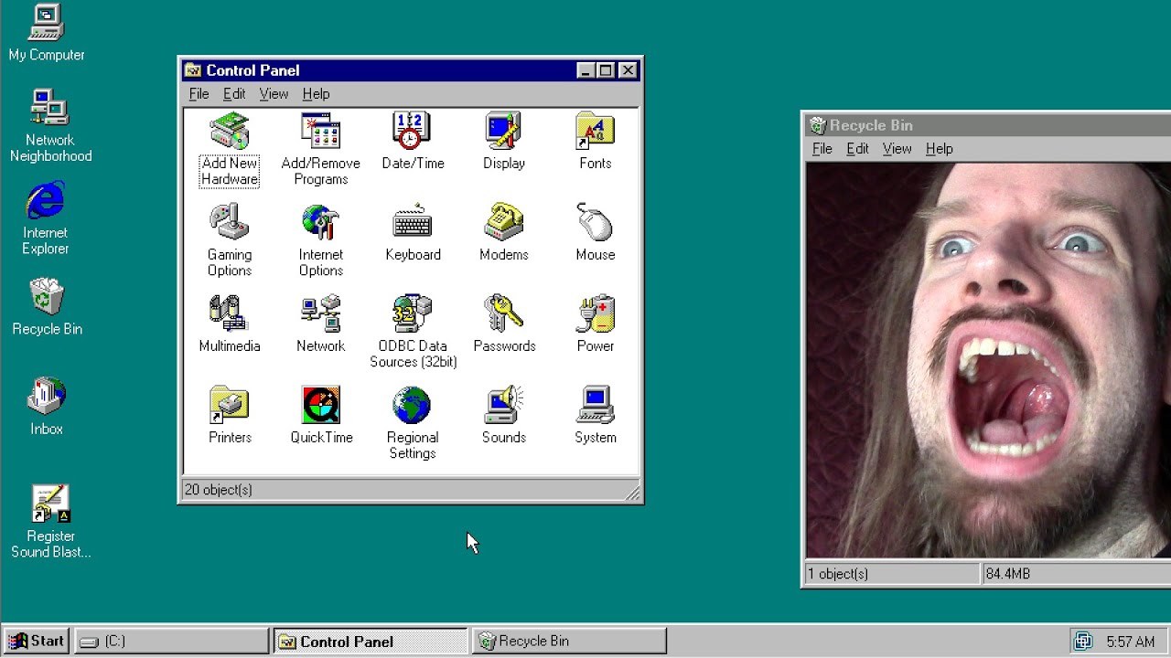
Microsoft Monopoly Stagnates Windows GUI, Wastes User Lifetimes
Accursed Farms
Operating system monopolies have calcified desktop interface design for 25 years, forcing users into inefficient, high-precision interactions that waste aggregate human productivity.
Desktop graphical user interfaces have stagnated for over 25 years, relying on the same micro-targeting, double-clicking ambiguities, and tiny window hitboxes introduced in the 1990s. (24:51)
Microsoft's market dominance has eliminated commercial incentives to innovate, leaving desktop ergonomics unoptimized despite research showing that flat design slows user navigation. (30:21)
Modern operating systems like Windows 10 actively suppress third-party desktop shells and visual customization through mandatory updates, hard-coded DLL assets, and aggressive anti-malware flagging. (19:55)
Ergonomic alternatives—including dead-man clutched mouse gestures, infinite corner click targets, and tiered radial menus—can drastically cut latency and unnecessary hand transitions between mouse and keyboard. (48:46)
Detailed notes
## Background
Published on June 10, 2020, on YouTube by Ross Scott's channel Accursed Farms, the video addresses what Scott describes as an alternate reality where graphical user interfaces remain fundamentally broken. The accompanying description directs viewers to ongoing community discussions on both the Accursed Farms forums and Reddit to share interface improvements and alternatives.
## TL;DR
Ross Scott presents an in-depth critique of operating system design, tracing 25 years of stagnation and aesthetic mediocrity across Windows releases from Windows 95 to Windows 10. He showcases his heavily customized Windows 7 setup—powered by LiteStep, Nexus Dock, and AutoHotkey—to illustrate how desktop interfaces can prioritize speed, minimize cursor travel, and eliminate screen clutter. Scott argues that corporate monopolies and a lack of empirical ergonomic research have calcified desktop navigation into inefficient pixel-hunting and cumbersome hotkeys. He proposes innovative alternatives such as dead-man clutch mouse gestures and multi-tiered radial menus, concluding with an open call to viewers and developers to design truly modern, uncompromised GUI paradigms.
## Atmosphere & style
The presentation carries the frantic, darkly comedic energy of an accidental existential crisis, blending deep technical frustration with Scott's signature acerbic wit. It feels like an impassioned midnight manifesto from a power-user pushed to the brink by mandatory OS updates and degraded workflow ergonomics. Scott oscillates between meticulous analytical breakdowns—drawing analogies from Giotto's circles to Groundhog Day—and exasperated, theatrical rants against modern software paradigms. The experience is intimate, obsessive, and rallying, transforming dry desktop mechanics into an urgent battle for human time and physical efficiency.
## Bulletin
- [24:51](https://www.youtube.com/watch?v=AItTqnTsVjA&t=1491s) Desktop graphical user interfaces have stagnated for over 25 years, relying on the same micro-targeting, double-clicking ambiguities, and tiny window hitboxes introduced in the 1990s.
- [30:21](https://www.youtube.com/watch?v=AItTqnTsVjA&t=1821s) Microsoft's market dominance has eliminated commercial incentives to innovate, leaving desktop ergonomics unoptimized despite research showing that flat design slows user navigation.
- [19:55](https://www.youtube.com/watch?v=AItTqnTsVjA&t=1195s) Modern operating systems like Windows 10 actively suppress third-party desktop shells and visual customization through mandatory updates, hard-coded DLL assets, and aggressive anti-malware flagging.
- [48:46](https://www.youtube.com/watch?v=AItTqnTsVjA&t=2926s) Ergonomic alternatives—including dead-man clutched mouse gestures, infinite corner click targets, and tiered radial menus—can drastically cut latency and unnecessary hand transitions between mouse and keyboard.
## Key takeaways
- [24:51](https://www.youtube.com/watch?v=AItTqnTsVjA&t=1491s) Graphical user interfaces have largely stagnated since the 1990s, forcing users into tedious pixel-hunting and tiny hitboxes rather than optimizing for human motor behavior.
- [08:54](https://www.youtube.com/watch?v=AItTqnTsVjA&t=534s) Under the 'Butler Principle', desktop workspaces should remain completely icon-free, summoning full application hierarchies instantly only when deliberately invoked.
- [19:55](https://www.youtube.com/watch?v=AItTqnTsVjA&t=1195s) The third-party Windows shell ecosystem has been crippled by modern OS architectures that lock visual assets into system DLLs and treat alternative shells like LiteStep as malware.
- [28:15](https://www.youtube.com/watch?v=AItTqnTsVjA&t=1695s) Fitts's Law demonstrates that screen corners provide infinite target boundaries, enabling instantaneous navigation clicks that eliminate misclicks and overshooting.
- [30:21](https://www.youtube.com/watch?v=AItTqnTsVjA&t=1821s) Shaving small latencies off everyday desktop interactions compounds into thousands of saved human lifetimes across millions of global computer users.
- [34:59](https://www.youtube.com/watch?v=AItTqnTsVjA&t=2099s) Operating systems should decouple the graphical interface from core system services and release official modding development kits similar to PC video games.
- [36:19](https://www.youtube.com/watch?v=AItTqnTsVjA&t=2179s) Flat design trends and mobile-first compromises objectively degrade usability, visual hierarchy, and navigation speed compared to depth-based interface styling.
- [40:46](https://www.youtube.com/watch?v=AItTqnTsVjA&t=2446s) Desktop ergonomics should minimize hand switches between the mouse and keyboard when not typing, while preventing disruptive keybindings like the Windows key.
- [40:46](https://www.youtube.com/watch?v=AItTqnTsVjA&t=2446s) Universal text search utilities like Cortana represent a design failure in visual layout, forcing users to type when intuitive spatial navigation should suffice.
- [48:46](https://www.youtube.com/watch?v=AItTqnTsVjA&t=2926s) Mouse gesture systems utilizing a dead-man clutch mechanism enable rapid, wand-like navigation without visual targeting or accidental trigger risks.
- [54:40](https://www.youtube.com/watch?v=AItTqnTsVjA&t=3280s) Automated testing pipelines have replaced human QA departments in modern software development, entrenching a 'perpetual beta' culture of unstable desktop updates.
- [01:01:13](https://www.youtube.com/watch?v=AItTqnTsVjA&t=3673s) Linux provides the modular architectural decoupling needed for total interface freedom, but community themes frequently suffer from severe contrast and readability flaws.
- [01:05:16](https://www.youtube.com/watch?v=AItTqnTsVjA&t=3916s) Contextual radial menus centered directly under the cursor allow flick-based navigation that outpaces nested rectangular menus and small checkboxes.
- [01:15:56](https://www.youtube.com/watch?v=AItTqnTsVjA&t=4556s) Users must actively shape their computing tools to demand superior ergonomics rather than allowing monopolistic tech vendors to dictate inefficient habits.
## Detailed walkthrough
### [00:00](https://www.youtube.com/watch?v=AItTqnTsVjA&t=0s) An Accidental Existential Crisis and the Two Audiences
Ross opens by reflecting on the concept of the internet's "long tail"—the idea that the web provides hyper-niche content that might not appeal to the mainstream, but deeply satisfies those looking for it. What was initially planned as a quick, casual tour of his personal desktop quickly spiraled out of control into something far heavier: “This started rapidly escalating, and is now a minor existential crisis for me instead.” Now frustrated by the state of things, he jokes that his goal is to make the audience just as upset as he is.
He identifies two distinct audiences for the video. The first group consists of anyone fascinated by graphical user interfaces (GUIs); Ross promises an exhaustive look at concepts and tools that few viewers will have seen in their entirety, giving a humorous 5% chance that the presentation might lead to collective "GUI enlightenment." The second group consists purely of "stalkers" who want to snoop through his messy desktop, private files, and disorganized workspace. Admitting that the video itself might turn into a sprawling mess, Ross offers a disclaimer that he is by no means an expert on interface design. However, he emphasizes that this is precisely the indictment: “As a non-expert, I'm seeing way, way too many problems that I wouldn't be if everything was going well.” To illustrate his perspective, he quips that while he is no botanist, he still understands that pouring water on plants makes them grow.
[01:44](https://www.youtube.com/watch?v=AItTqnTsVjA&t=104s) Tour of a "Frankenstein" Desktop (2002 to Present)
Ross pulls back the curtain to reveal his primary desktop environment, running on Windows 7. Visually, it looks almost unrecognizable compared to a stock installation: the standard Windows taskbar and system tray are tucked away, replaced with a streamlined launcher bar, a quick-command Run input, and direct shortcuts to frequent applications. Far from presenting a pristine, curated showpiece, Ross describes his environment as looking more like “Frankenstein's monster that's been beaten repeatedly,” assembled from decades of tinkering that began around 2002.
```mermaid
flowchart TD
accTitle: Evolution of Ross's Custom GUI
accDescr: Progression of Ross Scott's personal interface setups from 2002 to the present day.
subgraph Origins["Early Period (ca. 2002)"]
A["System Shock 2 Aesthetic"] --> B["Window Tiling Hotkeys"]
B --> C["Native 1152x864 Target"]
end
subgraph Transition["Intermediate Adjustments"]
C --> D["Toned-Down Daily Usability"]
D --> E["Frequent Battles with OS & Software"]
end
subgraph Current["Present Setup"]
E --> F["Windows 7 Base"]
F --> G["Blown up to 1440p (Scaling Artifacts)"]
G --> H["Frankenstein Utility over Pure Cohesion"]
end
```
He pulls up archival screenshots from earlier eras to demonstrate how his desktop evolved over eighteen years. As far back as 2002, he had configured custom hotkeys capable of instantly auto-arranging and snapping open windows into horizontal or vertical tiles—a feature he still relies on. He points out that the recorded video footage at 1080p looks somewhat distorted and oversized because his daily driver runs at 1440p resolution, while the core assets of his skin were originally drawn for 1152×864 displays. On Windows 7, scaling raster assets beyond 125% results in noticeable blurriness. His aesthetic preferences shifted over time: his earliest polished setups directly aped the sci-fi HUD of *System Shock 2*, but the visual exhaustion of daily use eventually drove him to adopt calmer, muted tones. He notes that none of his setups ever fully realized his ideal vision because the underlying software constantly fought his modifications: “Plus, with the GUI, I've never known 100% what I've wanted.”
- Custom window management shortcuts from 2002 could automatically tile open applications horizontally or vertically on demand.
- The base graphics of his current setup date back to an era when his native monitor resolution was 1152×864.
- Windows 7's display scaling engine introduces severe texture blurring whenever UI graphics are stretched beyond a 125% factor.
[04:08](https://www.youtube.com/watch?v=AItTqnTsVjA&t=248s) Two Fundamental Truths of GUI Design
Drawing from nearly two decades of trial, error, and aesthetic fatigue, Ross establishes what he considers the core principles of interface design. His first rule is that an interface must be visually comfortable enough that the user never grows sick of staring at it day after day. He compares the dynamic to the film *Groundhog Day*, arguing that designers should build interfaces fit for Phil Connors, who must wake up to the exact same environment for eternity: whatever interface is chosen, the user is trapped with it, so it cannot afford to be grating.
His second principle acknowledges that a single, universally perfect GUI does not exist, because distinct workflows, tasks, and individual aesthetics require different tools. Nevertheless, Ross stresses that interface ergonomics are not purely arbitrary: “However, there are lots of things you can do with the GUI that are ideal for the majority of people.” General user behavior can be measured statistically and optimized through experimental testing. For people who make their living on computers, the interface occupies thousands of hours of their waking lives, meaning it should be designed as frictionless, pleasant, and easy on the eyes as humanly possible.
[05:14](https://www.youtube.com/watch?v=AItTqnTsVjA&t=314s) The Windows Aesthetic: A 25-Year Tour of Mediocrity
Transitioning from design ideals to commercial reality, Ross vents his frustration with Microsoft Windows. Although he warns that MacOS and Linux desktop environments will face their own reckonings later in the video, he zeroes in on Windows first because of its overwhelming dominance in the desktop market: “Compared to what we could be doing, Windows is such garbage!” On a subjective visual scale, he rates Windows across all generations at a mediocre four out of ten—functional enough to get work done, but completely devoid of inspiration or visual pleasure.
To prove his point, Ross delivers a chronological rundown of major Windows releases spanning a quarter of a century:
| Windows Version | Visual Critique & Historical Context |
|:--- |:--- |
| **Windows 95 & 98** | Basic and utilitarian gray bevels; acceptable and understandable for 1990s desktop hardware, but rudimentary. |
| **Windows ME & 2000** | Visually the peak of Microsoft's built-in aesthetics, offering clean, unobtrusive interfaces that do not cause immediate visual annoyance. |
| **Windows XP (2001)** | Dubbed the "Fisher-Price interface"; garish plastic blues and greens that felt insulting given Microsoft's $250 billion valuation at launch. |
| **Windows Vista & 7** | Dominated by distracting faux-glass transparency layers (Aero) and clashing visual elements like the glaring red close button. |
| **Windows 8** | A jarring, full-screen tile experiment driven by a mobile identity crisis; tolerable only when third-party software bypassed the Metro interface. |
| **Windows 10** | A stark, disjointed visual split between blinding white surfaces by default and an equally unrefined, pitch-black dark theme. |
Ross expresses disbelief that a company that grew from a $250 billion market capitalization in 2001 to a trillion-dollar valuation in 2020, with twenty-five years of direct iteration since Windows 95, could only produce “a giant blah” for its flagship user experience. To add insult to injury, the native customization settings built into Windows offer almost nothing beyond altering accent colors or docking the taskbar to an alternate edge: “The level of customization on Windows is pathetic.” This corporate failure to provide meaningful personalization forces anyone seeking a better workflow into the chaotic world of third-party utility software.
[08:54](https://www.youtube.com/watch?v=AItTqnTsVjA&t=534s) The Icon-Free Desktop and the Butler Principle
Beginning a tour of his personal custom desktop setup, Ross Scott points out an immediate departure from standard computer configurations: his desktop is completely barren of icons. He argues that cluttering up a great wallpaper with desktop shortcuts that sit unused ninety-nine percent of the time makes no visual sense. Back in 1995, clunky desktop icons were acceptable because computing as a whole was primitive, but in 2020, having a screen littered with static shortcuts is an eyesore. A fundamental rule of user interfaces is that the operating system exists solely to launch and run software, meaning the interface itself should stay invisible until summoned. Ross summarizes this relationship: “It should be like a butler that's ready at a moment's notice, and disappears when you don't need them anymore.”
Because Ross has hundreds of programs installed, he still requires fast access to shortcuts, but he avoids desktop clutter by routing them through a context menu. Right-clicking anywhere on the open desktop instantly brings up his entire collection of software shortcuts, which also serves as his Start menu replacement. He describes his setup as a chaotic assortment of software accumulated over time rather than a meticulously curated showcase, comparing his perpetual struggle against software clutter to fighting the forces of Chaos in *Warhammer*. To manage the volume of programs, he divides them into two conceptual tiers modeled after planetary geology: "Surface," which holds newly installed programs, and "Core," which contains foundational tools he selected years earlier when first configuring the machine.
Ross addresses the common recommendation to bypass menus entirely using keystroke launchers like Launchy or Windows Cortana search. While typing a program's name might seem faster, it breaks down when a user cannot recall the specific name of a tool they need. Ross often tests multiple pieces of shareware to perform a single niche task or revisits utility programs he has not touched in months. He admits to repeatedly forgetting the name of frame-interpolation tools like MotionPerfect (which he notes is aging and should be replaced by Butterflow, despite recent errors), as well as obscure utilities like PrimeSense, which manages capture drivers for the Xbox Kinect. Without an organized, browsable visual directory, these tools would be impossible to find simply by guessing names in a search bar.
- **Desktop icons**: Eradicated entirely to preserve wallpaper aesthetics and prevent visual clutter.
- **Access mechanism**: A right-click anywhere on the desktop brings up the full launcher menu.
- **Structural organization**:
- **Surface**: Dedicated repository for newly installed software.
- **Core**: Stable baseline of long-standing utilities configured years prior.
- **Search vs. Browsing**: Search utilities (Launchy, Cortana) fail when software names are forgotten or when juggling specialized tools like MotionPerfect, Butterflow, or PrimeSense Kinect drivers.
[12:08](https://www.youtube.com/watch?v=AItTqnTsVjA&t=728s) Shell Replacement with LiteStep
Ross explains that stripping out native Windows interface components like the taskbar, Start menu, and system tray requires replacing the underlying Windows shell. While core operating system processes remain standard Windows code, the graphical shell running on top—traditionally handled by Windows File Explorer (`explorer.exe`)—can be swapped out. The foundational software driving his customized interface is LiteStep, an open-source shell replacement dating back to the late 1990s. LiteStep draws its philosophical and design lineage from Unix window managers, tracing a direct lineage from NeXTSTEP through AfterStep. While it does not change how native program windows render, it replaces the system tray, taskbar, desktop background, and launcher menus with fully modular equivalents.
```mermaid
flowchart TD
accTitle: Windows Shell Replacement Architecture
accDescr: Diagram illustrating how LiteStep substitutes Windows Explorer as the GUI layer while keeping the core OS intact.
subgraph OS["Windows Operating System Core"]
A["Windows Kernel & Subsystems"]
end
subgraph Default["Default Interface"]
B["Windows Explorer (explorer.exe)"]
B1["Default Taskbar"]
B2["Start Menu"]
B3["System Tray"]
B --> B1
B --> B2
B --> B3
end
subgraph Custom["Ross's Custom Shell Layer"]
C["LiteStep Shell"]
C1["Right-Click Desktop Menu"]
C2["Hidden System Tray"]
C3["Nexus Dock Module"]
C --> C1
C --> C2
C --> C3
end
A -.->|"Standard Windows"| B
A ==>|"Custom Replacement"| C
```
LiteStep provides nearly limitless interface flexibility, featuring thousands of historical community themes and hundreds of modules to govern desktop behavior. However, that power comes at a steep cost in usability. Ross warns that LiteStep is remarkably user-hostile, relying on massive text configuration files with a level of syntactic complexity that borders on computer programming. It is also fragile across modern Windows updates. Ross notes that upgrading from Windows XP to Windows 7 was a traumatic transition that permanently broke numerous essential LiteStep plugins without providing viable replacements. Despite LiteStep's ability to transcend default Windows limitations, the experience of maintaining it is fraught with friction, largely because underlying changes to Windows routinely break community-built extensions. Regarding the software's demanding nature, Ross remarks: “It lets you do so much more than default Windows, but at the same time, it's really abusive to the user!”
- **Core role**: Replaces default Windows Explorer as the primary GUI shell, controlling the desktop, tray, and taskbar.
- **Lineage**: Inspired by AfterStep, which was modeled after NeXTSTEP.
- **Configuration**: Managed through complex, code-like configuration files rather than graphical preference menus.
- **Fragility**: Windows updates consistently break community plugins; the transition from Windows XP to Windows 7 broke extensive functionality that was never fully restored.
[14:13](https://www.youtube.com/watch?v=AItTqnTsVjA&t=853s) Taskbar Deficiencies and Dock Workarounds
Turning to window management and running tasks, Ross showcases his use of Nexus Dock (noting that Stardock's ObjectDock offers similar behavior). Nexus Dock provides extensive visual customization, middle-click window closing, and personalized program icons. Ross uses a Netscape icon with its classic starfield animation for his web browser and a giant foot from the GNOME desktop project to represent File Explorer. Beyond aesthetics, the dock solves an objective usability problem inherent to the default Windows taskbar: identifying specific open windows among dozens of active tasks.
Under the default Windows interface, hovering over taskbar buttons to reveal full window titles involves a deliberate delay. If five plain text files are open simultaneously, identifying the correct document requires either hovering and waiting for tooltips to appear or navigating grouped window popups that require additional clicks. By contrast, dragging a cursor across Nexus Dock provides immediate, rapid-fire title updates for every hovered program without pause. Ross argues that unnecessary interface friction actively harms productivity: “If you know exactly what you want to do, but the GUI is making you wait, or jump through a series of hoops, then that's a bad design.”
However, even third-party dock utilities present frustrating design trade-offs. To maximize screen space, Ross prefers running applications borderless and fullscreen without persistent dock icons visible. Standard dock auto-hiding is unreliable: it frequently fails to reveal itself when triggered from within fullscreen software, yet unpredictably pops up when a user is simply scrolling near the edge of the screen or playing video games. To resolve this dilemma, Ross established an operating rule: “The GUI should activate when you want it, and not activate when you don't.” Lacking native software intelligence to achieve this, he relies on a crude workaround: setting the dock to permanently visible in its internal settings, then writing an AutoHotkey script that binds a dock show/hide toggle directly to an extra mouse button. Burning a dedicated mouse button just to control taskbar visibility is an imperfect hack, but Ross considers it a necessary compromise to escape default Windows behavior.
- **Window identification**: Nexus Dock provides instantaneous title display when skimming across open programs, bypassing Windows tooltip latency and grouped-icon menus.
- **Control features**: Allows closing running software instantly via mouse middle-click.
- **Auto-hide dilemma**: Built-in edge triggers misfire during fullscreen games or bottom-edge scrolling, yet fail to respond when urgently needed.
- **The AutoHotkey fix**: Dock is locked in an "always on" state and toggled on demand via a custom AutoHotkey script mapped to a dedicated mouse button.
[17:29](https://www.youtube.com/watch?v=AItTqnTsVjA&t=1049s) Alternative File Explorers and Desktop Utilities
Ross Scott explains that he relies on a years-old version of Directory Opus simply because he is too cheap to purchase an updated license. Although it is packed with options, his setup has suffered from creeping disorder: he previously had dedicated buttons to toggle directly between details and thumbnail views—the only two view modes he ever uses—but after a breakdown in his setup, he now has to click an extra button first. He laments this minor inefficiency, admitting that while the setup could look and function far better with the right theme if he knew what he was doing, “this still beats Explorer.” Features like queued file transfers make third-party file managers vastly superior to Windows Explorer, even if he cannot say definitively which one on the market is the absolute best.
Beyond his file manager, Ross points out subtle widgets on his desktop, such as numerical indicators that display remaining free space across all of his storage drives in real time. Having that metric permanently visible is critical, because discovering a drive has dropped to zero bytes in the middle of a project is an absolute nightmare. Additionally, he runs a desktop wallpaper changer configured so that holding Control and clicking anywhere on the empty desktop immediately loads a random new background on command.
[18:36](https://www.youtube.com/watch?v=AItTqnTsVjA&t=1116s) The *Magic: The Gathering* Wallpaper AI Upscaling Pitch
Ross veers off on a tangent regarding wallpaper art, professing his deep admiration for the visual design of *Magic: The Gathering*, particularly the illustrations on basic and nonbasic land cards. He points out that while the art is magnificent, Wizards of the Coast rarely makes super-high-resolution digital copies available to the public, keeping them locked away in what he imagines is a giant corporate vault. This sparks an idea: using modern AI machine learning to upscale tiny card scans into massive, crisp desktop wallpapers.
He notes that community AI upscalers have performed near-miracles on low-resolution textures in retro video games, and card art should be even easier because the end result merely needs to resemble an oil painting rather than a crisp photorealistic render. The training pipeline could be exceptionally effective by pairing the few high-resolution original digital files that artists have released with their printed card counterparts. While he stresses that nobody should infringe on living artists who actively sell high-res digital prints, thousands of older cards have no publicly accessible copies beyond the miniature physical cardboard prints. Admitting he is “kind of an art raider” without the spare time to tackle such a project himself, he urges interested viewers with AI experience to take on the challenge.
[19:55](https://www.youtube.com/watch?v=AItTqnTsVjA&t=1195s) The Windows 10 Impasse and the Death of Custom Shells
Concluding the desktop tour, Ross addresses the brewing crisis: he is running Windows 7 and cannot remain on it forever. While stubborn users might try to stay on it indefinitely, his desire to use modern VR headsets and avoid Windows 7's notoriously blurry DPI scaling forces an eventual upgrade. However, moving forward presents a catastrophic roadblock: “Well, when it comes to GUI customization, Windows 10 is like the end times.” Ross barely managed to keep LiteStep limping along on Windows 7, and its prospects on Windows 10 are completely hopeless.
Reflecting on history, GUI shell customization flourished during the Windows XP era, supported by a healthy ecosystem of alternative shells like GeoShell, Aston Desktop, and SharpE. Over the subsequent decades, however, that ecosystem turned into a total graveyard:
```mermaid
flowchart TD
accTitle: Decline of Windows Shell Customization
accDescr: Progression from the open ecosystem of Windows XP to the restricted environment of Windows 10.
subgraph XP["Windows XP Era"]
A["Thriving Shell Scene<br/>(LiteStep, GeoShell, Aston, SharpE)"]
end
subgraph Middle["Windows 7 Era"]
B["Ecosystem Collapses"]
C["LiteStep Barely Functions"]
A --> B
B --> C
end
subgraph Win10["Windows 10 Era"]
D["Forced System Updates"]
E["Hostile OS Security Scanners"]
F["Complete Loss of GUI Control"]
C --> D
C --> E
D --> F
E --> F
end
```
Third-party shell developers either quit or were suffocated by Microsoft's design choices. Modern Windows actively treats alternative desktop shells as malware, triggering antivirus warnings and requiring specialized third-party utilities just to reassign the default shell. Because Windows 10 routinely resets altered system preferences during automatic updates, any custom setup would be wiped out at Microsoft's whim.
[21:50](https://www.youtube.com/watch?v=AItTqnTsVjA&t=1310s) Hostile Security Updates and Deeply Buried GUI Code
The update model on modern Windows has become an outright war against user agency. On Windows 7, Ross was forced to intentionally skip multiple security updates because installing them broke LiteStep's ability to handle window Z-ordering, making the entire desktop half-unusable. While Windows 7 gave users the autonomy to omit problematic updates, Windows 10 removes that choice entirely: “You either update, or you go to hell!” Users are presented with a miserable false binary between having a secure operating system or maintaining a functional, customized user interface. Ross shares a friend's theory that Microsoft purposefully engineered security patches to break non-standard interfaces in order to enforce intrusive system notifications, noting that these graphical breakages began popping up exactly when Microsoft started aggressively nagging users to migrate to Windows 10.
Ross vents his fury over how deeply entangled the presentation layer is with core operating system functions:
- “I'm not trying to hack my damn system, I just want to change the graphics and the interface!”
- Most standard interface icons—such as system folders and dialog prompts—are hard-coded directly into protected system files like `shell32.dll`.
- Modifying `shell32.dll` to replace an icon requires jumping through administrative hoops, only for Windows to treat the modification as hostile malware tampering.
- Workarounds like Stardock's IconPackager fail to solve the core problem because they are designed to hook exclusively into Windows Explorer; using an alternative shell like LiteStep causes them to break completely.
[24:51](https://www.youtube.com/watch?v=AItTqnTsVjA&t=1491s) GUI Stagnation and Interface Heresy
Facing an unavoidable forced upgrade to Windows 10 feels to Ross like an aggressive technological regression: “For me, this is the equivalent of the industry discovering I'm writing papers using a word processor, so they want to come smash it up so they can sell me a typewriter.” Even with LiteStep hobbled and missing features, he operates dramatically faster than he ever could using stock Windows Explorer. Returning to default Windows represents a severe operational downgrade.
This ongoing frustration leads Ross to a broader philosophical critique: modern graphical user interfaces are woefully underdeveloped and have stagnated for a quarter of a century. Aside from minor superficial polish, the core mechanics of Windows operate virtually identically to how they did 25 years ago. The entire paradigm still relies on pixel-perfect mouse hunting, forcing the user to target tiny hitboxes to drag window borders or launch shortcuts instead of providing an intuitive, ergonomic interaction model.
[26:12](https://www.youtube.com/watch?v=AItTqnTsVjA&t=1572s) Precision, Double-Clicking, and Fitts's Law Analogies
Ross Scott points out that operating system interfaces penalize users heavily for lack of precision: the sloppier you are, the longer basic actions take. He expresses his longstanding dislike of double-clicking, describing it as an awkward interaction model that he simply does not like the feel of. Instead, he prefers an immediate single-click response. Double-clicking frequently creates ambiguous edge cases: clicking a file might open it, or the computer might misinterpret the timing and trigger an inline rename, or it might register nothing at all. This results in an irritating pause where the user is left wondering whether the machine is slowly loading the application or if the second click failed to register, leaving them waiting on nothing. With a single click, the user knows with certainty that the input registered.
Modern graphical user interfaces demand extreme precision, which runs counter to human biology. While humans are capable of precision, it demands significant concentration, mental energy, and time. Scott illustrates this with the historic anecdote of Pope Benedict XI, who sent a courtier to Giotto di Bondone requesting a sample of work to prove his mastery before awarding an art commission; Giotto famously demonstrated his skill by painting a freehand circle of perfect geometry in one stroke. While current desktop environments offer a tiny bit of wiggle room, less precision directly correlates with greater speed.
Scott likens UI targets to aircraft: airplanes require vast airport runways because they possess massive momentum and cannot stop on a dime, whereas helicopters can land in tight spaces but are significantly slower—the fastest helicopter in existence cannot match an ordinary passenger jet. Scoffing at the moment in the original *Deus Ex* where the player flies an ordinary-looking helicopter from New York to Hong Kong, Scott argues that operating systems fundamentally need fewer "helicopters" (tiny precision targets) and far more "airplanes" (broad landing zones).
> “The GUI as it is right now wants me to be precise. Humans are not precise.” — Ross Scott
[28:15](https://www.youtube.com/watch?v=AItTqnTsVjA&t=1695s) Benchmarking Corner Launchers in LiteStep
Microsoft introduced a dedicated "Show Desktop" button in the extreme corner of the screen with Windows 7. Scott considers this one of the best UI concepts to emerge from the company—so clever he jokes they must have stolen it. Having an infinite target in the display corner makes finding your bearings instantaneous. Scott took this mechanic and supercharged it within his custom desktop environment, LiteStep. Reasoning that his most heavily used daily tools are a web browser and a file manager, he mapped multiple mouse actions to that same corner: left-clicking triggers Show Desktop, while middle-clicking and right-clicking launch a web browser or Directory Opus.
To demonstrate the concrete benefits of this design, Scott timed himself launching a browser across three methods: a desktop shortcut, the classic Windows Quick Launch bar, and his LiteStep corner hot-zone. Timing concluded the moment the physical input finished, removing application loading speed from the equation. Averaging out repeated runs, his LiteStep approach was roughly half a second faster than targeting the Quick Launch bar. While half a second sounds trivial in isolation, repeating that action dozens or hundreds of times daily compounds into substantial wasted time. Moreover, the infinite corner target provides total physical reliability:
```mermaid
flowchart TD
accTitle: Corner Target Input Routing
accDescr: Diagram showing how different mouse clicks on the screen corner trigger distinct actions without requiring precise aim.
subgraph ScreenCorner["Screen Corner (Infinite Target)"]
direction TB
LClick["Left Click"]
MClick["Middle Click"]
RClick["Right Click"]
end
subgraph Actions["Assigned Actions"]
Desktop["Show Desktop"]
Browser["Launch Web Browser"]
DirOpus["Launch Directory Opus"]
end
- When attempting to click a small Quick Launch icon at maximum speed repeatedly, mis-clicks and accidental launches are inevitable.
- Targeting the display corner can literally be performed blindfolded without ever missing, because the cursor physically cannot overshoot the boundary of the monitor.
- This creates an objective, measurable, and reproducible difference in speed and error rates that proves desktop efficiency can be scientifically quantified.
> “It is possible to figure out what is best for the GUI based on what you're trying to do.” — Ross Scott
[30:21](https://www.youtube.com/watch?v=AItTqnTsVjA&t=1821s) Steve Jobs, Wasted Human Lifetimes, and OS Monopolies
Scott notes that while he rarely praises Steve Jobs—viewing him as an aggressive marketer with a cult-leader persona who took credit for technologies that would have naturally emerged anyway, while holding far more respect for technical creator Steve Wozniak—he fully endorses one of Jobs' core development philosophies on the original Macintosh: shaving boot time. Jobs argued that reducing startup by even a few seconds across millions of users translates into saving entire human lifetimes of wasted time.
Scott asserts this exact mindset should govern GUI design today. While long boot times allow someone to step away and perform other tasks, a clumsy desktop environment continuously creates friction during active computer use. When an operating system serves a billion people, small recurring inefficiencies across routine navigation collectively stall human productivity. Scott observes that Microsoft frequently seems detached from ordinary human behavior—suggesting viewers witness their surreal Windows 7 launch party video for proof—yet desktop design remains trapped at an unacceptable "four out of ten" quality standard.
Scott traces this stagnation directly to Microsoft’s lack of competition. Although desktop market share has dipped from historic peaks, their dominance remains unassailable for core user segments:
| Segment | Microsoft Windows Market Share |
|:--- |:--- |
| Overall Global Desktop Share | ~77% (down from 91%) |
| Steam PC Gaming Client Share | 96.8% |
Because Windows functions as a de facto monopoly—having successfully avoided being broken up during the 2001 United States antitrust litigation, and growing four times larger in value since—Microsoft has no commercial imperative to innovate on interface mechanics.
To solve this, Scott proposes an active user-experience research program: Microsoft should employ a dedicated department whose sole job is brainstorming and implementing experimental GUI interaction models. Much like the Windows Insider program releases operating system builds, a dedicated, continuous public testing branch for interface models could collect telemetry on how rapidly users complete common tasks. By systematically tracking real navigation speeds across diverse test groups, developers could use empirical data to iterate toward the most efficient user interface possible.
> “That has such far reaching consequences that any inefficiencies mean you are wasting people's lives!” — Ross Scott
[34:59](https://www.youtube.com/watch?v=AItTqnTsVjA&t=2099s) Decoupling the GUI and the Skyrim Modding Vision
Ross Scott envisions an alternate development path for Windows where the graphical user interface is completely detached from core system files. In this model, an official developer kit would be released to give artists, designers, and hobbyists complete freedom to build whatever interface they want. While Microsoft would ship Windows with an official, research-driven standard interface, users would not be trapped with it:
> “So they would ship Windows with the Microsoft standard, which would be brilliant instead of what we have now, because it would be derived from constant research and development, but if people didn't like it, fine! They could make their computer look like whatever they wanted, because they'd have the tools to do so!”
He points out that enthusiasts routinely spend hundreds or thousands of hours building and fine-tuning mods for games like *The Elder Scrolls V: Skyrim*, while other users pick and choose customized elements to build their ideal setups. If even a fraction of that creative talent were unlocked and given frictionless access to modify the operating system’s GUI, desktops could look like futuristic panels from *Star Trek* or massive extensions of *World of Warcraft*. As it stands, customizing the interface requires battling hurdle after hurdle. Most everyday users judge operating systems primarily by their GUI rather than their underlying codebase simply because the interface is all they ever see. Opening up the GUI would allow Windows to dominate because users genuinely love using it, rather than because of corporate strong-arming tactics.
```mermaid
flowchart TD
accTitle: Decoupled GUI Ecosystem Concept
accDescr: Diagram contrasting core system files, official GUI, and community-driven interface modding.
subgraph OS["Windows Architecture"]
Core["Core System Files"]
SDK["Official GUI Developer Kit"]
Core --- SDK
end
subgraph Interfaces["Interface Options"]
Default["Microsoft Standard UI<br/>(Rigorous R&D Base)"]
ModWoW["World of Warcraft Theme"]
ModTrek["Star Trek LCARS Panel"]
ModCustom["Community Mod Ecosystem<br/>(Skyrim-Style Customization)"]
end
[36:19](https://www.youtube.com/watch?v=AItTqnTsVjA&t=2179s) The Failure of Windows 8 and the Flaws of Flat UI
When Microsoft initially announced major interface changes for Windows 8, Ross was actually excited, hoping they would discard decades of outdated holdovers and engineer a genuinely faster, more efficient system that users would love once past the initial learning curve. Instead, Microsoft delivered a half-baked touchscreen layout that failed to perform basic system functions and became an embodiment of "one size fits no one." Furthermore, while aesthetic tastes are often considered subjective, empirical research contradicts this idea: flat-design themes objectively lower user productivity. Testing that measures time spent lingering on UI elements and tracks eye movements demonstrates that users navigate flat interfaces more slowly.
While a generous observer might speculate that flat interfaces operate like a Dvorak keyboard—initially slower during the learning phase but faster after six months of proficiency—Ross dismisses this benefit in Microsoft's case. (He notes parenthetically that he cannot switch to Dvorak himself because he is "keyboard homeless" with no formal home-row typing discipline.) Windows 8 proves that interface efficiency was never part of Microsoft's plan. That leaves only two explanations for why Microsoft pushes slower, flatter designs:
> “Either Microsoft is barely doing any research at all on the GUI, and their design process is like somebody taking a test who hasn't studied, or Microsoft did do the research, but some higher-ups at the company completely ignored it, and it's the ego of someone who's not a designer steering the ship.”
Because Microsoft operates as a monopoly, it suffers no business consequences for this incompetence.
[38:38](https://www.youtube.com/watch?v=AItTqnTsVjA&t=2318s) The Flaws of Keyboard Shortcuts and the Gamer's Hazard
Anticipating pushback from power users who champion Windows 10 hotkeys and keyboard shortcuts—such as holding the Windows key to snap windows, cycle taskbar apps, or run AutoHotkey scripts—Ross argues that these mechanisms fail to solve core interface problems. For PC gamers, relying on the Windows key is a major liability. Accidental keystrokes frequently pull up the Start menu and wreck fullscreen titles. As an example, he demonstrates pressing the Windows key while running the classic game *Messiah*; while the application manages not to crash entirely, returning to it leaves the game state glitchy and degraded. The key is such a persistent hazard that Ross disabled it on his own rig, immediately locking him out of the operating system's built-in keyboard navigation.
This conflict highlights an essential GUI rule:
> “It shouldn't be really easy to do something you don't want to by accident.”
Although high-speed workflows are often in direct tension with accident prevention, placing a destructive system command directly beside high-frequency gameplay keys remains fundamentally poor design.
[40:46](https://www.youtube.com/watch?v=AItTqnTsVjA&t=2446s) Ergonomics, Hand-Switching, and the Search Bar Surrender
Even outside of gaming, modern keyboard shortcuts suffer from atrocious ergonomics. Activating an action like switching to the fifth docked taskbar app requires reaching for `Win + 5`—an awkward hand contortion on a layout never engineered for such combinations. The alternative requires the user to pull their right hand completely off the mouse. This constant switching disrupts the user's spatial reference, forcing them to look away from the monitor, glance down at the keyboard to differentiate letters like "N" and "M," press the key, and then reposition their hand onto the mouse before looking back up. Ross compares his frustration with conventional workflows to Michael Palin's character in Terry Gilliam's *Jabberwocky*, who tries to optimize an artisan's barrel-making process only to be violently thrown out of the workshop.
```mermaid
flowchart LR
accTitle: Inefficient Hand-Switching Loop
accDescr: Sequence showing the disruptive steps required to activate a standard keyboard shortcut while using a mouse.
A["Hand on Mouse"] --> B["Lift Hand off Mouse"]
B --> C["Look Down at Keyboard"]
C --> D["Hunt for Key (e.g., N vs M)"]
D --> E["Press Key"]
E --> F["Return Hand to Mouse"]
F --> G["Refocus Eyes on Screen"]
```
To solve this, Ross establishes another interface principle:
> “If you're not actually typing, the number of times you have to switch your hand between the mouse and keyboard should be kept to an absolute minimum.”
Ideally, a desktop setup should function like a throne—invoking the image of the Riddler effortlessly operating an array of controls in *Batman Forever*—where common tasks can be performed entirely with one hand, reserving two-handed interactions exclusively for complex commands. From this perspective, Microsoft’s reliance on Cortana and universal text search to launch applications is not an innovation, but an admission of defeat. Incapable of designing an intuitive visual navigation structure, the OS simply demands that users type program names into a search bar, abandoning visual organization while clearing Start menu real estate to promote *Candy Crush*.
[44:00](https://www.youtube.com/watch?v=AItTqnTsVjA&t=2640s) The Unreliability of Basic Hotkeys and the Cult of Inefficiency
The everyday ergonomics of basic computer shortcuts often fall flat due to inexplicable unreliability. Ross Scott points out that while keyboard combinations like Ctrl+C should theoretically pass the ergonomics test by keeping hand movement minimal, the shortcut fails when it randomly refuses to register. Users frequently find themselves highlighting text, hitting Ctrl+C multiple times in frustration, navigating to a new window, pressing Ctrl+V, and being met with absolute silence. It is not strictly a keyboard shortcut bug, either, as the exact same failure occurs when manually right-clicking and selecting "Copy" from the context menu. Ross estimates this failure rate at roughly 5% to 10%—an unacceptable margin of error for a foundational computing task. While relying on memory might be hazy, he recalls that copy and paste was not a game of chance on older operating systems like Windows 98 and Windows XP.
Beyond basic clipboard functions, the broader hotkey paradigm is thoroughly fragmented. Shortcuts could be substantially improved with a dedicated, optimized keypad, but currently, they are scattered haphazardly across the keyboard. Windows expects users to memorize an absurd catalog of esoteric shortcuts for obscure system menus, prompting Ross to mock the expectation:
> “Pop quiz: What's the hotkey for Device Manager? For System Restore? The Display panel? Learn those hotkeys! Hup hup hup hup hup hup hup!”
Ross pushes back hard against critics who accuse him of whining about the minor physical effort needed to click small targets or move a hand off the mouse. The entire philosophy of using a graphical user interface should center on maximum laziness: getting the greatest amount of work done with the least possible physical exertion so that energy can be preserved for the actual task at hand. Tolerating bad design does not build character; it simply generates pointless aggravation. As Ross puts it: “If you don't want your arms to be lazy, then get off the computer and go lift some weights! What, are you getting pumped from using the mouse?”
- The copy/paste failure rate in Windows hovers around 5% to 10%, turning basic text entry into a gamble.
- Users are arbitrarily expected to memorize disjointed combinations for system utilities instead of having intuitive, dedicated access.
- Ergonomic efficiency in computer interfaces should strive for total laziness, leaving physical effort for real-world exercise rather than wrestling with a GUI.
---
[46:13](https://www.youtube.com/watch?v=AItTqnTsVjA&t=2773s) The Sacrosanct Window Controls and the Lack of Flow
The standard desktop environment is riddled with deep structural inefficiencies that designers take for granted. Users are forced to switch off the mouse constantly, reach to the far bottom corner of enormous ultrawide monitors just to open the Start menu, aim for tiny icons that could instead be hidden until summoned at a larger scale, double-click for routine operations, and accept that middle-clicking usually does nothing at all. Venturing into what he describes as "full heretic" territory, Ross challenges one of the most sacred, unquestioned conventions of modern computing: placing miniscule close, maximize, and minimize buttons in the top corner of a window. Windows, macOS, and Linux all slavishly follow this exact layout, despite the fact that tiny targets require active concentration to strike, invite accidental misclicks, and consume screen real estate that belongs to the running application.
```mermaid
flowchart TD
accTitle: The Interrupted Flow of Standard GUI Interaction
accDescr: Diagram contrasting smooth keyboard typing with the jarring start-stop precision clicking required by standard desktop GUIs.
subgraph TypingFlow["Fluid Typist Experience"]
A["Rhythmic Keypresses"] --> B["Continuous Input Flow"]
B --> C["High Velocity Work"]
end
subgraph GUIInterruption["Standard Window Navigation"]
D["Small Corner Buttons"] --> E["Micro-Targeting & Precision Clicking"]
E --> F["Start-Stop Friction & Hesitation"]
F --> G["Interface Suited for Androids (Data)"]
end
```
Stripping away modern visual eye candy reveals that the underlying functional mechanics of the desktop GUI have barely evolved over the past 35 years. Comparing the modern Windows interface to Windows 95 highlights a shocking lack of progress for a field billed as cutting-edge technology. Typing on a keyboard possesses an inherent rhythm and continuous velocity where the user rolls through sentences with momentum. In sharp contrast, the desktop GUI feels like stop-and-go downtown city traffic characterized by constant hesitations, brake checks, and micro-precision targeting. Evaluating this dynamic, Ross argues that the modern interface is fundamentally alienated from human physiology:
> “We've created an interface for androids, not humans!”
To illustrate, he references an episode of *Star Trek: The Next Generation* where the ship's sabotaged engines can only be saved by manually inserting sequence cards into a computer terminal faster than any biological human can react, leaving Commander Data as the only crew member capable of operating the interface in time.
---
[48:46](https://www.youtube.com/watch?v=AItTqnTsVjA&t=2926s) Hollywood Interfaces, Motion Controls, and Mouse Gestures
Alternative interaction paradigms seen in science fiction cinema hint at what true interface velocity could look like. Movies frequently depict slick, kinetic interfaces where operators manipulate on-screen elements with lightning-fast hand motions. While Hollywood tropes often lean on impractical gimmicks like floating transparent displays, the fluid physical interactions demonstrate clear potential. Video editing, for example, would be vastly faster if an editor could sweep, cut, and push media with full hand gestures rather than being shackled to the sluggish confines of mouse clicks and keyboard shortcuts. Even though motion controls demand more physical exertion than a mouse, their raw efficiency represents the kind of forward leap personal computing needs.
```mermaid
flowchart LR
accTitle: Mouse Gesture Design Principles
accDescr: Two core design rules proposed for implementing fluid mouse gestures without accidental triggering.
subgraph GestureRules["Ideal Gesture System"]
direction TB
R1["Rule 1: Simplicity"] --> S1["Maximum of 3 quick strokes"]
R2["Rule 2: Accidental Trigger Prevention"] --> S2["Clutch Mechanism: Hold dedicated button while drawing"]
end
```
Within the practical boundaries of standard 2D mouse-and-keyboard setups, mouse gestures offer a massive, immediate upgrade. Demonstrating a setup where smooth mouse sweeps effortlessly trigger browser navigation, searches, background scrolling, and tab management, Ross highlights how fluid computing becomes when the user can wave the cursor like a wand rather than hunting down microscopic UI targets. The fact that mouse gestures remain an obscure third-party power-user tweak rather than an out-of-the-box industry standard is an indictment of market stagnation:
> “Maybe because Microsoft wasn't broken up and maintained their monopoly, so it calcified every designer's thinking into doing things the way they've always been done! It stunted people's brains!”
To make mouse gestures genuinely practical for mass adoption, Ross outlines two core design rules:
- **Simplicity of input**: Gestures must be swift, natural, and limited to a maximum of three strokes per command.
- **A dead-man clutch mechanism**: To prevent accidental activations during normal cursor travel, the system should mirror a *Star Wars* lightsaber—which shuts off the moment it leaves a user's grip—by requiring the user to hold down a dedicated mouse clutch button while drawing the stroke.
Implementing this clutch functionality across dozens of system operations would require specialized mice equipped with multiple side buttons, resembling high-button-count MMO mice. Ross explicitly cautions that showing such hardware is not an endorsement of Razer, noting that he has actively boycotted the company ever since they began forcing DRM into their mouse software.
[52:40](https://www.youtube.com/watch?v=AItTqnTsVjA&t=3160s) Multi-Button Mouse Gestures and Context-Aware Software
Ross Scott evaluates how mouse hardware and gestures should interact, arguing that a small set of well-placed buttons could unlock immense functionality if combined with motion. While having a mouse covered in a dozen buttons might be unnecessary, using a right-click or thumb-click combined with directional swipes allows a single physical input to handle multiple distinct actions. He stresses that limiting oneself to a single button is foolish, declaring: “You need multiple mouse buttons for maximum efficiency.” However, an immediate challenge with gesture-based navigation is preventing it from firing accidentally during video games, mirroring the annoyance of hitting the Windows key mid-play.
A viable answer already exists in mouse configuration utilities. Ross recalls owning a SteelSeries mouse that allowed users to map completely different button profiles depending on the active foreground application. Inside a video editor, mouse buttons could trigger editing shortcuts, but switching over to a web browser would instantly and seamlessly change those same buttons to web navigation controls. Although he praises the software concept, Ross makes sure to clarify that this is not an endorsement of the hardware itself. His scroll wheel buttons broke on two consecutive SteelSeries mice, and even on his current mouse the scroll wheel button has failed, forcing him to remap middle-click to the DPI toggle switch.
Ross insists that application-aware button remapping combined with gesture support needs to be standardized at the operating system level rather than relegated to proprietary mouse software. By coupling directional gestures with smart software detection, desktop productivity could accelerate dramatically. Gesture navigation is not a new idea—the classic Presto-based Opera browser offered mouse gestures years ago. However, Ross notes he abandoned Opera after it scrapped its original engine in favor of a Chromium base.
- Combining a swipe left or swipe right with specific modifier buttons allows dozens of discrete actions without cluttering the mouse body with extra plastic switches.
- Application-sensitive profiling ensures game controls remain untouched while productivity tools gain complex macro shortcuts.
- Ross describes himself as a “mutant when it comes to mice,” frequently wearing out scroll wheel click mechanisms across multiple brands.
---
[54:40](https://www.youtube.com/watch?v=AItTqnTsVjA&t=3280s) Browser Regressions and the Windows “Perpetual Beta”
Turning to web browsers, Ross explains that he sticks with Mozilla Firefox primarily because of GUI customization—specifically, Firefox remains one of the last browsers that still allows users to disable the tab close button (`X`). Having relied on middle-clicking tabs for decades, Ross finds dedicated close buttons entirely counterproductive. When opening multiple tabs rapidly with middle-click, an imprecise click on a standard tab header often accidentally closes a tab instead of selecting it. Removing the `X` button widens the safe clickable zone for selecting tabs, eliminates accidental closures, and frees up valuable horizontal space for tab titles. When users requested this toggle in Google Chrome, the developers dismissed it as a "will not fix" issue, and modern Opera followed suit. Ross vents that modern software design consistently tries to pull users backward into less efficient paradigms.
Even Firefox is not immune to degradation. Ross recounts an update that completely broke its handling of operating system file associations. Subsequent updates patched the issue only partially, leaving it in a degraded state for roughly six months before it was quietly resolved, leaving him wary of applying browser updates. Yet he views this unreliability as an industry-wide infection led by Microsoft. As an example, when Microsoft ended official support for Windows 7, they shipped a final rollup patch that introduced a bug turning desktop wallpapers pitch black. To repair that, they released a follow-up patch—which promptly broke the operating system's ability to shut down, requiring yet another fix for the fix.
Ross argues that Windows 10 formalized this reckless development cycle across personal computing: “With Windows 10, Microsoft has made perpetual betas the new standard for computing.” He connects this collapse in system stability to Microsoft gutting its human Quality Assurance department in favor of automated AI testing pipelines, a trend mirrored by the company replacing human news curators at MSN with automated systems.
```mermaid
flowchart TD
accTitle: Windows 7 End of Life Patch Cascade
accDescr: Flowchart illustrating the chain reaction of bugs introduced by Microsoft's final Windows 7 update patches.
subgraph Patches["Microsoft Update Cascade"]
A["Final Windows 7 Patch"] -->|"Introduces bug"| B["Desktop Wallpaper Turns Black"]
B -->|"Addressed by"| C["Hotfix for Final Patch"]
C -->|"Introduces new bug"| D["System Shutdown Fails"]
D -->|"Requires"| E["Fix for the Fix for the Final Fix"]
end
```
- Disabling tab close buttons widens the margin of error, making left-click safely select and middle-click cleanly close.
- Google Chrome marked requests for an optional tab close button toggle with "This is a will-not-fix kind of issue."
- The firing of internal QA departments in favor of automated testing has removed stable software baselines for everyday users.
---
[57:38](https://www.youtube.com/watch?v=AItTqnTsVjA&t=3458s) Visual Customization and the Eye Strain of Modern Themes
Shifting focus from GUI mechanics to GUI aesthetics, Ross calls default Windows visual design pathetic, noting that users are essentially offered nothing beyond basic accent color palettes. Historically, third-party software allowed deep customization: Style XP existed in the Windows XP era, and Ross personally uses a BricoPack utility to soften harsh default buttons on his system, though it is unlikely to function on Windows 10. The main surviving tool for comprehensive visual restyling is Stardock’s WindowBlinds, but finding quality themes has become an exercise in wading through endless mediocrity.
Browsing through public themes, Ross finds that the vast majority rate around a four or five out of ten. Very few reach a standard that someone would want to stare at daily for a decade. The biggest recurring design flaw is poor contrast balance: designers frequently pair light gray text with mid-gray backgrounds or low-visibility window chrome, generating severe eye fatigue. Ross jokes: “Hey, Bach was a great composer, but he went blind because he used crappy WindowBlinds themes.” High visual contrast between interface elements and legible text must be treated as a fundamental design truth to prevent physical strain. While WindowBlinds maintains the technical capability to overhaul the interface, finding a polished, functional skin remains difficult.
- Default Windows visual customization provides almost no structural aesthetic control beyond flat color accents.
- Legacy theming engines like Style XP and BricoPack have largely fallen by the wayside with newer Windows revisions.
- Poor contrast ratios between fonts and window frames remain the most pervasive visual flaw in community-made themes.
---
[59:21](https://www.youtube.com/watch?v=AItTqnTsVjA&t=3561s) The GUI Paradigms of macOS and Linux
Ross examines whether alternative desktop operating systems offer better design models. Regarding Apple's macOS, he acknowledges he is not a Mac user due to longstanding complaints about high hardware prices, locked-down ecosystems, and poor gaming support. However, he admits its visual presentation is considerably more unified and cohesive than Windows. He appreciates specific aesthetic details, such as the Finder icon ("that two-faced smiley guy"), and prefers the look of the macOS Dock over the rigid Windows taskbar.
Despite those visual touches, Ross feels Apple falls into many of the same core functional traps as Windows, failing to rethink desktop interactions in truly innovative ways. One notable exception is Apple’s Magic Mouse, which attempted to bring touch gestures directly onto the surface of desktop pointing hardware. While Ross suspects that shortcomings in execution kept the Magic Mouse from revolutionizing the wider tech industry, he leaves the floor open to dedicated Mac users to evaluate its true utility. If an operating system gets an interface convention right, Ross believes other platforms should unashamedly copy it.
Finally, Ross turns to Linux, noting that there is no singular "Linux interface" because the platform consists of countless distinct distributions and desktop environments. In earlier eras, default Linux desktop themes frequently looked cleaner, crisper, and more refined than anything shipped by Microsoft or Apple. While those older environments still had room for polish, they exhibited real promise. Looking at modern distributions, however, Ross finds himself bewildered by the direction desktop styling has taken, concluding: “Now, I don't know what the hell is going on.”
- Apple’s macOS presents a more unified default design language and superior dock presentation, but shares fundamental GUI architectural limitations with Windows.
- Apple's Magic Mouse represents one of the few mainstream commercial attempts to fuse mouse hardware with surface-level gesture recognition.
- Linux historically offered some of the cleanest default visual designs among major operating systems, though its modern visual trajectory has become disjointed and confusing.
[01:01:13](https://www.youtube.com/watch?v=AItTqnTsVjA&t=3673s) The State of Linux Themes and Desktop Environments
Ross Scott hoped to showcase how visually impressive Linux can look, but nearly every theme he examined had noticeable flaws. He explains that he dislikes super dark themes because transitioning between a pitch-black desktop and a bright web page inevitably shocks and hurts unadjusted eyes. Conversely, other options swing too far toward flat, blinding white layouts that feel like poor copies of Windows 10. The most prevalent offender, however, is the awkward trend of taking a decent theme and slapping stark black bars across the top or bottom of the screen, which spikes eye strain and damages readability. He also notes instances of dreadfully low-contrast designs. While he acknowledges that gorgeous Linux themes must exist somewhere, “they're in hiding, and the mainstream stuff doesn't seem to know what it's doing.”
Despite these aesthetic shortcomings, Ross emphasizes that Linux holds a massive structural advantage: its desktop environments sit entirely on top of the underlying operating system. Because the interface is decoupled from the core OS, users can completely restyle or swap out their graphics without the system treating custom modifications like a virus. This architectural freedom means Linux could theoretically be the ideal breeding ground for the perfect GUI. Furthermore, for baseline tasks like casual web browsing or light media consumption, modern Linux has become exceptionally easy to navigate—arguably even simpler than Windows. While some viewers might argue that ease of understanding should be one of his core design truths, Ross rejects the idea entirely, explaining that he only cares about maximizing his own speed and proficiency rather than catering to novices.
```mermaid
flowchart TD
accTitle: Linux Desktop Modularity Architecture
accDescr: Diagram showing how desktop environments sit atop the core Linux operating system without being treated as malware.
subgraph OS["Base Operating System"]
A["Core Linux OS / Kernel"]
end
subgraph DE["Modular Desktop Layer"]
B["Custom Desktop Environments & Themes"]
end
subgraph Workflows["User Tasks"]
C["Basic Tasks: Web Browsing & Media (Very Easy)"]
D["Advanced Tasks: Specialty Software (CLI Dependency)"]
end
A --> B
B --> C
B --> D
```
[01:02:59](https://www.youtube.com/watch?v=AItTqnTsVjA&t=3779s) The Command-Line Myth vs. GUI Potential
Once a user steps beyond trivial everyday tasks into intermediate territory or specialized software, Ross finds that encountering the command-line interface (CLI) on Linux becomes practically unavoidable—a hurdle rarely imposed on mainstream Windows or macOS users. He firmly disputes the common purist claim that the CLI is inherently faster than a GUI. Drawing from his own background using DOS, he recalls having no nostalgia for typing commands and uses frontends for DOS emulation today. Adjusting a game profile, tuning CPU cycles, swapping a graphic scaler, toggling full-screen mode, or redirecting directories takes mere seconds with checkboxes and dropdowns. Similarly, cherry-picking disparate files from a visual folder list and moving them elsewhere is vastly faster visually than typing out individual paths and filenames.
Ross acknowledges that while niche scenarios might exist where text input wins, those gaps only appear because modern graphical interfaces are poorly designed. “It means the current GUI is worse,” Ross argues, reiterating that desktop interfaces remain sluggish, unoptimized, and weighed down by needless cursor travel time. He laments that a vocal, entrenched segment of the Linux community treats the terminal as an untouchable sacred cow while viewing GUIs with outright hostility. In their eyes, the command-line is the ultimate solution to everything. This ideological bias often stalls visual interface innovation on Linux, even though Linux remains one of the few platforms not actively sabotaged by corporate regression.
- Selecting individual non-contiguous files to transfer between directories remains vastly quicker via drag-and-drop than typing complex terminal file paths.
- The belief that typing commands beats visual control simply exposes how unoptimized modern desktop shells are.
- Linux preserves the potential for interface evolution because, unlike Microsoft, its developers are not deliberately crippling power-user functionality.
[01:05:16](https://www.youtube.com/watch?v=AItTqnTsVjA&t=3916s) Designing a High-Speed Radial Interface: The Zorro Workflow
To illustrate how a GUI could crush the command-line in raw speed, Ross highlights the tedious nature of current desktop designs: buried sub-menus, hunting for tiny tabs, double-clicking, and pinpointing fiddly checkboxes. It is easy to see why frustrated users abandon graphics and retreat to typing terminal syntax. Instead, he proposes a system of rapid, cursor-centered radial wheel menus. Pressing a single key would instantly spawn contextual categories directly under the cursor. Swiping the mouse in a specific direction would immediately fan out secondary sub-wheels, allowing the user to flick through tiered layers in milliseconds. By assigning distinct menus to different hotkeys, hundreds of deep operating system commands could be invoked almost instantaneously.
Ross imagines executing complex, multi-layered actions with the quick flick of a wrist: “I could just bring up the menu then go zoop, zoop, zoop, done. I could be as fast as Zorro carving a 'Z'.” He notes that command-line loyalists often lack the imagination to picture interfaces beyond conventional nested dropdowns. While editing the video, he discovered that MakuluLinux had independently prototyped an almost identical circular menu concept. However, he critiques MakuluLinux's implementation for prioritizing flashiness over muscle memory. The wheel packs far too many items into a single circle, turning quick directional gestures into cautious, slow selections. The presence of a wobbly animation effect and massive gaps between concentric rings further degrades speed by inflating cursor travel time. While it needs refinement, Ross applauds MakuluLinux for actively daring to experiment while the rest of the industry remains asleep.
```mermaid
flowchart LR
accTitle: Rapid Radial Menu Interaction Flow
accDescr: Flowchart illustrating the rapid cursor flick mechanism through tiered radial menus to launch system commands.
A["Trigger Hotkey at Cursor"] --> B["Primary Wheel: Broad Categories"]
B -->|"Directional Flick"| C["Secondary Sub-Wheel Layer"]
C -->|"Directional Flick"| D["Action Executed in < 1 Second"]
```
[01:07:51](https://www.youtube.com/watch?v=AItTqnTsVjA&t=4071s) A Cry for Help and the Search for GUI Masters
Ross clarifies that the video was never created merely to bash Microsoft; their ongoing GUI blunders simply made the criticism inevitable. Rather, the project serves as an urgent plea for help. With the mandatory push toward Windows 10 looming on the horizon, he feels the operating system is threatening to strip away decades of accumulated workflow efficiency. The prospect of having his personal productivity undone has left him genuinely distressed about where to migrate his computing setup.
He compares deep interface configuration to character optimization in role-playing games, where dedicated theory-crafters discover obscure ability synergies that yield five times the standard damage output. In GUI design, elite users perform a similar balancing act, maximizing interaction speed while minimizing accidental inputs. He explains that he intentionally avoided making a brief video because viewers would have trivially recommended third-party patches: “I could have made it shorter, but if I had done that, then people would have said, 'Oh, just use Classic Shell. Problem solved!' and not seen the bigger picture.” Instead, Microsoft has artificially narrowed the window of desktop design possibilities down to an unimaginative sliver. Ross frames his essay as a rallying cry to locate the true, unsung GUI masters across the computing world so their collective expertise might salvage the future of user interfaces.
- Character min-maxing in RPGs mirrors expert desktop customization: tuning actions for raw efficiency while preventing misclicks.
- Band-aid solutions like Classic Shell mask systemic industry decline instead of pushing desktop environments forward.
- The overarching goal of the critique is to assemble visionary interface designers capable of expanding GUI design beyond corporate stagnation.
[01:09:31](https://www.youtube.com/watch?v=AItTqnTsVjA&t=4171s) Three Requests: Imagining GUI Utopia and Current Workarounds
Ross Scott turns to the audience with a concrete call to action divided into three distinct inquiries. His first request is for people to present their vision of an uncompromised, ideal graphical user interface, imagining a world where Windows does not exist and users are unburdened by legacy operating system constraints. He wants to see mock-ups, sketches, and design concepts illustrating what a true "GUI utopia" would look like in practice—how users would launch, hide, resize, and close programs, as well as organize their files. Calling out the stagnation of mainstream computing, Ross urges creators: “Show us your brilliance, and how the industry, especially Microsoft, should be ashamed of itself that it's so far behind!”
His second request is more pragmatic: discovering the absolute closest approximation to an ideal GUI achievable with software available right now. Acknowledging that stock Windows will never fulfill this dream, Ross looks at incremental workarounds. He mentions Stardock software, noting that while Stardock's Fences might not be ideal, it may be the only workable tool left to banish desktop icons entirely. Similarly, Rainmeter could restore the visual drive space labels he lost after moving on from LiteStep. Ross is especially enthusiastic about Circle Dock, viewing its radial, pop-up launcher design as an evolutionary step forward, though he wants multiple categorized wheels on "steroids" and automated rules—comparable to SteelSeries mouse configuration profiles—to automatically suppress the dock whenever a game or specific full-screen application is running. He remains skeptical about existing Start menu replacements, lamenting that none appear to match LiteStep's ability to summon the menu anywhere under the cursor.
```mermaid
flowchart TD
accTitle: Audience Call to Action for GUI Solutions
accDescr: Three categories of input requested from viewers to improve desktop interfaces.
subgraph Ideation ["1. The Ideal"]
A["GUI Utopia Sketches"] --> B["Reimagined File & Window Management"]
end
subgraph Workarounds ["2. Practical Tools"]
C["Launcher & Dock Tweaks"] --> D["Circle Dock & Radial Menus"]
C --> E["Stardock Fences & Rainmeter"]
F["Mouse Gestures"] --> G["StrokesPlus Workflows"]
end
subgraph Aesthetics ["3. Visual Design"]
H["Curated Visual Assets"] --> I["Icon Packs & Typography"]
H --> J["Themed Application Interfaces"]
end
```
- **Stardock Fences:** Considered a potential necessity for clearing application icons completely off the desktop background.
- **Rainmeter:** Slated as a replacement to re-implement persistent desktop drive capacity indicators.
- **Circle Dock:** Praised for placing large, click-friendly shortcuts anywhere on screen on demand, though Ross desires multi-ring category wheels and conditional window detection to automatically disable it during gaming sessions.
- **StrokesPlus:** Highlighted alongside Circle Dock as an example of software pointing toward a faster, more fluid desktop navigation model.
---
[01:12:02](https://www.youtube.com/watch?v=AItTqnTsVjA&t=4322s) Developing "GUI Karate" and the Linux Challenge
Software availability is only half the problem; optimizing configurations, keyboard shortcuts, and mouse gesture combinations represents an entirely separate hurdle. Designing an efficient gesture system requires intuitive bindings for frequent tasks while minimizing accidental triggers. Ross compares the mastery of custom navigation gestures to training in combat sports: “It's almost like we're literally having to come up with a martial art style for the computer.” Rather than clumsily improvising his own discipline, he would prefer to find a recognized expert and learn established principles directly, though he laments that society is simply living in the wrong era for standardized "GUI karate" to exist yet.
Alternative desktop replacement shells like Winstep and Cairo Shell fail to impress him, as neither strikes him as a GUI masterpiece. While Ross focuses his critique primarily on Windows because he belongs to the 96.8% majority of desktop users running it, he openly issues an invitation to the Linux community. If Linux advocates believe they possess superior desktop interfaces—expressly excluding purely command-line setups—he challenges them to demonstrate workflows that visually and functionally outperform Windows.
- **Gesture System Complexity:** Creating an ergonomic mouse gesture profile requires balancing ease of execution, distinct inputs, and avoidance of misfires during routine navigation.
- **Alternative Shells Evaluated:** Winstep and Cairo Shell were reviewed but dismissed as falling short of true GUI masterpieces.
- **The Linux Challenge:** Linux power users are challenged to showcase desktop environments that visually outshine Windows without relying on terminal prompts.
---
[01:13:34](https://www.youtube.com/watch?v=AItTqnTsVjA&t=4414s) Aesthetic Inspiration, Community Hubs, and Email GUIs
Ross's third request is purely aesthetic: he wants community submissions of visually appealing graphical interfaces, regardless of platform. He invites examples showing harmonious color palettes, background patterns, tasteful icon packs, and legible typography, noting that visual polish drastically alters how an interface feels during daily use. Although aesthetic tastes are inherently subjective, he is confident that almost any curated community submission will look substantially better than default Windows styling.
To gather these concepts without losing them in ephemeral comment feeds, Ross established a dedicated discussion thread on the Accursed Farms forums and pointed users toward the Accursed Farms Reddit community. He cautions against relying on video comments for substantive technical discussions, warning: “I mean, you can try to post something important in the YouTube comments if you really want to, but that's a little like putting a note in a bottle at sea, and hoping it reaches the right person.”
Before wrapping up, Ross extends his interface obsession into web applications, questioning why everyday tools like email clients remain visually dull. He notes using Gmail with custom skins, recalling a bright, sunny pixel-art theme reminiscent of an 8-bit racing game that he enjoyed until its dynamic day-and-night cycle unexpectedly forced night mode onto his display. He asks whether third-party email clients offer high-quality aesthetic themes, arguing that styling productivity tools to resemble charming video game environments can noticeably boost user motivation and overall daily productivity.
- **Forum Archive:** A permanent thread on the Accursed Farms forums was created to serve as a persistent public repository for GUI tools, themes, and design concepts.
- **Reddit Alternative:** The Accursed Farms subreddit is highlighted as a secondary submission hub for users who prefer not to register for the forum.
- **Gmail Theming:** Ross abandoned Gmail's 8-bit retro gaming theme after being frustrated by an unconfigurable feature that automatically flipped the interface to a dark night-time palette.
---
[01:15:56](https://www.youtube.com/watch?v=AItTqnTsVjA&t=4556s) Shaping Our Tools Lest They Shape Us
Ross reflects soberly on the future of operating system interfaces, admitting doubt over whether everyday users will ever reach the proverbial promised land of computing environments as long as dominant tech giants maintain their monopolies. Expressing his skepticism about the corporate status quo, he observes: “To be honest, I'm not sure we're ever gonna make it to the promised land with the GUI as long as Microsoft and Google exist, but we can still try.”
He concludes the video by citing an aphorism that summarized his underlying philosophy while editing: *"Man must shape his tools lest they shape him."* In Ross's view, modern computer users have spent decades allowing poorly designed, uninspired interfaces to dictate their physical habits and digital workflows. While acknowledging that producing an exhaustive, hour-plus analysis on interface mechanics that few people publicly dissect made him feel slightly unhinged, he insists that the sheer volume of concrete flaws across modern desktop environments validates his frustration, joking that he is at worst only "half-crazy."
## Notable quotes
> [14:13](https://www.youtube.com/watch?v=AItTqnTsVjA&t=853s) If you know exactly what you want to do, but the GUI is making you wait, or jump through a series of hoops, then that's a bad design. — Ross Scott
> [26:12](https://www.youtube.com/watch?v=AItTqnTsVjA&t=1572s) The GUI as it is right now wants me to be precise. Humans are not precise. — Ross Scott
> [54:40](https://www.youtube.com/watch?v=AItTqnTsVjA&t=3280s) With Windows 10, Microsoft has made perpetual betas the new standard for computing. — Ross Scott
> [40:46](https://www.youtube.com/watch?v=AItTqnTsVjA&t=2446s) If you're not actually typing, the number of times you have to switch your hand between the mouse and keyboard should be kept to an absolute minimum. — Ross Scott
> [19:55](https://www.youtube.com/watch?v=AItTqnTsVjA&t=1195s) Well, when it comes to GUI customization, Windows 10 is like the end times. — Ross Scott
> [46:13](https://www.youtube.com/watch?v=AItTqnTsVjA&t=2773s) We've created an interface for androids, not humans! — Ross Scott
> [14:13](https://www.youtube.com/watch?v=AItTqnTsVjA&t=853s) The GUI should activate when you want it, and not activate when you don't. — Ross Scott
## Mentioned
Ross Scott, Microsoft, Windows 95, Windows 98, Windows ME, Windows 2000, Windows XP, Windows Vista, Windows 7, Windows 8, Windows 10, macOS, Linux, System Shock 2, Groundhog Day, Phil Connors, Warhammer, Launchy, Cortana, MotionPerfect, Butterflow, PrimeSense, Xbox Kinect, LiteStep, AfterStep, NeXTSTEP, Nexus Dock, ObjectDock, Stardock, Netscape, GNOME, AutoHotkey, Directory Opus, Magic: The Gathering, Wizards of the Coast, GeoShell, Aston Desktop, SharpE, IconPackager, Pope Benedict XI, Giotto di Bondone, Deus Ex, Steve Jobs, Steve Wozniak, Macintosh, Apple, Batman Forever, BricoPack, Candy Crush, Chromium, Commander Data, Dvorak keyboard, Google Chrome, Jabberwocky, Magic Mouse, Messiah, Michael Palin, Mozilla Firefox, MSN, Opera, Razer, Riddler, Star Trek, Star Trek: The Next Generation, Star Wars, Stardock WindowBlinds, Steam, SteelSeries, Style XP, Terry Gilliam, The Elder Scrolls V: Skyrim, Windows Insider, World of Warcraft, Google, MakuluLinux, Classic Shell, Stardock Fences, Rainmeter, Circle Dock, StrokesPlus, Winstep, Cairo Shell, Gmail, Reddit, YouTube
## Video description
We're all trapped in an alternate reality where the GUI is still bad. I don't know if we're going to make it.
Link to forum discussion:
https://www.accursedfarms.com/forums/topic/5784-the-gui-should-be-better/
Link to reddit discussion:
https://www.reddit.com/r/accursedfarms/comments/h0cumc/the_gui_should_be_better_a_lot_better_new_video/
Ross Scott argues that mainstream desktop graphical user interfaces—principally Microsoft Windows—have stagnated for a quarter of a century in mediocrity, friction, and visual fatigue due to a lack of market competition and architectural lock-in.
Ergonomics, Fitts's Law, and Precision Bottlenecks (26:12)
Modern desktop interfaces penalize human imprecision by demanding high concentrations of mental energy and pixel-perfect accuracy for trivial tasks. Conventional conventions like tiny window management buttons in display corners, double-clicking ambiguities, and reaching across keyboards disrupt workflow velocity. Double-clicking frequently misinterprets timing as an inline rename, whereas single clicks offer unambiguous confirmation. Furthermore, hotkeys like the Windows key pose active hazards for PC gamers by glitching fullscreen games like Messiah when pressed accidentally.
Decoupled Shells and the Modern Upgrade Crisis (19:55)
Power-user workflows historically relied on open-source shell replacements like LiteStep, GeoShell, and Aston Desktop, which substituted explorer.exe with modular, launcher-driven environments. However, forced updates and security layers in modern Windows treat alternative shells as hostile tampering and tie basic visual assets to core system files like shell32.dll. While Scott managed to keep LiteStep operational on Windows 7 by intentionally skipping problematic security patches, mandatory updates and restrictive DPI scaling make maintaining custom shells on Windows 10 practically impossible.
Alternative Interaction Models Beyond the Command Line (28:15)
Disputing the claim that command-line interfaces are inherently superior to visual systems, Scott maintains that the terminal only wins because existing GUIs remain burdened by nested menus and slow cursor travel. In contrast, rapid multi-button mouse gestures and cursor-centered radial wheel menus could execute complex, multi-tiered operations in milliseconds. Demonstrating corner hot-zones in LiteStep showed application launches occurring roughly half a second faster than targeting traditional quick-launch bars, proving that infinite screen borders and flick motions drastically reduce mechanical delay.
Monopoly Stagnation Across Windows, macOS, and Linux (30:21)
With Windows holding an estimated 77% global desktop share and 96.8% of the Steam PC gaming market, Scott claims Microsoft faces zero competitive pressure to optimize user productivity. This insulation enables flawed paradigms, such as eye-tracking tests showing that trendy flat UI themes actively slow navigation. While macOS offers superior visual coherence and Linux decouples the desktop environment from the operating system core, both platforms still struggle with poor contrast balance, jarring dark or light themes, and an adherence to conventional 35-year-old window mechanics.
Scott concludes by seeking community proposals for an unconstrained 'GUI utopia,' asking whether modern users can break free of decades-old software habits so long as corporate monopolies like Microsoft dictate daily desktop tools.
精炼阅读摘要
视频创作者 Ross Scott 认为,现代桌面图形用户界面(GUI)在过去二十五年中陷入停滞,微软 Windows 的事实垄断不仅锁死了人机交互的效率与美感,更通过封闭的系统架构扼杀了用户的深度定制空间;他主张将界面表现层与系统内核彻底解耦,构建兼顾人体工学、鼠标手势与高反应速度的全新交互范式。
交互微操的效率惩罚与人体工学缺陷 (26:12)
Scott 指出,主流桌面操作系统对用户的操作精度提出了严苛要求,这严重背离了人类生理直觉。双击机制频繁带来重命名失败、卡顿或无效响应等歧义状态,强迫用户陷入无谓的停顿等待;将关闭、最小化等常用功能固化在窗口角落微小像素区域的做法,迫使光标进行毫米级的精准寻靶,打断了持续的工作心流。此外,在日常任务中频繁往返于鼠标与键盘之间,不仅破坏了操作者的空间参考基准,还迫使视线离开显示器去辨识按键;而游戏过程中误触 Windows 键导致画面卡死或崩溃,更是系统快捷键布局缺乏防误触考量的典型例证。
针对微观操作带来的摩擦力,Scott 援引费茨定律(Fitts's Law)强调了无界边缘目标的巨大价值。他在高度定制的 LiteStep 外壳中,将屏幕最角落(理论上的无限大目标)映射为高频操作热区:左键点击显示桌面,中键与右键分别直接唤起浏览器与文件管理器。实测对比表明,盲甩光标至角落触发应用比精准瞄准任务栏快捷图标平均快出约半秒。Scott 认为,对于全球数以亿计的桌面用户而言,这类以秒为单位的高频微小阻滞在长期复利累加下,实质上是在操作系统层面持续浪费整个人类的生命时间。
操作系统垄断与外壳定制生态的消亡 (19:55)
回顾个人桌面长达十八年的演进史,Scott 介绍了一套运行在 Windows 7 上基于 LiteStep 外壳的无图标环境。该方案贯彻“管家原则”——操作系统界面在闲置时应当彻底隐形,仅在需要时通过右键分层菜单唤出。然而,自 Windows XP 时代曾百花齐放的第三方替代外壳(如 LiteStep、GeoShell、Aston、SharpE)如今已完全化为废墟。现代 Windows 系统不仅将替代外壳机制视作恶意软件拦截,还将系统图标与渲染逻辑深度硬编码在 shell32.dll 等受保护文件中,使得普通用户根本无法在不危及系统稳定性的前提下自由替换界面表现层。
Scott 严厉批评了微软强制且不可逆的系统更新机制,认为这剥夺了用户的自主控制权。在 Windows 7 阶段,用户尚能选择性跳过破坏窗口层级渲染的特定补丁;而 Windows 10 则强加了“要么打补丁,要么失去安全防护”的恶劣对立。Scott 指出,凭借在全球桌面端约 77%、Steam 游戏平台高达 96.8% 的垄断份额,微软缺乏改进界面的外部竞争动力,导致其系统界面长期停留在 4/10 的平庸水平。即便已有眼动与耗时测试证实扁平化设计显著拖慢了视觉识别效率,垄断地位依然使得低效退步的界面设计得以被普遍强推。
界面解耦、鼠标手势与径向轮盘构想 (65:16)
为打破现有界面的停滞状态,Scott 提出了一系列彻底重构操作系统的设想。首先是借鉴游戏《上古卷轴5:天际》(Skyrim)庞大的模组生态,将 GUI 从操作系统底层彻底解耦,由官方提供标准开发工具包,允许爱好者与专业设计者自由开发、组合并分享个性化的图形外壳。其次是普及多按键鼠标手势与上下文感知能力:通过单手持鼠配合短促的方向划动触发多维系统动作,并根据前台运行的应用软件自动切换按键方案,从而消除瞄准屏幕微小按钮的时间损耗。
针对 Linux 社群中推崇命令行(CLI)必然优于图形界面的观点,Scott 提出了坚决反驳。他指出,在批量筛选非连续文件或调取多维配置参数时,优秀的视觉控件效率远超手动输入冗长路径;当前命令行看似占优,纯粹是因为主流 GUI 陷入了深层嵌套菜单与繁琐寻靶的死胡同。作为替代方案,Scott 构想了以光标为中心的“Zorro 径向轮盘菜单”:只需单键唤出多级同心轮盘,凭借肌肉记忆向外甩动手腕,便能在数毫秒内直达深层指令。尽管 MakuluLinux 曾尝试过类似设计,但他批评其实装过于臃肿且缺乏人体工学考量,未真正实现极限的操作速度。
视觉对比度危机与桌面空手道倡议 (69:31)
除交互机制外,Scott 直指主流桌面主题在审美与视觉健康上的严重退化。大量现存主题充斥着浅灰底白字或高反差的突兀黑条,在长期注视下极易引发眼疲劳。虽然 Linux 在架构上天然实现了桌面环境与操作系统的解耦,但其主流发行版的默认主题同样深陷于极端黑白或低对比度的设计误区。Scott 强调,一个合格的界面必须满足“常年注视亦不觉刺眼”的舒适底线,而日常生产力工具(如电子邮件客户端)亦可通过融入精良的游戏美术风格来提升使用者的工作专注与热情。
面对未来被迫升级至 Windows 10 将摧毁其数十年积累的高效工作流,Scott 向技术社群发出了三项具体呼吁:一是设计彻底摆脱历史包袱的终极“GUI 乌托邦”概念草图;二是在现存软件生态中拼装出最优替代方案(如整合 Circle Dock、Rainmeter 及 Stardock Fences 等工具);三是征集兼具高对比度与艺术美感的主题范例。他将这一探寻极限操作流与防误触平衡的实践比作创立数字时代的“桌面空手道”(GUI Karate),呼吁隐匿民间的界面高手共同扭转人机交互日益萎缩的未来。
Scott 援引“人类必须塑造工具,否则工具将塑造人类”的格言总结全篇。他坦承,在微软等科技巨头牢固的市场垄断下,普通用户短期内或许难以抵达理想的界面乌托邦,但这绝不意味着应当麻木顺从低效的行业标准;这场详尽的界面批判,旨在呼唤计算机使用者重新审视被平庸交互支配的日常习惯,主动夺回人机界面的定义权。
Detailed notes — zh
## Background
该视频由 YouTube 频道 Accursed Farms(Ross Scott)于 2020 年 6 月 10 日发布。视频简介慨叹大众如今全被困在一个图形界面依然极度糟糕的平行现实中,不知道人类未来是否还能走出来,并附上了针对该话题展开深入探讨的官方论坛与 Reddit 讨论帖链接。
## TL;DR
视频深入剖析了现代图形用户界面(GUI)自 Windows 95 以来长达数十年的停滞与退化,直指微软凭借垄断地位强推扁平化与低效交互,使桌面系统沦为服务于“生化人”而非人类的拙劣产物。作者结合自身自 2002 年起使用 LiteStep、Directory Opus 及手势脚本等高度定制外壳的抗争史,通过启动测速等实验证明了边缘触发、宽容度设计与轮盘手势对降低精度消耗的巨大优势。面对 Windows 10 强制更新对第三方定制生态的系统性扼杀,作者不仅批判了“双击”、微型关闭按钮等陈规,更向社区发起号召,共同构想摆脱垄断束缚的终极 GUI 乌托邦与高效交互武艺。
## Atmosphere & style
整部视频弥漫着一种充满极客黑色幽默的“存在主义危机”与执着狂躁感。Ross Scott 操着标志性的愤世嫉俗腔调,以连珠炮般的辛辣吐槽、生动的类比(如把用户当直升机、生化人 Data)和详尽的桌面实测,将一场看似小众的“界面折腾史”层层推进为对整个科技巨头扼杀人机交互潜能的控诉。观众在观看过程中既会被他各种自嘲与离奇的定制系统逗乐,又会不可避免地被他深刻的无力感与危机感所感染,切实感受到那种“人类正在被自己糟糕的工具反向规训”的刺痛与警醒。
## Bulletin
- [23:13](https://www.youtube.com/watch?v=AItTqnTsVjA&t=1393s) 自 Windows 95 奠定基础以来的 25 年间,现代图形用户界面(GUI)并未发生根本性进化,依然严重依赖精确像素微操与角落细小按钮,导致操作效率长期停滞。
- [36:19](https://www.youtube.com/watch?v=AItTqnTsVjA&t=2179s) 人机交互眼动追踪与计时实测证实,现代流行的“扁平化设计”(Flat Design)显著增加了用户的视觉搜索时间,在客观效率上甚至不如以往带有阴影与边界的立体设计。
- [20:00](https://www.youtube.com/watch?v=AItTqnTsVjA&t=1200s) 微软的强制自动更新机制频繁修改底层图形接口,导致 LiteStep、Aston 等第三方桌面外壳(Shell)生态濒临灭绝,迫使深度定制用户在系统安全与操作效率之间做荒谬妥协。
- [28:15](https://www.youtube.com/watch?v=AItTqnTsVjA&t=1695s) 利用屏幕物理死角作为无限大命中区域(符合 Fitts 定律)可带来显著效率飞跃,实测将常用程序映射至屏幕角落盲点触发比传统任务栏启动快约整整半秒。
## Key takeaways
- [08:54](https://www.youtube.com/watch?v=AItTqnTsVjA&t=534s) GUI 的核心设计哲学应当是“当你不需要它时主动隐形退让”,操作系统的角色应当像一位随叫随到、完成任务即刻隐退的高效管家,而非充斥着无用桌面图标。
- [12:08](https://www.youtube.com/watch?v=AItTqnTsVjA&t=728s) 外壳替代程序 LiteStep 虽然能解除原生 Explorer 对桌面布局的束缚,但极硬核的代码级配置、脆弱的容错率与历次系统升级带来的兼容性断代使其对用户构成沉重负担。
- [14:12](https://www.youtube.com/watch?v=AItTqnTsVjA&t=852s) 现代任务栏因悬停延迟与多窗口折叠严重拖慢识别效率,而使用即时划过即可辨识文字标签的 Dock 工具能够显著提升盲操多任务切换速度。
- [23:13](https://www.youtube.com/watch?v=AItTqnTsVjA&t=1393s) Windows 系统在架构上将图标与界面表现层代码深埋于核心动态链接库(如 shell32.dll)中,并将替代外壳的正常行为视作恶意破坏,人为提高了桌面定制的技术门槛。
- [26:12](https://www.youtube.com/watch?v=AItTqnTsVjA&t=1572s) “双击”操作因误触重命名以及缺乏明确即时反馈而存在严重交互缺陷;GUI 应当建立类似客机跑道而非直升机停机坪的粗线条高速交互体系,因为操作容错率越高,操作速度就越快。
- [28:15](https://www.youtube.com/watch?v=AItTqnTsVjA&t=1695s) 屏幕物理边缘与死角拥有无限大的理论点击面积,作者实测证明基于边角盲操的启动方式比任务栏常规点选快整整半秒且拥有绝对的零误触率。
- [30:21](https://www.youtube.com/watch?v=AItTqnTsVjA&t=1821s) 为数以亿计人口开发核心操作系统的企业肩负着严肃的人性责任,糟糕界面所导致的每分每秒微小迟滞,累加起来本质上是在严重浪费整个人类文明的生命。
- [33:06](https://www.youtube.com/watch?v=AItTqnTsVjA&t=1986s) 由于微软在桌面(尤其是 PC 游戏领域超过 96% 份额)事实上维持垄断地位,其彻底丧失了从人机工程与科学实验角度迭代优化 GUI 的商业动力。
- [34:59](https://www.youtube.com/watch?v=AItTqnTsVjA&t=2099s) 操作系统应当将核心系统底层与 GUI 彻底解耦,为艺术家和开发者提供完整 SDK,借鉴类似《天际》的游戏模组社区模式释放民间的交互设计创造力。
- [40:46](https://www.youtube.com/watch?v=AItTqnTsVjA&t=2446s) 非打字场景下,双手在键盘与鼠标之间的横向位移次数必须严格降至最低,当前依赖复杂快捷键或文本搜索启动程序的方案是对糟糕视觉导航体系的变相认输。
- [45:26](https://www.youtube.com/watch?v=AItTqnTsVjA&t=2726s) 现代桌面将核心关闭、缩放等控制按钮置于窗口微型边角的做法长达三十五年未有改进,将日常操作变成频繁刹车的急停微调,宛如专门为生化人(Androids)而非人类设计的界面。
- [48:46](https://www.youtube.com/watch?v=AItTqnTsVjA&t=2926s) 结合鼠标侧键防误触机制、轨迹在三笔画以内的鼠标手势,具备颠覆传统精确定位点击的巨大潜力,本应成为操作系统的行业标准交互模型。
- [54:29](https://www.youtube.com/watch?v=AItTqnTsVjA&t=3269s) 浏览器隐藏标签页上的关闭叉号(X)改用中键点击关闭,不仅能根除切换时的误关惨剧,还能拓展标题展示面积,但 Chromium 等主流生态却冷漠拒绝该类自定义需求。
- [54:29](https://www.youtube.com/watch?v=AItTqnTsVjA&t=3269s) 微软解雇人工 QA 部门并推行常态化 AI 自动化测试,导致补丁连环出击并引发黑屏或无法关机等恶性故障,将 Windows 10 变成了桌面计算领域的“永久 Beta 版”。
- [01:03:10](https://www.youtube.com/watch?v=AItTqnTsVjA&t=3790s) 命令行之所以在部分高级任务中显得比图形界面更快,恰恰反衬出主流 GUI 充斥着多层子菜单与零散勾选框的低效弊端,而非文本交互本身的优越性。
- [01:03:10](https://www.youtube.com/watch?v=AItTqnTsVjA&t=3790s) 借由快捷键在光标原位呼出的方向性甩动轮盘菜单(Wheel Menu),能依托肌肉记忆在 1 秒内执行多级级联指令,是纯 GUI 操作彻底超越命令行的潜在范式。
- [01:13:34](https://www.youtube.com/watch?v=AItTqnTsVjA&t=4414s) “人类必须塑造其工具,以免被工具所塑造”,现代操作系统巨头的垄断与规训正逐渐抹杀大众对更先进、更人性化人机交互形态的想象力与追求。
## Detailed walkthrough
### [00:00](https://www.youtube.com/watch?v=AItTqnTsVjA&t=0s) 缘起与两类观众:一场从小视频演变而成的存在主义危机
作者在开篇谈到了互联网让他着迷的一大特性——“长尾效应”(the long tail)。这意味着每个人都有极其小众、对绝大多数人毫无吸引力的特定爱好,但对于那些真正感兴趣的群体而言,这类内容却能精准击中需求。这部视频的初衷原本只是一段简短的录屏,用来展示作者当前那套略显奇特、迥异于大众习惯的电脑桌面。然而在制作过程中,事态迅速升级失控,最终演变成了一场关乎人生的轻度“存在主义危机”。作者直言自己现在心情非常糟糕,因此制作这个视频的目的之一就是“把你们也惹毛”。
这部视频主要面向两类观众:第一类是对图形用户界面(GUI,Graphical User Interface)感兴趣的人。作者准备了海量的内容,并自信地表示如果有人能认出他展示的所有东西,那绝对令人印象深刻;他甚至戏称这段探讨有大约 5% 的概率带领大家达到“GUI 的终极顿悟境界”,尽管概率极低,但也足够成为制作视频的理由。第二类观众则是纯粹的“窥探者”(stalkers),因为作者会毫无保留地公开大量桌面布局和个人文件,展示整个系统到底有多凌乱。面对铺天盖地的杂乱思绪,作者提前打好预防针,表示自己并不是所涉及领域的专家,但正如作者所言:“作为一个门外汉,我看到了太多的问题,如果一切运转正常,我本不该看到这么多问题。” 他用一个绝妙的幽默类比来概括自己的立场——“我不是植物学家,但我知道给植物浇水它们就会生长,这就是我看待这个问题的基本逻辑。”
- **长尾效应定位**:小众且高度垂直,专为界面交互偏执狂与好奇者准备。
- **预期受众**:
1. 界面发烧友(探讨是否存在让交互更合理的“GUI 启蒙”)。
2. 桌面窥视者(观察作者毫无修饰、堆满文件的真实工作环境)。
- **核心悖论**:正因为一个普通用户都能挑出数不胜数的毛病,才反衬出整个操作系统桌面生态的问题有多么积重难返。
---
### [01:44](https://www.youtube.com/watch?v=AItTqnTsVjA&t=104s) 现实与历史回顾:弗兰肯斯坦式的个性化桌面与分辨率困境
作者正式揭开了自己桌面的真面目:表面上运行的是 Windows 7 系统,但整体布局被改造得面目全非。任务栏、隐藏的系统托盘、某种自定义的“开始”菜单、运行栏(Run bar)以及常用程序的快捷方式错落排布。这绝非为了视频特意打磨出来的精致艺术品,作者形容它更像是“一个屡遭痛殴的弗兰肯斯坦怪物”(Frankenstein's monster that's been beaten repeatedly)。事实上,作者从 2002 年左右便开始折腾这种深度定制的 GUI。幸运的是,作者在过去的岁月里无意间留存了各个时期的桌面截图,记录了这段漫长的折腾史。
在展示 2002 年的一组历史截图中,作者展现了他唯一一次全力以赴打造统一主题的尝试:通过按下特定快捷键,所有打开的窗口就能瞬间横向或纵向自动排列整齐——这一早在 2002 年就能实现的高效操作,至今依然保留在他的系统中。随后作者解释了画面比例的微妙瑕疵:视频是以 1080p 录制的,但他日常工作使用的是 1440p 分辨率,导致当前画面中的元素显得有些偏大;在 Windows 7 下,如果图像缩放超过 125%,界面就会开始模糊。更尴尬的是,这套定制界面的原始美术资产最初是为 1152×864 分辨率量身定制的。随着时间推移,作者只是在老底子上缝缝补补,人也越来越懒得大修。回顾当年的审美趣味,他曾一度直接临摹经典沉浸式模拟游戏《网络奇兵 2》(System Shock 2)的科幻 UI;后来品味逐渐转向低调克制,追求哪怕长年累月盯着看也不会产生审美疲劳的界面。但由于软件底层的各种限制,系统经常与他的想法“对着干”,使得没有任何一个成品能完全达到他心目中的理想形态。
```mermaid
flowchart TD
accTitle: GUI Evolution
accDescr: 作者桌面布局从2002年至今的演变历程与分辨率适配问题
subgraph Phase1["早期探索 (约 2002 年)"]
A["追求酷炫风格"] --> B["致敬《网络奇兵 2》科幻界面"]
B --> C["窗口快捷键自动平铺/排列"]
end
subgraph Phase2["设计妥协与转变"]
D["视觉降级/追求耐看度"] --> E["原生软件底层冲突与反抗"]
E --> F["原始资产基准: 1152×864"]
end
subgraph Phase3["现状 (录制环境)"]
G["日常运行: 1440p"] --> H["视频呈现: 1080p 局部放大"]
H --> I["Win7 缩放超 125% 导致模糊失真"]
end
Phase1 --> Phase2
Phase2 --> Phase3
```
- **历史起点**:大约始于 2002 年,当时已实现通过热键让活动窗口一键横向或纵向并排对齐。
- **美学参考**:早期受《网络奇兵 2》(System Shock 2)启发,追求科幻炫酷感;后期转向低调柔和、适合全天候工作的视觉风格。
- **分辨率技术债**:早期核心界面资产为 1152×864 设计,在后续向 1440p 过渡时由于 Windows 7 的缩放算法缺陷(超过 125% 泛起模糊),导致整体视觉难以兼顾精细与比例。
---
### [04:08](https://www.youtube.com/watch?v=AItTqnTsVjA&t=248s) 交互的两大真理与 Windows 的平庸现实
经过多年的折腾与碰壁,作者总结出了图形界面领域的两条核心真理。第一条真理是:“你的 GUI 应当足够好看,以至于你永远不会对它真正感到厌烦。” 作者搬出了经典喜剧电影《土拨鼠之日》(Groundhog Day)作为隐喻:主人公菲尔(Phil)被迫无限循环度过同一天,而现代人每天面对的操作界面就如同困住菲尔的时间牢笼——“无论我们挑选了什么界面,他都不得不困在其中,所以这套界面最好足够出色。” 尤其是对那些将电脑作为生产力工具、每天面对屏幕数个小时的人来说,一个顺滑、护眼且舒适的界面本应是必不可少的基本人权。
紧接着是第二条真理:“世上不存在适合所有人的完美 GUI。” 每个人使用电脑的目的、习惯与审美取向千差万别,强求大一统是不现实的。然而,这绝不意味着界面设计不能寻求最大公约数——世界上存在许多经过大量用户行为统计与实验验证、能被证明适合绝大多数人的理想设计。遗憾的是,主流现实完全偏离了这条轨道。作者愤怒地吐槽,如果你使用的是 Windows,这种美好设想就会彻底破灭:“不,如果你在用 Windows,你就只能跟其他人一样在垃圾堆里打滚!”
面对桌面操作系统的绝对霸主,作者给予了极其尖锐的批评。尽管其他操作系统也各有各的原罪、整个行业“无一人免于罪责”,但鉴于 Windows 占据了绝大部分市场份额,它首当其冲。作者给 Windows 的整体界面表现打出了冰冷的 4 分(满分 10 分):“它们能完成任务,但用起来和看起来都绝不令人愉悦。” 即使有少数用户自诩特立独行、真心觉得原生 Windows 美轮美奂,作者也直言不讳地指出,抛开主观审美不谈,它在其他功能与交互维度上依然烂得彻底。
- **GUI 第一真理**:界面必须拥有极高的耐看度,经受得住如《土拨鼠之日》般的无尽重复使用。
- **GUI 第二真理**:不存在单一完美的万能界面,但存在能够通过统计学与交互实验证明、对大多数人最友好的最优解。
- **Windows 的综合评分**:扎实的 4/10 分——勉强可用,但与优雅舒适毫无关联。
---
### [06:21](https://www.youtube.com/watch?v=AItTqnTsVjA&t=381s) Windows 历代界面巡礼与贫瘠的原生自定义
作者梳理了自 Windows 95 以来的历代微软图形界面演进史。Windows 95 奠定了现代桌面交互的基础模型,尽管谈不上多美,但在 20 世纪 90 年代尚且说得过去;Windows 98 大体延续了这一基调。到了 Windows 2000 和 Windows ME 时代,虽然两者底层内核差异巨大(NT 内核与 9x 内核),但在视觉层面上,作者出人意料地给出了评价:“我甚至想说这是微软拿出过的最好的图形界面。” 当然作者补充强调,这并不意味着它们本身有多优秀,只是比起后续版本,它们至少不会让人一眼就产生强烈的厌恶感。
灾难始于 2001 年的 Windows XP,作者将其戏称为“费雪玩具界面”(Fisher-Price interface,指其色彩过于低幼化、塑料感十足)。即便用户可以将其手动切回经典主题,但默认主题无疑是灾难性的:“微软在 2001 年的身家大约在 2500 亿美元左右,而他们拿出的成果就是这个。” 随后登场的 Windows Vista 和 Windows 7 引入了毛玻璃与透明特效(Aero 效果),作者认为这种设计极其分散注意力,红色的关闭按钮更是突兀扎眼。至于 Windows 8,作者认为其全屏磁贴虽然试图“跳出固有思维框框”,但在关掉那些垃圾逻辑之后依然令人毫无波澜。最后谈到 Windows 10,作者指出其充斥着严重的“身份危机”(identity crisis)——默认界面惨白一片,开启深色模式后又黑得过头。
| 操作系统版本 | 视觉风格与特征 | 作者评价与槽点 |
|:--- |:--- |:--- |
| **Windows 95 / 98** | 经典灰阶视窗、开始菜单确立 | 算不上漂亮,但在 90 年代算是合格的时代产物。 |
| **Windows 2000 / ME** | 经典界面的精致化收尾 | 微软相对最顺眼的时期,至少不会让人立刻心生反感。 |
| **Windows XP** | 高饱和度蓝绿配色、圆润塑料质感 | “费雪玩具界面”,2500 亿美元市值的科技巨头端出来的滑稽产物。 |
| **Windows Vista / 7** | Aero 毛玻璃拟物、半透明窗口 | 视觉干扰严重,关窗按钮配色突兀扎眼,难言美观。 |
| **Windows 8** | Modern UI(Metro 磁贴设计) | 激进却反直觉,即便关闭磁贴后也平庸乏味。 |
| **Windows 10** | 扁平化风格、双重设置面板割裂 | 严重的身份危机;浅色主题过白,深色主题过黑。 |
回顾历代变迁,作者讽刺道,微软经历了从 Windows 95 至今 25 年的技术沉淀,市值已膨胀至万亿美元级别,然而端给核心主力产品的旗舰 GUI 却不过是“一声巨大的叹息(a giant blah)”。更讽刺的是,Windows 原生提供的视觉定制选项极其寒酸,无非是改改强调色、把任务栏挪动到屏幕其他三侧而已。作者鼓着掌讽刺道:“Windows 上的自定义自由度简直可悲透顶。” 虽然市面上存在诸多第三方桌面美化与外壳替换程序,但它们的实际体验同样一言难尽,作者将在后续内容中逐一剖析这些工具带来的全新折磨。
- **历史投入与产出失衡**:从 2500 亿市值的 XP 到万亿市值的 Win10,界面的交互与视觉水平未见本质突破。
- **原生自定义匮乏**:仅允许修改基础颜色、挪动任务栏位置,系统缺乏深层次的界面排版与模块自由度。
- **第三方工具预警**:用户不得不依赖外部增强软件来对抗官方界面的僵化,但这种拼凑方案本身同样充满陷阱。
### [08:54](https://www.youtube.com/watch?v=AItTqnTsVjA&t=534s) 极简桌面与右键菜单:操作系统应如隐形管家
Ross Scott 坦言这注定会是一期针对“长尾受众”的超长视频。他首先展示了自己经过深度定制的系统界面,最引人注目的就是桌面上完全没有任何图标。他直言不讳地指出桌面图标既丑陋又多余:如果你精心挑选了一张绝美的壁纸,为什么还要用平时 99% 的时间都用不上的快捷方式去破坏它?快捷方式的作用只是启动程序,启动完任务就结束了,根本没必要一直钉在桌面上。这种设计在 1995 年的 Windows 95 时代或许无伤大雅,因为那时一切交互都很笨重;但到了 2020 年,依然保留这种模式就是一种碍眼的尴尬。由此他总结出一条关于 GUI 的重要原则:“The GUI should get out of the way when you don't need it.”(当你不需要图形界面时,它就应该主动退让,别来碍事。)操作系统的核心职责是运行程序,它理应像一位随叫随到、办完事立刻隐形退下的管家。
为了管理电脑中安装的数百款程序,Ross 采用了一种自制方案:在桌面任意位置单击鼠标右键,所有桌面快捷方式就会瞬间弹出。他将这套菜单同时作为“开始菜单”的替代品。他的软件组织架构受到了星球构造的启发:
- **Surface(地表)**:用于存放最新安装的各类软件。
- **Core(地核)**:收纳多年前搭建系统时就已经确定要长期保留的经典核心程序(尽管有些软件至今依然好用,有些已经过时)。
面对那些建议他改用 Launchy 或 Cortana 等键盘启动器只需打字搜索的人,Ross 反驳道,自己在电脑上进行的多样化工作往往让他根本记不住具体软件的名字。他经常为了完成某个特定功能测试多款共享软件,或者有些工具软件虽长期不用但偶尔急需。比如用于视频补帧的软件,他经常把 MotionPerfect 的名字忘得一干二净(即便该软件已日趋过时,理应换成经常莫名报错的 Butterflow);又或者看到名为“PrimeSense”的条目,完全想不起是什么,直到点开才意识到是微软 Kinect 的采集驱动。在这种对抗混沌的过程中,只有完整、直观的层级列表才能帮他找回记忆。
```mermaid
flowchart TD
accTitle: 桌面快捷方式层级架构
accDescr: Ross Scott 将桌面快捷方式分类为地表层与地核层以对抗混乱。
subgraph System["右键弹出总菜单"]
Desktop["Desktop 根目录"]
Surface["'Surface'(地表层)<br/>最新安装与测试的软件"]
Core["'Core'(地核层)<br/>长期固化的核心工具库"]
Desktop --> Surface
Desktop --> Core
end
```
---
### [12:08](https://www.youtube.com/watch?v=AItTqnTsVjA&t=728s) 驯服底层:用 LiteStep 肢解 Windows 原生外壳
为了将系统原生的开始菜单、系统托盘和任务栏彻底剥离,Ross 引入了老牌外壳替代软件 LiteStep。在 Windows 体系中,操作系统底层机制(内核与系统服务)保持不变,但绘制部分图形界面的外壳程序默认由 `Explorer.exe`(文件资源管理器)兼任。LiteStep 正是用来替换原生 Explorer GUI 表现层的工具,其血统可以追溯到 Linux/Unix 上的 AfterStep,而 AfterStep 又源自 NeXTSTEP。
LiteStep 并不会改变普通 Windows 应用程序窗口的边框或行为,但它能全盘接管任务栏、系统托盘和开始菜单,并支持数以百计的处理桌面不同特性的独立模块与成千上万个天马行空的主题。然而,高度自定义的代价是极度糟糕的用户友好度:
- 配置过程极其硬核,用户必须手写庞大复杂的配置文件,其繁琐程度堪比直接编写代码。
- 容错率极低,系统一旦崩溃往往让人无从下手。
- 系统升级是一场灾难。Ross 提到当年从 Windows XP 迁移到 Windows 7 时遭遇了“微型噩梦”,海量插件由于底层接口变动而彻底瘫痪,且往往找不到修复补丁或替代品,导致他至今都没完全缓过来。
他无奈地评价道:“It lets you do so much more than default Windows, but at the same time, it's really abusive to the user!”(它能让你做很多默认 Windows 根本做不到的事,但与此同时,它对用户来说简直是精神折磨!)但他也承认,这在很大程度上要归咎于 Windows 自身在更新时频繁破坏向后兼容性。
---
### [14:12](https://www.youtube.com/watch?v=AItTqnTsVjA&t=852s) 任务切换效率:Nexus Dock 与 AutoHotkey 的对抗式妥协
在探讨多任务管理时,Ross 搬出了 Windows 任务栏在效率上的客观缺陷。他目前使用 Nexus Dock(类似 ObjectDock)来充当任务栏,甚至为它配置了充满情怀的图标——将网页浏览器图标替换为带有怀旧星空动画的 Netscape Navigator 标识,将文件管理器图标替换为代表 GNOME 的大脚丫。Nexus Dock 允许他通过鼠标中键直接关闭程序,但最核心的优势在于窗口识别速度。在 Windows 经典任务栏或现代分组任务栏中,当打开五个未命名的文本文件或多个同类窗口时,用户必须将光标悬停数秒等待缩略图或文字提示浮现,甚至必须额外点击一次分组菜单才能选中目标窗口,这种延迟对于盲操来说慢得难以忍受。而在 Dock 工具中,光标划过时文字标签瞬间刷新,能够实现连续快速的“连珠炮式辨识”。基于此,他确立了下一条设计真理:“The GUI should be as efficient as possible if you know what you're doing.”(如果你清楚自己在做什么,图形界面就应该尽可能高效。)
```mermaid
flowchart LR
accTitle: 窗口识别速度对比
accDescr: 对比原生 Windows 悬停等待与 Nexus Dock 即时识别的交互效率。
subgraph WinDefault["Windows 默认任务栏"]
W1["多窗口归类"] --> W2["光标悬停 / 额外点击"] --> W3["等待缩略图/文字延迟弹出"]
end
subgraph DockMethod["Nexus Dock 交互"]
D1["并排图标"] --> D2["鼠标即时划过"] --> D3["毫秒级文字秒显识别"]
end
```
然而,即便是 Nexus Dock 同样将他拖入了另一种交互困境:
1. **自动隐藏与全屏冲突**:为了最大化可视空间,理想状态是全屏浏览时不显示任何图标。但若开启 Dock 的“自动隐藏”,在全屏浏览想要呼出 Dock 时常常失灵;而在全屏打游戏、看视频或者鼠标滚轮划到底部时,Dock 反而会频繁误触弹窗。
2. **激活判定法则**:他由此提出了另一项理想状态下的准则:“The GUI should activate when you want it, and not activate when you don't.”(图形界面应当在你想要它出现时激活,在你不想要它时绝不跳出来骚扰。)
3. **AutoHotkey 硬核救场**:面对两难局面,Ross 只能将 Dock 设为常驻显示,并用一段 AutoHotkey 脚本将 Dock 的显隐切换绑定到一个专属的鼠标侧键上。
尽管他痛恨为了这项基础功能白白牺牲掉一个宝贵的鼠标按键,并承认整套方案非常粗暴难看,但这却是对抗 Windows 固有弊病、换取瞬间读取程序标题能力的必要代价。最后他透露,除了外壳和任务栏,他对系统自带的文件资源管理器(Windows Explorer)同样做出了彻底的替换。
### [17:29](https://www.youtube.com/watch?v=AItTqnTsVjA&t=1049s) 文件管理器、桌面指示器与《万智牌》壁纸的 AI 设想
在文件管理方面,Ross 使用的是一款多年前的老版本 Directory Opus,原因纯粹是他“太抠门了,舍不得花钱买更新的版本”。尽管这个旧版本提供了海量选项,但他的主题设置最近又败给了“混乱的力量”:原本他设计了一键在“详细信息”(Details)和“缩略图”(Thumbnail)视图之间切换的按钮,因为这两种视图是他唯二使用的模式;但现在不知道哪里出了问题,他必须先多点一个按钮才能切换,这让他懊恼地大呼又多了一道低效率的步骤需要修复。不过,无论配置如何混乱,Directory Opus 依然能够彻底碾压 Windows 自带的资源管理器(Explorer),例如它能够支持文件传输排队等实用特性。
在桌面上,Ross 还配置了若干实用的监视组件:
- **磁盘剩余空间指示器**:直接在桌面上显示各个硬盘分区的剩余容量。他强调在工作正酣时突然发现磁盘空间归零绝对是一场灾难,因此必须常驻桌面。
- **快捷壁纸切换器**:只需按住 `Ctrl` 键并点击桌面,就能瞬间随机切换一张新壁纸。
聊到壁纸,Ross 顺带展开了一个关于《万智牌》(Magic: The Gathering)卡牌插画的设想。他极为喜爱《万智牌》中那些壮丽的地牌(Lands)艺术,认为它们是绝佳的壁纸素材。然而,除了少数画师会公开高分辨率原画外,绝大多数画作的原版都被威世智(Wizards of the Coast)深锁在公众无法触及的高清库中。Ross 提议,如今的 AI 超分辨率技术已经在老游戏高清材质重置上创造了奇迹,完全可以用现有的高清原画与卡牌扫描件进行对比训练,将那些只有巴掌大的卡牌扫描图无损放大成油画质感的超清壁纸。他自嘲是个“艺术掠夺者”(art raider),并呼吁有空闲的技术人员尝试这一项目。
---
### [20:00](https://www.youtube.com/watch?v=AItTqnTsVjA&t=1200s) 桌面定制的死局:Windows 10 的扼杀与更新噩梦
桌面展示完毕后,Ross 直奔主题:一场关于图形用户界面的严重危机正在降临。他目前仍停留在 Windows 7,但由于需要玩虚拟现实(VR)以及获得更好、不再发虚的 DPI 缩放支持,他迟早必须迁移系统。然而在桌面界面定制方面,Windows 10 简直就是“世界末日”。在 Windows 7 上,他就已经只能勉强维持 LiteStep 的基本运转,软件表现得“如同腿上中了一枪”;到了 Windows 10,定制壳层基本彻底失去了生存空间。
回想 Windows XP 时代,GUI 定制生态曾百花齐放,存在着 GeoShell、Aston Desktop、SharpE 等众多第三方 Shell。但如今的定制领域尸横遍野,开发者要么心灰意冷放弃,要么被微软活活掐死。微软不仅在系统底层对定制行为极度排斥,更将任何替代桌面 Shell 的程序视作病毒,动辄触发杀毒软件误报,甚至需要调用专用工具才能强行还原。而在 Windows 10 强制自动更新的霸道机制下,即便 LiteStep 侥幸能跑起来,也会在某次更新后被系统无情抹杀。
```mermaid
flowchart TD
accTitle: Windows 更新对第三方桌面壳层的破坏循环
accDescr: 展示了系统更新与第三方桌面定制之间不可调和的矛盾与死锁过程。
subgraph Conflict["微软的强制体系"]
A["微软强制推送安全/系统更新"] --> B["底层图形接口被暗中修改"]
end
subgraph Breakage["定制环境崩溃"]
B --> C["窗口 Z 轴层级错乱 / 壳层失效"]
C --> D{"用户面临的两难抉择"}
end
subgraph Dilemma["绝境抉择"]
D -->|"在 Win7 跳过更新"| E["保留可用 GUI,牺牲系统安全性"]
D -->|"在 Win10 强制更新"| F["系统安全,但 GUI 彻底损毁变回默认"]
end
```
这种敌意甚至早在 Windows 7 上就已显露:Ross 现场演示了一次安装特定“安全更新”后的灾难,整个桌面的窗口 Z 轴层级(Z-order)瞬间彻底错乱,主题当场崩溃且根本无法修复。在 Windows 7 上,用户尚且可以选择拒绝或隐藏有问题的更新,而在 Windows 10 中,这种选择权被彻底剥夺。更新表面上是修复安全漏洞,却莫名其妙地重创了底层的图形显示逻辑。Ross 怀疑这是微软为了强行推送升级通知和广告所搞的鬼:“I've had to skip multiple security updates, because they screw up LiteStep!” 用户被迫在“系统安全”与“一个顺手的操作界面”之间做荒谬的二选一。
---
### [23:13](https://www.youtube.com/watch?v=AItTqnTsVjA&t=1393s) 系统的敌意、落后的底层与 GUI 停滞 25 年的真相
针对微软的封闭机制,Ross 愤怒地质问:为什么修改一个图形界面,非要把代码埋在系统核心的最深处?他仅仅是想改动界面的视觉与交互,系统却摆出一副用户仿佛要“删除内核”的架势。例如,最基础的文件夹和提示框图标竟然都被打包封印在受系统严格保护的 `shell32.dll` 之中。普通用户想要替换图标,不仅要冒着破坏系统文件的风险去修改 DLL,还会被系统当成恶意的木马编写者百般刁难。
第三方工具的妥协同样令人窒息。比如 Stardock 开发的著名换肤软件 IconPackager,宣称能随意更换 Windows 图标,但这一切的前提是用户必须老老实实使用微软默认的 Explorer 作为外壳;一旦切换到 LiteStep 这类第三方 Shell,软件就立刻罢工。整个生态无时无刻不在将试图摆脱束缚的用户往回拽。
> “For me, this is the equivalent of the industry discovering I'm writing papers using a word processor, so they want to come smash it up so they can sell me a typewriter.”(对我也言,这就像整个行业发现我正在用文字处理软件写论文,于是他们冲过来把它砸个稀烂,好掉过头来卖给我一台老式打字机。)
Ross 认为,即便自己在拖着一条瘸腿的定制界面上操作,整体效率也远胜于默认的 Windows。这种倒退让他认清了一个残酷的事实:整整 25 年过去了,现代操作系统在 GUI 理念上几乎毫无本质长进。主流设计不仅谈不上完美,反而严重依赖极其低效的精确微操——想点开快捷方式必须精准对准小区域,想缩放窗口必须小心翼翼地把光标对准那几像素宽的边框边缘。
- **图标与系统深层绑定**:修改基础图标需要解构并篡改核心系统文件 `shell32.dll`,极易破坏系统完整性并引发安全拦截。
- **第三方换肤工具的附庸性**:诸如 IconPackager 等流行软件仅针对官方资源管理器设计,脱离默认环境即告失效。
- **GUI 交互范式的长期停滞**:自 Windows 95 确立桌面模式以来的四分之一个世纪里,界面设计长期依赖苛刻的光标定位与点选微操,未能带来真正飞跃性的交互进化。
### [26:12](https://www.youtube.com/watch?v=AItTqnTsVjA&t=1572s) 双击的弊端与人类精度的生理局限
操作越不严谨,所有事情耗费的时间就越长。Ross Scott 直言自己其实一直都很讨厌“双击”(double-clicking)这个动作。虽然这听起来像是一件无足轻重的小事,但他从未喜欢过双击的手感,他更希望点击一下就能立刻发生反应。双击在交互上显得有些笨拙尴尬:有时你本想打开一个文件夹或启动一个程序,结果却阴差阳错变成了“重命名文件”;又或者有时系统似乎毫无反应,随之而来的便是一阵令人烦躁的停顿——你根本拿不准电脑是正在慢吞吞地启动程序,还是压根没有识别出你的第二次点击,导致你只能干坐在那里傻等。如果只需要单击一次,按键是否生效一目了然。
当前的图形用户界面(GUI)总是强迫用户做到极致的精准,然而人类天生就不是精密的机器。人类固然可以通过集中精神、消耗更多精力和时间来达到相对精准,但这种代价十分高昂。这里有一个流传甚广的历史典故:教宗本笃十一世(Pope Benedict XI)曾派人送信给意大利画家乔托·迪·邦多纳(Giotto di Bondone),要求他在接受委托前证明自己的艺术造诣;乔托当场不借助任何工具,随手徒手画出了一个无可挑剔的完美圆形。教宗对此大为震撼,而这个故事也一直流传至今,足见人类对这种超凡精度的推崇与罕见程度。目前的 GUI 虽然留了一点点容错空间,但给得远远不够。Ross Scott 总结了一个核心定律:“The less precise you need to be, the faster you are.”(你越不需要精准,你的速度就越快。)
为了形象地说明这一点,Ross 提出了一个飞机与直升机的生动类比。众所周知,机场之所以占地面积巨大,是因为客机不能在一个硬币大小的地方骤然停下;飞机具有巨大的动量,需要长长的跑道才能平稳着陆。相比之下,直升机虽然能在极其狭小的区域降落,但飞行速度却慢得多——全世界最快的直升机也比不上一架普通的民航客机。这也正是为什么在初代《杀出重围》(Deus Ex)中,主角乘直升机直接从纽约飞到香港的情节显得荒诞可笑(除非那是某种超现实的未来直升机)。Ross 强调,现代 GUI 迫切需要更多像“客机跑道”一样容错率高、追求高速的宽阔设计,而不是处处都需要小心翼翼悬停的“直升机”。
- **双击的三大痛点**:误触进入重命名状态、系统无响应导致的“假死等待悬疑”、增加了多余的动作不确定性。
- **乔托画圆典故**:说明无需辅助的绝对精准对人类来说是极高难度、极耗心力的特例,而非日常常态。
- **跑道与停机坪隐喻**:GUI 元素若需要极高的像素定位精度(直升机),操作速度必然变慢;若允许大面积、粗线条的甩动交互(飞机跑道),操作速度则能获得质的飞跃。
---
### [28:15](https://www.youtube.com/watch?v=AItTqnTsVjA&t=1695s) 屏幕边角利用与 LiteStep 极速启动实测
Windows 7 曾在屏幕最右下角引入了一个微小的“显示桌面”按钮。Ross 认为这是微软想出的极少数绝妙点子之一(虽然他怀疑这搞不好也是从别处抄来的)。当屏幕堆满窗口杂乱无章时,只需把鼠标随便往角落一甩猛点一下,就能立刻理清全局。Ross 非常喜欢这个概念,于是将其照搬到了自己在 LiteStep 替代 Shell 中的桌面配置里,但他并没有止步于此。他日常使用电脑时频率最高的两个程序是网页浏览器以及高级文件管理器 Directory Opus,因此他将该区域的交互进行了扩展:左键点击依然是显示桌面,而右键或中键点击则分别直接启动浏览器和文件管理器。既然这两样工具占据了他绝大部分的电脑使用时间,那就应该让它们的启动变得轻而易举。
为了用硬指标证明这种方式的优越性,Ross 进行了一场掐秒实测。他测试了以最快速度启动网页浏览器的时间,对比了三种方式:使用桌面常规快捷方式、使用任务栏快速启动栏(Quick Launch),以及使用他在 LiteStep 中配置的屏幕边缘盲操方式。测试计时在操作完成的瞬间立即停止,排除电脑硬件本身的程序加载时间。在反复尝试并取平均值后,数据清晰地显示:在 LiteStep 中用边角盲点启动,比在任务栏快速启动栏上点击快了大约整整半秒钟。
```mermaid
flowchart TD
accTitle: 启动程序交互模式对比
accDescr: 对比传统精细定位与边角无限大目标的点击成本差异
subgraph DesktopOrBar["传统方式:任务栏 / 桌面图标"]
A["视线转移寻找图标"] --> B["精细移动鼠标对准小图标"]
B --> C["小心点击(伴随误触或双击判定风险)"]
end
subgraph CornerAction["LiteStep 边缘策略:Fitts 定律极致利用"]
D["甩动鼠标至屏幕死角(无需减速对准)"] --> E["盲按对应按键(左键/中键/右键)"]
E --> F["即刻触发目标程序"]
end
```
半秒钟听起来似乎微不足道,但用户每天启动浏览器或搬移文件的次数成百上千,这些碎片时间累积起来极其惊人。更重要的是,这种边角方案具备压倒性的可靠性。如果要求一个人以极限速度连续多次点击快速启动栏,迟早会出现手滑点错图标的失误;但基于屏幕物理边缘的设计,用户哪怕闭着眼睛操作也能百发百中。面对这种实证结果,Ross Scott 强调道:“And that's an objective difference. We can measure it, repeat it in trials, get hard data, and quantify the bastard.”(这是一种客观差异。我们可以对其进行测量、在试验中重复、获取硬数据,并将这个该死的问题彻底量化。)他坚信,只要根据用户想要实现的目标进行严谨测试,完全有可能推导出 GUI 的最优解,而这个边角按键的设计仅仅展现了 GUI 潜在可能性的冰山一角。
---
### [30:21](https://www.youtube.com/watch?v=AItTqnTsVjA&t=1821s) 史蒂夫·乔布斯的开机论与操作系统的人性责任
谈到系统效率,Ross 罕见地表示自己要说一句史蒂夫·乔布斯(Steve Jobs)的好话。Ross 坦言自己通常极少夸奖乔布斯,甚至冒着触怒乔布斯狂热信徒的风险直言:在他看来,乔布斯本质上是一个擅长市场营销、具有邪教领袖型人格的掠夺性混蛋;乔布斯所做的大多数事情,即使没有他,在那个时代的技术演进下也迟早会以某种形式自然发生——就像历史上多位发明家几乎在同一时期各自独立发明了电话一样。相比之下,Ross 表示自己对史蒂夫·沃兹尼亚克(Steve Wozniak)要崇敬十倍,因为沃兹才是真正亲手发明 Apple 电脑的天才工程师,而且成名后不仅没有膨胀,还一直潜心钻研工程项目,对生活抱有更健康的态度。
不过,乔布斯当年研发初代 Macintosh 时说过的一番话,Ross 赞同得无以复加:乔布斯当时近乎偏执地要求工程师缩短开机时间,他的逻辑是,如果该系统未来有数以百万计的人每天使用,那么每节省哪怕几秒钟,累加起来就等同于拯救了许多条完整的人类生命。Ross 认为,虽然严格的数学换算并不那么绝对,而且开机时间慢其实也并非世界末日(用户完全可以在开机等待时去泡杯咖啡或做别的事),但 GUI 却截然不同。一个糟糕的 GUI 会在用户使用电脑的每一分每一秒里,像沉重的包袱一样持续不断地拖慢你的节奏。
大公司在设计日常系统时,本就应当秉持这种“锱铢必较地削减每一秒浪费”的严肃态度。如果开发者只是在做一款小游戏,或者做一个只会发出小狗叫声的娱乐小软件,效率自然无所谓;但如果是在打造一个服务于数以亿计(甚至上百亿)人口的核心操作系统,其牵涉的深远后果使得任何设计缺陷都不再只是小毛病。Ross Scott 极其尖锐地指责道:“That has such far reaching consequences that any inefficiencies mean you are wasting people's lives!”(这会带来极其深远的影响,以至于任何低效都意味着你是在浪费人们的生命!)这种日复一日在 Windows 里低效、烦躁地穿梭寻找的微小阻碍,本质上是在拖累整个人类社会的文明进步。Ross 讽刺说,微软似乎从根子上就不理解人类这一物种;任何对此有所怀疑的人,都应该去瞻仰一下微软当年发布的“Windows 7 发布会家庭派对(Launch Party)”宣传片,那片子诡异得就像是一群外星人拍摄的关于人类生活的伪纪录片。
---
### [33:06](https://www.youtube.com/watch?v=AItTqnTsVjA&t=1986s) 微软的事实垄断与本该存在的科学测试机制
如果说计算机已经彻底改变了人类世界,为什么核心的 GUI 交互至今依然停留在“10分满分只能打4分”的停滞泥潭里?Ross 指出,核心原因就在于微软的事实垄断。虽然总有人跳出来反驳称市场上还有 macOS、Linux 等选择,但客观数据揭示了无情的现实:尽管微软在全球桌面操作系统的份额已从几年前的 91% 下滑至当前的 77% 左右,但在 PC 游戏玩家这一庞大群体中,Steam 平台的硬件调查显示 Windows 占据了高达 96.8% 的绝对统治地位。这种“名义上存在竞争”的说辞早在一两百年前就已经被经济学家嘲弄过了。在 2001 年,微软因体量过大违反反垄断法而遭到美国司法部起诉,但微软最终全身而退(如今其市值已经是当年的四倍),这让 Ross 忍不住遐想,如果当年司法部成功拆分了微软,今天的计算机世界会不会比现在好得多。正是因为在众多核心领域缺乏真正的生存竞争,微软根本没有任何改进 GUI 的动力。
随后,Ross 勾勒了如果由他来执掌微软 GUI 部门(假设他们真有这么个部门的话)将会推行的革新方案:
| 实施阶段 | 核心任务与运作机制 | 预期目标与产出 |
|:--- |:--- |:--- |
| **阶段一:全职创新智囊团** | 招募专门的界面极客,其唯一工作职责就是整天进行头脑风暴,构思、发明全新的 GUI 交互逻辑并制作原型。 | 摆脱对数十年前传统桌面范式的路径依赖,探索各种非传统的激进布局。 |
| **阶段二:建立常态化 GUI 预览通道** | 类似于现有的 Windows Insider 预览体验计划,专门设立一个永续迭代的 GUI 实验版本,向公众定期推送 Alpha 级别的测试界面。 | 让广大先锋用户在真实日常使用场景中检验各种试验性设计。 |
| **阶段三:全量遥测与数据驱动** | 对自愿参与测试的用户进行详细的操作效率数据追踪,量化分析哪种设计能让大众以最快速度完成各项任务。 | 彻底摒弃凭空拍脑袋的设计风格,用硬数据堆叠出无限逼近完美的次世代图形用户界面。 |
### [34:59](https://www.youtube.com/watch?v=AItTqnTsVjA&t=2099s) 开放 GUI 架构:向游戏模组社区学习
将 GUI 与核心系统底层代码彻底剥离,并为艺术家和设计师打造一套完整的开发者工具包(SDK),是解决界面停滞的关键设想。在这一架构下,微软出厂自带基于持续研发与实证数据打磨的“微软标准主题”,但如果用户不喜欢,完全可以借助开发工具自由改造外观:无论是做成《魔兽世界》(World of Warcraft)风格的拓展界面,还是《星际迷航》(Star Trek)舰桥的操作面板。许多玩家愿意为《上古卷轴5:天际》(The Skyrim)投入成百上千个小时制作与挑选模组;如果将这股庞大社区创作才能释放到操作系统 GUI 上,电脑界面的演进将不可估量。
大多数普通用户讨论对某款操作系统的偏好时,往往指的不是底层代码架构,而是看得见摸得着的 GUI。将 GUI 彻底开放,不仅能让 Windows 凭借用户发自内心的喜爱称霸市场,还能摒弃传统的商业强推手段。然而现实中想要改造界面却困难重重、步步受阻。
- 用户对操作系统的评价往往直接等同于对其 GUI 的观感体验。
- 解耦核心系统与界面层,可实现“官方高性能默认基准 + 社区深度模组化生态”的并存模式。
### [36:19](https://www.youtube.com/watch?v=AItTqnTsVjA&t=2179s) Windows 8 的溃败与“扁平化设计”的客观效率缺陷
当微软最初宣布为 Windows 8 重新设计 GUI 时,曾引发极大期待,许多人以为微软终于要大刀阔斧抛弃陈旧的历史包袱,推出一套学习成本虽高、但熟练后能大幅提升效率的新系统。然而最终产物却是一个半生不熟的触控界面,连 Windows 自身的功能都无法完整支持,沦为“谁都不讨好”(one size fits no one)的妥协产物。
关于“GUI 美感纯属主观”的说法,近期的人机交互研究给出了相反结论:测试人员让受试者执行特定操作、记录其视线在界面上的停留时间并追踪眼动,结果表明扁平化主题客观上会显著降低工作效率。即便有人辩称扁平化可能如同 Dvorak 键盘一样——初期学习变慢、六个月后效率反超,但 Windows 8 的灾难性表现足以证明微软根本没有把 GUI 效率列入核心考量。
面对客观显示“越改越慢”的实测数据,微软的设计决策只有两种可能解释。罗斯·斯科特(Ross Scott)直言:“Either Microsoft is barely doing any research at all on the GUI, and their design process is like somebody taking a test who hasn't studied, or Microsoft did do the research, but some higher-ups at the company completely ignored it, and it's the ego of someone who's not a designer steering the ship.” 无论哪一种,本质上都是不称职;而正因为手握垄断地位,他们即便做出这种决策也不会受到市场惩罚。
- 眼动追踪与任务计时研究证实:扁平化 UI 增加了视觉搜寻时间,降低了整体操作效率。
- 键盘指法自嘲:作者谈到自己没有基准键位习惯(home row),自嘲为“键盘流浪汉”(keyboard homeless),因此也放弃了改用 Dvorak 键盘。
### [38:38](https://www.youtube.com/watch?v=AItTqnTsVjA&t=2318s) 快捷键的神话破灭:游戏冲突与误触代价
面对 GUI 的缺陷,很多重度用户会诉诸快捷键生态,例如 Windows 10 丰富的 Windows 键组合(窗口靠齐停靠、任务栏应用切换、最小化/最大化),或是使用 AutoHotkey 自定义快捷键。这些机制固然是局部改进,但在实际使用中却暴露出致命隐患。
对于 PC 游戏玩家而言,Windows 键的组合键几乎形同虚设。只要稍微玩过一段时间电脑游戏,几乎都经历过激烈操作中间不小心蹭到 Windows 键的惨剧——系统强制弹出“开始”菜单,全屏游戏随即卡死或崩溃。作者以自己视频中展示过的老游戏《受难》(Messiah)为例:游戏中按下 Windows 键虽未直接崩溃,但画面切回后整体渲染已然完全损坏。由于误触代价极其高昂,许多玩家不得不彻底禁用 Windows 键,进而连带放弃了所有与其相关的快捷键功能。
```mermaid
flowchart TD
accTitle: 游戏误触 Windows 键的连锁反应
accDescr: 展示游戏中误按 Windows 键导致弹出开始菜单并最终损坏渲染的流程
subgraph InputFailure["操作失误"]
A["键盘高频操作 (WASD / 附近修饰键)"] --> B["误触 Windows 键"]
end
subgraph SystemInterrupt["系统中断"]
B --> C["强制呼出 Windows 开始菜单"]
C --> D["游戏丢失焦点 / 独占全屏中断"]
end
subgraph Consequences["运行结果"]
D --> E["游戏直接崩溃"]
D --> F["切回后画面渲染异常损坏 (如 Messiah)"]
F --> G["最终防范方案: 全局禁用 Windows 键,放弃所有快捷键"]
end
```
这种现象揭示了一条核心人机工程原则:软件绝对不应该让意外误操作发生得轻而易举。快捷操作追求极致路径,往往与“防止误触”产生冲突;但如果一个功能键紧挨着常用按键,且一经误触就会摧毁当前运行环境,这种布局就是彻头彻尾的糟糕设计。
### [40:46](https://www.youtube.com/watch?v=AItTqnTsVjA&t=2446s) 离开鼠标的人体工学代价:“三只手”困境与搜索妥协
即使排除全屏游戏的误触问题,Windows 的组合快捷键在人体工学上也难称合格。以按下“Windows + 5”切换任务栏第五个程序为例,单手别扭伸展几乎难以触及,键盘最初的物理布局根本不是为此类组合键设计的;若换用另一只手帮忙,原本握在鼠标上的手就必须离开原位。
现代电脑操作充斥着手部在鼠标与键盘之间的频繁来回切换。右手脱离鼠标移向键盘后,失去了原有的物理定位参照系,无法纯靠触觉盲打定位(例如不低头常会按错 N 与 M 键);用户被迫将视线从屏幕移开、低头找键、按下按键,再把手移回鼠标并重新抬头看屏幕。
罗斯·斯科特(Ross Scott)在此总结道:“If you're not actually typing, the number of times you have to switch your hand between the mouse and keyboard should be kept to an absolute minimum.” 理想的交互应当像《蝙蝠侠》中的谜语人(The Riddler)那样稳坐控制台、双手各司其职,单手就能完成绝大部分操作,双手并用时则调出高级功能,而不是像现在这样仿佛需要三只手才能兼顾。
这种手部反复横移的弊端,同样让 Launchy 等依赖打字呼出程序的启动器无法成为完美方案。Windows 后期极力推广使用 Cortana 和文本搜索作为启动程序的标准入口,实则是设计上的变相认输——证明官方已经无法拿出一套优雅、高效的视觉化导航体系,只能让用户“自己打字去搜”,顺便把腾出来的“开始”菜单空间拿去塞满《糖果传奇》(Candy Crush)这类预装推广。
- 人体工学核心规律:非纯打字场景下,双手在键盘与鼠标间的横向位移次数必须严格降至最低。
- 引用电影《吹牛伯爵历险记/贾伯沃基》(Jabberwocky)中迈克尔·帕林(Michael Palin)的桥段,自嘲指出效率优化方案往往会被既得习惯当成异端。
- 将“开始”菜单转化为打字搜索框,暴露出图形化界面层级设计的溃败与商业化妥协。
### [43:59](https://www.youtube.com/watch?v=AItTqnTsVjA&t=2639s) 复制粘贴的玄学故障与失控的快捷键体系
日常电脑操作中最基础、最常用的快捷键莫过于 `Ctrl+C`。它本应符合人体工学标准,但现实中却经常失灵。讲者提到,自己无数次选中一段文本,连按了三次 `Ctrl+C`,转到目标位置按下 `Ctrl+V` 时,屏幕上却空空如也,刚才的复制动作就像从未发生过一样被历史抹去。这并不是快捷键本身的硬件问题,因为即便用鼠标右键菜单点击“复制”,依然会出现毫无反应的情况。虽然这种“玄学故障”发生的概率大约只有 5% 到 10%,但对于如此基础的操作来说,这个失败率高得令人无法接受。讲者凭借模糊的记忆指出,在 Windows XP 和 Windows 98 时代,复制粘贴绝不是一种靠运气的“抽奖游戏”,如今的基础系统稳定性反而退化了。
快捷键体系的问题还不止于此。如果能配备专用的外接功能键盘并针对各项操作进行优化,快捷键体验会好很多;然而现实是,现有的全局快捷键极其杂乱分散。普通用户根本不可能也不愿意记住操作系统里浩如烟海的组合键。讲者犀利地质问:“设备管理器”的快捷键是什么?“系统还原”的快捷键又是什么?“显示设置”面板的快捷键是什么?指望用户像受训士兵一样把这些杂乱无章的指令全部背下来,完全违背了工具服务的初衷。
```mermaid
flowchart TD
accTitle: 现代快捷键与交互流程的碎片化问题
accDescr: 图表展示了当前 GUI 快捷键与传统点击面临的失灵、记忆负担及精度消耗问题。
subgraph BrokenBasics ["基础功能可靠性缺陷"]
A["高频操作: 复制 (Ctrl+C / 右键)"] --> B{"5% - 10% 概率静默失败"}
B -->|结果| C["粘贴空空如也,历史被抹除"]
end
subgraph HotkeyOverload ["记忆负荷过重"]
D["海量系统功能"] --> E["设备管理器 / 系统还原 / 显示设置"]
E --> F["杂乱无序的组合键,缺乏人体工学映射"]
end
subgraph InterfaceFriction ["界面交互内耗"]
G["低效设计"] --> H["鼠标手频繁脱离切换"]
G --> I["跨越大屏幕寻找角落微小按钮"]
G --> J["精细瞄准消耗专注力与工作流"]
end
```
---
### [45:26](https://www.youtube.com/watch?v=AItTqnTsVjA&t=2726s) 人性化懒惰、流动感缺失与为“生化人”设计的操作界面
在操作图形用户界面(GUI)时,人理应追求极度的“懒惰”。只有在界面交互上投入最少的无谓体力,才能省下精力去完成真正重要的实际工作。面对那些可能嘲讽他“连挪一下鼠标、点个小图标都嫌累”的人,讲者反驳道,容忍低效的软件交互并不能磨炼一个人的品格,只会让人徒增烦躁;如果真想锻炼身体、不想让手臂偷懒,大可以离开电脑去健身房举铁,而不是在鼠标垫上无谓地消耗肌肉。
现代操作系统充斥着荒谬的反直觉设计:为什么右手总要在鼠标和键盘之间频繁切换?为什么在一个超宽带鱼屏上,非得把光标一路拖到左下角的死角才能打开菜单,而不是允许在任何位置就地唤出?为什么界面上要堆满细碎密密麻麻的小图标,而不是在需要时才呼出大尺寸交互元素?为什么非要双击?为什么鼠标中键点击在很多地方毫无响应?更具颠覆性的是,讲者开始质疑整个 GUI 领域最神圣的信条——在窗口右上角放置微小的最小化、最大化和关闭按钮。这种设计要求用户高度集中视线去精准瞄准,极易误触,并且白白侵占了本应留给应用程序核心内容的宝贵空间。三十五年前这或许是个不错的妥协,但三十五年过去了,这一模式几乎毫无进化。
打字时,手指在键位间起伏,用户能感受到顺畅的“流动感(flow)”;而现代 Windows GUI 却毫无心流可言,充斥着频繁的急停、微调、核对与像素级精确点击,就像在拥堵不堪的城市早高峰路口不断刹车和起步。讲者借用《星际迷航》(Star Trek)中的一个经典桥段来形容这种荒诞:当飞船引擎遭到破坏即将爆炸时,拯救飞船的唯一方法是以非人的极限速度和绝对精准度将卡片插回计算机端口,全船唯有生化人 Data 才能做到。正如讲者一针见血的总结:
> “This is what the ideal GUI user looks like. We've created an interface for androids, not humans!”
(这就是理想 GUI 用户的模样。我们创造了一套服务于生化人、而不是服务于人类的界面!)
- **35年毫无长进**:剥离掉花哨的毛玻璃和动效外壳,仅凭功能性来评判,自 Windows 95 以来,GUI 交互逻辑在几十年间几乎原地踏步。
- **微小目标的隐形成本**:Windows、Mac、Linux 无一例外沿用角落微型按钮方案,这种精度要求不断打断思维的专注连贯性。
---
### [48:46](https://www.youtube.com/watch?v=AItTqnTsVjA&t=2926s) 电影科幻界面的启发与鼠标手势的巨大潜力
摆脱这种机械迟钝感并非异想天开,许多科幻电影中展示的无障碍人机交互界面就极富启发性。尽管透明悬浮图层在实际使用中并不实用,但那种通过自然肢体动作瞬间响应的行云流水感,正是桌面环境所极度欠缺的高效。虽然大众短期内未必会全面转向动作捕捉或增强现实(AR),但在现有的 2D 键鼠体系中,鼠标手势(Mouse Gestures)正是实现这种效率跃升的现实突破口。
视频中展示了一段流畅的鼠标手势演示:用户无需费力把光标挪到特定的微型按钮上,只需在屏幕上用鼠标如挥动魔杖般随意划出轨迹,就能直接完成静音、切歌、后台页面滚动、刷新、标签页切换、返回与前进等复杂操作。相比于目前主流操作系统里枯燥的精确定位点击,这种交互方式显得格外快速和直观。讲者愤怒而困惑地质问,如此优秀的交互模式为何至今仍蜷缩在小众第三方插件的角落,而没能成为操作系统的行业标准?究其原因,微软未被拆分且长期维持事实上的垄断地位,彻底僵化了整个行业的界面设计思维,让一代又一代的产品经理与设计师陷入“自古以来就是这么做”的思维定势中。
要将手势交互真正推向主流,必须确立两项核心交互原则:
1. **短促简洁**:手势必须极易触发,单次命令的操作轨迹最多不能超过三笔画。
2. **防误触机制**:必须存在可靠的主动激活控制。讲者以《星球大战》(Star Wars)中光剑的物理设定为例——光剑手柄通常设有压力感应,一旦脱手便会自动关闭;因此鼠标手势也需要类似的防误触机制,例如必须按住特定的鼠标侧键时划动才会被识别为指令,松开则恢复普通光标功能。
```mermaid
flowchart LR
accTitle: 鼠标手势交互规范流程
accDescr: 展示了安全防误触鼠标手势的操作机制,从按住侧键到执行限制在三笔画以内的指令。
subgraph GestureExecution ["安全手势执行链"]
M1["按住专用鼠标触发键 (类光剑防脱手设计)"] --> M2["划动极简轨迹 (最多 3 笔画)"]
M2 --> M3["执行预设指令 (静音/后退/标签管理等)"]
M3 --> M4["松开按键 / 恢复普通指针定位"]
end
```
这种机制可能需要鼠标配备更多侧键(例如多按键的 MMO 鼠标)。在展示多侧键鼠标示意图时,讲者特意补充澄清,这绝不是对雷蛇(Razer)的品牌背书;事实上,自从雷蛇开始在鼠标驱动程序中植入类似 DRM 的联网验证机制以来,他本人就一直在坚决抵制该品牌。鼠标手势或许不能包治百病,但它所展现出的潜能,足以证明 GUI 交互本该拥有远比现状更广阔、更高效的未来。
### [52:40](https://www.youtube.com/watch?v=AItTqnTsVjA&t=3160s) 多按键与手势结合:根据活动程序智能切换
如果给鼠标配置了足够的手势识别,用户其实未必需要像老式多功能鼠标那样密密麻麻的按键——传统的右键和拇指侧键完全可以兼顾原有功能与手势触发。例如,按住按键一向左划动代表一种指令,而按住按键二向左划动则代表另一种指令,仅凭两三个按键就能解锁几十种快捷操作。Ross Scott 直言不讳地确立了一条定律:“为了实现最高效率,你需要多个鼠标按键。”(“You need multiple mouse buttons for maximum efficiency.”)他还借此打趣自己绝不认同乔布斯推崇的单键鼠标极简哲学。然而,这也引出了类似键盘“Windows 键”在游戏中容易误触的问题:玩家绝不希望在激战正酣时意外触发桌面级手势。
对此,Ross 提出了一种基于软件层的解决方案,这种机制他曾在 SteelSeries 鼠标的驱动中体验过:驱动能识别当前活动的程序并动态切换按键映射。当用户切换到视频剪辑软件时,按键会自动映射为剪辑工具;切回网页浏览器后,它们又会无缝变回浏览操作。Ross 顺带澄清这并非在给 SteelSeries 打广告,甚至开始大肆吐槽该品牌的硬件质量:他的上一只 SteelSeries 鼠标滚轮中键按坏了,再前一只也是滚轮中键报废,甚至他目前正在使用的这只鼠标中键同样坏了,全靠把中键功能重新映射到 DPI 切换键上才勉强续命。他调侃自己是鼠标破坏狂,并呼吁操作系统应当原生将这种“按活动窗口智能分配鼠标多功能按键与手势”的特性彻底标准化。
- 鼠标手势与按键组合可以大幅缩减物理按键数量,同时将可用快捷指令翻倍。
- 智能程序感知切换:依据当前活动窗口自动加载专用鼠标映射(如剪辑环境与网页浏览互不干扰)。
- 硬件耐久性抱怨:连续三只鼠标的滚轮微动按键损坏,当前设备仅靠 rebind 到 DPI 键维持日常使用。
---
### [54:29](https://www.youtube.com/watch?v=AItTqnTsVjA&t=3269s) 浏览器标签页交互退化与微软的“永久 Beta”更新灾难
鼠标手势虽然早在早期的 Opera 浏览器时代就已出现,但业界至今未能将其推广为主流。谈及浏览器,Ross 解释了自己为何在 Opera 转向 Chromium 内核后放弃它并坚守 Firefox:最核心的原因依然是 GUI 交互。Firefox 是如今极少数仍允许用户完全隐藏标签页上自带“关闭按钮(X)”的浏览器。Ross 习惯用鼠标中键批量新开标签页,再用中键点击任意标签位置进行关闭,而左键仅用于切换标签。如果标签栏常驻 X 按钮,像他这种“不够精准的凡人”在快速点击切换时极易误触并关闭网页。去除关闭按钮后,不仅杜绝了误触,还留出了更宽敞的标题阅读空间与更大的鼠标点击容错面积。
```mermaid
flowchart LR
accTitle: 标签页关闭逻辑对比
accDescr: 对比传统带关闭按钮的标签栏与去按钮中键关闭方案的优劣
subgraph ChromeStyle ["传统模式 (Chrome / 新 Opera)"]
A1["标签栏显示小叉号 (X)"] --> B1["点击边缘容易误关闭"]
A1 --> C1["挤占标题显示空间"]
end
subgraph RossStyle ["极简优化模式 (Firefox 定制)"]
A2["彻底隐藏标签上的 X"] --> B2["左键安全切换标签"]
A2 --> C2["中键点击标签任意处关闭"]
A2 --> D2["标题空间变大 / 容错率极高"]
end
```
然而,Chrome 开发团队对此类反馈直接给出了“不予修复”(will-not-fix)的傲慢答复,甚至连 Opera 也随波逐流取消了该自定义项。这种“现代化”倒退令 Ross 感到不可理喻。尽管 Firefox 守住了这个功能,但其频繁更新同样充满隐患——某次更新直接搞崩了系统的文件关联,后续小修小补甚至花了整整六个月才彻底修复,使得用户对点击“检查更新”充满恐惧。
谈到糟糕的系统更新,Ross 借机痛批了微软的更新常态化灾难。在 Windows 7 寿命终结之际,微软发布的“最终修复补丁”居然引入了一个将用户壁纸直接变成纯黑的 bug;随后微软发布补丁修复该问题,却又导致部分系统完全无法正常关机。针对 Windows 10,Ross 辛辣地批评道:“伴随着 Windows 10,微软已经把‘永久公测版’变成了桌面计算的新标准。”(“With Windows 10, Microsoft has made perpetual betas the new standard for computing.”)他推测这种无休止的“修补丁的补丁的补丁”现象,与微软解雇人工 QA 测试部门、转而依赖 AI 自动化测试脱不开干系;雪上加霜的是,剪辑视频时他又看到了微软用 AI 取代 MSN 新闻外包编辑的报道,令他深感荒诞。
- 交互细节:标签页去除关闭按钮不仅消除了误触可能,还显著拓宽了文字展示空间和点击容错区。
- 主流厂商冷漠响应:Chrome 社区关于隐藏关闭按钮的需求被官方标记为“will-not-fix”。
- Windows 7 补丁连环车祸:官方最终补丁导致桌面壁纸黑屏,二次修复补丁导致系统无法关机。
- 软件工程质量断崖:微软解雇质量保障(QA)部门并采用 AI 测试,导致 Windows 10 成为无稳定版可言的“永久 Beta 版”。
---
### [57:38](https://www.youtube.com/watch?v=AItTqnTsVjA&t=3458s) GUI 外观设计的平庸、视觉对比度灾难与竞品系统对比(Mac & Linux)
在探讨了功能层面的缺陷后,Ross 将矛头指向了 GUI 的美学外观。在他看来,原版 Windows 系统的界面外观简陋到令人发指,系统原生所能提供的定制项充其量也就是改改配色。虽然过去有像 StyleXP、BricoPack 这样的美化工具,以及历经多年仍在维持更新的 Stardock WindowBlinds,但互联网上绝大多数第三方主题的水平普遍低劣,评分顶多徘徊在四五分(满分十分)的及格边缘。更致命的是,海量主题都犯了低对比度的低级错误,深浅不分的文字与背景极度伤眼。Ross 甚至辛辣地调侃道:“你看这对比度,看久了眼睛多难受!为什么这么多主题在文字和背景之间都只有极低的对比度?眼睛疲劳就是这么来的!嘿,巴赫是个伟大的作曲家,但他瞎了就是因为用了烂透了的 WindowBlinds 主题!”(“Look at this contrast; that's not easy on the eyes! And why do so many themes have low contrast between the text and the background? That's how you get eye strain! Hey, Bach was a great composer, but he went blind because he used crappy WindowsBlinds themes.”)
随后,Ross 将视野转向了非 Windows 阵营:
- **macOS**:Ross 坦言自己并非 Mac 拥趸,因为苹果产品价格高昂、硬件生态封闭且游戏匮乏。但他承认 macOS 默认视觉的一致性明显优于 Windows,其底部 Dock 栏的设计也比 Windows 任务栏顺眼,Finder 的双面笑脸图标也很可爱。然而在整体 GUI 逻辑上,Mac 并没有真正跳出传统桌面操作的思维定势,依旧面临很多与 Windows 类似的局限性。至于主打手势交互的 Magic Mouse,他虽然有所耳闻但因缺乏长期的深度体验而不作定论,呼吁苹果用户参与探讨。
- **Linux**:对于 Linux,Ross 不得不重写自己的讲稿。他指出 Linux 从不存在所谓的“单一外观”,而是拥有无数发行版与桌面环境。在过去的岁月里,某些 Linux 发行版的默认主题在美学与协调性上甚至远超同期的 Windows 和 macOS;然而放眼当下的 Linux 桌面生态,界面风格的分裂与走向却让他感到愈发费解与迷茫。
- Windows 原生外观长期缺乏深度定制,第三方美化包(如 WindowBlinds)面临适配断代与整体设计质量平庸的问题。
- 低对比度 UI 设计是造成视觉疲劳的核心元凶,界面美化必须建立在文字可读性与色彩反差之上。
- 跨系统横向观察:macOS 视觉统一性更胜一筹且拥有 Dock 栏优势,但缺乏革命性交互;Linux 发行版众多,其界面美学曾一度领先苹果与微软,但现状变得扑朔迷离。
### [01:01:13](https://www.youtube.com/watch?v=AItTqnTsVjA&t=3673s) Linux 主题的审美缺陷与桌面环境的潜力
罗斯·斯科特(Ross Scott)原本希望借由展示 Linux 来说明现代图形界面可以多么惊艳,但他搜寻之后发现几乎所有 Linux 主题都存在严重问题。首先是他极其反感“超级暗黑主题”(super dark themes),因为在日常浏览网页时,用户不可避免地会遇到明亮的页面,这会瞬间刺痛尚未适应强光的眼睛。与之相对的则是充斥着大片死白的扁平化主题,他不禁吐槽这完全是在拙劣地抄袭 Windows 10。更普遍的毛病在于莫名其妙的对比度设计:许多原本还算不错的主题偏偏要在屏幕顶部或底部硬塞进两道纯黑粗边框,既加剧了眼部疲劳,又严重破坏了可读性;此外还有对比度极低、灰暗模糊的主题。罗斯无奈地表示,市面上或许确实藏着极其优雅的 Linux 主题,但它们都被埋没了,主流审美似乎根本不知道自己在干什么。
尽管外观现状令人沮丧,但 Linux 拥有一个无可比拟的核心优势:桌面环境是独立构建于操作系统之上的。这意味着用户更换整套视觉图形组件时完全自由,系统绝不会将其视为病毒攻击,因此 Linux 理论上正是诞生“终极完美 GUI”的最佳土壤。事实上,在网页浏览和轻量级多媒体播放等基础应用场景中,现代 Linux 已经变得极其简易,甚至比 Windows 还要好用。罗斯顺带澄清道,他在前面没有将“易于理解”列为界面设计的公理,是因为他根本不在乎上手难度,老人家或许需要这种傻瓜式设计,但他追求的是能让自己成为“GUI 魔法师”的极致工具。
- **暗黑主题的硬伤**:高对比度的全黑界面在切换至常规明亮网页时,容易对未调节适应的眼睛造成刺痛。
- **界面设计的极端分化**:现代主题常陷入两个极端,要么是大面积刺眼的无阴影死白,要么是文字与背景毫无辨识度的超低对比度。
- **架构级灵活性**:在 Linux 中,桌面环境(Desktop Environment)仅作为独立层运行在 OS 内核之上,深度定制视觉外观不会遭遇系统底层的安全阻拦。
---
### [01:03:10](https://www.youtube.com/watch?v=AItTqnTsVjA&t=3790s) 命令行与图形界面的效率之争及轮盘菜单构想
然而,一旦跨入中级操作或专业特定软件,Linux 用户往往不可避免地要掉入命令行界面(CLI)之中,而这在 Windows 或 Mac 上并不常见。面对部分极客“命令行比图形界面更快”的说辞,罗斯坚决不予认同。作为经历过 DOS 时代的过来人,他坦言自己一点也不怀念纯文本时代;即便现在玩 DOS 老游戏,他也必定搭配图形前端工具。无论是切换游戏配置、调整 CPU 频率、更换画面缩放滤镜,还是开关全屏与切换路径,图形前端点几下就能利落搞定。更不用说在杂乱的文件列表中筛选特定文件并拖拽移动,命令行在这类操作上毫无速度优势。针对两者的效率高低,罗斯一针见血地指出:“如果假定命令行在某些操作上确实更快,我依然不认为这代表命令行更好;这恰恰证明现有的图形界面更烂。”
罗斯直言,部分 Linux 核心社群对命令行有一种近乎病态的执念,他们视图形界面为敌人,坚信命令行才是万物终极答案,非得等人死了才能从他们冰冷僵硬的尸手上撬走命令行。正是这种保守思想阻碍了 Linux 孕育出终极 GUI。现代 GUI 之所以被命令行反超,根源在于它充斥着多级子菜单、繁琐的标签页切换、双击判定与零散的复选框,逼得人抓狂。为了打破这种困境,罗斯提出了一种颠覆性的高速交互构想:按下快捷键后,鼠标光标原位直接浮现轮盘式扇形菜单(Wheel Menu),用户仅需往特定方向快速一甩,就能瞬间级联滑入下一层子轮盘。多层级叠加或配合不同按键,足以在一秒内盲操调出数百种指令,动作快如佐罗划出“Z”字剑痕,这才是彻底甩开命令行的 GUI 未来形态。
```mermaid
flowchart LR
accTitle: 高速轮盘菜单交互流
accDescr: 展现通过快捷键呼出光标处扇形轮盘,并借由方向甩动手势在1秒内执行上百种指令的设计流程。
subgraph Trigger["触发阶段"]
A["按下快捷键"] --> B["光标原地弹出首层轮盘"]
end
subgraph Flick["甩动手势"]
B --> C["向大类方向瞬时甩动光标"]
C --> D["触发级联子轮盘"]
end
subgraph Execute["执行"]
D --> E["极速微移命中目标指令"]
E --> F["完成操作(耗时<1秒)"]
end
```
- **DOS 前端的现实佐证**:在图形前端中调整核心频率、渲染模式和路径,效率远高于在终端中逐个输入带参数的代码行。
- **文件管理对比**:面对非规律命名的多文件跨目录筛选,直观的视觉点选与批量拖曳比手动输入长路径指令高效得多。
- **佐罗式盲操体验**:依靠肌肉记忆的方向性甩动(Flick),摆脱在菜单栏中缓慢搜寻与定位像素的低效交互。
---
### [01:06:43](https://www.youtube.com/watch?v=AItTqnTsVjA&t=4003s) MakuluLinux 的轮盘原型与速度设计的取舍
在视频制作即将收尾的最后一刻,罗斯意外发现 MakuluLinux 竟然早就内置了一套与他构想惊人相似的环形菜单界面。然而仔细分析后,他发现这个现有实现完全没有经过速度和功能性的优化。该设计的致命伤在于单层轮盘塞入了过多的选项图标,导致每个扇区的角度太窄,用户根本无法依靠粗略的手势甩动来盲选,必须放慢速度小心翼翼地精确对准。罗斯借用前文的比喻感慨道,这直接把人从畅快巡航的“飞机模式”拽回了步步为营的“直升机悬停模式”,所有的交互速度荡然无存。
不仅如此,该原型还加入了华而不实的摇晃动画特效(Wobble Effect),使得目标在晃动中更难被准确点击;同时,中心菜单与外围图标之间留有巨大的无意义空白间距,徒增了鼠标光标的位移路程(Travel Time)。即便缺点显著,罗斯依然对 MakuluLinux 的尝试给予了极高赞誉。他反思道,自己作为非专家都能在短时间内察觉这些问题,说明整个操作系统行业在界面创新上早已昏睡太久。这种敢于跳出传统框架的原型实验在行业内实在太少,而要真正诞生一款革命性的高效界面,正是需要海量这样敢为人先的激进尝试。
- **扇区密度过高**:单一轮盘图标拥挤,破坏了无需视觉聚焦即可甩动触发的肌肉记忆机制。
- **冗余位移动画**:晃动的果冻特效与过宽的空隙增加了不必要的光标游走耗时与命中难度。
- **先驱探索价值**:虽然初版原型粗糙,但证明了轮盘交互在桌面操作系统中的落地可行性,为后续优化指明了方向。
---
### [01:07:51](https://www.youtube.com/watch?v=AItTqnTsVjA&t=4071s) Windows 10 逼近下的求救信与寻找“GUI 大师”
在视频结语部分,罗斯澄清自己制作这段长篇大论绝非单纯为了痛骂微软,批评微软只是陈述客观事实时的副产品;这部视频本质上是他的一封“救命稻草式的呼救信”。眼看着 Windows 10 如阴云般在地平线上逼近,他感到自己的双手即将被强行砍断,过去二十多年所积累和适应的高效界面操作习惯正被系统更新彻底抹杀,这令他陷入了巨大的焦虑与无力感中。
罗斯相信自己绝不是唯一为此抓狂的人,在科技界的某个角落,一定隐藏着比他更为清醒、更具智慧的“GUI 大师”。他将界面定制比作角色扮演游戏(RPG)中的角色数值构筑:有些硬核玩家能通过极其精妙的技能搭配打出常人五倍的爆炸伤害,而顶级 GUI 设计正是要在“极致操作效率”与“防止误触机制”之间找到最苛刻的平衡点。他解释自己之所以不做简短的快餐视频,是因为如果讲得太浅,所有人都会敷衍地回答“去装个 Classic Shell 软件不就完事了”,从而彻底忽视了整个图形交互体系正在萎缩倒退的大局。对于微软近年来的行径,罗斯悲凉地感叹:“在图形界面所蕴含的宏大可能性光谱中,微软硬生生将公众所能接受的思维范围收窄成了极小的一截细缝。这就像是眼睁睁看着一个梦想彻底死掉。”
- **长视频的初衷**:拒绝给出“安装第三方开始菜单替换包”这类治标不治本的简易答复,旨在唤醒外界对底层人机交互逻辑退化的关注。
- **RPG 构筑类比**:普通用户只看表面功能,而高手通过精细排布按键、热键与布局,实现远超默认预设的生产力爆发。
- **思维带宽的收窄**:商业巨头对操作逻辑的强行规训,正在抹杀普通用户对更先进、更人性化交互形式的想象力。
### [01:09:31](https://www.youtube.com/watch?v=AItTqnTsVjA&t=4171s) 呼吁社区:设想没有限制的 GUI 乌托邦
罗斯·斯科特(Ross Scott)向观众发起了号召,直言自己在寻找三样东西。首先是征集每个人心中“完美的图形用户界面(GUI)”构想。他鼓励大家彻底抛开现实束缚,假装 Windows 根本不存在,在没有任何技术或商业限制的前提下构想全新的人机交互方式。这不需要是现成的软件,哪怕只是简单的设计图、手绘草图甚至脑洞构想都可以。他想知道在这个理想的“GUI 乌托邦”中,人们究竟该如何启动软件、隐藏窗口、缩放、关闭窗口以及整理文件。他充满激情地呼吁大家亮出才华,以此向整个科技行业施压:“Show us your brilliance, and how the industry, especially Microsoft, should be ashamed of itself that it's so far behind!”
```mermaid
flowchart TD
accTitle: 理想与现实 GUI 探索框架
accDescr: 展示从长远乌托邦设计到当前可用替代软件,再到美学与交流沉淀的三大征集方向。
subgraph S1["诉求一:终极乌托邦 (概念设计)"]
A["抛开 Windows 限制"] --> B["程序启闭 / 缩放 / 隐藏"]
A --> C["文件组织与窗口管理新范式"]
end
subgraph S2["诉求二:当下现实替代 (实用方案)"]
D["桌面整理: Stardock Fences"]
E["系统监控: Rainmeter"]
F["快速启动: Circle Dock"]
G["操作体系: StrokesPlus 鼠标手势"]
end
subgraph S3["诉求三:美学与社区沉淀"]
H["图标 / 字体 / 色彩截图"]
I["Accursed Farms 论坛知识库"]
end
S1 -.->|"指导目标"| S2
S2 -->|"实践反馈"| S3
```
- 核心目标是树立一个明确的 GUI 终极理想,让人们看清真正高效的设计应当是什么模样。
- 重点关注基础操作的重构:程序的唤出与收起、窗口缩放与关闭机制,以及深层次的文件管理逻辑。
### [01:10:07](https://www.youtube.com/watch?v=AItTqnTsVjA&t=4207s) 现状摸索:当下最接近理想的拼凑方案与“GUI 空手道”
退一步讲,第二样诉求则是探讨在当下的现实环境中,我们所能达到的最佳 GUI 方案是什么。罗斯清醒地承认,指望微软带来根本性改变是不可能的:“Windows is not going to let us achieve the GUI dream.” 但用户依然可以通过各种第三方插件和工具,一点一滴向理想状态靠近。他列举了自己考察过的工具生态:Stardock 凭借其工具包占据了一定市场,其产品 Fences 或许是他将图标彻底从桌面上清除的唯一途径;Rainmeter 虽然此前由于使用 LiteStep 而从未涉足,但很适合用来补齐磁盘剩余容量的监控标签;Circle Dock 则被他寄予厚望,这种按下热键即在光标处弹出环形大图标启动器的设计,极具未来交互雏形,不过他渴望更高级的“打满鸡血的 Circle Dock”,支持多层分类轮盘,并且必须像赛睿(SteelSeries)驱动那样具备上下文感知能力,以便在运行游戏时自动禁用快捷呼出。
然而软件只是骨架,最耗费心力的难点在于具体的配置与操作逻辑。以鼠标手势为例,任何人都能随意绑定几个动作,但要打磨出一套符合人体工学、高频操作极其顺手且不易发生误触的体系极其困难。罗斯感叹道:“It's almost like we're literally having to come up with a martial art style for the computer.” 他自嘲不想自己闭门造车摸索出一套半吊子的套路,而是希望能有一位“GUI 领域的宫城先生(Mr. Miyagi)”直接传授高超的界面空手道武艺,可惜这种成体系的交互哲学在当下可能根本尚未诞生。至于 Winstep 和 Cairo Shell 这类替代外壳,他认为距离真正的杰作仍有差距。最后,他向占据少数的 Linux 用户群体下了战书:如果 Linux 社区真的拥有超越 Windows 的界面答案,而且不是靠逃避到命令行界面的话,那就拿出真正的实力,在视觉和操作体验上彻底让 Windows 相形见绌。
- 交互未来展望:罗斯凭借直觉判断,像 StrokesPlus(鼠标手势)与 Circle Dock(光标处呼出启动环)这种降低鼠标移动距离的工具才是操作演进的正轨。
- 痛点妥协:目前 Windows 生态中缺少一款能像 LiteStep 那样在任意位置点击唤出完整开始菜单的替代品,用户往往只能退而求其次。
- 平台挑战:针对统计数据中 96.8% 以外的用户,他鼓励 Linux 阵营提交纯 GUI 逻辑下的降维打击方案。
### [01:13:34](https://www.youtube.com/watch?v=AItTqnTsVjA&t=4414s) 界面美学、社区协作与“莫让工具塑造人”的终局反思
第三项诉求则无需高深的交互设计门槛:罗斯希望大家分享自己见过的最漂亮的 GUI 截图。无论是优秀的色彩搭配、细腻的纹理模式,还是赏心悦目的图标包与高品质字体,这些视觉元素对操作心流有着不可忽视的影响。美感固然极度主观,但他坚信无论观众提交什么设计,都大概率远远胜过默认的 Windows 界面。为了沉淀这些资料并不将其据为己有,他在自己的官方论坛设立了专门的讨论帖,作为一个公共资源库供所有厌倦了现代操作系统的用户查阅与参考;此外 Reddit 的 Accursed Farms 版块也是一个备选去处,而油管评论区则被他比作“扔进大海里的漂流瓶”,极容易被算法淹没。谈及美学,他顺带聊到了电子邮件客户端——他在使用 Gmail 时曾非常喜欢一款阳光明媚的 8-bit 赛车风格像素主题,但系统总在不合时宜的时候自动切换成夜间模式,最终只能放弃,这让他感慨即便在收发邮件这种日常琐事中,如果能置身于喜爱的游戏美学里,也能大幅提升生产力。
在视频的尾声,罗斯对未来流露出复杂的悲观与执着。他直言只要微软和谷歌等垄断巨头还在掌控计算生态,普通人或许永远也无法抵达真正的界面应许之地,但探寻更好工具的尝试依然不能停歇。他引用了一句在制作视频过程中偶然读到的名言作为结语:“‘Man must shape his tools lest they shape him.’” 他感叹所有人如今都已经不知不觉被拙劣的软件规训和塑造得太深了。面对自己在长达一个多小时里对着大众几乎视而不见的界面瑕疵喋喋不休,罗斯半开玩笑地安抚观众:自己列举了如此之多扎实的病灶和细节,就算真疯了,充其量也只是“半疯”而已。
- 知识库归宿:论坛设有永久留存帖作为公开资料库,旨在打破信息壁垒,避免个人囤积解决方案。
- 邮件界面畅想:呼吁探索具有高定制自由度与沉浸游戏美感的第三方电子邮件客户端。
- 核心哲学反思:“人类必须塑造其工具,以免被工具所塑造”,指出现代科技正在将糟糕的交互逻辑反向强加于人类用户。
## Notable quotes
> [01:03:10](https://www.youtube.com/watch?v=AItTqnTsVjA&t=3790s) 如果假定命令行在某些操作上确实更快,我依然不认为这代表命令行更好;这恰恰证明现有的图形界面更烂。 — Ross Scott
> [54:29](https://www.youtube.com/watch?v=AItTqnTsVjA&t=3269s) With Windows 10, Microsoft has made perpetual betas the new standard for computing. — Ross Scott
> [40:46](https://www.youtube.com/watch?v=AItTqnTsVjA&t=2446s) If you're not actually typing, the number of times you have to switch your hand between the mouse and keyboard should be kept to an absolute minimum. — Ross Scott
> [26:12](https://www.youtube.com/watch?v=AItTqnTsVjA&t=1572s) The less precise you need to be, the faster you are. — Ross Scott
## Mentioned
Ross Scott, Accursed Farms, Windows, Windows 7, Windows 10, Windows 95, Windows 98, Windows 2000, Windows ME, Windows XP, Windows Vista, Windows 8, macOS, Linux, LiteStep, Nexus Dock, ObjectDock, AutoHotkey, Directory Opus, Launchy, Cortana, MotionPerfect, Butterflow, PrimeSense, Kinect, AfterStep, NeXTSTEP, Explorer.exe, Stardock, IconPackager, WindowBlinds, Fences, GeoShell, Aston Desktop, SharpE, Firefox, Opera, Google Chrome, Rainmeter, Circle Dock, StrokesPlus, Cairo Shell, Winstep, MakuluLinux, SteelSeries, Razer, Apple, Steve Jobs, Steve Wozniak, Magic: The Gathering, Wizards of the Coast, System Shock 2, Deus Ex, Messiah, World of Warcraft, The Skyrim, Star Trek, Data, The Riddler, Giotto di Bondone, Pope Benedict XI, Jabberwocky, Michael Palin, Classic Shell
## Video description
We're all trapped in an alternate reality where the GUI is still bad. I don't know if we're going to make it.
Link to forum discussion:
https://www.accursedfarms.com/forums/topic/5784-the-gui-should-be-better/
Link to reddit discussion:
https://www.reddit.com/r/accursedfarms/comments/h0cumc/the_gui_should_be_better_a_lot_better_new_video/
https://accursedfarms.com
[Source](https://www.youtube.com/watch?v=AItTqnTsVjA)
Source quotes
[63:10] Ross Scott: 如果假定命令行在某些操作上确实更快,我依然不认为这代表命令行更好;这恰恰证明现有的图形界面更烂。
[54:29] Ross Scott: With Windows 10, Microsoft has made perpetual betas the new standard for computing.
[40:46] Ross Scott: If you're not actually typing, the number of times you have to switch your hand between the mouse and keyboard should be kept to an absolute minimum.
[26:12] Ross Scott: The less precise you need to be, the faster you are.
Source quotes
[14:13] Ross Scott: If you know exactly what you want to do, but the GUI is making you wait, or jump through a series of hoops, then that's a bad design.
[26:12] Ross Scott: The GUI as it is right now wants me to be precise. Humans are not precise.
[54:40] Ross Scott: With Windows 10, Microsoft has made perpetual betas the new standard for computing.
[40:46] Ross Scott: If you're not actually typing, the number of times you have to switch your hand between the mouse and keyboard should be kept to an absolute minimum.
[19:55] Ross Scott: Well, when it comes to GUI customization, Windows 10 is like the end times.
[46:13] Ross Scott: We've created an interface for androids, not humans!
[14:13] Ross Scott: The GUI should activate when you want it, and not activate when you don't.
Original transcript
[0:00] Hi.
[0:01] One of the things I like about
the internet is the long tail,
[0:04]
[0:05] which means everybody
has specific interests
[0:07] that won't appeal to most people,
[0:09] but for the people who are
interested, it really delivers.
[0:13] So on that note, this was
originally going to be a quick video
[0:16] showing my desktop at this point in time,
[0:19] since it’s a little exotic and not
what most people are used to.
[0:22] But this started rapidly escalating,
[0:24] and is now a minor
existential crisis for me instead.
[0:28] So, now I’m upset, and maybe
I can make you upset too.
[0:32] I think this video’s going
to be for two basic camps:
[0:36] First, if you have any interest in the GUI,
[0:38] you know, the graphic user interface,
[0:41] stick around.
[0:43] I have loads for you in this video,
and I’ll be impressed if anyone out there
[0:47] is familiar with everything
I’m gonna show you.
[0:49] In fact, I’d say there’s a possibility
this will lead us to GUI enlightenment.
[0:55] Probably not though, I’m only giving that
about a 5% chance of happening,
[0:59] but that's good enough
for me to make the video.
[1:01] And the other camp is just stalkers,
[1:03] because I’m gonna show a bunch
of my desktop, my files, and so on.
[1:07] You’ll see what a mess everything is.
[1:09] In fact, this video is probably
gonna be a mess too.
[1:12] I have a dozen thoughts
coming at me all at once on this,
[1:15] so I may jump around all over the place,
[1:18] but I think it'll all
make sense by the end.
[1:21] And just to make things worse,
[1:22] I am not an expert on pretty
much anything in this video.
[1:26] But that's exactly the issue!
[1:28] As a non-expert,
[1:30] I'm seeing way, way too many problems that
I wouldn't be if everything was going well.
[1:35] Now, I'm no botanist, but I do know that
if you put water on plants, they grow.
[1:40] Yeah, that's about where
I'm coming from here.
[1:42] So let's kick this thing off.
[1:44] Here is my desktop:
[1:46] Ta-da!
[1:47] Yeah, I'm on Windows 7 right now.
[1:50] Isn't it obvious?
[1:51] See, I have my taskbar,
system tray hidden here,
[1:55] my sort of Start menu, a Run bar,
some shortcuts to programs I use a lot…
[2:01] Now, I said I'm not an
expert, and I mean it.
[2:03] This is not the perfect desktop
that I've polished up for the video.
[2:07] No, I'm just showing this as is,
[2:10] and it's more like Frankenstein's monster
that's been beaten repeatedly.
[2:14] I've been using a custom GUI like this
since maybe 2002, sometime around then?
[2:20] Now, thanks to dumb luck, I took
screenshots at various points in time,
[2:24] so you can see what my desktop
used to look like in the past.
[2:27] This first batch is the only time
[2:29] I attempted to go all out to make
some sort of coherent theme.
[2:33] So I was actually trying
to showcase this one.
[2:36] Yeah, for this part, I can hit a hotkey
and make all open windows
[2:39] line up vertically or horizontally.
[2:41] I can still do that now.
[2:43] [pop]
[2:43] And this was in 2002!
[2:46] Oh, and before I get too far,
[2:47] what you're seeing right now
isn't actually how my desktop looks.
[2:51] I'm recording this at 1080,
[2:53] but I'm normally running it at
1440 resolution these days,
[2:57] so if everything looks
a little oversized, that's why.
[3:00] This is what it looks like proportionally,
even though this isn't great.
[3:05] See, on Windows 7, if you scale the images
much past 125%, they'll start blurring.
[3:11] My current GUI was
originally designed for 1152×864.
[3:17] Yeah, been a while since
I ran at that resolution.
[3:20] And what's happened is I've just slowly
modified it since, and have gotten lazier.
[3:25] But back to the past.
[3:26] In the past, I just wanted my
desktop to look as cool as possible
[3:30] and still be functional.
[3:31] Yeah, you can see for a while
[3:32] I was just copying System Shock 2's
interface to an extent.
[3:36] After that, my taste shifted and I just
wanted something a little more toned-down
[3:40] that I wouldn't mind
staring at, day in, day out.
[3:43] Even then, none of these
themes were my true vision,
[3:45] since the software would often fight me.
[3:48] Yeah, see, look at that.
You can see it in the screenshot.
[3:51] Plus, with the GUI, I've never
known 100% what I've wanted.
[3:55] In fact, I still don't.
[3:57] What I'll hope you'll see here is that I
was trying to make something better.
[4:01] I'm still not an expert, but out of
years of meddling with things,
[4:05] I think I've at least
discovered some GUI truths.
[4:08] So here's the first one:
[4:09] Your GUI should look nice enough
so that you never really get sick of it.
[4:13] A lot of you have seen
Groundhog Day, right?
[4:16] Where the protagonist
relives the same day forever?
[4:18] When we think of the GUI, we should be
thinking of what Phil is gonna use here.
[4:23] Whatever we pick, he is stuck with,
so it better be good.
[4:27] Now, that said, that's going to be
different for every person,
[4:30] which brings me to another truth:
[4:32] There's no perfect GUI for everyone.
[4:35] Everyone has different
tastes and requirements
[4:37] for what they use a computer for.
[4:39] However, there are lots of things
you can do with the GUI
[4:42] that are ideal for the majority of people.
[4:46] There are many things
you can experiment with
[4:48] and measure statistically from
users when it comes to the GUI.
[4:52] More on that later.
[4:54] But yeah, if you're someone who
works on the computer for your job,
[4:57] or just simply spends
a lot of time on one,
[5:00] the GUI is what you're going to be
staring at for a large portion of your life,
[5:05] so shouldn't that be the
nicest experience possible?
[5:08] Smooth and just easy on the eyes,
[5:11] to make your time just
that much more pleasant?
[5:14] No.
[5:15] No, no, no, no, no.
[5:17] Not if you're on Windows!
[5:19] You can roll around in the
trash like everybody else!
[5:22] Compared to what we could be doing,
Windows is such garbage!
[5:27] And yes, I'm mostly going
to focus on Windows here,
[5:30] because it has the lion's share
of the desktop market.
[5:33] But if you're on another OS,
don't worry, I'm coming for you too!
[5:38] The entire industry is guilty!
[5:41] None are without sin!
[5:43] But yeah, Windows.
[5:45] Let's get straight to it.
[5:47] Windows is ugly.
[5:48] Pick any version of it, I don't care.
[5:50] Now, to be fair, it's not
god-awful hideous,
[5:54] but that's not the same
thing as "good," is it?
[5:57] I think Windows is in solid
four out of ten territory for its GUIs.
[6:02] They get the job done, but they're
not pleasant to use or look at.
[6:07] Now this part is subjective—in other
words, I personally think it's ugly,
[6:11] but maybe you're a freak and think
the Windows OS is a work of beauty.
[6:15] Not a problem!
[6:18] It still sucks, and I'll
prove it in other ways.
[6:21] But Windows, let's have a quick tour:
[6:23] Everything before Windows 95
I'm skipping over,
[6:26] because that's not really
the model being used now.
[6:29] But Windows 95:
[6:30] Okay, not beautiful, but it was the '90s,
I guess this worked for the time.
[6:35] Windows 98: mostly more of the same.
[6:38] Windows ME and 2000:
[6:41] Those two are very different
under the hood, but visually,
[6:44] I kind of want to say these are the
best GUIs Microsoft has come up with.
[6:49] Again, I'm not calling them good,
[6:52] but I don't find myself
immediately hating how they look.
[6:55] That takes longer.
[6:57] Windows XP: also known
as the Fisher-Price interface.
[7:01] This is just ugly in my eyes.
[7:04] Yes, you can tweak it to look
more like Classic Windows,
[7:07] but this was the default
theme everybody saw.
[7:10] Microsoft was worth around 250 billion
in 2001 and this is what they came up with.
[7:15] Fine, let's keep going.
[7:17] Vista:
[7:19] Eh, this glass and transparency
stuff isn't my thing.
[7:22] I think it's visually distracting,
and the red button clashes visually.
[7:27] It's not as loud as XP,
but I still think it's ugly.
[7:31] Windows 7:
[7:33] Well, everything I just said
about Vista still applies, so...
[7:37] Windows 8:
[7:39] Uh...
[7:40] Okay, we're thinking outside the box now.
[7:43] But assuming you turn that crap off,
[7:46] eh, better I guess,
still not impressing me.
[7:50] And Windows 10:
[7:52] still not digging it.
[7:53] Too much white, and still feels
like an identity crisis to me.
[7:57] And if we turn on the dark theme,
then too much black.
[8:01] All right, and now Microsoft
is worth one trillion dollars.
[8:05] Jesus.
[8:06] And this is their best of the best
GUI on their flagship product,
[8:11] with 25 years of experience
since Windows 95.
[8:15] Okay...
[8:16] And that's my review
of the Windows GUI.
[8:19] Just a giant blah.
[8:21] Blah!
[8:23] Now of course, you don't have to
stick with the default Windows look.
[8:27] It also allows the bare
minimum of visual customization.
[8:31] Wow.
[8:32] [claps]
[8:33] We can change the colors,
[8:36] put the taskbar on
different sides of the screen,
[8:39] maybe a few other things?
[8:42] It's pathetic.
[8:43] The level of customization
on Windows is pathetic.
[8:47] Now that's not the end of the story,
[8:49] because there are a lot of third-party
programs to work with, but ah...
[8:53] I'll get to the those.
[8:54] Yeah, this is probably
going to be a long video.
[8:57] A long video for the long tail.
[8:59] Okay, let's go back to my custom GUI,
I'll give you a quick tour here.
[9:03] I guess, first, let's talk
about the desktop.
[9:05] Yeah, notice how
there are no icons on it?
[9:08] Yeah, that's because that's ugly.
[9:10] I mean, if you have a great wallpaper,
[9:12] why would you want to
clutter it up with shortcuts
[9:14] you're not using 99% of the time?
[9:18] I mean, you run them, then you're done.
They don't need to stay there.
[9:22] This wasn't a big deal in 95, because
everything was clunky back then.
[9:26] Now, in 2020?
[9:29] This is an eyesore and an
embarrassment this still exists!
[9:33] There are dozens
of better ways to do this.
[9:36] In fact, that brings up another truth:
[9:39] The GUI should get out of the
way when you don't need it.
[9:43] You want your attention focused on what's
important, which is usually your programs.
[9:48] I mean, that's the point of an
operating system: to run your programs.
[9:53] It should be like a butler
that's ready at a moment's notice,
[9:56] and disappears when you
don't need them anymore.
[10:01] Yeah, like that.
[10:03] Perfect.
[10:04] But I do need desktop shortcuts,
[10:06] because I probably have a couple
hundred programs total.
[10:09] So here's how I handle it,
which may not be the best way,
[10:12] but it's better than the default.
[10:15] I right click anywhere on the desktop,
boom, boom, boom, anywhere, and bam:
[10:19] There are all the desktop shortcuts.
[10:21] Again, I want to emphasize I'm
not putting really well organized.
[10:25] This is just random junk I have
installed on here at the moment.
[10:29] That's really a trend
for me on my computer.
[10:31] It feels like I'm constantly
battling the forces of chaos,
[10:35] and I don't think I'm
winning, but I'm trying.
[10:38] That might be why I can
relate to Warhammer.
[10:41] Waugh!
[10:42] Anyway, this is also my
equivalent of the Start menu.
[10:45] I can throw whatever I want here.
[10:47] Besides the desktop, I also have
folders "Surface" and "Core,"
[10:51] since I was imagining my
computer like a planet.
[10:54] "Surface" is where any
new programs are installed,
[10:57] but "Core" is a bunch of programs
I knew I wanted installed
[11:00] at the time I set this up,
which was a few years ago.
[11:05] Some still hold up,
some are outdated,
[11:07] but this just helps me from
being even more overwhelmed.
[11:11] Otherwise, the crap I'd have to
sift through would be twice as big.
[11:14] Now I know some of you are going to
tell me to use something like Launchy
[11:18] or Cortana, and just type
the name of my program.
[11:21] Much faster!
[11:22] Well, I'll expand on that later,
[11:24] but what if I don't know the
name of the program I want?
[11:27] I do a lot of different
things with my computer.
[11:29] Sometimes I have a specific function
I'm looking for software to,
[11:32] and I have to test multiple shareware
programs until I find what I need.
[11:36] Or maybe it's just something I want,
[11:38] but I haven't used in a long time
and I forgot the name of it.
[11:41] I've forgotten the name of
MotionPerfect multiple times before,
[11:44] even though that's becoming obsolete,
[11:46] and I should probably switch
over to Butterflow instead,
[11:50] even though I started
having errors with that,
[11:52] even though I didn't used to,
but that's probably on my end.
[11:55] Forces of chaos, guys.
[11:57] Or "PrimeSense," what the hell is that?
[12:00] Oh, that's related to capture
drivers for the Kinect.
[12:04] See, I don't keep all this stuff in
my head, I need it listed like this.
[12:08] Okay, before I move on,
[12:09] I guess I should explain how I was able
to just tear out the Start menu,
[12:13] the system tray, the taskbar, and so on.
[12:17] I mean, okay, I have the system tray
in about the same place,
[12:20] but I could put it anywhere!
[12:22] Anywhere!
[12:23] Plus, it's hidden.
[12:24] It never comes up
unless I click on this spot.
[12:27] Well, it's multiple
programs doing all this
[12:30] but the glue holding it together
is a program called LiteStep.
[12:33] This is a shell replacement for Windows.
[12:36] What that means is all the inner workings
of the operating system are still the same—
[12:40] it's all Windows code;
[12:42] the shell is a program on top of that
that displays part of your GUI.
[12:47] Normally, that's Explorer.
[12:49] Yeah, you know, the Windows
File Explorer you use to browse files?
[12:53] Yeah, that's your shell also.
[12:55] So LiteStep was created as a
replacement to Explorer for the GUI.
[13:00] It was inspired by AfterStep,
which was inspired by NextStep,
[13:04] which was inspired by step steps.
[13:07] Now, LiteStep does not replace the
way regular Windows look or function,
[13:12] but it does replace the taskbar,
system tray, Start menu,
[13:16] and other miscellaneous things.
[13:18] It's also crazy customizable
and supports hundreds of modules
[13:23] that can handle different aspects
of the desktop in different ways.
[13:27] It's also had hundreds,
if not thousands of themes for it
[13:30] that can get really imaginative.
[13:32] And it's also really user-hostile,
[13:35] and uses giant configuration files whose
complexity borders on programming.
[13:40] Also, things go wrong, and sometimes
there's nothing you can do about it.
[13:45] Changing from XP to Windows 7
was a minor nightmare for me,
[13:49] and honestly, I've never fully recovered.
[13:51] That's because that
broke so many plugins,
[13:53] and there wasn't always
a fix or alternatives.
[13:57] I don't know what to say about LiteStep.
[13:59] It lets you do so much more
than default Windows,
[14:03] but at the same time,
it's really abusive to the user!
[14:06] Though, that's kind of not its fault,
[14:08] since Windows is the one
actually breaking things.
[14:12] Ahhh—!
[14:13] The taskbar!
[14:14] Okay, here's an example of an
objective shortcoming of Windows.
[14:18] I'm using the program Nexus Dock here,
though ObjectDock behaves similarly.
[14:22] Although with Nexus, I can close programs
by middle-clicking; that's handy.
[14:27] In both, you can customize the icons.
[14:29] Yeah, I have the web browser set up
to look like Netscape, because why not?
[14:34] I kind of miss that starfield animation.
[14:36] That was good.
[14:37] Also, I'm using what I think is the GNOME
icon to represent the File Explorer.
[14:42] I just got sick of the same icons,
and a giant foot seemed appropriate.
[14:46] Anyway, onto objective shortcomings.
[14:49] Say you have a bunch of programs open
and you want to pick one out immediately,
[14:52] but you're not sure which is which.
[14:54] Well, on the Classic taskbar,
that looks ugly, and it's a problem.
[14:59] And here's something Windows can't do,
and even LiteStep can't do.
[15:02] If you hover over the task,
[15:04] eventually the text comes up that
identifies which program is which,
[15:09] then you can scroll the rest.
[15:11] Well, that is too damn slow for me!
[15:14] But on the Dock program,
[15:17] boom, boom, boom, boom, boom;
rapid-fire identification.
[15:20] Say I have five text files open.
[15:22] I can identify which
is which immediately,
[15:25] and the rest of the time
I have nice looking icons instead,
[15:28] and I don't have to see the
text cluttering up everything.
[15:31] I hate the default grouping
Windows does now,
[15:34] so I have to click an additional menu
before I can select my program.
[15:38] That's another slowdown!
[15:40] This is faster than normal Windows,
and makes me more efficient.
[15:44] That's half the damn point of a GUI!
[15:47] Boom, another truth:
[15:48] The GUI should be as efficient as
possible if you know what you're doing.
[15:53] If you know exactly what you want to do,
but the GUI is making you wait,
[15:57] or jump through a series of hoops,
then that's a bad design.
[16:01] Although, even Nexus Dock isn't great.
[16:04] Yeah, you want a taste of
GUI hell? Here you go.
[16:07] Ideally, I wouldn't have any icons at all,
[16:09] and it would just be fullscreen
browsing to maximize my space.
[16:13] Now, it does support auto-hiding,
but that's another problem.
[16:16] Let's say I'm browsing fullscreen, but
now I want to switch to another window.
[16:20] Okay, bring up the dock.
[16:22] Uh...
[16:22] Bring up the dock!
[16:24] Bring it up!
[16:26] It won't work, I can't do it.
[16:28] But what if I was in a
fullscreen game or a video?
[16:31] Or I'm just scrolling towards the
bottom of the screen for something else?
[16:34] Well then, I wouldn't
want the dock to show up.
[16:37] I can't win.
[16:38] So that brings up another truth:
[16:40] The GUI should activate when you want it,
and not activate when you don't.
[16:45] Now, that's a lot easier said than done,
but that's what the perfect GUI would do.
[16:51] Now the way I solve this problem
is I told the dock to always show up,
[16:55] but I used a script in AutoHotkey
to map a toggle function
[16:58] to one of my mouse buttons.
[17:00] So I can turn it on and off at will.
[17:02] Now, I hate to burn a whole
mouse button on just this,
[17:06] but I couldn't find any other way.
[17:08] This is all super hacky
and I'm not proud of it,
[17:11] but that's the price I pay for being
able to read my titles immediately.
[17:15] Fighting Windows is hell.
[17:18] All right, I should start wrapping up
the tour, but a few more things quick.
[17:21] Besides all this, I've replaced
Windows Explorer too.
[17:25] The default with Windows is okay,
but it could be a lot better.
[17:29] I'm using a years old version
of Directory Opus,
[17:32] because I'm too cheap
to buy an updated copy.
[17:34] It has a lot of options.
[17:37] My theme here used to look better, but the
forces of chaos had another victory here.
[17:41] See, I used to have buttons
[17:42] to switch back and forth
between details and thumbnail view,
[17:46] since that's all I ever use,
[17:47] but now I have to click
an extra button first.
[17:50] See, that's another example
of an inefficiency I should fix!
[17:54] I used to have that fix, but...
[17:56] Gah!
[17:57] Anyway, I'm sure this could be
even better with the right theme,
[18:00] but I don't know what I'm doing,
and this still beats Explorer.
[18:04] Like, hey, I can have queued
file transfers, that's handy.
[18:07] There's a lot of file explorers out there.
[18:10] I don't know what's best,
[18:11] but they're pretty much
all better than Explorer.
[18:14] Uh, what else?
[18:16] You may have noticed
the number indicators.
[18:18] This shows how much free space
I have on each of my drives.
[18:21] I do want that on the desktop,
[18:23] since discovering you've gone to zero
while you're working is not fun.
[18:28] Uh, I have a wallpaper changer
I can change to a random one
[18:31] by pressing Control and
clicking on the desktop.
[18:34] I like being able to
do that on command.
[18:36] Oh, and while I'm on wallpapers,
I want to veer off course a second.
[18:40] I'm a fan of the art from
Magic: The Gathering.
[18:42] They have lots of gorgeous art,
especially the lands.
[18:46] I was thinking these would
be perfect as wallpapers.
[18:49] Now, sometimes the artists make
the high-resolution copies available,
[18:53] but a lot of times, they don't.
[18:55] Since we don't have access
to what I imagine is a giant vault
[18:58] with super high-res copies of all
their artwork at Wizards of the Coast,
[19:03] I had the idea of maybe
using some of this AI learning
[19:05] to scale these card
scans to wallpaper size,
[19:09] and still have them look pretty good.
[19:11] I mean, I've seen miracles performed
on that with old game textures,
[19:15] this seems like more of the same thing.
[19:17] If anything, this might be easier,
it just has to look like an oil painting.
[19:21] Plus, you could probably
train the AI really well
[19:24] by using high-resolution
originals that we do have,
[19:27] against the cards scans
themselves for it to learn from.
[19:30] We could have thousands
of potential wallpapers.
[19:33] Now, if the artist has the
high-res stuff for sale,
[19:36] yeah, we don't want to rip them off,
[19:38] but a lot of this art has no other
version available to the public
[19:42] other than these tiny cards.
[19:44] I'm kind of an art raider.
[19:46] Anyway, I totally don't have
time to be spending on that,
[19:49] but I wanted to encourage someone
who does to take a crack at it.
[19:52] I'll have contact info at the end.
[19:55] All right, so that's the
quick tour of my desktop.
[19:58] But I said there's a crisis emerging.
[20:00] What's that all about?
[20:01] Well, I'm on Windows 7, and I'm not
going to be able to stay on it forever.
[20:06] Now, I know a few of
you out there might try,
[20:08] but I want to be able to do VR
[20:10] and have better DPI scaling
than that blurriness on 7,
[20:14] so that limits things for me.
[20:16] So what's the big deal?
[20:17] Well, when it comes to GUI customization,
[20:20] Windows 10 is like the end times.
[20:24] I barely got LiteStep working
with the functionality I needed on 7,
[20:29] and even now it acts like
it's been shot in the leg.
[20:32] I'm thinking there's
no hope at all for 10.
[20:35] The state of GUI customization
was pretty healthy back in XP times.
[20:39] There were lots of options.
[20:40] See, look at all those green boxes.
[20:42] These weren't all of them either.
[20:44] I remember GeoShell,
Aston Desktop, SharpE...
[20:48] I'm sure there were more.
[20:49] Now look at things.
[20:51] It's been a trail of bodies when
it comes to GUI customization.
[20:56] People either gave up, or
Windows suffocated them.
[20:59] Now, the software
dying was bad enough,
[21:01] but Windows has been
moving in for the kill, too.
[21:04] Okay, first, Windows doesn't
like you're doing any of this.
[21:08] It tends to treat any sort of replacement
to the desktop shell like it's a virus.
[21:13] It'll even set off some
virus or malware scanners,
[21:16] and I have to use a special
utility to set it back again.
[21:19] And hey, Windows 10
likes to update, right?
[21:23] Assuming my LiteStep theme will work
properly, which it won't, there's no way,
[21:28] Windows 10 is going to scrub it
pretty much any time it feels like it.
[21:32] Customizing the GUI is outside
the range of acceptable thought.
[21:38] No, sick!
[21:39] Sick and wrong!
[21:41] Yeah, I get the message loud and clear.
[21:44] I should use Windows
the way it's intended,
[21:46] and I'm a degenerate for actually
trying to customize my desktop.
[21:50] Oh, and speaking of updates,
let's head back to Windows 7 a second.
[21:54] I've had to skip multiple security updates,
because they screw up LiteStep!
[22:00] No joke, look at this:
[22:01] I'll install one temporarily.
[22:03] See, look: now the Z-order on my
windows is screwed; my theme's broken.
[22:08] I literally cannot fix this.
[22:11] My computer's half-unusable
unless I do things the Windows way.
[22:15] Now on 7, I can choose
to skip those updates,
[22:19] which I guess makes my system
less secure; that's nice,
[22:22] but on 10, they got rid of that option!
[22:26] You either update, or you go to hell!
[22:28] There's no "skipping"
problematic ones they never fix!
[22:32] Plus, what a wonderful
choice I'm being given!
[22:36] Choosing between
a more secure system,
[22:39] or being able to use
my GUI the way I want to!
[22:42] No, sick!
[22:43] Sick and wrong!
[22:45] Yeah, I get it!
[22:46] I'm a freak, and I'm the
only person who's doing this,
[22:49] but riddle me this:
[22:50] Why do security updates need to
screw with the graphics like this?
[22:56] A friend of mine has a theory that
they're doing this to push notices on you,
[23:00] and he could be right.
[23:02] I'll say this:
[23:03] I received updates for
years without incident,
[23:06] and this all started right around the time
[23:08] Microsoft was aggressively telling
people to move to Windows 10.
[23:12] They're assholes!
[23:13] And why the hell does the GUI have to be
so damn deep in the code to begin with?!
[23:19] I'm not trying to hack my damn system,
[23:21] I just want to change the
graphics and the interface!
[23:26] You'd think I'm trying
to delete the kernel!
[23:28] The Windows way of doing things
is so damn hostile to this!
[23:33] Hey, do you know where
the icons are located
[23:35] for things like folders,
message prompts, and so on?
[23:38] Well, most of them are
buried inside shell32.dll,
[23:42] which is a protected system file
[23:44] that you have to jump through
all kinds of hoops to modify,
[23:47] and again, Windows will never
let it go that it's been modified!
[23:51] And what's worse is
that sort of makes sense,
[23:54] because why the hell should I
have to modify a system DLL file
[23:58] just to change the damn icons?!
[24:01] Because I'm a dirty
virus creator, apparently!
[24:04] Sick!
[24:04] Sick and wrong!
[24:06] Yeah, remember kids:
Non-Windows graphics equals virus!
[24:10] That's the Microsoft way!
[24:12] Now, there are workarounds,
but everything's a compromise.
[24:16] Take the program IconPackager by Stardock:
[24:19] It advertises itself as being able to change
the Windows icons to whatever you want!
[24:24] Great, right?
[24:25] No!
[24:26] Not great!
[24:27] If you're using a custom shell,
like say, a LiteStep user,
[24:32] then it doesn't work!
[24:34] It only works if you're using
Explorer as your shell,
[24:39] as God—I mean, Microsoft intended!
[24:42] So even trying to break free,
[24:45] you're being funneled back into the way
Windows wants you to do things again!
[24:49] I hate this crap!
[24:51] Windows 10 is bringing me to an impasse.
[24:54] I feel like I'm being
dragged back to the past,
[24:57] and having what limited progress
I've made over the past decades erased!
[25:01] For me, this is the equivalent
[25:03] of the industry discovering I'm
writing papers using a word processor,
[25:07] so they want to come smash it up
so they can sell me a typewriter.
[25:11] They're trying to make me go back,
and I don't want to go back to that!
[25:15] See, that's just it:
[25:16] I'm faster on my flawed, limping interface
[25:19] in almost any situation
than I am on Windows default.
[25:23] The thought of going
back to regular Windows
[25:26] is going to be such a
slap in the face for me!
[25:30] Okay, here I'm really gonna
start sounding like a heretic,
[25:32] but if you're still here watching this,
maybe you can handle a little heresy.
[25:36] This entire experience
has gotten me to realize
[25:39] just how woefully underdeveloped
the GUI as a whole is.
[25:43] Yes, there have been minor
improvements over time,
[25:46] but the GUI on Windows isn't
that different than it was 25 years ago.
[25:52] So, what, we got it almost perfect
back then, only small things to improve?
[25:57] No!
[25:57] God, no!
[25:59] Okay, for starters, much of the GUI
depends on precise movements and actions.
[26:04] If I want to open up a shortcut,
I have to click on this area.
[26:08] If I want to resize the window,
I have to click here.
[26:12] The sloppier you are, the
longer everything takes you.
[26:16] And while I'm on it, I kind of
don't like double-clicking?
[26:19] This is a minor thing, but I've
never really liked how it feels.
[26:23] I like things to happen when I click once.
[26:26] Plus, it's a little awkward.
[26:27] Sometimes I open a folder
or launch a program,
[26:30] but sometimes I accidentally
tell it to rename the file.
[26:33] Or sometimes nothing
seems to happen.
[26:35] Then there's this pause
when you're not sure
[26:37] if the computer is just taking
its time to start the program,
[26:41] or if it just didn't register your
double-click for some reason,
[26:44] and you're waiting on nothing.
[26:46] If I only have to click once,
I know I pressed the button.
[26:49] The GUI as it is right now
wants me to be precise.
[26:54] Humans are not precise.
[26:56] Now, they can be relatively precise,
[26:59] but that takes additional concentration
and energy, and usually time.
[27:04] In fact, there's a famous story
about how Pope Benedict XI
[27:07] sent a letter to Giotto di Bondone
[27:10] asking him to prove his skill as an artist
before he offered a commission.
[27:14] So he drew a perfect circle freestyle
without any assistance on the spot.
[27:20] That blew the pope away, and
that story has survived even now.
[27:24] That's how big a deal
human precision is.
[27:27] Nyah!
[27:28] Well, the GUI gives you some
wiggle room, but not a lot.
[27:32] The less precise you need to be,
the faster you are.
[27:36] I'm surprised this analogy works,
[27:39] but everybody knows why airports
take up so much space, right?
[27:43] Because planes can't just land on a dime.
[27:45] They have a lot of momentum
and need lots of room to do it right.
[27:50] Whereas helicopters can land in
pretty tight areas, but they're slower.
[27:55] The fastest helicopter in the world isn't
as fast as an ordinary passenger plane.
[28:01] That's also why that scene in Deus Ex
[28:03] where you fly from New York to
Hong Kong by helicopter is a little silly,
[28:08] but I guess that's a future helicopter.
[28:10] I think the GUI needs a lot
more planes and less helicopters.
[28:15] Here, let me show you
what I'm talking about:
[28:17] Windows 7 added a Show Desktop
button in the corner of the screen.
[28:21] I thought this was such a good
idea to come from Microsoft,
[28:25] that maybe they stole it from elsewhere.
[28:26] I don't know.
[28:27] But that's great.
[28:28] If everything's cluttered and you
just need to get a bearing on things,
[28:32] bam, there you go.
[28:33] Well, I liked that so much I copied it
for my own desktop in LiteStep,
[28:37] so I can do the same thing.
[28:39] But I thought, "Why stop there?"
[28:41] Two programs I run
all the time on my computer
[28:44] are a web browser and a file manager,
[28:46] so I made the left mouse button
in this area show the desktop,
[28:49] but the right one or middle one
launch a web browser or Directory Opus.
[28:54] I mean, I use those a lot
of the time I use a computer,
[28:57] so why not make that stupid easy?
[29:00] But let me prove this:
[29:01] I'm going to clock myself launching
a web browser as fast as I can,
[29:05] using the default Windows methods
of using a shortcut on the desktop,
[29:09] using the Quick Launch bar,
[29:11] and then using my way on LiteStep.
[29:14] We're not gonna wait
on my computer to load it,
[29:16] timing ends as soon as
I complete the action.
[29:19] Okay, I looked over the footage and took
the average times on multiple attempts.
[29:23] Now, I wasn't Bruce Lee speed,
[29:26] but it looks like my way is about half a
second faster than using the Quick Bar.
[29:30] Now, sure, that doesn't sound like much,
[29:33] but how many times do you use a
web browser or need to move files around?
[29:37] That crap adds up.
[29:38] Plus, my method is more reliable.
[29:41] If you asked me to launch stuff from
the Quick Launch bar as fast as I can
[29:45] over and over,
[29:46] I'm probably going to
screw up at some point.
[29:49] "Oh, no, I hit the wrong button!"
[29:52] Whereas I'll get it
every time using my way.
[29:55] I could literally do this blindfolded.
[29:58] So it's faster, and more reliable.
[30:01] And that's an objective difference.
[30:03] We can measure it, repeat it in trials,
get hard data, and quantify the bastard.
[30:09] It is possible to figure out
what is best for the GUI
[30:13] based on what you're trying to do.
[30:16] And I feel like this example
is just a microcosm
[30:18] of what we could be doing with the GUI.
[30:21] All right, now listen up, because I'm going
to say something positive about Steve Jobs.
[30:26] You're not going to hear me do that often.
[30:28] In fact, I might be
playing with fire here,
[30:30] since there's some
Steve Jobs worship out there,
[30:33] but from what I know of him,
[30:34] I think he was a predatory asshole
who was good at marketing,
[30:38] and had a cult leader personality type.
[30:40] Sure, he did stuff,
[30:42] but a lot of it probably still would've
happened one way or another,
[30:45] even without him.
[30:46] You know how multiple people
[30:48] invented the telephone
independently around the same time?
[30:52] A lot of stuff in computers
I think was like that,
[30:54] especially when you
don't have a monopoly.
[30:57] I have ten times more
respect for Steve Wozniak,
[31:01] also known as the guy who actually
invented the Apple Computer?
[31:05] He didn't let success go to his head,
[31:08] has kept dabbling in
engineering projects,
[31:10] and just has a better
attitude about life in general.
[31:15] Where am I?
[31:16] Oh, that's right...
[31:17] One thing Steve Jobs said
that I agree with 100%
[31:20] is when he was working on the Macintosh,
[31:23] he was hellbent on
getting it to boot faster,
[31:26] because if millions of people
were going to be using it,
[31:29] that collectively adds up
to people's lives being saved.
[31:33] Okay, now obviously the math
doesn't work out that cleanly,
[31:36] and to be honest, boot time
isn't the end of the world.
[31:40] You can do other things
while you wait for it to boot up.
[31:43] But the GUI?
[31:45] A bad one is constantly going to weigh
you down the more you're on a computer.
[31:50] Shaving seconds down anywhere you can
[31:53] is exactly the attitude major
companies should take towards it.
[31:57] Now if you're making a game or a program
that makes dog noises or something,
[32:02] you can forget all this crap.
[32:03] But a major operating system
that's going to be used by millions?
[32:08] Oh no, excuse me,
a billion people, I guess?
[32:12] That has such far reaching consequences
[32:16] that any inefficiencies mean
you are wasting people's lives!
[32:21] That's practically holding
human progress back a bit,
[32:25] Because instead of
getting more things done,
[32:27] we're wasting bits of time everywhere
[32:29] on navigating Windows
in a semi-irritating way!
[32:33] I mean, I realize Microsoft doesn't
seem to understand the human race.
[32:37] If you have any doubts about that,
[32:39] I encourage you to watch their
Windows 7 launch party video.
[32:43] It feels like a documentary
about humans made by aliens.
[32:47] But Jesus, the level of stagnation
on the GUI just drives me crazy,
[32:52] because I have to deal
with it almost every day!
[32:55] Again, if you work on the computer,
the GUI is most of what you're seeing.
[32:59] Computers have changed the world,
[33:02] so why are we still in four
out of ten territory on this?
[33:06] Well, I know part of the answer.
[33:08] Again, I'm mostly
singling out Microsoft here,
[33:10] but that's because they're a monopoly.
[33:12] Oh, sure, somebody's going to say,
"No they're not, there are other options!"
[33:16] Yes, technically, that's correct.
[33:19] So they're a de facto monopoly.
[33:21] I mean, actually, they are down
globally for desktop share.
[33:25] Only 77% of the market.
[33:28] That's lower than I thought.
[33:30] Down from 91% a few years ago.
[33:33] Huh.
[33:33] Well, what if you're a PC gamer?
[33:35] What percent of the market are they then?
[33:37] Okay, on Steam, they're
only 96.8% of the market.
[33:42] Oh yeah, that's not a monopoly at all.
[33:45] And yes, competition technically exists.
[33:48] And people were making fun of that concept
over a hundred years ago, by the way.
[33:52] I mean, in 2001,
[33:54] Microsoft was so big they attracted
attention from the Justice Department
[33:57] for violating antitrust laws.
[34:00] Microsoft won,
[34:01] though I can't help but think if computing
would be better off now if they hadn't.
[34:06] I mean, their net worth now is
four times bigger than it was back then.
[34:10] Anyway, the point to all this is in many
areas, Microsoft doesn't need to compete,
[34:15] so they don't.
[34:16] See, here's what I would do if I was
running the GUI department at Microsoft,
[34:20] assuming they have one.
[34:22] First, I'd hire some people that just
invent GUI methods and test them out.
[34:26] That'd be their whole job:
just to brainstorm all day.
[34:29] Then, they can implement ideas
in test builds or programs
[34:32] that the public could try alphas of.
[34:34] You know how Microsoft has
the Insider builds of Windows?
[34:38] I'd have that as a perpetual
program for the GUI also.
[34:41] There would be a new one for
people to test out all the time.
[34:44] Then, collect data on everyone
who does opt into that.
[34:47] See which designs the
public navigates the fastest.
[34:51] Over time, I could accumulate lots of data
on maybe not the perfect GUI,
[34:57] but something pretty close,
[34:59] because you would have
the numbers to back it up.
[35:01] And I'm getting ahead of myself here,
[35:03] but I would also detach the
GUI from core system files,
[35:08] and make a developer kit, so artists and
designers could do whatever they wanted.
[35:12] So they would ship Windows
with the Microsoft standard,
[35:15] which would be brilliant
instead of what we have now,
[35:18] because it would be derived from
constant research and development,
[35:21] but if people didn't like it, fine!
[35:24] They could make their computer
look like whatever they wanted,
[35:26] because they'd have the tools to do so!
[35:29] So it could look like a giant
extension of World of Warcraft,
[35:32] those panels from Star Trek, whatever!
[35:35] Some people will spend hundreds
if not thousands of hours
[35:39] working on mods for Skyrim, with others
picking out exactly what they want.
[35:44] Can you imagine what
the computer would look like
[35:47] if even a fraction of
that talent was unlocked,
[35:50] and given full access to
the GUI itself in an easy way?
[35:55] Right now, it's hurdle after hurdle.
[35:57] I mean, when most people talk about
[35:59] how they prefer an
operating system over another,
[36:02] half the time, they're not really talking
about the underlying code, but the GUI,
[36:08] because that's all they see.
[36:09] So by opening that up,
Windows could be the king
[36:12] because people genuinely prefer
using it over alternatives,
[36:16] and not just because of
business strong-arming tactics.
[36:19] You know, when I first
heard about how Microsoft
[36:21] was going to be changing
the GUI for Windows 8,
[36:24] I got excited.
[36:26] I thought, "This is it!
[36:27] This is their chance to just
scrap all the outdated holdovers,
[36:30] and come up with something really good!
[36:33] Sure, people will have
to learn something new,
[36:35] but then they'll be able
to use Windows faster,
[36:37] and hate the thought of
going back to the old way!"
[36:40] Well, that didn't happen.
[36:43] Instead, it was a half-baked
touchscreen interface
[36:46] that not only wasn't thought through,
[36:48] but it couldn't even perform
all Windows functions,
[36:51] so it truly was "one size fits no one."
[36:55] Or hey, remember how I said
the look of a GUI is subjective?
[36:59] Turns out that's not entirely true.
[37:02] I saw an article recently
[37:03] about how apparently flat-looking
themes lower productivity.
[37:07] They did exactly what
I was talking about:
[37:10] Gave users tasks to perform,
[37:11] and clocked time spent
lingering on the UI,
[37:14] and tracked their eye movements.
[37:16] So objectively, Microsoft's
flat theme is slower.
[37:21] Now, if we want to be super generous,
which I don't think we should be,
[37:25] we could speculate that maybe it's
slower initially, but then faster later.
[37:30] For example, I've heard that
typing on a Dvorak keyboard
[37:34] is faster than a regular one.
[37:36] But if you clock somebody
one week into learning it,
[37:39] yeah, they're going to be slower.
[37:41] But six months later, no,
they'll probably be faster.
[37:45] And if you're wondering
why I don't use one,
[37:47] it's because I may be a lost cause, since
I don't type the right way to begin with.
[37:51] I don't have a home row.
[37:53] I'm keyboard homeless.
[37:55] Anyway, Windows 8 exists,
so I think it's safe to assume
[38:00] GUI efficiency wasn't part
of Microsoft's master plan.
[38:04] And here's data stating what
they're doing is objectively worse.
[38:08] So to me, this says one of two things:
[38:11] Either Microsoft is barely doing
any research at all on the GUI,
[38:15] and their design process is like
somebody taking a test who hasn't studied,
[38:20] or Microsoft did do the research,
[38:23] but some higher-ups at the
company completely ignored it,
[38:26] and it's the ego of someone who's
not a designer steering the ship.
[38:30] Either way, it's incompetence,
and they're rewarded for it,
[38:33] because they're a monopoly.
[38:36] I'm not a fan of Microsoft, by the way.
[38:38] Okay, now if you're still here,
because let's face it,
[38:41] most normal people left by now,
[38:43] I'm sure some of you are
jumping out of your seat
[38:46] to tell me about hotkeys and shortcuts,
and all the innovations on that front.
[38:51] Now on Windows 10, you can
hold down the Windows key,
[38:54] and make a window dock,
[38:56] or access a specific
program on the taskbar,
[38:59] or minimize, maximize...
[39:01] There's a keyboard
shortcut for everything!
[39:04] Or hey, use the program
AutoHotkey to create your own,
[39:07] which I do actually, but uh...
[39:10] Okay, I'll start off easy.
[39:12] First, yes, these are improvements.
[39:15] But...
[39:16] [sighs]
[39:17] it's like we're getting
there, and we're not.
[39:20] Okay, to kick things off,
[39:21] all the Windows key shortcuts are
almost useless if you're a gamer.
[39:25] Anybody who's gamed on the PC
long enough has hit that key by accident,
[39:30] and that can sometimes
end your game,
[39:32] because it tells Windows
to pull up the Start menu,
[39:35] which a lot of games
are not cool with.
[39:38] Hey, I made a video on the
game Messiah not long ago.
[39:42] Let's see what happens when I
press the Windows key while in that.
[39:46] Uh-oh, didn't want that!
[39:48] But that's okay, I'll just
switch back to the game.
[39:51] Now, impressively,
the game did not crash,
[39:54] but it's just not quite the same anymore.
[39:58] There's a lot of games this happens with.
[40:01] It's such a liability, I had the
key disabled on my system,
[40:05] so I'm missing out on
all these hotkeys anyway.
[40:08] And wouldn't you know it,
that brings me to another GUI truth:
[40:12] It shouldn't be really easy to do
something you don't want to by accident.
[40:18] Now that truth is in a constant
tug of war with the efficiency one,
[40:21] because often the fastest path
is also easy to trigger accidentally.
[40:26] But there are ways around that.
[40:28] Bottom line is if pressing
one button wrecks everything,
[40:32] and it's right next to other
buttons you press frequently,
[40:36] that's not a good design.
[40:38] But let's say I wasn't a gamer,
[40:40] and I never had to worry about
getting ripped out of a fullscreen game.
[40:44] This still isn't efficient.
[40:46] First, let's look at the ergonomics.
[40:49] Let's say I wanted to bring up
the fifth program using that hotkey.
[40:52] Well, that's Windows key and 5.
[40:57] Eh...
[40:58] Ergh...
[41:00] Yeah, that sucks.
[41:01] It's a solution the keyboard was
never designed for to begin with.
[41:05] But surely it's a lot easier
to just do this, right?
[41:09] But uh-oh,
[41:10] now my hand's off the mouse.
[41:13] So I had to bring my hand all the
way from over here to press this key.
[41:17] Modern computing is full of this crap.
[41:20] If you use hot keys,
[41:22] unless they're really well
thought-out, which most aren't,
[41:26] you're constantly going back and forth.
[41:28] This is crap design.
[41:30] You have to stop whatever you were
doing with this hand on the mouse,
[41:34] bring it all the way over here,
that takes time,
[41:38] and now because your
hand was on the mouse,
[41:40] and you don't have a frame of reference,
[41:42] you may not be able to locate
the exact key you want by touch,
[41:46] so you have to take your
eyes away from the screen,
[41:48] look down to find the key you wanted,
[41:51] because no one ever gets "N" and "M"
mixed up when they don't look down,
[41:56] then press it,
[41:57] then move your hand back to the mouse,
and resume looking at the screen.
[42:02] This is garbage!
[42:04] Now most of us probably don't think of
it that way, because we're so used to it,
[42:08] but I told you I was going
to sound like a heretic!
[42:11] I feel like Michael Palin in Jabberwocky.
[42:20] I couldn't help noticing that
you could increase your efficiency
[42:23] if you moved your box to here.
[42:25] [screams]
[42:30] Oof!
[42:31] [all scream]
[42:37] Yeah, that's what I should expect, huh?
[42:40] Unless you're actually typing a sentence,
[42:43] because I don't see a way around that,
with the mouse and keyboard anyway,
[42:47] ideally your hands should
never come off the mouse.
[42:50] You should be able to do as
much as possible with just one hand,
[42:55] and then really bring out the
higher functions if you use two,
[42:58] not essentially require
three hands the way it is now.
[43:03] This is why even if you know
the name of your programs,
[43:07] using something like Launchy
still isn't an optimal solution,
[43:11] because it involves leaving the mouse.
[43:14] In fact, I feel another truth coming on:
[43:17] If you're not actually typing,
[43:19] the number of times you have to switch
your hand between the mouse and keyboard
[43:23] should be kept to an absolute minimum.
[43:26] The computer could
almost be like a throne,
[43:28] where your hands are on
each side doing everything.
[43:32] Look at the Riddler there.
[43:33] He doesn't have to lift his hands!
[43:35] Look at how much
information he's processing!
[43:38] Really, I almost see Windows
pushing Cortana as the go-to standard
[43:42] for launching programs
as an admission of defeat.
[43:45] It's like they're saying
[43:46] they can't come up with a graceful way
to navigate your computer visually,
[43:50] so here, just type in what
you want and leave us alone.
[43:53] That will free up more of the Start menu
for us to add Candy Crush to it.
[43:57] Now, not all hotkeys are bad.
[43:59] I use Control-C a lot, since
that's a common function,
[44:03] and that sort of passes
the ergonomics test.
[44:06] Too bad it only works when it wants to!
[44:09] Okay, I'm off course again, but there have
been times I've highlighted a bit of text,
[44:14] pressed Control-C three times,
[44:17] then went over here and pressed
Control-V, and then, nothing.
[44:21] It's like it never happened.
Erased from history.
[44:24] However, this is not the hotkey's fault,
[44:27] because I've seen it happen before,
[44:29] right-clicking, pressing copy,
and then still, nothing.
[44:34] Now this only happens
maybe 5–10% of the time,
[44:38] but that's still way too high.
[44:41] I have zero idea what's causing this,
[44:44] and if we're to rely on my blurry
memory, which maybe we shouldn't,
[44:49] I want to say it didn't used to be
this bad on XP and Windows 98.
[44:55] I seem to remember copy and paste
not being a game of chance.
[45:00] Anyway, hotkeys could be better
if you had a dedicated keypad,
[45:04] and all the functions
were optimized for that.
[45:08] But right now, they're
just all over the place.
[45:10] Plus, there's a lot of them.
[45:12] Do you really want to memorize all these
hotkeys for different Windows functions?
[45:17] Pop quiz: What's the
hotkey for Device Manager?
[45:20] For System Restore?
[45:21] The Display panel?
[45:23] Learn those hotkeys!
[45:24] Hup hup hup hup hup hup hup!
[45:26] I want to be as lazy
as possible when using the GUI.
[45:30] I get more done that way.
[45:32] I should get the maximum
amount done for the minimum effort.
[45:36] And I'm sure some of you are making fun of
me for complaining about the "extra effort"
[45:40] it takes to click on tiny icons,
move my hand off the mouse, and so on.
[45:45] Well, go ahead, but it's not
like you're building character
[45:48] by putting up with inefficiencies.
[45:50] You're just getting aggravated.
[45:52] Everyone should want to
be lazier using the computer.
[45:55] You should save the effort
for your actual work,
[45:59] or just whatever you were using
the computer for in the first place,
[46:02] not the GUI.
[46:04] If you don't want your arms to be lazy,
[46:07] then get off the computer
and go lift some weights!
[46:10] What, are you getting
pumped from using the mouse?
[46:13] The GUI is full of
inefficiencies like this.
[46:16] Why do we have to switch
off the mouse so often?
[46:19] Why go down to the bottom corner when
you could just launch the menu anywhere?
[46:23] Yeah, I bet people using
super-wide monitors love that one.
[46:27] Why do we have tiny icons
and buttons to click on
[46:30] instead of just hiding big ones
until we need them?
[46:33] Why do we double-click?
[46:34] Why does middle-clicking often do nothing?
[46:37] And this is just the stuff I'm noticing.
[46:40] I don't even know half
of the problems we have.
[46:43] But every time I use a computer,
[46:45] my intuition is screaming
at me that it could be better.
[46:49] Okay, I'm going to go full heretic:
[46:51] I'm not even convinced one of the
most sacred aspects of GUI design,
[46:56] having tiny buttons in the corner
to close, maximize, and resize your window
[47:02] is a good way of doing things.
[47:04] I mean, if you look at
Windows, Mac, Linux...
[47:07] They all follow that formula.
[47:09] These are tiny targets.
[47:11] It takes concentration to hit them.
[47:14] It's easy to hit the
wrong one by accident.
[47:17] They take up space that can
be devoted to the program itself.
[47:21] Now, this wasn't a bad
system 35 years ago,
[47:25] but it's barely evolved since then!
[47:28] Hey here's a thought experiment for you:
[47:30] Pretend you got rid of
all modern eye candy,
[47:33] and judge the Windows GUI
solely by how functional it is.
[47:37] Does this look like decades
worth of advancement
[47:40] in a cutting edge technology field?
[47:43] If this was yours, would you be
proud to show this off to the world
[47:47] if this was all the progress
you've made since 95?
[47:52] I wouldn't!
[47:53] When you type a sentence, it has flow.
[47:56] You roll along with the keys,
[47:57] and things feel like they're moving
about as fast as they could be.
[48:01] It generally feels good.
[48:03] The Windows GUI has no flow.
[48:05] It's all a bunch of starting and
stopping and precision clicking.
[48:09] It feels more like driving downtown in
a city with constant stops and checks.
[48:14] In fact, when I think of what the
optimal Windows user would look like,
[48:18] I keep thinking back to a Star Trek episode
where the engines have been sabotaged,
[48:22] they need to get them working again
in time before the ship is destroyed,
[48:26] except the only way to start the engines
[48:28] is by inserting these cards into
the computer in the exact right way,
[48:33] and no one can humanly do it
fast enough to save them in time,
[48:37] except Data.
[48:38] This is what the ideal
GUI user looks like.
[48:42] We've created an interface
for androids, not humans!
[48:46] Now I have some ideas on how
to fix this, because I've seen better.
[48:51] This may sound stupid, but plenty of movies
have shown slick-looking interfaces.
[48:56] Zip, zip, zip.
[48:57] That is what I'm talking about.
[49:00] Now don't worry, I'm not saying we have to
use motion controls and augmented reality,
[49:05] at least, not for most people, uh... yet.
[49:09] But I can't help but think
there's potential here.
[49:11] I mean, motion controls are less
lazy than the mouse and keyboard,
[49:15] but this looks so much more efficient,
which is what I actually want.
[49:20] All right, forget the layered
transparency crap, I don't like that,
[49:24] but do you know how much
faster I could edit this video
[49:26] if I could use my hands like this,
instead of the mouse and keyboard?
[49:31] And these all look like they have flow.
[49:33] Look at that.
[49:34] I have no idea what he's
doing, but it looks efficient.
[49:39] Oh, and hey, this one takes place in 2021!
[49:43] There's still time for this, guys!
[49:45] Now, back in the 2D mouse and
keyboard world, we still have options.
[49:50] I think the future of GUI efficiency
lies at least partially in mouse gestures.
[49:56] Here, take a look:
[49:57] So I was sitting here doing nothing,
just playing my music, and I thought,
[50:00] you know, I'd better stop and mute this,
and go ahead and upload a video to YouTube,
[50:04] and I thought, "What can I talk about?
Maybe I could talk about the mouse,"
[50:07] you know, scrolling
in the background, maybe.
[50:09] This is something Windows doesn't
do by default, it's pretty cool to have.
[50:13] And I thought, you know,
"Nah, people don't want to watch that."
[50:15] But then maybe they do.
[50:16] Some people go on YouTube just to find
new content. They want to see anything.
[50:20] They're happy to refresh the page
just to find new videos to watch.
[50:24] So I could do that,
or I could search on Google.
[50:26] I mean, at the end of the day, there's
always something to be found on Google.
[50:31] Then again,
[50:31] I don't really want to be that person
that just takes content and copies it,
[50:35] and then you end up seeing
exactly the same thing again later on.
[50:38] That's not what I'm about, you know.
My channel isn't going backwards,
[50:41] it's going forwards, so, I don't know.
[50:43] Maybe I should go on Twitter
to find new content,
[50:46] or maybe I should just, uh,
think about something closer to home.
[50:49] Ooh, my mind went blank.
[50:50] Tell you what, let's talk
about mouse gestures.
[50:53] Yeah, see, now that looks like an
actual advancement to the GUI.
[50:59] Instead of aiming for precise targets,
[51:01] we just wave the mouse around
like a wand and things happen.
[51:04] Tell me that doesn't look
faster and more intuitive
[51:07] than almost every
GUI computers use today!
[51:10] I dare you!
[51:12] Why the hell is this an obscure third-party
program instead of an industry standard?
[51:17] Maybe because Microsoft wasn't
broken up and maintained their monopoly,
[51:22] so it calcified
every designer's thinking
[51:24] into doing things the way
they've always been done!
[51:27] It stunted people's brains!
[51:29] Hell, now I'm mad at myself
that I haven't been using this.
[51:33] I'm not saying this is
the answer to everything,
[51:35] but in the same way my intuition
has been screaming at me
[51:38] that the GUI could be better,
[51:40] this is screaming to me
that it has massive potential.
[51:44] But I do think there are a few
principles you would want here.
[51:48] First, you would want very
quick and simple gestures.
[51:51] I'm thinking three strokes maximum.
[51:53] Second, you don't want to
trigger these by accident.
[51:56] Okay, I'm not super knowledgeable
on Star Wars, but from what I can tell,
[52:01] there's some sort of
mechanism in the lightsabers,
[52:03] where they turn off
if you're not gripping them.
[52:06] At least, that's what it
looks like in the movies.
[52:08] For example, we know
this video isn't canon,
[52:11] because when they knock the
lightsaber out of the farmer's hand,
[52:15] it should turn off, but it doesn't.
[52:17] So you would want
something similar with gestures.
[52:20] Maybe assign a button from your mouse
to hold it down when you make a gesture,
[52:24] then let it go the rest of the time?
[52:26] Actually, there are so many functions,
[52:28] you might need a few buttons,
or need a mouse that looks like this.
[52:32] Oh, and that's not an endorsement
of Razer, by the way.
[52:35] In fact, I've been trying to boycott them
[52:37] ever since they started
adding DRM to their mice.
[52:40] But maybe this many buttons isn't needed,
and right-click and thumb-click
[52:44] could take care of everything
they traditionally did,
[52:46] except now with gestures too.
[52:48] I don't know.
[52:49] You'd probably need
more than one button though,
[52:52] so a swipe left would mean
one thing with button one,
[52:55] and another with button two.
[52:57] You could unlock dozens
of functions that way.
[53:00] In fact, I think that's another truth:
[53:02] You need multiple mouse
buttons for maximum efficiency.
[53:06] See, I told you I wasn't
a fan of Steve Jobs!
[53:09] Now, another problem is
like the Windows key,
[53:12] you don't want gestures
triggering by accident in a game.
[53:16] Now, maybe there's
third-party software like this
[53:18] already on Windows
that I don't know about,
[53:21] but I've actually seen a
possible solution to that.
[53:24] When I had a SteelSeries mouse,
[53:26] I could assign different
functions to the mouse key
[53:29] depending on what program was active.
[53:31] So if I was inside a video editor,
my buttons would trigger editing functions,
[53:36] but if I switched over to a web browser,
they would seamlessly do something else.
[53:41] Oh, and that's not an endorsement
of SteelSeries mice either.
[53:44] My scroll wheel button
broke on my last one.
[53:47] The scroll wheel button broke on
my SteelSeries mouse before that, too.
[53:51] Actually, my scroll wheel button
is broken on my current mouse,
[53:54] but I was able to remap it to the DPI
button, so it's still hanging in there.
[53:59] But that's my problem;
I'm a mutant when it comes to mice.
[54:02] You can watch my birthday video
if you want to know more about that.
[54:06] The point to all this is we really
need software like that standardized,
[54:10] so that mouse buttons can do a lot
more depending on what you're running.
[54:13] I'm not sure if all this is the answer,
but it seems like it could be.
[54:18] Mouse gestures combined
with smart application detection
[54:22] could get things done very quickly.
[54:24] I mean, maybe there's a good reason
the industry isn't really using them,
[54:28] I don't know.
[54:29] Gestures have been around a long time.
[54:31] I remember the Opera browser
had them from way back,
[54:34] although I don't use Opera anymore because
they switched to a Chromium foundation,
[54:38] which is a problem for me.
[54:40] I currently use Firefox,
because once again of the GUI.
[54:45] See, Firefox is one of
the last browsers standing
[54:48] to let me disable the tab close button.
[54:51] I haven't used those in maybe decades.
[54:54] See, they're not on those early
screenshots from 2002 or whenever that was.
[54:59] Say I want to open up a bunch
of tabs, like some screenshots.
[55:03] Fine, I middle-click.
[55:04] Open, open, open.
[55:06] Now I want to browse some, and—oh, darn!
[55:08] I closed one by accident
because I hit that stupid button,
[55:12] because I'm an imprecise human being!
[55:14] Gee, if only I didn't need
that damn button at all,
[55:18] because I can just
middle-click to close the tab,
[55:20] and left-click to select it,
[55:23] thus ensuring I never
close one by accident,
[55:26] and freeing up more
space to read the titles!
[55:29] Plus, the space to click on a tab
instead of a close button is wider,
[55:33] so there's more margin for error.
[55:35] This is just a more efficient system.
[55:38] I'm not the only person
who thinks this, either.
[55:41] I've seen threads asking Chrome
to add this, to which they've replied,
[55:45] "This is a will-not-fix kind of issue."
[55:48] And now Opera is doing this too!
[55:50] Now this is much more minor,
[55:52] but again, it feels like the industry
is trying to drag me backwards to the past
[55:58] when it comes to the GUI!
[55:59] Thank god Firefox
hasn't done this to me!
[56:03] ...yet!
[56:04] Though, it's given me other problems.
[56:06] One of the updates completely
broke file associations for me.
[56:09] Then they updated again,
and made it less broken, but not fixed.
[56:14] It remained busted
from its original state.
[56:16] Then, update after update, no fix.
[56:19] Now, to be fair, it did get fixed
just recently, which honestly shocked me,
[56:24] but it was still bugged
for about six months.
[56:27] Stuff like that makes me
afraid to click on updates.
[56:31] Though problems like this are
hardly unique to Firefox.
[56:35] Hey, did you know that now Microsoft
has stopped supporting Windows 7?
[56:38] They released one
final patch of fixes for it?
[56:41] Except that fix added a new bug
which turned people's wallpapers black.
[56:46] So they released a
fix for their final fix.
[56:49] Except that fix added another new bug,
[56:52] so people couldn't shut
down Windows anymore.
[56:54] I haven't kept up
[56:56] to see whether they've released
a fix for the fix for the final fix.
[56:59] With Windows 10,
[57:01] Microsoft has made perpetual betas
the new standard for computing.
[57:06] There are no stable versions
for the user now.
[57:08] It's always a fix for the fix for the fix.
[57:11] That might have something to do with them
firing their quality assurance department,
[57:15] and replacing them with AI testing.
[57:18] It blows my mind the industry
and just users in general tolerate this,
[57:23] but all right, I'm getting
way off track now.
[57:25] Actually, wait, no.
[57:27] As I'm editing this,
[57:28] there's news that Microsoft is replacing
its news contractors at MSN with AI also.
[57:33] Oh boy(!)
[57:34] It's a brave new world, guys.
[57:37] Back to the GUI!
[57:38] Uh...
[57:39] All right, I'm winding this up,
but before I do that,
[57:42] I've been focusing so much
on how the GUI functions.
[57:45] What about how it looks?
[57:47] Again, Windows is pathetic!
[57:50] We have different colors, and...
[57:52] yeah, that's pretty much
all you get out of default Windows.
[57:55] Now in the past, there have
been programs like StyleXP,
[57:59] I think that's dead now...
[58:01] I use this BricoPack thing I've found
to make the buttons less ugly,
[58:05] and that probably won't
work on Windows 10,
[58:07] but one of the holdouts that
still works, I think, is WindowBlinds.
[58:12] Now, in the past, at least,
[58:14] WindowBlinds and a lot of
Stardock programs could change a lot,
[58:18] and I have found some promising themes,
[58:20] but I don't know how many of
those got updated for Windows 10.
[58:24] Plus, there's so much
mediocrity out there.
[58:28] Eh...
[58:29] Eh...
[58:30] Eh...
[58:31] Like vanilla Windows itself,
[58:33] so much that's out there looks like
four or five out of ten material to me.
[58:38] I mean, yeah, these took time to make,
[58:41] but can you honestly say
these themes look almost perfect,
[58:45] and what you would want your computer
to look like for the next ten years?
[58:49] Look at this contrast;
that's not easy on the eyes!
[58:53] And why do so many
themes have low contrast
[58:55] between the text and the background?
[58:58] That's how you get eye strain!
[59:00] Hey, Bach was a great composer,
[59:02] but he went blind because he
used crappy WindowsBlinds themes.
[59:06] Here, I'm adding those to the truth list.
[59:09] Now, again, I don't know
exactly what I want,
[59:12] but I have seen some themes in
the past I like more than these,
[59:15] so the potential is there with
WindowsBlinds to make something nicer,
[59:19] but good luck finding the right themes.
[59:21] All right, let's talk about
other OSs for a minute.
[59:24] Now, I'm not much of a Mac user.
[59:26] They've always cost more,
have locked-down hardware,
[59:30] and don't have as many games,
[59:31] but if they had a look I really liked,
I'd say that's worth copying.
[59:36] Well, it's not terrible.
[59:38] I'd say the default look is definitely
more cohesive than Windows.
[59:42] I like some of the icons,
like that two-faced smiley guy,
[59:46] but I can't say I like it so much
I want to model the GUI after this.
[59:50] Though obviously I like the look of the
dock better than the Windows taskbar.
[59:55] Now I haven't used a Mac in a few years,
so my knowledge may be a little outdated—
[59:59] Macs have a different way of doing things,
[60:01] but I'd say they have a lot of the same
pitfalls as Windows regarding the GUI.
[60:06] They weren't thinking
that outside the box.
[60:09] However, I have heard of the Magic Mouse,
[60:12] which seems to be embracing
gesture-based navigation.
[60:16] I don't know how successful that's been.
[60:18] I would think that if they
did a really good job on that,
[60:21] the tech media would
be talking about it more,
[60:24] but I'm operating from ignorance here.
[60:26] If any Mac users want to
weigh in on how nice or not nice
[60:30] the current state of the GUI
is on the Mac, let us know.
[60:34] I still can't see myself switching
for all the same reasons I've had for...
[60:39] my whole life pretty much,
[60:40] but that doesn't mean they
couldn't be doing some things right,
[60:43] and are worth copying if they are.
[60:46] Now what about Linux?
[60:48] Okay, I had to rewrite everything
I was going to say about Linux.
[60:51] First off, there's no one Linux look.
[60:54] There are lots of different
flavors and distributions.
[60:57] In the past, I felt like some
of these default themes
[61:01] were some of the nicest around;
[61:03] better than what Windows
or Mac was coming up with.
[61:06] There was definitely
room for improvement,
[61:08] but I liked a lot of what I was seeing.
[61:10] Now, I don't know
what the hell is going on.
[61:13] I was hoping to show just
how great Linux can look,
[61:17] but everything I've found
had a problem with it.
[61:19] For starters, I'm not a
fan of super dark themes,
[61:22] because if you're browsing
the internet or something,
[61:25] you'll inevitably come
across something bright,
[61:27] which can hurt your non-adjusted eyes.
[61:30] Well, there's a lot of super dark themes.
[61:33] There's also that flat-looking
"too much white" stuff.
[61:37] Are we copying Windows 10 here?
[61:39] But most of all, a million themes
today seem to have this ugly contrast,
[61:43] where we have a decent theme going on,
[61:45] but then they slap these
black bars on the top or bottom,
[61:49] which increases eye strain
and hurts readability.
[61:52] Why are they doing this?
[61:54] And of course, there's also some
of the super low contrast stuff.
[61:58] Eugh.
[61:59] Look, I tried.
[62:01] Odds are, there are really nice
looking Linux themes out there,
[62:05] but they're in hiding,
[62:06] and the mainstream stuff
doesn't seem to know what it's doing.
[62:09] See, that's one thing that
is great about Linux:
[62:12] These are all desktop environments
that sit on top of the OS itself.
[62:17] So if you want to
change all the graphics,
[62:19] that's totally cool and it isn't
treated like a virus attack.
[62:23] So if you wanted to create the perfect GUI,
Linux might be the place to do it.
[62:29] And to add some more positive,
[62:30] for basic things like web
browsing or light multimedia,
[62:34] Linux is actually super easy to use now,
even easier than Windows.
[62:40] Oh yeah, some people might expect me
to add "easy to understand" to the truths?
[62:45] No, that's not one of my truths.
[62:47] [pop]
[62:47] I don't care at all about that.
[62:49] I want whatever makes me a GUI wizard.
[62:51] Though, old people might want that one.
[62:53] Uh!
[62:54] Regardless, for basic things,
Linux has that going for it: it's easy.
[62:59] But once you get into intermediate stuff,
or specialty functions and programs,
[63:04] I want to say it's
inevitable at some point
[63:07] that you're going to have
to use the command-line interface.
[63:10] This isn't really the case
for Windows or Mac.
[63:14] I've heard some people say the
command-line is faster than the GUI.
[63:18] I don't really think that's true.
[63:20] I used the command-line
back in the DOS days.
[63:22] I don't miss it at all.
[63:24] I still play DOS games, but man,
I use a front end for that crap now.
[63:30] Say I want to change a
profile for a game I'm running,
[63:32] then change my CPU speed,
maybe try a different scaler,
[63:36] turn fullscreen on or off,
change the directory...
[63:39] Boom, boom, boom, I'm done.
[63:41] It's just faster.
[63:43] Or say I want to select
some specific files from a list,
[63:46] then move them to a different directory.
[63:48] I can't see a command-line
being faster for that.
[63:51] There are tons of things like this.
[63:53] Now there might be some
scenarios I'm not thinking of
[63:56] where a command-line could beat the GUI,
[63:58] though I'm not sure what that would be
if you had a properly optimized front end.
[64:03] And hey, don't forget the travel time!
[64:06] But, assuming the command
line is faster at some things,
[64:10] I still don't think that means
the command-line is better.
[64:13] It means the current GUI is worse.
[64:17] It's inefficient and unoptimized,
which is the whole point of this video!
[64:21] It needs to be better!
[64:23] All right, I may upset
some people, but whatever.
[64:26] I don't want to
stereotype all Linux users,
[64:29] but I think people will agree there's a
significant portion of the Linux community
[64:34] that see the GUI as the enemy,
[64:36] and the command-line as
the end-all answer to everything.
[64:40] You can pry the command-line
away from their cold dead hands,
[64:44] and Linux development
can reflect that sometimes.
[64:47] In fact, while making this video,
[64:50] I ran into this comic
completely by coincidence,
[64:54] and it kind of sums up
what I'm talking about.
[64:57] So with this obsession
by some Linux users,
[65:01] I'm not sure we're going to see
the perfect GUI emerge on Linux.
[65:05] Though, we could.
[65:06] No matter how you slice it,
[65:08] Linux is not stopping the
march of progress of the GUI,
[65:12] and Microsoft is,
[65:14] so the potential's there.
[65:16] But just to illustrate what I'm
talking about, let me give an example:
[65:19] Normally, the GUI requires you
to go through all these sub-menus,
[65:23] press the right tab, double-click,
press checkboxes in the right locations...
[65:29] For sure, all that can bog you down.
[65:31] It can get so bad,
[65:32] I completely understand why
some people say, "hell with it,"
[65:36] and just type out what they want.
[65:38] Well, what if instead of
all that, I just hit a button,
[65:40] then options came up
where my mouse cursor was,
[65:43] and one of them was a
broader category I wanted.
[65:46] Then, as soon as I move to that direction,
I can move to another sub-menu wheel,
[65:50] until I got to where I wanted.
[65:52] If I needed more options,
I can maybe have multiple layers.
[65:55] Or maybe different buttons
would bring up different wheel options.
[65:59] That could give us hundreds
of options right there.
[66:02] Then, if I knew what I was doing,
[66:04] I could just bring up the menu
then go zoop, zoop, zoop, done.
[66:07] I could be as fast as Zorro carving a "Z".
[66:11] That's how you become
faster than the command-line:
[66:14] by being able to launch hundreds of
different options in under a second.
[66:17] We don't really have this or something
even better in standard GUIs today.
[66:22] At least, not how I'm envisioning it.
[66:24] And remember, I am not an expert—
[66:27] this is just an idea I had off the cuff
that I could imagine flowing very rapidly.
[66:33] There's probably even
better ideas out there!
[66:35] I think people who swear
by the command-line
[66:38] may have trouble imagining an interface
much better than what we have now.
[66:43] Okay, I spoke too soon.
[66:45] I found this out at the last minute.
[66:47] Apparently, MakuluLinux has something
[66:49] extremely similar to
what I was thinking of,
[66:52] but it looks like it wasn't
optimized for speed and functionality.
[66:56] See, look, that's way too
many options per wheel.
[66:59] When there's that many, you can't just
flick your mouse in the general direction
[67:03] you want to make things happen.
[67:04] You have to slow down and
carefully select what you want.
[67:08] That means we're back to
helicopters and not planes again, guys.
[67:12] You lose all your speed when that happens.
[67:14] This wobble effect makes it even
harder to click on your target, too.
[67:18] That's no good.
[67:19] Plus, look at how huge a gap there is
between the menu in the icons.
[67:23] That travel time is too high.
[67:25] This needs work.
[67:27] However, I feel like I'm unfairly
trashing a prototype here.
[67:31] Big props to MakuluLinux for at
least attempting something better.
[67:35] We need a lot more experimentation
like this to get something good.
[67:40] I feel dumb.
[67:41] I had no idea this
even existed until now.
[67:44] See, this is what happens when a
non-expert realizes there's a problem,
[67:48] and most of the industry
is asleep at the wheel.
[67:51] All right, time to wrap things up.
[67:53] Now, believe it or not, I did not
make this video to trash Microsoft.
[67:58] That's just unavoidable.
[67:59] No, I made this as a cry for help.
[68:02] Windows 10 is looming on the horizon,
and it's coming to chop my hands off.
[68:08] It wants to undo all the
progress I've had with the GUI,
[68:12] and I don't know what I'm gonna do.
[68:14] What am I gonna do?!
[68:15] Yeah, I don't know!
[68:17] I'm really not taking this well.
[68:19] But I can't be the first person
to be thinking like this.
[68:23] There has to be some
unsung GUI genius out there
[68:27] who's even more frustrated than I am,
and has more of the answers.
[68:31] You know how in role-playing games
where you customize your character?
[68:35] Some people are really
good at optimizing them?
[68:39] They'll figure out some bizarre combo
[68:41] that amounts to five times the
damage you would normally get?
[68:44] I feel like GUI design
is a lot of the same thing.
[68:48] Instead of balancing
your offense and defense,
[68:50] you're balancing efficiency and
not triggering things by accident.
[68:54] So this video is a search
for the GUI masters.
[68:58] Now that you've watched it,
you know where I'm coming from.
[69:01] I could have made it shorter,
[69:02] but if I had done that,
then people would have said,
[69:04] "Oh, just use Classic shell.
Problem solved!"
[69:08] and not seen the bigger picture.
[69:09] That would be depressing.
[69:11] Out of the spectrum of magnificent
possibilities for the GUI,
[69:15] Microsoft has shifted the range of
acceptable thought to this tiny sliver.
[69:21] It's like watching a dream die.
[69:24] So, I'm seeking out the GUI masters,
because I think they're out there,
[69:28] and maybe their knowledge
can benefit us all.
[69:31] I'm looking for three things:
[69:33] First, show me your
vision of the perfect GUI.
[69:37] Pretend Windows doesn't exist,
and you can do anything.
[69:41] I at least want to know what GUI utopia
looks like, and what to aim for.
[69:45] This could be a mock-up,
some sketches, anything.
[69:49] How are we launching
programs, hiding them,
[69:51] resizing, closing,
organizing files, whatever.
[69:55] Let's see it.
[69:56] Show us your brilliance, and how
the industry, especially Microsoft,
[70:01] should be ashamed of itself
that it's so far behind!
[70:06] Shame!
[70:07] Second, what's the closest
we can get to an ideal GUI today?
[70:12] Windows is not going to let us
achieve the GUI dream.
[70:16] That much is clear.
[70:18] But we can chip away at it
and get a little closer, at least.
[70:21] Now, I do know about some
programs as a starting point here.
[70:25] First off, Stardock has partially
cornered the market on this sort of thing.
[70:29] I mentioned some of their stuff already,
[70:31] but they also have Fences, which,
I don't know if that's going to be ideal,
[70:36] but I'm going to want
those icons off the desktop,
[70:38] so this may be my only route for that.
[70:41] I've heard of Rainmeter, which I never
bothered learning since I had LiteStep,
[70:45] but it should be good for adding
my little drive space labels back.
[70:49] Circle Dock:
[70:51] I'm almost certainly
going to start using this,
[70:54] even though I don't know how, yet.
[70:56] I feel like this one in particular is
getting us closer to GUI evolution.
[71:01] You just press a button,
[71:02] and shortcuts come up wherever
you are to whatever you want,
[71:06] and they're relatively
big and easy to click.
[71:09] This could maybe replace
my primary shortcuts,
[71:12] though it would be more chaotic.
[71:14] I'd like multiple wheels like
this for different categories.
[71:17] See, even Circle Dock
may not be enough for me!
[71:20] I need Circle Dock steroids!
[71:22] Also, I'm not sure
how to get this working,
[71:25] and turn it off when I'm running games.
[71:28] Again, we're going to need some
equivalent of that SteelSeries software,
[71:31] where if program "X" is the active window,
[71:34] then disable "Y" function,
that sort of thing.
[71:37] But yeah,
[71:38] my stumbling intuition tells me more
software like StrokesPlus and Circle Dock
[71:43] is the path to the future.
[71:46] We have the potential to be so slick!
[71:49] I know it's out there!
[71:51] Now there are a lot of
Start menu replacements,
[71:53] but I'm not sure any of them let you
bring up the menu anywhere,
[71:56] like LiteStep does now.
[71:58] So I may just have to deal with it.
[72:00] So thanks, Windows.
[72:01] Thanks.
[72:02] Now, knowing what software
to use is only half the battle.
[72:06] What the best themes or configurations for
them are can take forever to figure out.
[72:11] I don't want just options,
[72:12] I want to know what are some of the
best methods for navigating the computer.
[72:16] Hey, I mentioned mouse gestures.
[72:18] What are the best combos for that?
[72:20] See, that's tricky, because anybody
can come up with a system,
[72:24] but a well thought-out
one that's efficient,
[72:26] where the most common functions
are the easiest and feel natural,
[72:30] and you're less inclined
to trigger the wrong ones?
[72:32] Ugh, that's hard.
[72:34] I don't even want to think about that.
[72:36] It's almost like we're
literally having to come up
[72:38] with a martial art style for the computer.
[72:41] I'll do it if I have to,
[72:43] but I'd really prefer not to have to
figure out my own half-assed style,
[72:47] and instead just learn karate
from some GUI Mr. Miyagi out there,
[72:51] but that would require GUI karate
to exist, which it may or may not.
[72:57] It's the wrong year!
[72:58] We're too early!
[73:00] Now, there are programs
like Winstep and Cairo Shell,
[73:03] but they don't strike me
as GUI masterpieces,
[73:06] so I'll probably pass on those.
[73:08] I'm sure there's more stuff
out there I'm not familiar with.
[73:11] It's a long, dark road
trying to figure all this out.
[73:14] And hey, I'm focused on Windows,
because, surprise, I'm part of that 96.8%,
[73:20] but if you're on Linux and
think you have all the answers,
[73:23] and they're not the command-line,
then let's hear them!
[73:26] Yeah, there's a challenge for you!
[73:28] Make Windows look bad, literally.
[73:31] So that's what I want
from the GUI masters.
[73:34] But there's one last thing I want to see
[73:36] that you don't need to be a
master to help out with.
[73:39] Maybe you don't know where
to start when designing a GUI,
[73:42] but you do know what
you think looks good.
[73:45] So let's see it!
[73:47] Let's see screenshots of your
favorite GUIs, they can be from anywhere.
[73:51] Stuff that has nice color usage, patterns…
[73:54] I mean, what a concept:
an interface that's pleasant to look at!
[73:58] Or hey, what are the nicest
looking icons out there?
[74:01] What fonts look the best?
[74:03] That stuff has a surprisingly
large impact and how a GUI feels.
[74:08] Just what should we be imitating?
[74:11] Now this is highly subjective,
[74:12] because different people are
going to like different things,
[74:15] but whatever people come up with
[74:17] I'm betting will far and away
look better than default Windows,
[74:21] so you almost can't lose.
[74:23] So, where do you submit this stuff?
[74:25] Well, you can always email
me about anything in this video,
[74:28] but I'm not looking to
hoard the knowledge here,
[74:31] and I think a lot of people might
benefit from this being public.
[74:34] So I've set up a thread in my forums
where you can post information,
[74:37] and it can serve as a resource for
anyone else frustrated with the GUI.
[74:41] I can't be the only person who's
sick of Windows, that's impossible!
[74:46] Now, I don't care if you
sign up for my forums or not,
[74:49] it's just that then I can guarantee
the information will stay up there.
[74:52] But if you don't want to do that,
there's also an Accursed Farms Reddit,
[74:56] though I'm not actually in charge of that.
[74:58] I mean, you can try to post something
important in the YouTube comments
[75:02] if you really want to,
[75:04] but that's a little like
putting a note in a bottle at sea,
[75:06] and hoping it reaches the right person.
[75:09] Oh, and before I finish,
I mentioned my email address—
[75:12] what's the nicest looking email interface?
[75:15] See, I can't stop, the GUI
pervades everything!
[75:18] I use Gmail, which allows
some minimal customization
[75:21] if you're not using the official themes.
[75:24] They have this pretty nice pixel art theme
[75:26] that makes me think of a bright,
sunny day in some 8-bit racer,
[75:29] but then it would switch to night on me
[75:31] when I didn't want it to,
so I stopped using it.
[75:34] I love the idea of a GUI making me
think I'm in a nice-looking game.
[75:38] Stuff like that can make
you more productive.
[75:40] Is there a third-party email client
that has really nice themes like that?
[75:45] A lot of people use email,
I'm sure plenty of them would be happy
[75:49] to feel like they're in their
favorite game when they go through it.
[75:52] We need a good GUI for everything!
[75:55] Everything!
[75:56] And that's it.
[75:58] I hope we find answers.
[76:00] To be honest,
[76:00] I'm not sure we're ever gonna make it
to the promised land with the GUI
[76:04] as long as Microsoft and Google exist,
but we can still try.
[76:09] And to end things, while making this,
[76:11] I stumbled onto a quote
that's just too perfect:
[76:14] "Man must shape his tools
lest they shape him."
[76:18] Wow, if that isn't what this is all about.
[76:21] We've all been shaped a little too much.
[76:24] I felt kind of crazy making this,
[76:25] since I went on a long time about
something almost nobody talks about,
[76:30] but there's just too many observations
for me to be completely crazy.
[76:34] So I'm only half-crazy
at worst on this, guys.
[76:38] Half.
[76:39] [Subtitles by Erasmus Magnus]
[76:41] ♪♪
[77:04] [ominous music]