Jésabel DC Urges Tech Builders to Scrap Addictive Attention Models
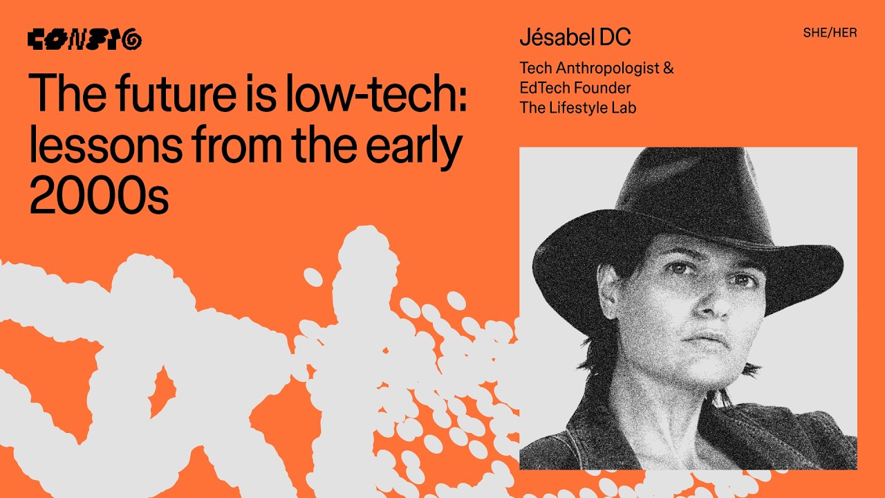
The future is low-tech: lessons from the early 2000s ft. Jésabel DC | Config 2026 — Figma

Figma

Ad-based monetization forced platforms to exploit user nervous systems for screen time, leaving future commercial survival to products that drive people back into the real world.

AI-assisted summary of The future is low-tech: lessons from the early 2000s ft. Jésabel DC | Config 2026 — original source. Check the original for full context.

Source published:

Key ideas

  • Over 4,000 hours of ethnographic fieldwork across various professions revealed that users overwhelmingly internalize guilt and blame their own willpower for tech-induced distraction, rather than recognizing manipulative software architecture. (2:09)
  • The transition from software as a destination to an attention-trapping enclosure was driven by the rise of digital advertising as the tech industry's dominant monetization model. (0:12)
  • Jésabel DC outlines four foundational calm-design lessons from early-2000s artifacts: embed radical clarity (LEGO), regulate the nervous system via orientation (loading bars), activate physical reality (Pokémon), and build with a secure attachment style (Animal Crossing). (5:36)
  • Aligning product monetization with real-world user competence rather than ad impressions allows builders to design natural stopping points without sacrificing commercial viability. (14:56)

Detailed notes

## Background Published on YouTube by Figma on July 1, 2026, this Config 2026 presentation features tech anthropologist and low-tech futurist Jésabel DC. The talk explores lessons from the early 2000s—such as loading bars and retro games—to advocate for calm, nervous-system-friendly product design rooted in autonomy and real-world interaction.

## TL;DR Jésabel DC argues that modern digital platforms shifted from intentional destinations into exploitative attention traps once ad-driven monetization began rewarding companies for hijacking human nervous systems. Drawing on over 4,000 hours of ethnographic research, she presents four low-tech design principles inspired by early-2000s artifacts: LEGO manuals for radical clarity without redundant explanations, loading bars for spatial and causal orientation, Pokémon for activating real-world community, and Animal Crossing for designing with a secure attachment style and natural stopping points. She concludes that the next era of enduring tech products will abandon engagement-driven extraction in favor of business models that genuinely serve human agency and earn long-term trust.

## Atmosphere & style The presentation carries a calm, thoughtful, and validating tone, pairing sharp structural critiques of contemporary software with fond, nostalgic references to early digital culture. Jésabel speaks with the measured authority of a researcher, relieving the audience of personal guilt regarding screen time by systematically exposing how interface design deliberately exploits biology. The energy is inspiring rather than defeatist, grounding high-level ethical arguments in practical product mechanics that leave designers feeling empowered to build more humane technology.

## Bulletin - [02:09](https://www.youtube.com/watch?v=otkSbl399tU&t=129s) Over 4,000 hours of ethnographic fieldwork across various professions revealed that users overwhelmingly internalize guilt and blame their own willpower for tech-induced distraction, rather than recognizing manipulative software architecture. - [00:12](https://www.youtube.com/watch?v=otkSbl399tU&t=12s) The transition from software as a destination to an attention-trapping enclosure was driven by the rise of digital advertising as the tech industry's dominant monetization model. - [05:36](https://www.youtube.com/watch?v=otkSbl399tU&t=336s) Jésabel DC outlines four foundational calm-design lessons from early-2000s artifacts: embed radical clarity (LEGO), regulate the nervous system via orientation (loading bars), activate physical reality (Pokémon), and build with a secure attachment style (Animal Crossing). - [14:56](https://www.youtube.com/watch?v=otkSbl399tU&t=896s) Aligning product monetization with real-world user competence rather than ad impressions allows builders to design natural stopping points without sacrificing commercial viability.

## Key takeaways - [00:12](https://www.youtube.com/watch?v=otkSbl399tU&t=12s) In the early 2000s, the internet functioned as a distinct destination rather than an ambient state, allowing users to complete tasks and step away back into physical life. - [00:12](https://www.youtube.com/watch?v=otkSbl399tU&t=12s) Modern interface design deteriorates because ad-driven business models incentivize platforms to maximize time spent by hijacking users' biological nervous systems. - [00:12](https://www.youtube.com/watch?v=otkSbl399tU&t=12s) A low-tech philosophy offers a middle path between total digital entrapment and complete disconnection, granting users agency to step smoothly between software and reality. - [02:09](https://www.youtube.com/watch?v=otkSbl399tU&t=129s) Designing for user well-being and reciprocity is becoming a critical competitive advantage amid rising regulatory scrutiny and consumer skepticism of psychological harms. - [02:09](https://www.youtube.com/watch?v=otkSbl399tU&t=129s) Users consistently blame their own lack of willpower for screen addiction and focus issues instead of manipulative software patterns. - [05:36](https://www.youtube.com/watch?v=otkSbl399tU&t=336s) Radical clarity requires designing products that communicate through their intrinsic architecture rather than patching confusion with tooltips, guides, or support documentation. - [05:36](https://www.youtube.com/watch?v=otkSbl399tU&t=336s) LEGO instruction manuals show that when an assembly step feels confusing, the physical product build must be simplified rather than explaining the complexity with text. - [08:39](https://www.youtube.com/watch?v=otkSbl399tU&t=519s) Early sensory feedback mechanisms like loading bars, hover states, and shutter sounds regulated the nervous system by continuously answering where the user is and whether actions worked. - [08:39](https://www.youtube.com/watch?v=otkSbl399tU&t=519s) Disorientation caused by infinite scrolls and algorithmic feeds creates platform dependency, whereas structured orientation builds user trust. - [10:16](https://www.youtube.com/watch?v=otkSbl399tU&t=616s) Interfaces must minimize sensory friction and present explicit states to prevent overwhelming users whose nervous systems are already strained. - [11:52](https://www.youtube.com/watch?v=otkSbl399tU&t=712s) Early Pokémon created a multi-faceted ecosystem that used digital devices as a catalyst for in-person trading, play, and community interaction. - [11:52](https://www.youtube.com/watch?v=otkSbl399tU&t=712s) Modern software often replaces genuine experiences with synthetic digital loops, whereas calm design uses digital tools as a launchpad to activate offline reality. - [14:56](https://www.youtube.com/watch?v=otkSbl399tU&t=896s) Animal Crossing mapped to the console's internal clock and daylight cycle, engineering natural stopping points because point-of-sale revenue did not rely on artificial retention. - [14:56](https://www.youtube.com/watch?v=otkSbl399tU&t=896s) Building with a secure attachment style means trusting users to leave and return freely based on genuine utility, rather than deploying anxious retention traps. - [14:56](https://www.youtube.com/watch?v=otkSbl399tU&t=896s) Shifting monetization away from user extraction requires asking who else benefits when users gain competence, unlocking institutional and real-world funding models. - [19:11](https://www.youtube.com/watch?v=otkSbl399tU&t=1151s) The next generation of successful technology companies will not be those that fight to steal the most attention, but those that earn user returns.

## Detailed walkthrough ### [00:12](https://www.youtube.com/watch?v=otkSbl399tU&t=12s) The Shift from Visiting the Internet to Being Trapped Inside

Jésabel DC opens by asking the audience for a show of hands on who experienced technology back in the early 2000s, versus those who grew up with modern touchscreens and smartphones. While technological capability has become undeniably impressive, user experience has steadily deteriorated. Jésabel argues that this decline happened because technology became exceptionally proficient at one specific objective: keeping users trapped inside digital spaces.

In the early 2000s, the internet was treated as a distinct destination rather than an ambient, continuous state of existence. A user would walk over to a shared family desktop computer, wait patiently for the machine to boot up, check in on their Neopets, and then physically close the browser and walk away to return to their everyday life. Early digital experiences were not inherently better because designers were more virtuous or thoughtful; rather, companies simply had not yet discovered or adopted the economic model that actively rewarded trapping people. By the close of the decade, advertising emerged as the dominant monetization engine across the tech sector. To maximize advertising revenue, platforms aggressively optimized for total time spent, aligning interface design with engagement mechanics that hijack users’ own biological nervous systems.

This dynamic has created a severe cultural divide. On one extreme, individuals spend their lives inside digital enclosures that merely simulate genuine human connection and lived experience. On the other extreme, users feel so overstimulated and exhausted that throwing their phones into a lake feels like the only viable escape. Jésabel advocates for a middle path: a low-tech philosophy where people use the digital tools they need while maintaining the friction-free agency to step right back into the real world.

```mermaid flowchart TD accTitle: Evolution of Digital Tech Models accDescr: Diagram contrasting early 2000s destination computing with late 2000s attention extraction.

subgraph Early["Early 2000s: Destination Model"] A["Family Computer Boots Up"] --> B["Perform Task / Check Neopets"] B --> C["Close Machine & Return to Life"] end

subgraph Modern["Late 2000s Onward: Attention Extraction"] D["Ad-Driven Monetization"] --> E["Optimize Time on Platform"] E --> F["Exploit Nervous System"] F --> G["User Trapped Inside System"] end ```

- In the early 2000s, logging on required dedicated physical intent—navigating to a shared family PC and waiting out slow boot sequences. - The shift from software utility to platform addiction occurred when online advertising became the dominant monetization strategy.

---

[02:09](https://www.youtube.com/watch?v=otkSbl399tU&t=129s) Moving from Extraction to Reciprocity and Low-Tech Futurism

Transitioning away from exploitative software requires designers to reorient their priorities around user well-being rather than single-mindedly maximizing profit. While profitability remains necessary, treating users merely as an extractable resource destroys sustainable value. For years, the industry’s standard operating procedure has been strictly extractive: engineer an experience so compelling that users cannot leave, harvest their finite attention, and monetize the resulting screen time. Jésabel summarizes the one-sided nature of this model succinctly: “The user gives, the product takes.” In contrast, a healthy relationship requires genuine reciprocity, where products deliver real-world utility and earn long-term user trust in return.

Designing for user well-being is evolving from an idealistic moral stance into a necessary competitive advantage. Tech companies face mounting regulatory scrutiny, increased public skepticism, and shifting consumer expectations regarding the downstream psychological harms of their software. The organizations that survive and thrive in the next era of computing will be those that actively recognize this shift and adapt early.

Jésabel describes her background as a tech anthropologist and low-tech futurist. Just as traditional anthropologists investigate how human beings interact with their physical habitats, her work examines how people interface with their technological environments. Over more than 4,000 hours of ethnographic fieldwork observing everyday digital behaviors—ranging from startup founders and corporate executives to celebrities—she encountered a consistent, tragic pattern: people universally believe they are personally flawed and bad at technology. Users regularly internalize guilt for their lack of focus, their inability to put down devices, and their feeling of being overwhelmed by the very software intended to simplify their lives.

To prove that digital tools can serve human health without sacrificing commercial viability, Jésabel co-founded the Lifestyle Lab, an ecosystem spanning video game design, educational curricula, and organizational consulting. Reflecting on this mission, Jésabel DC posed the core challenge of her work: “What would it look like if technology were designed for your nervous system instead of against it?”

- Over 4,000 hours of field research revealed that users across all professional backgrounds consistently blame their own willpower rather than manipulative software architecture. - Early personal computing invested heavily in user onboarding and education because the medium was novel and companies had to make people feel competent to drive adoption. - The Lifestyle Lab translates calm design principles into actionable product frameworks through games that prompt screen breaks, grounded educational tools, and corporate product consulting.

---

[05:36](https://www.youtube.com/watch?v=otkSbl399tU&t=336s) Lesson 1: LEGO Instructions and Designing for Radical Clarity

Jésabel turns to four foundational lessons drawn from artifacts of the early 2000s, beginning with the wordless, step-by-step illustrations of LEGO instruction manuals. LEGO booklets rely entirely on color-coded visuals that even a child without reading literacy can independently navigate without adult intervention. LEGO employs a dedicated team whose sole responsibility is to assemble every model dozens of times using different permutations to isolate the clearest, most intuitive sequence possible. Whenever a construction phase feels convoluted, LEGO’s designers never patch the confusion by piling on explanatory text; they redesign and simplify the physical brick build itself. The instructions function as a diagnostic mirror for the physical product’s design clarity.

In modern software development, teams often default to the exact opposite approach. When an interface proves confusing, designers layer on intrusive tooltips, lengthy onboarding walkthroughs, and sprawling knowledge bases containing hundreds of support articles. This practice mistakenly offloads design debt onto the customer, assuming users possess infinite patience to decode broken user journeys. Condemning this industry habit, Jésabel DC asserts: “If it requires an explanation, it needs a redesign.” Products must communicate through their intrinsic architecture rather than supplementary explanations.

Several modern examples demonstrate how radical clarity can be embedded directly into experiences: - **No Name Grocery Brand**: Instead of burying consumer packaging in buzzwords like "farm-fresh, not-from-concentrate, organic apple juice," the Canadian value brand labels the carton plainly as "apple beverage," stripping out cognitive overhead. - **Super Mario Bros. (World 1-1 to Present)**: Nintendo introduces gameplay mechanics incrementally without written tutorials. A mechanic is introduced, the player tests it safely, the stakes are elevated, and the concept is layered forward so players master complex actions purely through intuitive play. - **Lifestyle Lab Co-Living Interface**: Rather than managing shared household tasks through multi-layered abstract software menus, the interface mimics a familiar physical living space. Household chores are pinned to a visual corkboard, personal messages sit in a glass jar, and roommate meetings are scheduled directly on a virtual beanbag chair, leveraging millions of years of human spatial intuition.

---

[08:39](https://www.youtube.com/watch?v=otkSbl399tU&t=519s) Lesson 2: Loading Bars and Regulating Nervous Systems Through Orientation

The second early-2000s artifact Jésabel explores is the digital loading bar. While loading bars originally emerged out of raw computational necessity because network and processing tasks genuinely took time, they served an overlooked psychological function: providing continuous nervous system orientation. A clear progress indicator reassures the user that the system has not crashed, their input was registered, and active progress is occurring under the hood.

Loading bars were part of a broader suite of sensory feedback mechanisms prevalent in early consumer technology. Obvious hover states confirmed that an on-screen element could be clicked, and tactile or auditory camera shutter clicks confirmed an image had been captured. Jésabel explains that these sensory signals consistently answered four core questions: 1. *Where am I?* 2. *What's happening?* 3. *Can I interact with this?* 4. *Did my action work?*

When software provides unambiguous answers to these spatial and causal questions, a user’s nervous system relaxes and settles into the digital experience. However, modern interfaces often strip away clear boundaries and state changes in favor of infinite scrolling, unpredictable algorithmic feeds, and erratic push notifications. Highlighting the manipulative consequences of this evolution, Jésabel DC states: “Disorientation creates dependency. Orientation creates trust.” By stripping away structural landmarks, contemporary platforms disorient users, making them substantially more vulnerable to addictive behavioral feedback loops. Designers hold an ethical responsibility to build digital environments that deliberately support human autonomy and actively regulate, rather than exploit, human nervous systems.

[10:16](https://www.youtube.com/watch?v=otkSbl399tU&t=616s) Designing for Nervous-System Orientation: Shazam, IKEA, and Lifestyle Lab

Designers must design products that counteract the overwhelming chaos of daily life rather than compound it. Failing to do so carries a distinct danger: “Otherwise, we risk losing them not because our product is bad, but because their nervous systems are already maxed out before they even arrive.”

Several real-world examples illustrate how companies purposefully orient users by making states clear and minimizing sensory friction:

- **Shazam:** Built for rapid comprehension under distracting real-world conditions (such as catching a song mid-conversation at a party). The UI quickly communicates every state and immediately steps aside: 1. A single giant button 2. A listening state 3. A searching state 4. An unmistakable confirmation state - **IKEA:** Combats the sensory overload of navigating a massive warehouse packed with crowds on a Saturday afternoon by turning the physical store into an explicit map featuring oversized directional arrows, distinct room labels, and paths painted directly on the floors. - **The Lifestyle Lab:** Applies digital orientation through high-contrast hover states on web interfaces, replacing linear slide navigation in presentations with interactive menu-style overviews, using cursor motion to visually anchor eye transitions between sections, and engineering distinct moments of closure when lessons are completed.

```mermaid flowchart LR accTitle: Shazam State Flow accDescr: The four explicit UI states used by Shazam to quickly orient a distracted user. A["Giant Button"] --> B["Listening State"] B --> C["Searching State"] C --> D["Confirmation State"] ```

---

[11:52](https://www.youtube.com/watch?v=otkSbl399tU&t=712s) Lesson 3: Technology Should Activate Reality, Not Replace It

The third lesson draws its inspiration from early 2000s Pokémon. Rather than confining players to their Game Boy screens, Pokémon expanded its universe into a multi-faceted ecosystem of physical trading cards, toys, collector handbooks, and competitive in-person tournaments. By giving players tangible excuses to meet and interact face-to-face, the brand embedded itself into daily routines: it built a world people could actively participate in, not merely a product they played.

Jésabel DC argues that modern digital design has strayed far from this model by substituting synthetic digital loops for genuine human experiences: “Technology should activate reality, not replace it.” Contemporary platforms encourage people to passively consume community rather than participate in it, watch curated moments instead of living them, and broadcast social identity rather than cultivate it internally. Instead, software should serve as a launchpad that drives people back out into the physical world.

Several modern products attempt to bridge this digital-physical divide:

- **Strava:** Transforms urban geography into a shared social interface for runners and cyclists, prompting real-world movement and inspiring user-led expressions like GPS art plotted across city maps. - **Tinder:** In response to deep "swipe fatigue"—the repetitive cycle of matching, messaging, and disappearing—Tinder complemented its AI matching rollouts by organizing in-person singles events. An algorithm can spark feelings of connection, but only physical spaces provide the actual conditions for human connection to flourish. - **The Lifestyle Lab Game:** Rather than being purely escapist, the virtual game mirrors an intentional living community where players manage shared living dynamics, chore charts, and household communication. When a player masters a co-living workflow and levels up their in-game avatar, the platform provides functional, real-world templates and tools they can apply immediately to their actual roommates.

---

[14:56](https://www.youtube.com/watch?v=otkSbl399tU&t=896s) Lesson 4: Designing with a Secure Attachment Style

The fourth artifact is the early-2000s life simulator *Animal Crossing*. Running on the console's internal hardware clock, the game mapped directly to the rhythm of physical time: daylight matched the morning sun outside, seasonal weather aligned with real-world seasons, shops closed their doors at night, and town villagers went to sleep. These intentional constraints created natural stopping points, freeing players to step away from the screen without anxiety. Nintendo could implement this because their revenue was settled at the initial point of sale, freeing them from the need to artificially manufacture time-on-device: they designed for anticipation rather than compulsive retention.

Modern technology companies, by contrast, frequently design around an anxious attachment style, deploying manipulative patterns and engagement loops out of a desperate fear that users will leave. Jésabel DC emphasizes that business models dictate software ethics: “If it requires attention, engagement starts driving the product.” Healthy tools operate from a secure attachment mindset—trusting that users will return freely because the utility provided is real. Aligning business models with real-world user success allows companies to step away from metric extraction:

| Company / Product | Product Strategy | Revenue / Business Alignment | Real-World Impact | |:--- |:--- |:--- |:--- | | **Pinterest** | Shortening the path between inspiration and physical action rather than fostering passive mood-boarding. | Monetizes discovery and purchases without requiring infinite screen time. | Users execute real-world projects (e.g., buying lights, hosting dinners) instead of endlessly browsing. | | **Timeleft** | Organizes curated dinners for strangers to connect in person. | Uses recurring subscriptions and lifestyle brand partnerships instead of ad loops. | Financial incentives reward repeated physical attendance and genuine offline bonding. | | **The Lifestyle Lab** | Builds life-skill games (interpersonal communication, co-living systems). | Funded by institutions (schools, workplaces, civic groups) that directly benefit from capable individuals. | Avoids monetization through engagement traps or ad impressions. |

Reframing product monetization away from user extraction requires asking: *"Who else benefits when our users learn these skills?"* When enterprise, educational, and community partners fund the tools because they benefit from capable people, the product remains free to serve human agency.

---

[19:11](https://www.youtube.com/watch?v=otkSbl399tU&t=1151s) The Mandate for the Next Generation of Builders

The talk concludes by synthesizing the four core design lessons:

1. Embed clarity 2. Provide orientation 3. Activate reality 4. Serve our users

Digital products actively shape how people spend their hours, navigate environments, and perceive their connections to others. Designers bear direct responsibility for the ambient conditions of shared human reality. Jésabel DC closes with a vision for the future of digital software: “Because the companies that succeed in the next generation of technology won't be the ones that fight to steal the most attention. They'll be the ones that earn the return.”

## Notable quotes > [08:39](https://www.youtube.com/watch?v=otkSbl399tU&t=519s) Disorientation creates dependency. Orientation creates trust. — Jésabel DC

> [11:52](https://www.youtube.com/watch?v=otkSbl399tU&t=712s) Technology should activate reality, not replace it. — Jésabel DC

> [19:11](https://www.youtube.com/watch?v=otkSbl399tU&t=1151s) Because the companies that succeed in the next generation of technology won't be the ones that fight to steal the most attention. They'll be the ones that earn the return. — Jésabel DC

> [05:36](https://www.youtube.com/watch?v=otkSbl399tU&t=336s) If it requires an explanation, it needs a redesign. — Jésabel DC

> [14:56](https://www.youtube.com/watch?v=otkSbl399tU&t=896s) If it requires attention, engagement starts driving the product. — Jésabel DC

## Mentioned Animal Crossing, Config 2026, Figma, Game Boy, IKEA, Jésabel DC, LEGO, Lifestyle Lab, Neopets, Nintendo, No Name, Pinterest, Pokémon, Shazam, Strava, Super Mario Bros., Timeleft, Tinder

## Video description We’ll rewind to the early 2000s—when tech was low-tech, playful and non-extractive. Think: loading bars, Tamagotchis and RollerCoaster Tycoon in a cereal box. This talk explores calm, nervous-system-friendly design: attention regulation, slowness as a feature, autonomy-first mechanics, real-world interaction and gentle feedback loops. A call for designers and builders to make tech feel human again. ____________________________________________________

Find us on ⬇️ X (formerly Twitter): https://x.com/figma Instagram: https://www.instagram.com/figma LinkedIn: https://www.linkedin.com/company/figma TikTok: https://tiktok.com/@figma Figma forum: https://forum.figma.com/

[Source](https://www.youtube.com/watch?v=otkSbl399tU)

Reading summary

Tech anthropologist Jésabel DC argues that modern software harms user well-being by optimizing for continuous attention extraction rather than utility, urging designers to adopt early-2000s principles that respect human biology, provide clear boundaries, and encourage a return to physical reality. The Transition from Destination Computing to Extraction (0:12) In the early 2000s, interacting with the internet was an intentional destination rather than an ambient state. Users logged onto shared desktop computers for specific tasks—such as checking Neopets—and physically walked away once finished. Jésabel DC explains that this dynamic shifted when online advertising emerged as tech's dominant monetization model, prompting platforms to aggressively maximize time spent on screens by engineering mechanics that exploit users' biological nervous systems. This structural shift has created widespread digital exhaustion. Drawing on more than 4,000 hours of ethnographic fieldwork observing everyday technology users, DC notes that people across all professions consistently internalize guilt for their lack of focus and screen habits. Rather than identifying manipulative software architecture as the root cause, users routinely blame their own willpower. Radical Architectural Clarity Over Explanatory Patches (5:36) Looking to early-2000s artifacts, DC highlights LEGO instruction booklets, which use wordless, color-coded illustrations that even non-literate children can navigate. When a construction sequence proves confusing, LEGO’s testing teams redesign the physical model itself rather than adding explanatory text. DC asserts that software designers must apply the same discipline: if an interface requires onboarding walkthroughs, tooltips, or extensive support articles, it indicates underlying design debt that requires a core redesign. To achieve radical clarity, software should communicate through its intrinsic structure. DC cites examples such as the Canadian value brand No Name using plain product descriptions, Nintendo introducing mechanics in Super Mario Bros. through incremental play rather than written manuals, and Lifestyle Lab organizing co-living management around familiar spatial metaphors like virtual corkboards and beanbag chairs. Nervous-System Regulation Through Predictable Orientation (8:39) Early digital mechanisms like loading bars, hover states, and shutter clicks were originally computational necessities that fulfilled an essential psychological need: nervous-system orientation. These sensory signals consistently clarified four basic questions for users: where they are, what is happening, whether an element is interactive, and whether an action succeeded. Modern design patterns have largely replaced these clear boundaries with infinite scrolling and unpredictable algorithmic feeds, which DC argues disorients users to foster dependency. Designing for orientation requires interfaces that counter real-world sensory overload rather than compounding it. DC points to Shazam’s interface—which uses a single button and four distinct sequential states (listening, searching, and confirmation) to quickly deliver value and exit—as well as IKEA's physical floor navigation arrows, illustrating that predictable visual landmarks relieve cognitive friction and establish user trust. Secure Attachment and Reality-First Monetization (11:52) Early consumer experiences like Pokémon and Animal Crossing were built to activate offline life rather than consume it. Animal Crossing matched its console clock to physical time, using sleeping villagers and closed shops to create natural stopping points that let players step away. Modern platforms, by contrast, operate with an anxious attachment style, implementing retention traps out of a desperate fear that users will leave. Transitioning to a secure attachment model requires decoupling business revenue from raw screen time. Products like Pinterest, Strava, and Timeleft structure digital interactions to drive physical execution, athletic movement, and in-person dining. To eliminate the incentive for engagement traps, DC advocates rethinking product funding entirely by asking who else benefits when users acquire real-world capability, such as educational or workplace institutions that sponsor life-skill tools. DC concludes that the next generation of successful technology companies will not be those that compete to steal the most human attention, but those that earn voluntary user return by providing genuine utility and supporting real-world agency.

Source quotes

[8:39] Jésabel DC: Disorientation creates dependency. Orientation creates trust. [11:52] Jésabel DC: Technology should activate reality, not replace it. [19:11] Jésabel DC: Because the companies that succeed in the next generation of technology won't be the ones that fight to steal the most attention. They'll be the ones that earn the return. [5:36] Jésabel DC: If it requires an explanation, it needs a redesign. [14:56] Jésabel DC: If it requires attention, engagement starts driving the product.

Original transcript

[0:12] Hi everybody. How's it going? [0:15] Woo! [0:17] >> [laughter] [0:18] >> Awesome. Welcome to the Futures Low-Tech [0:20] Lessons from the early 2000s. [0:23] Show of hands, who here got to [0:25] experience technology in the early [0:27] 2000s? [0:28] Hell yeah. [0:30] And who here experienced this instead? [0:34] Well, [0:35] fast forward to today and technology is [0:37] getting more and more impressive, which [0:39] could be exciting, except the user [0:42] experience keeps getting worse. [0:44] And the reason is because technology got [0:46] really, really good at doing one [0:48] specific thing. [0:50] Keeping us trapped inside. [0:53] Well, in the early 2000s, the internet [0:55] was a place that you visited. [0:57] You'd have to walk up to the family [0:58] computer, [0:59] wait for it to boot up, [1:01] check on your Neopets, [1:03] and then you'd close it, [1:05] and go back to your life. [1:08] But technology wasn't better in the [1:09] early 2000s because designers were more [1:11] ethical or more thoughtful. [1:13] It was better because they hadn't yet [1:15] been handed the business model that [1:16] rewarded trapping the user. [1:19] But by the end of the decade, ads became [1:21] the main way that tech companies made [1:22] money. So, they began optimizing for [1:24] time spent on the platform. And when the [1:27] business model changed, the design [1:29] changed with it. [1:30] And we went from designing experiences [1:32] for our users to designing engagement [1:35] mechanisms that use their own nervous [1:37] systems against them. [1:39] So, where does that leave us today? [1:41] With a huge cultural divide. [1:43] On one end, we're seeing people lose [1:45] touch with reality by spending more time [1:47] inside of systems that simulate [1:49] connection and experience. [1:50] And then on the other hand, we're seeing [1:52] people so overwhelmed by technology that [1:54] chucking their phones into a lake is [1:56] starting to seem like the only way out. [1:58] But what I propose is an in-between. [2:01] Low-tech. [2:02] It means using the technology that we [2:04] need [2:05] with the ability to step back into our [2:07] lives. [2:09] But that shift requires us as designers [2:12] to build technology around our users' [2:14] needs, not just what generates the most [2:16] profit. [2:18] Of course, profitability will always be [2:19] a goal, but it cannot be the only goal [2:21] that we're optimizing for because our [2:23] users shouldn't be seen as a resource. [2:25] They should be seen as a relationship. [2:28] For many years, the dominant model has [2:30] been extraction. Build something so [2:32] compelling that your users cannot leave, [2:34] harvest their attention, and then [2:36] monetize the time that they spend [2:37] trapped inside of your products. [2:40] The user gives, the product takes. [2:42] But a relationship implies reciprocity. [2:45] Create real value for your user, and in [2:46] turn, they give you their trust. [2:49] And this is no longer just an ethical [2:51] consideration. [2:52] We're entering a period where tech [2:54] companies will face increasing pressure [2:55] to justify the effects of their [2:57] products. [2:58] As regulation, public awareness, and [3:00] user expectations evolve, designing for [3:03] your users' needs will become a [3:04] competitive advantage. [3:07] And the companies that succeed in the [3:08] next generation of technology will be [3:09] the ones that recognize the shift and [3:12] start paying attention to it now. [3:15] But before we dive into the lessons, I [3:16] want to tell you why I got into this. [3:18] So, hi. I'm Jezebel D'Cie. I am a tech [3:21] anthropologist and a low-tech futurist. [3:24] Much like how traditional [3:24] anthropologists study the relationship [3:26] between humans and their physical [3:28] environment, I study the relationship [3:30] between humans and their tech [3:31] environments. [3:33] And after over 4,000 hours of fieldwork [3:34] studying how people navigate their [3:36] digital lives, from entrepreneurs to [3:38] CEOs to celebrities, I kept seeing the [3:40] same thing. [3:42] People are convinced that they're bad at [3:44] technology. [3:46] They blame themselves for their lack of [3:47] focus, [3:48] for their inability to put their phones [3:49] down, [3:51] and for feeling overwhelmed by the very [3:52] tools that were supposed to make their [3:54] lives easier. [3:56] But that wasn't the case in the early [3:57] 2000s. Interfaces were easier to [4:00] navigate and companies put a real effort [4:02] into educating their users, mostly [4:04] because personal computing was still so [4:06] new that they had to help their users [4:07] feel capable in order for adoption to [4:09] happen. [4:11] So I started asking myself this [4:12] question. [4:14] What would it look like if technology [4:16] were designed for your nervous system [4:19] instead of against it? [4:21] If interfaces oriented you instead of [4:23] disorienting you. [4:24] And if technology returned you to your [4:26] life instead of trying to replace it. [4:29] So instead of theorizing about this, my [4:31] co-founder and I are doing just that [4:32] with a lifestyle lab. The lifestyle lab [4:35] is a product ecosystem that incorporates [4:37] a video game, education programs, and [4:39] consulting experiences. [4:41] So if we can design a game that helps [4:43] people step away from their screens, [4:45] programs that actually translate into [4:47] real life, and consulting that turns [4:49] user well-being into actual product [4:50] decisions, [4:53] then we have more than a philosophy. [4:55] We have proof that the future of [4:57] technology can be both profitable and [4:59] human-friendly, [5:00] which is why I'm here, to show you how [5:02] the early 2000s can teach us about [5:04] building the technology that this future [5:06] needs. [5:07] All right, ready to start? [5:16] I had to do it. [5:19] Welcome back to the early 2000s. [5:22] A slower, weirder, more human era of [5:25] technology. [5:26] These four lessons will teach us about [5:27] clarity, orientation, real life [5:29] connection, and serving your user. [5:36] For each lesson, we're going to examine [5:38] an artifact, [5:41] uncover the lesson it teaches us, [5:44] and explore modern-day applications. [5:50] Lesson one. [5:54] The artifact, LEGO instructions. [5:56] LEGO instructions have zero words, just [5:59] full-color step-by-step illustrations [6:01] designed to be clear enough that a child [6:02] with no reading ability can follow them [6:04] without needing help from their parents. [6:07] LEGO has an entire team dedicated to [6:09] building the model dozens of times in [6:10] different ways to find the clearest [6:12] possible sequence. [6:14] And when the step becomes too [6:15] complicated to clearly, they don't add [6:17] more explanation. They simplify the [6:19] build. [6:21] In other words, the instructions aren't [6:22] just there to teach the user. They're a [6:24] diagnostic tool for designers to see [6:26] where the experience requires more [6:28] clarity. [6:29] And over the years, LEGO started [6:31] embedding even more clarifying elements [6:32] like numbered bags, piece call-outs, and [6:34] logical stopping points to make the [6:36] process even easier to follow. [6:40] So, what's the lesson? [6:41] If it requires an explanation, [6:44] it needs a redesign. [6:47] In modern tech, we often do the [6:48] opposite. If it requires an explanation, [6:50] we pile on tooltips, onboarding flows, [6:52] and help centers with hundreds of [6:53] articles. [6:55] These products assume that their users [6:57] will have the time and patience to [6:58] figure things out, and their drop-off [7:00] rates suffer because of it. [7:01] If your product requires an explanation [7:03] before it can be used, you're asking [7:05] your user to do the work that the design [7:07] should have done itself. [7:09] Because the strongest products teach [7:11] through the experience by embedding [7:12] guidance directly into the product. [7:18] >> [laughter] [7:19] >> Thank you. [7:21] Here's how companies are applying that. [7:23] The No Name brand is a grocery brand [7:25] that embedded clarity right into the [7:27] visual identity of their product by [7:28] making its package radically clear. [7:31] They don't have farm fresh, not from [7:32] concentrate, organic apple juice. [7:35] They have apple beverage. [7:37] Most brands layer on marketing language [7:39] that the customer has to process before [7:40] making a decision, but the No Name brand [7:42] reduces confusion by just saying it [7:44] exactly like it is. [7:46] And Super Mario Bros. does this by [7:47] embedding instructions directly into the [7:49] first level of gameplay. From their [7:51] original world 1-1 to their most modern [7:53] games, [7:54] it introduces a mechanic, lets you try [7:57] it, raises the stakes, and then builds [7:59] up on it. So, before the end of the [8:01] first level, players have learned all of [8:03] the mechanics without reading a single [8:04] line of instruction. [8:06] And at the Lifestyle Lab, we embed [8:08] clarity by using physical space logic [8:10] for our interfaces. This is a co-living [8:12] tool that roommates can use to organize [8:14] shared living, but instead of a [8:16] traditional software interface, we [8:17] designed it to look like a physical [8:19] environment because A, it's much more [8:22] fun to interact with, but B, humans have [8:24] evolved to understand physical spaces. [8:26] So, rather than having to look through a [8:27] menu, [8:29] chores can be found on the bulletin [8:30] board, [8:31] notes are left in the glass jar, [8:33] and meetings happen on the beanbag [8:35] chair. [8:39] All right, lesson two. [8:44] The artifact, loading bars. [8:46] On a technical level, loading bars [8:48] existed because things back then [8:49] genuinely took time to load. [8:51] But, psychologically, loading bars [8:53] served another purpose, orientation. [8:56] Orientation tells the nervous system, [8:58] "You're not lost. You're not stuck. [9:00] Something is happening." [9:02] And loading bars were just one of many [9:04] orientation cues that were used in the [9:05] early 2000s. [9:07] Seeing an obvious hover animation [9:08] signaled that the button was in fact [9:10] clickable, [9:11] and hearing the camera shutter confirmed [9:13] that the photo had been taken. [9:15] Every single one of these cues answered [9:17] one of four questions. "Where am I? [9:20] What's happening? Can I interact with [9:22] this? And did my action work?" And when [9:25] those questions are finally answered, [9:27] your nervous system can actually settle [9:28] into the experience. [9:32] So, what's the lesson? [9:33] Disorientation creates dependency. [9:36] Orientation creates trust. [9:39] When an infinite scroll, push [9:41] notifications, and algorithmic feeds got [9:42] introduced, our need for orientation [9:45] increased. But instead, many platforms [9:48] used that need against us, turning cues [9:50] into dark patterns that create urgency, [9:52] pressure, and distraction. [9:54] But because the more disoriented users [9:57] become, the harder it is for them to [9:59] resist harmful loops. [10:01] Which is why as designers, it is our [10:03] responsibility to create environments [10:05] that support human not exploit it. And [10:08] it's not enough to just design something [10:09] that is not exploitative. We have to [10:11] actively design experiences that help [10:14] regulate our users' nervous systems to [10:16] counteract the rest of their reality. [10:19] Otherwise, we risk losing them not [10:21] because our product is bad, but because [10:23] their nervous systems are already maxed [10:24] out before they even arrive. [10:29] Here's how companies are applying that. [10:31] Shazam orients its users by making every [10:33] state of the product super obvious. [10:36] Their users might be at a party, [10:37] mid-conversation, and want to catch a [10:39] song before it ends. So Shazam orients [10:42] them fast, gives them the answer, and [10:43] then gets out of the way, like this. [10:45] It's one giant button, [10:47] a listening state, [10:49] a searching state, [10:51] and then a very obvious confirmation [10:52] state. [10:55] IKEA orients its users by turning the [10:57] whole store into a giant map. The arrows [10:59] are huge, the room labels are obvious, [11:01] and paths are drawn right on the floor. [11:03] And this is smart because how else would [11:05] they offset the overwhelm of navigating [11:07] a massive warehouse on a very stressful, [11:08] very packed Saturday afternoon? [11:12] And at the Lifestyle Lab, we orient our [11:13] users on our website by designing in [11:15] very obvious hover states like these. [11:18] And whenever we design a presentation [11:20] like this one, instead of having a [11:22] standard sequential slide navigation, we [11:25] design a menu-style navigation that [11:27] allows you to preview the entire [11:28] experience beforehand, so that you know [11:31] where you are within it at all times. [11:34] And we also use the cursor to reduce the [11:36] disorientation that happens when [11:37] sections change. It guides your eye [11:39] through the transition, so you know [11:40] where to look next. [11:42] And lastly, we indicate lesson [11:45] completion by designing in a very clear [11:46] moment of closure, like this. [11:52] All right, lesson three. [11:59] The artifact, Pokémon. [12:01] In the early 2000s, there was a rise of [12:03] products that extended digital [12:05] experiences into the real world. Like [12:07] Pokémon, who took something that began [12:09] on a Game Boy and extended it into an [12:11] entire ecosystem of trading cards, toys, [12:14] handbooks, and tournaments. [12:16] By creating reasons for people to [12:17] connect in the real world, the brand [12:18] became woven into their everyday lives. [12:20] It didn't just build a product that [12:22] people could play, it built a world that [12:24] it could that they could participate in. [12:28] So, what's the lesson? [12:30] Technology should activate reality, not [12:33] replace it. [12:35] Most products today replace real-world [12:37] behavior, yeah. [12:38] >> [laughter] [12:42] >> Most products today replace real-world [12:43] behaviors with digital approximations of [12:45] them. We consume community instead of [12:47] participating in it. We watch [12:49] experiences instead of having them. And [12:51] we signal identity instead of developing [12:54] it. But technology should be the bridge [12:56] that help people engage more deeply with [12:58] reality by encouraging action beyond the [13:01] screen. [13:03] Here's how companies are applying that. [13:05] Strava does this for runners and [13:06] cyclists. Their app doesn't just track [13:08] movement, but it turns the physical [13:10] world into a social interface and [13:12] encourages their users to move through [13:13] their city. [13:14] And people even began creating Strava [13:16] art by completing routes that trace [13:18] giant drawings across the map. These are [13:20] the weird human things that start [13:22] happening when technology gives people a [13:24] chance to interact with reality. [13:26] Tinder's also an interesting example. [13:29] Most dating apps trap users into an [13:31] exhausting loop of swiping, matching, [13:33] messaging, disappearing, and [13:34] reappearing. But Tinder responded to the [13:36] swipe fatigue by announcing in March [13:38] that even amid a broader push to [13:40] announcing uh AI-powered matching [13:42] features, they also announced in-person [13:45] events. [13:46] Which tells us something. [13:48] That even Tinder is realizing that [13:50] better digital matching is not enough. [13:52] The real product problem is the handoff [13:54] between possibility and reality. [13:57] Because an app can create the feeling of [13:59] connection, but an event can create the [14:01] actual conditions for real connection to [14:03] happen. [14:05] And here's how we're activating reality [14:07] in the lifestyle lab. [14:08] In the video game, players move to an [14:10] intentional community where they form [14:11] relationships, navigate daily life, and [14:13] participate in the culture of the town. [14:16] But the game doesn't just simulate [14:17] better ways of living, it translates [14:19] them into real life. One of the [14:21] mechanics of the game is co-living, [14:23] where players move in with roommates. [14:25] Hold on, let me take you there. [14:31] Okay, we're here. [14:33] Uh [14:33] >> [laughter] [14:34] >> players learn to share a space, [14:36] coordinate chores, communicate needs, [14:37] and build systems that allow the [14:39] household to function smoothly. But [14:41] learning doesn't just stay in the game. [14:44] Players unlock the real world version of [14:46] that system that they can use with their [14:47] actual roommates. So, as their avatar [14:49] levels up in the game, so do they in [14:52] real life. [14:56] Lesson four. [15:01] The artifact, Animal Crossing. [15:04] Yeah. [15:05] >> [laughter] [15:07] >> Animal Crossing was built to mirror the [15:08] cadence of real life. It used the [15:10] console's internal clock, so if it was [15:12] morning in your life, it was morning in [15:14] the game. And if it was winter outside, [15:16] it was winter in your town. [15:17] Stores closed and characters went to [15:19] sleep, which meant that at times there [15:21] was just less to do. And those limits [15:23] created natural stopping points that let [15:25] the players go. [15:27] And Nintendo could design that way [15:28] because the business model wasn't based [15:30] on monetizing engagement. They had [15:32] already been paid when you bought the [15:33] game. So, instead of designing for [15:35] retention, they were free to design for [15:37] anticipation. [15:40] So, what's the lesson? [15:42] If it requires attention, engagement [15:44] starts driving the product. [15:47] Most tech products today are built with [15:48] an anxious attachment style. Constantly [15:51] afraid that you'll leave, using fear [15:52] tactics and manipulation to keep you [15:54] trapped. [15:55] But healthy technology is built with a [15:57] secure attachment style. Confident that [15:59] your users will come back because of the [16:01] value that you create. [16:03] The challenge is that even when [16:05] designers want to build healthier [16:06] experiences, the business model is often [16:08] pulling in the opposite direction. [16:10] But when the success of your business is [16:12] tied to the success of your user, the [16:14] design can start moving in the same [16:16] direction. [16:18] Here's how companies are applying that. [16:20] Pinterest recently launched the slogan, [16:23] uh sorry, Pinterest recently launched a [16:25] campaign around the slogan, "The best [16:27] thing you can find online is a reason to [16:29] go offline." [16:31] That's a pretty radical statement for a [16:32] tech company to make, especially one [16:34] whose business model is based on ad [16:36] revenue. [16:37] How can they remain commercially [16:38] successful by telling their users to go [16:40] offline? [16:42] Well, Pinterest answer to that is to [16:44] shorten the distance between inspiration [16:46] and action. [16:47] Because left unchecked, inspiration can [16:49] become a form of entertainment in [16:50] itself. An endless collection of recipes [16:53] never cooked and projects never started. [16:56] But a backyard mood board isn't valuable [16:58] because it was collected. It's valuable [17:00] because someone bought the twinkle [17:01] lights, set the table, and invited their [17:03] friends over. [17:04] But Pinterest doesn't have to keep their [17:06] users online forever in order to remain [17:08] commercially successful. [17:10] If they can help someone find the right [17:12] idea faster, [17:13] buy what they need with less friction, [17:15] and spend more time actually living the [17:18] idea than searching for it, [17:20] then both sides win. [17:23] Time left organizes curated dinners [17:24] between strangers, but instead of [17:26] selling one-off tickets, they move [17:28] toward a subscription model. And this is [17:30] not just a pricing model. This is what [17:32] aligns their business success with their [17:33] users' success. Because Time Left does [17:36] make more money with recurring [17:37] subscriptions, but people also build [17:39] better connections when they keep [17:41] showing up. So again, both sides win. [17:43] And they've taken this one step further [17:46] by diversifying their revenue through [17:47] brand partnerships built around social [17:49] connection. [17:51] This is important because it means that [17:52] the business can grow by creating more [17:54] opportunities for people to connect in [17:56] real life, not just by charging the user [17:58] more. [18:00] And at the Lifestyle Lab, our challenge [18:02] was how do we keep the game accessible [18:04] for the people that it was built for [18:06] without building a business model that [18:07] depends on keeping them trapped inside? [18:10] Because our goal is to help players [18:11] practice skills that they can use [18:13] outside the game. So designing a [18:15] business spent around the time spent in [18:17] the game would be working against our [18:19] goal. [18:20] So instead of asking how do we monetize [18:21] the user, we asked, [18:24] "Who else benefits when our users learn [18:26] these skills?" [18:28] Well, schools benefit when students are [18:30] better prepared for the future. [18:32] Workplaces benefit when teams are more [18:34] organized. [18:35] And communities benefit when their [18:36] members are have more practical tools [18:38] for living, communicating, and [18:39] supporting each other. [18:41] So instead of making our user carry the [18:43] cost, we built our model around the [18:45] institutions that benefit from our [18:47] users' growth. That way our revenue [18:49] doesn't have to come from extracting our [18:50] user. It comes from the value created [18:53] when the user becomes more capable. [18:55] Cuz that's the thing. Our business model [18:57] decides what our product is free to [18:58] become. [18:59] And if the success of our business is [19:01] dependent on our users becoming more [19:03] capable, then serving our user becomes [19:06] how our company survives. [19:11] In the last four lessons, we learned [19:15] to embed clarity, [19:18] to provide orientation, [19:21] to activate reality, [19:24] and to serve our users. [19:27] As designers, we are responsible for [19:29] creating the conditions of our shared [19:31] reality. [19:32] Every product in this room shapes how [19:34] people spend their time, move through [19:36] the world, and connect to each other and [19:38] themselves. So, if we want to build a [19:40] reality where our users are cared for, [19:43] we have to integrate these principles [19:44] into how we build. [19:46] Because the companies that succeed in [19:48] the next generation of technology won't [19:49] be the ones that fight to steal the most [19:51] attention. [19:52] They'll be the ones that earn the [19:53] return. [19:55] Thank you. [19:56] >> [applause]